QML学习笔记(三十三)QML的CheckBox
前言
CheckBox是一个提供可勾选的选项按钮,常用于各种设置界面,它既可以两态(checked/unchecked),也可以三态(checked/partial/unchecked)” 的开关控件。它还可以搭配了ButtonGroup 进行使用,代表同组按钮之间的多选、单选或互斥操作。
一、了解CheckBox
翻译一下:
CheckBox presents an option button that can be toggled on (checked) or off (unchecked). Check boxes are typically used to select one or more options from a set of options. For larger sets of options, such as those in a list, consider using CheckDelegate instead.
CheckBox inherits its API from AbstractButton. For instance, the state of the checkbox can be set with the checked property.
In addition to the checked and unchecked states, there is a third state: partially checked. The partially checked state can be enabled using the tristate property. This state indicates that the regular checked/unchecked state can not be determined; generally because of other states that affect the checkbox. This state is useful when several child nodes are selected in a treeview, for example.
二、简单实现
我们新建三个CheckBox看看效果:
ColumnLayout {CheckBox {checked: truetext: qsTr("First")}CheckBox {text: qsTr("Second")}CheckBox {checked: truetext: qsTr("Third")}}
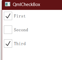
可以看到Check自带有文本信息,我们可以进行自定义设置。同时,它还允许给定初始的checked值。
二、按钮组ButtonGroup
Column {ButtonGroup {id: childGroupexclusive: falsecheckState: parentBox.checkState}CheckBox {id: parentBoxtext: qsTr("Parent")checkState: childGroup.checkState}CheckBox {checked: truetext: qsTr("Child 1")leftPadding: indicator.widthButtonGroup.group: childGroup}CheckBox {text: qsTr("Child 2")leftPadding: indicator.widthButtonGroup.group: childGroup}}
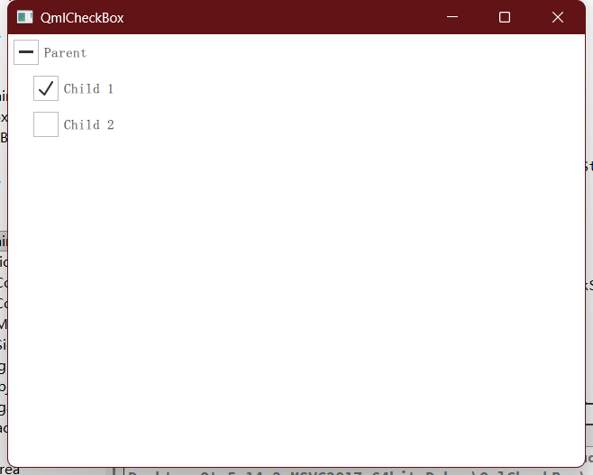
现在默认是多选的功能,我们可以勾选Child 1和Child 2,当它们都被勾选的时候,Parent会自动显示勾选。
有几点需要说明:
1.ButtonGroup实际上是一个虚拟概念,它不会呈现出组件的具体样式。
2.在CheckBox中设置了ButtonGroup.group: groupId,意思是这个复选按钮被设置了按钮组,被指定了id。
3.leftPadding: indicator.width实际上只是给左侧添加了边距,indicator是checkbox的那个勾选正方形,取了它的宽度而已。
4.默认情况下,当所有子复选按钮都被选中后,ButtonGroup的checkState才会变成true。而由于parentBox的checkState直接绑定了ButtonGroup,所以呈现出了“当Child 1和Child 2都被勾选的时候,Parent会自动显示勾选”的效果。
5.如果直接勾选parentBox,由于改变了ButtonGroup的checkState,会导致全部的子复选框全部被勾选,属于是快速全选的效果。
6.正常的选择按钮会在空白和√之间切换,但parentBox会出现“-”的情况,这属于是三态当中的“部分”,代表ButtonGroup的checkState此时属于子组件部分选中的状态。
如果想要实现选项互斥,该怎么办?
我们将exclusive属性改为true。
exclusive: true
此时,选项一和选项二就只能同时被选中一个。我之前的工作中就用到过这个效果。当然了,此时由于ButtonGroup的checkState不可能会被选中,所以parentBox的功能就会变得混乱,也没有意义了。
另外还要介绍一种属性:
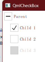
enabled: false
我们可以给CheckBox赋上使能,某些情况下我们希望复选框连点击都不能够,此时就可以用这种方法。
三、信号
CheckBox本质上就是Button的一种,除了onClicked这种,我们还可以通过onCheckStateChanged监听它的状态。
onCheckStateChanged: function(){if(checked){console.log("check!")}else {console.log("not check!")}
}
这是通过checked来判断的,但无法判断三态。我们可以直接读取值,和Qt变量进行对比:
onCheckStateChanged: function(){switch (checkState) {case Qt.Unchecked:console.log("无")breakcase Qt.PartiallyChecked:console.log("部分")          // ← 这里能抓到breakcase Qt.Checked:console.log("全选")break}
}
四、样式
这里只给一个参考,毕竟我初学,感觉也写得很烂呢。
Rectangle/*Item*/ {width: chk.width + chk.indicator.widthheight: chk.heightCheckBox {id: chkx: chk.indicator.width               // ← 整体右移
//                    leftPadding: indicator.widthleftPadding: 0  // 重载了indicator之后,leftPadding仅对text有效,此时应当设成0text: qsTr("Child 4")ButtonGroup.group: childGroupspacing: 6  // 默认值,如果设成0,文本将和复选框紧贴indicator: Rectangle {                 // ☐ / ☑ 本体width: 28; height: 28; radius: 5color: chk.checked ? "#4CAF50" : "#fff"border.color: "#888"Text {                               // 对勾anchors.centerIn: parenttext: chk.checked ? "✔" : ""color: "#fff"; font.pixelSize: 16}}//                    contentItem: Text {                    // 文字区域
//                        text: chk.text
////                        leftPadding: indicator.width + 25
//                        leftPadding: 0
//                        color: chk.enabled ? "#000" : "#999"
//                    }onClicked: console.log("indicator.width: " + indicator.width)}
}
}
}
这里演示了重载indicator也就是复选框的实现。需要注意的是重载之后,checkboxl将无法通过eftPadding来进行偏移,我尝试在外部包裹一个item来实现。我还尝试了重载text,但有坐标偏移的问题,文本始终和复选框重合,目前还没解决这个问题。无特殊需求的话,建议还是用font.pointSize: 25这种方式来修改字体吧。
最终效果如下:
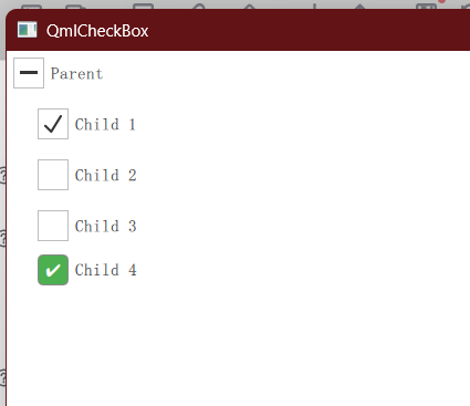
我其实有点没想到,靠纯代码也能画得这么好看,看上去也不需要用到图片的方式呢。
五、总结
CheckBox属于UI界面开发中非常常用的一个组件,它也是按钮Button的一种变体,会有一定的相似之处。