关于margin:auto的注意点
要理解 margin: auto 的生效条件,核心是抓住它的本质规则:margin: auto 仅在「弹性布局(flex)」或「网格布局(grid)」中,才能实现“自动分配剩余空间”的效果;在默认的流式布局(static)中完全不生效。你的代码中注释 flex 后 margin-top: auto 失效,正是因为脱离了弹性布局环境。
一、margin: auto 的核心生效条件
margin: auto 的行为在不同布局模式下完全不同,只有在以下两种布局中,它才具备“自动推挤元素、分配剩余空间”的能力:
1. 弹性布局(flex):最常用场景
当父元素设置 display: flex 或 display: inline-flex 后,子元素的 margin: auto 会触发“剩余空间分配”逻辑:
- 水平方向:若父元素有剩余宽度,
margin-left: auto会把元素推到右侧,margin-right: auto推到左侧,margin: 0 auto实现水平居中; - 垂直方向:若父元素有明确的高度(或通过 flex 拉伸获得高度),
margin-top: auto会把元素推到父元素底部,margin-bottom: auto推到顶部,margin: auto 0实现垂直居中。
代码中,one 父元素原本的逻辑是:
.one {display: flex; /* 开启弹性布局 */flex-direction: column; /* 子元素垂直排列 */height: 100%; /* 父元素有高度(继承自 el-col 的 flex 高度) */
}
.one-content {margin-top: auto; /* 自动分配父元素垂直方向的剩余空间,把自己推到底部 */
}
当注释 display: flex 后,父元素回到默认的「流式布局」,margin-top: auto 自然失效。
2. 网格布局(grid):类似 flex 的生效逻辑
父元素设置 display: grid 后,子元素的 margin: auto 也能分配剩余空间(效果类似 flex),但日常开发中 flex 更常用,这里暂不展开。
二、为什么流式布局(默认)中 margin: auto 不生效?
默认情况下,元素使用「流式布局(position: static)」,此时 margin: auto 的行为非常“简单”:
- 仅在水平方向有微弱作用(比如块级元素
width: 200px时,margin: 0 auto能水平居中),但这是“浏览器默认居中逻辑”,并非“分配剩余空间”; - 垂直方向完全无效:流式布局中,元素的垂直位置由“文档流”决定(从上到下排列),
margin-top: auto会被浏览器当作margin-top: 0处理,无法推挤元素。
你的 one-content 在注释 flex 后,父元素 one 是默认的块级元素(流式布局),即使设置 margin-top: auto,浏览器也会忽略这个值,所以元素不会被推到底部。
三、恢复 flex 后如何生效?
为了更直观理解,修复代码,让 margin-top: auto 正常工作(关键是父元素保留 flex 并确保有高度):
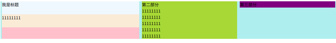
<template><div><el-row :gutter="10" type="flex" style="background-color: paleturquoise; height: 300px;"><!-- el-row 本身是 flex 布局,子元素 el-col 会自动拉伸高度(100%) --><el-col :xs="24" :sm="24" :md="24" :lg="10" :xl="10"><div class="one"><!-- 父元素 one 必须开启 flex + 垂直排列 + 继承高度 --><div class="title" style="background-color: aliceblue; height: 50px">我是标题</div><div class="one-content" style="background-color: antiquewhite;">11111111(会被推到父元素底部)</div></div></el-col><!-- 其他 el-col 省略 --></el-row></div>
</template><style scoped>
.one {background-color: pink;height: 100%; /* 继承 el-col 的高度(300px) */display: flex; /* 必须开启弹性布局! */flex-direction: column; /* 子元素垂直排列,才能让 margin-top: auto 生效 */
}
.one-content {height: 50px;margin-top: auto; /* 生效:分配垂直剩余空间(300px - 50px 标题高度 = 200px),把自己推到底部 */
}
</style>
效果:one-content 会被自动推到 one 父元素的底部,因为 margin-top: auto 占用了父元素垂直方向的所有剩余空间。
四、总结:margin: auto 生效的3个关键前提
- 父元素必须是 flex 或 grid 布局(
display: flex/grid); - 父元素必须有明确的“可用空间”(比如设置了固定高度
height: 300px,或通过 flex 拉伸获得高度height: 100%); - 子元素的
margin: auto方向要与布局方向匹配(垂直布局flex-direction: column对应margin-top/bottom: auto,水平布局对应margin-left/right: auto)。
只要满足这3个条件,margin: auto 就能实现“自动推挤元素”的效果;反之,脱离 flex/grid 环境,它就会失效。
代码附下
<script setup></script><template><div><el-row :gutter="10" type="flex" style="background-color: paleturquoise"><el-col :xs="24" :sm="24" :md="24" :lg="10" :xl="10"><div class="one"><div class="title" style="background-color: aliceblue; height: 50px">我是标题</div><divclass="one-content"style="background-color: antiquewhite;">11111111</div></div></el-col><el-col :xs="24" :sm="24" :md="24" :lg="7" :xl="7"><div class="two">第二部分<div>11111111</div><div>11111111</div><div>11111111</div><div>11111111</div><div>11111111</div></div></el-col><el-col :xs="24" :sm="24" :md="24" :lg="7" :xl="7"><div class="three">第三部分</div></el-col></el-row></div>
</template><style scoped>
.one {background-color: pink;height: 100%;/* display: flex; *//* flex-direction: column; 垂直排列子元素 */
}
.one-content {height: 50px;margin-top: auto;
}
.two {background-color: rgb(167, 216, 53);/* height: 100%; */
}
.three {background-color: purple;/* height: 100%; */
}
</style>