(4)SwiftUI 基础(第四篇)
📘 SwiftUI 基础(第四篇)
【求打赏】
🎨 颜色与形状:Color、RoundedRectangle、Circle、LinearGradient 渐变背景
在前面几篇里,我们已经能排版出漂亮的界面。
但如果没有配色和形状修饰,画面会显得单调。
这一篇让你掌握 SwiftUI 的视觉基础:颜色 + 圆角 + 渐变背景 + 形状叠加。
一、Color —— 背景与主题色
🎯 1️⃣ 系统内置颜色
SwiftUI 自带了很多系统色,支持亮暗模式自动适配:
Color.blue
Color.red
Color.green
Color.orange
Color.gray
Color.primary    // 主要文本色(会随系统模式变)
Color.secondary  // 次要文本色
🎯 2️⃣ 自定义颜色
Color(red: 0.3, green: 0.6, blue: 0.9)   // RGB 范围:0~1
Color(.systemPink)                        // UIKit 系统色也能用
🎯 3️⃣ 设置为背景
Text("带背景色的文字").padding().background(Color.yellow)
💡 如果你想让颜色铺满整个屏幕,可以用:
Color.blue.ignoresSafeArea()
二、RoundedRectangle —— 圆角矩形
这是 SwiftUI 中最常用的形状之一。
RoundedRectangle(cornerRadius: 20).fill(Color.purple).frame(width: 200, height: 100)
.fill()设置填充色
.stroke()设置边框线条
例如:
RoundedRectangle(cornerRadius: 20).stroke(Color.blue, lineWidth: 4).frame(width: 200, height: 100)
三、Circle —— 圆形与头像容器
圆形可以用于头像、按钮或徽章。
Circle().fill(Color.orange).frame(width: 100, height: 100)
如果想用图片裁剪成圆形头像:
Image("swift-logo").resizable().scaledToFit().frame(width: 120, height: 120).clipShape(Circle()).overlay(Circle().stroke(Color.white, lineWidth: 4))
四、LinearGradient —— 线性渐变
渐变能让界面更现代、更有层次感。
🎨 基本用法:
LinearGradient(colors: [.blue, .purple],startPoint: .topLeading,endPoint: .bottomTrailing
)
.frame(width: 200, height: 100)
.cornerRadius(12)
你可以用
.top、.bottom、.leading、.trailing、.center等控制方向。
🎨 应用于背景:
Text("渐变背景按钮").padding().frame(width: 220).background(LinearGradient(colors: [.orange, .pink], startPoint: .leading, endPoint: .trailing)).foregroundColor(.white).cornerRadius(12)
五、组合示例 🌈
🎯 目标:制作一张「SwiftUI 学习卡片」
import SwiftUIstruct ContentView: View {var body: some View {ZStack {// 背景渐变LinearGradient(colors: [.blue, .purple],startPoint: .topLeading,endPoint: .bottomTrailing).ignoresSafeArea()VStack(spacing: 24) {// 头像Image("swift-logo").resizable().scaledToFit().frame(width: 120, height: 120).clipShape(Circle()).overlay(Circle().stroke(Color.white, lineWidth: 4)).shadow(radius: 10)// 标题Text("SwiftUI 学习卡片").font(.title).fontWeight(.bold).foregroundColor(.white)// 内容区域RoundedRectangle(cornerRadius: 20).fill(Color.white.opacity(0.2)).frame(width: 300, height: 120).overlay(VStack(spacing: 8) {Text("掌握修饰符、布局、颜色与形状").foregroundColor(.white)Text("打造你第一个 iOS 应用界面 🚀").foregroundColor(.white.opacity(0.8)).font(.footnote)})// 渐变按钮Button(action: {}) {Text("立即开始学习").fontWeight(.semibold).padding().frame(width: 220).background(LinearGradient(colors: [.pink, .orange], startPoint: .leading, endPoint: .trailing)).foregroundColor(.white).cornerRadius(12).shadow(radius: 5)}}}}
}#Preview {ContentView()
}
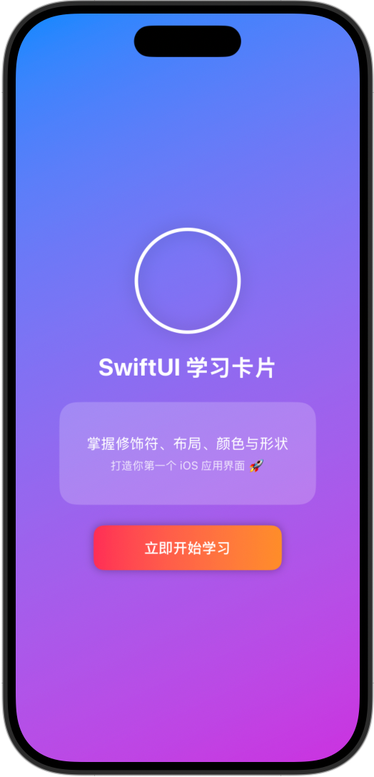
✅ 效果说明:
- 背景是蓝紫渐变
- 中间有圆形头像 + 半透明信息卡
- 底部是橙粉渐变按钮
六、小结 📚
| 功能 | 控件/修饰符 | 示例 |
|---|---|---|
| 背景颜色 | Color | .background(Color.blue) |
| 圆角矩形 | RoundedRectangle | .fill(Color.red).cornerRadius(20) |
| 圆形头像 | Circle() + .clipShape() | .clipShape(Circle()) |
| 渐变背景 | LinearGradient | .background(LinearGradient(colors: [...])) |
| 铺满屏幕 | .ignoresSafeArea() | 让背景色全屏覆盖 |
✏️ 课后挑战
- 修改渐变颜色方向;
- 把圆角矩形换成
Capsule()(药丸形); - 给按钮增加阴影;
- 用不同透明度
.opacity()设计出层次感。