如何优雅的布局,height: 100% 的使用和 flex-grow: 1 的 min-height 陷阱
一、层层嵌套的布局
假设我们有这样一段代码如下,在一个层层前套的布局中,有一个 header(A),固定高度44px,内容区域有很长的内容(d),需要可以滚动。
<template><div class="outer-container"><div class="box"><div class="A"></div><div class="B"><div class="c"><div class="d"><li v-for="item in 200" :key="item">{{ item }}</li></div></div></div></div></div>
</template>
<style lang="scss" scoped>
* {box-sizing: border-box !important;
}
.outer-container {width: 100vw;height: 100vh;border: 1px solid red;
}
.box {height: 100%;width: 100%;display: flex;flex-direction: column;border: 2px solid;overflow: hidden;
}
.A {flex-shrink: 0;height: 44px;background: red;
}
.B {display: flex;flex-direction: column;width: 100%;height: 100%;padding: 10px;border: 5px solid yellow;
}
.c {display: flex;flex-direction: column;height: 100%;width: 100%;border: 2px solid blue;overflow: hidden;
}
.d {display: flex;flex-direction: column;width: 100%;height: 100%;background: gray;overflow: auto;color: #fff;li {width: 100%;height: 44px;flex-shrink: 0;}
}
</style>
在上面的例子中
- 我们使用 flex 的 column 布局
- 内部前套的元素宽高都设置为 width:100%,height: 100%
- 给滚动元素 d 设置 overflow: auto
- 给 d 的父级设置 overflow: hidden;
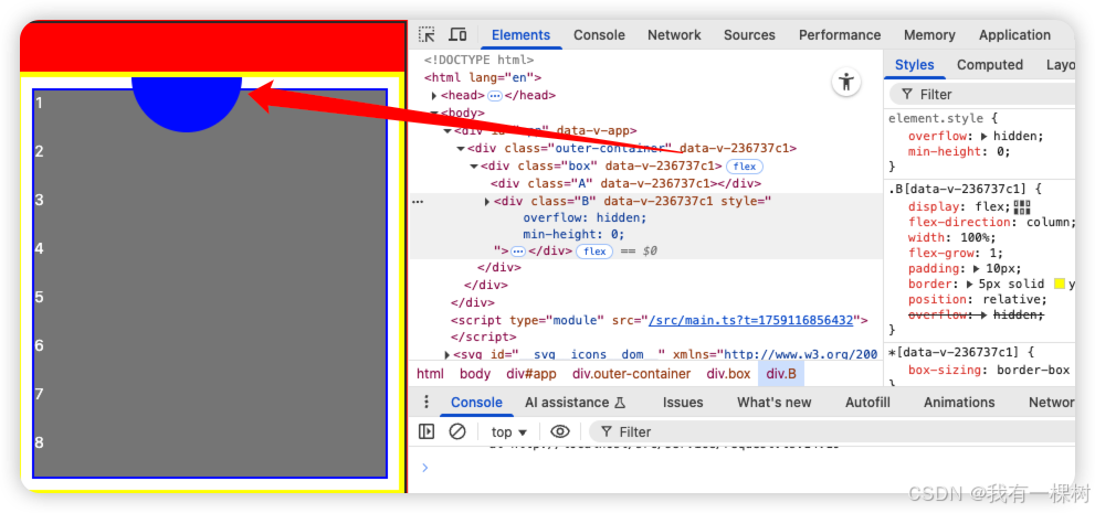
不瞒你说,我经常这样写,但是实际效果却不尽人意,下面区域有部分内容展示不全,如下图所示:
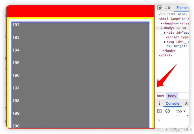
1.1 想清楚再用 100%
我们发现从黄色边框【也就是B】元素开始就有部分内容不展示了。
想要解决这个问题,其实很简单,只需要给 B 增加 overflow: hidden 就行,
增加了 overflow: hidden,把超出 B 内容区域的东西都隐藏了,看起来就展示正确了。
1.2 布局要有逻辑
但是我们仔细看下代码,有些地方是不符合“逻辑的”,我们要深刻的理解一下 height: 100% 的意义,想清楚了再用 100%, 不要随便写。布局也要写的有逻辑,改起来才能有思路。
前提是我们设置了 box-sizing: border-box !important; 所以 100% 代表的是内容区域,不包含padding 和 border
首先
- .outer-container 固定宽高 100vw/100vh 没有任何问题
box 宽高 100% / 100% 也没有问题,因为 outer-container 里面只有一个元素
A 固定高度 44 px ,且不可压缩 flex-shrink: 0
重点来了,到 B 元素了,B元素的高度显然不是100% ,而是 100% - 44px( A的高度)
所以在这个例子的布局中,从 B 元素开始我们的高度设置就出了问题!!!
我们可以给 B 设置 height: calc(100% - 44px),但是这样的问题是,一旦 A 的高度变化了,B 的高度也得随之改变,很麻烦,也容易忘。
二、flex-grow: 1 的陷阱
所以鉴于 B 的父元素 box 使用了 flex 布局,我们自然能想到给 B 使用 flex-grow: 1,A 元素固定高度的情况下,让 B 的高度撑开剩余内容,得到下面的代码:
<template><div class="outer-container"><div class="box"><div class="A"></div><div class="B"><div class="c"><div class="d"><li v-for="item in 200" :key="item">{{ item }}</li></div></div></div></div></div>
</template>
<style lang="scss" scoped>
* {box-sizing: border-box !important;
}
.outer-container {width: 100vw;height: 100vh;border: 1px solid red;
}
.box {height: 100%;width: 100%;display: flex;flex-direction: column;border: 2px solid;overflow: hidden;
}
.A {flex-shrink: 0;height: 44px;background: red;
}
.B {display: flex;flex-direction: column;width: 100%;// height: 100%;flex-grow: 1; // 使用 flex-grow 代替 heightpadding: 10px;border: 5px solid yellow;
}
.c {display: flex;flex-direction: column;height: 100%;width: 100%;border: 2px solid blue;overflow: hidden;
}
.d {display: flex;flex-direction: column;width: 100%;height: 100%;background: gray;overflow: auto;color: #fff;li {width: 100%;height: 44px;flex-shrink: 0;}
}
</style>
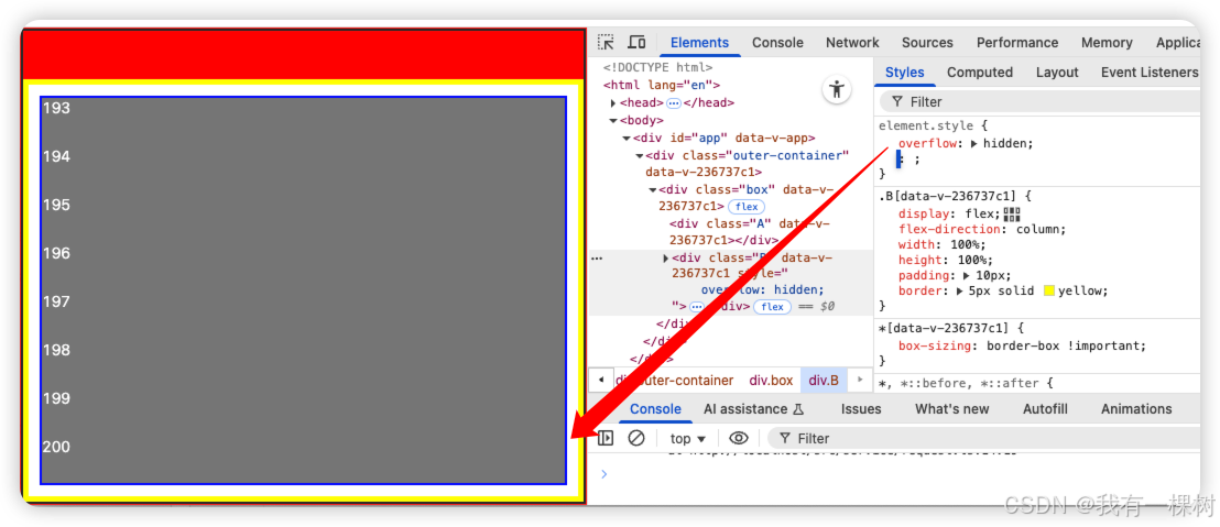
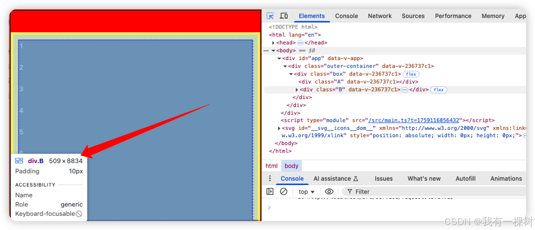
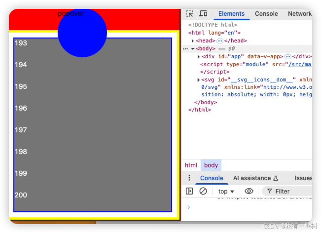
但是这样还是有问题,我们发现,内层元素 d 居然滚动不了了,一看 B 元素的高度竟是 8834px,这显然不对。如果 B 的高度是 8834px,那么会导致 c 和 d 的高度都是 8834px, 自然就无法滚动展示。
2.1 别随便用 overflow: hidden
有一个解决办法,就是给 B 设置 overflow: hidden;
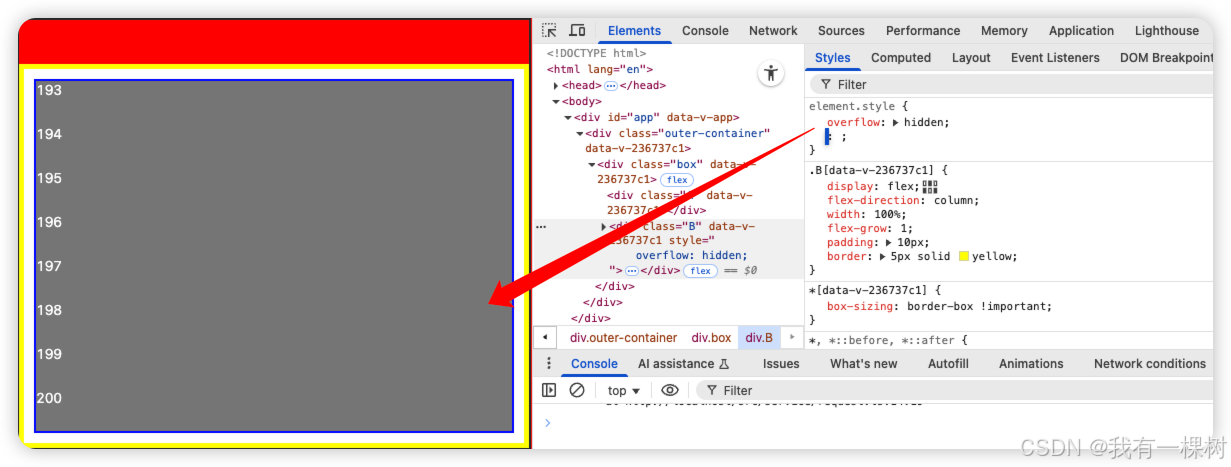
没错,又是这个 overflow:hidden,虽然他解决我们的问题,但是仔细一想“逻辑”还是不对的,而且可能会导致别的问题。
比如,假设我们 B 里面有一个超出区域的绝对定位的 气泡,增加 overflow:hidden 会把这个气泡裁剪,这显然不是我们想要的,如下图:
<template><div class="outer-container"><div class="box"><div class="A"></div><div class="B"><div class="poppover">popover</div><div class="c"><div class="d"><li v-for="item in 200" :key="item">{{ item }}</li></div></div></div></div></div>
</template>
<style lang="scss" scoped>
* {box-sizing: border-box !important;
}
.outer-container {width: 100vw;height: 100vh;border: 1px solid red;
}
.box {height: 100%;width: 100%;display: flex;flex-direction: column;border: 2px solid;overflow: hidden;
}
.A {flex-shrink: 0;height: 44px;background: red;
}
.B {display: flex;flex-direction: column;width: 100%;// height: 100%;flex-grow: 1; // 使用 flex-grow 代替 heightpadding: 10px;border: 5px solid yellow;position: relative;overflow: hidden;.poppover {position: absolute;top: -50px;left: 100px;width: 100px;height: 100px;background: blue;border-radius: 50%;}
}
.c {display: flex;flex-direction: column;height: 100%;width: 100%;border: 2px solid blue;overflow: hidden;
}
.d {display: flex;flex-direction: column;width: 100%;height: 100%;background: gray;overflow: auto;color: #fff;li {width: 100%;height: 44px;flex-shrink: 0;}
}
</style>
2.2 flex 布局的 min-height 陷阱
现在我们来说一下终极解决方案
给 flex-grow: 1 的元素增加 min-height: 0;
<template><div class="outer-container"><div class="box"><div class="A"></div><div class="B"><div class="poppover">popover</div><div class="c"><div class="d"><li v-for="item in 200" :key="item">{{ item }}</li></div></div></div></div></div>
</template>
<style lang="scss" scoped>
* {box-sizing: border-box !important;
}
.outer-container {width: 100vw;height: 100vh;border: 1px solid red;
}
.box {height: 100%;width: 100%;display: flex;flex-direction: column;border: 2px solid;overflow: hidden;
}
.A {flex-shrink: 0;height: 44px;background: red;
}
.B {display: flex;flex-direction: column;width: 100%;// height: 100%;flex-grow: 1; // 使用 flex-grow 代替 heightmin-height: 0; // 给 flex-grow: 1的元素如增加最小高度 0padding: 10px;border: 5px solid yellow;position: relative;// overflow: hidden; //不要随便设置一个元素 overflow: hidden;.poppover {position: absolute;top: -50px;left: 100px;width: 100px;height: 100px;background: blue;border-radius: 50%;}
}
.c {display: flex;flex-direction: column;height: 100%;width: 100%;border: 2px solid blue;overflow: hidden;
}
.d {display: flex;flex-direction: column;width: 100%;height: 100%;background: gray;overflow: auto;color: #fff;li {width: 100%;height: 44px;flex-shrink: 0;}
}
</style>
上面这段代码,可以满足我们所有的需求。
这里有个知识点,flex 布局的项目,也就是子元素的 min-height 默认是 auto!!
所以我们手动设置 min-height: 0 就可以解决很多内部元素无法滚动或者展示不全的问题。牢记这个小技巧,可以大大提高我们的开发效率。
三、知识总结
3.1 flex-grow: 1 和 min-height: auto
在 flex 容器里面,子元素设置 flex:grow: 1 之后,会去分配剩余空间
但是 css 规范有一个默认的行为,flex-item 在交叉轴(比如 column 布局中的垂直方向)默认最小尺寸是 min-height: auto (或者min-width: auto);
这意味着
- 当你给某个元素 flex-grow: 1, 它理论上应该被压缩、撑开、来分配剩余空间
- 但如果它的内容本身很大(比如内容有一段长文字或者子元素),浏览器会认为它至少要容纳这些内容,因此会把min-height:算得很大
- 结果就是,父容器虽然是100%高度,但子元素因为最小高度的限制、不能被压缩到期望的高度,导致出现,子元素内容撑破容器,滚动条不出来、兄弟元素展示不全等问题。
3.2 overflow 的规范
为什么 overflow:hidden 可以解决问题?
在 flex 布局中,默认的 min-height: auto 表示:元素的最小高度至少等于其内容高度,这会阻止元素被压缩。
当你给这个元素设置 overflow:hidden 时,浏览器规范要求:
如果一个设置了非 visible 的overflow ,那么他的 min-height/min-width 会被强制当作0
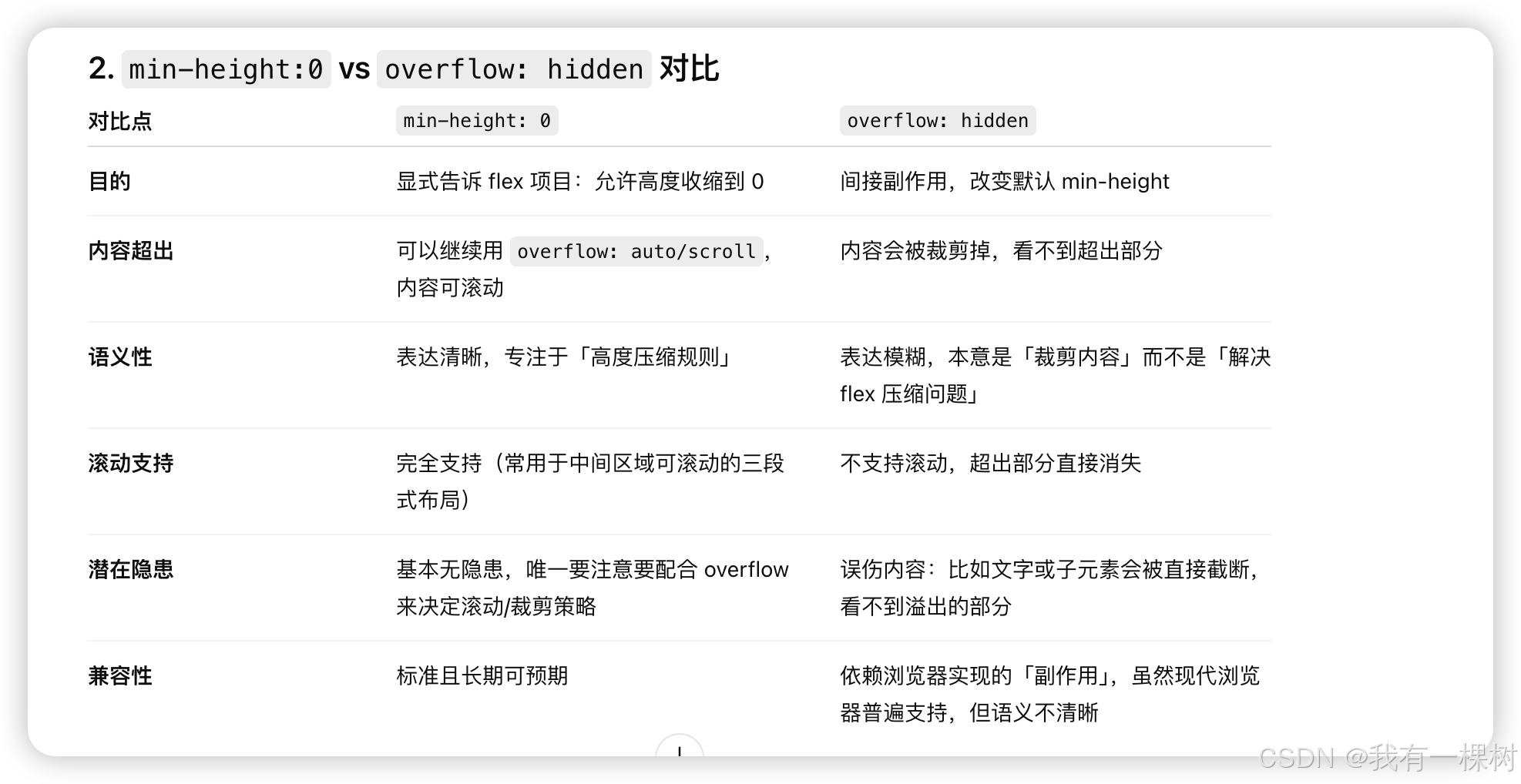
所以 overflow: hidden 只是起到了【间接把 min-height: auto 改成了0 的效果】但是却会导致我上面说的那种内容被裁剪的问题。
所以看看 chatgpt 给的对比,还是用 min-height: 0吧
四、结论
flex 布局防止内容展示不全的终极解决方案是,给 flex-grow: 1 的元素,增加 min-height: 0 属性。
好了,看到这里,快去把你所有 flex-grow:1 的元素,且元素内容可能会很多的 dom 都增加一个属性 min-height: 0 吧。