提高前端开发效率的利器:VUE常用组件及应用
在 Vue 项目开发中,高效复用的组件是提升开发效率的核心。本文精选前端日常开发中使用频率最高的 5 类组件,结合实用场景与代码示例,快速掌握组件化开发精髓。
一、基础 UI 组件:构建页面骨架的核心
基础 UI 组件是页面的 "原子单元",覆盖按钮、输入框等高频元素,通常依赖 Element Plus、Vuetify 等 UI 库实现,也可自定义封装。
1. 按钮组件(Button)
按钮是交互的入口,需支持不同状态与样式。以 Element Plus 为例,其el-button组件支持多种类型:
<el-button type="primary" @click="handleSubmit">主要按钮</el-button>
<el-button type="success" icon="Check" circle></el-button>
<el-button type="warning" disabled>禁用按钮</el-button>
2. 输入框组件(Input)
表单交互的核心,需处理输入验证、格式限制等场景:
<el-inputv-model="username"placeholder="请输入用户名":maxlength="16"show-word-limit@blur="validateUsername"
></el-input>
关键能力:结合v-model实现双向绑定,通过prefix-icon/suffix-icon添加图标,利用blur事件触发验证逻辑。
二、表单组件:数据收集的核心工具
表单组件是用户与系统交互的关键,需兼顾易用性与校验逻辑,常用组件包括表单容器、选择器、日期选择器等。
1. 表单容器(Form)
统一管理表单字段与校验规则,Element Plus 的el-form组件支持配置式校验:
<el-form :model="form" :rules="rules" ref="formRef"><el-form-item label="手机号" prop="phone"><el-input v-model="form.phone"></el-input></el-form-item><el-form-item><el-button type="primary" @click="submitForm">提交</el-button></el-form-item>
</el-form><script setup>
const rules = {phone: [{ required: true, message: '请输入手机号', trigger: 'blur' },{ pattern: /^1[3-9]\d{9}$/, message: '手机号格式错误', trigger: 'blur' }]
}
</script>
2. 选择器组件(Select)
处理下拉选择场景,支持单选、多选与远程搜索:
<el-selectv-model="selectedCity"multiplefilterableremote:remote-method="fetchCities"placeholder="请选择城市"
><el-option v-for="city in cityList" :key="city.id" :label="city.name" :value="city.id"></el-option>
</el-select>三、布局组件:页面结构的搭建利器
布局组件决定页面的整体架构,常用的有容器组件、栅格系统与卡片组件。
1. 栅格组件(Grid)
基于 Flexbox 实现灵活布局,Element Plus 的el-row与el-col支持 24 列栅格:
<el-row :gutter="20"><el-col :span="8"><div class="card">左侧栏</div></el-col><el-col :span="16"><div class="card">主内容区</div></el-col>
</el-row>
响应式适配:通过xs/sm/md等属性设置不同屏幕尺寸下的列数,如:md="8"表示中等屏幕占 8 列。
2. 卡片组件(Card)
承载内容模块,提升页面层次感:
<el-card :header="cardHeader" shadow="hover"><template #header-extra><el-button type="text" size="small">编辑</el-button></template><div>卡片内容区域</div>
</el-card>四、导航组件:引导用户的交互枢纽
导航组件负责页面跳转与功能入口,核心包括菜单、分页与标签页。
1. 菜单组件(Menu)
实现侧边栏或顶部导航,支持多级菜单:
<el-menudefault-active="1"mode="vertical"@select="handleMenuSelect"
><el-sub-menu index="1"><template #title><span>数据管理</span></template><el-menu-item index="1-1">用户列表</el-menu-item><el-menu-item index="1-2">订单管理</el-menu-item></el-sub-menu>
</el-menu>
2. 分页组件(Pagination)
处理大量数据的分页展示,减少性能损耗:
<el-paginationv-model:current-page="currentPage"v-model:page-size="pageSize":total="total"@size-change="handleSizeChange"@current-change="handleCurrentChange"layout="prev, pager, next, jumper, total"
></el-pagination>五、反馈组件:提升用户体验的关键
反馈组件用于告知用户操作结果,常用的有弹窗、提示与加载组件。
1. 弹窗组件(Dialog)
处理模态交互场景,如表单弹窗、详情弹窗:
<el-button @click="dialogVisible = true">打开弹窗</el-button>
<el-dialog v-model="dialogVisible" title="弹窗标题" width="50%"><div>弹窗内容</div><template #footer><el-button @click="dialogVisible = false">取消</el-button><el-button type="primary" @click="dialogVisible = false">确定</el-button></template>
</el-dialog>
有了这些常用的组件,可以实现一个如图所示的电商网页:上面有一行菜单栏;菜单栏下面是轮播图;再下面就是购物的主体内容;最后还可以增加一个版权声明。
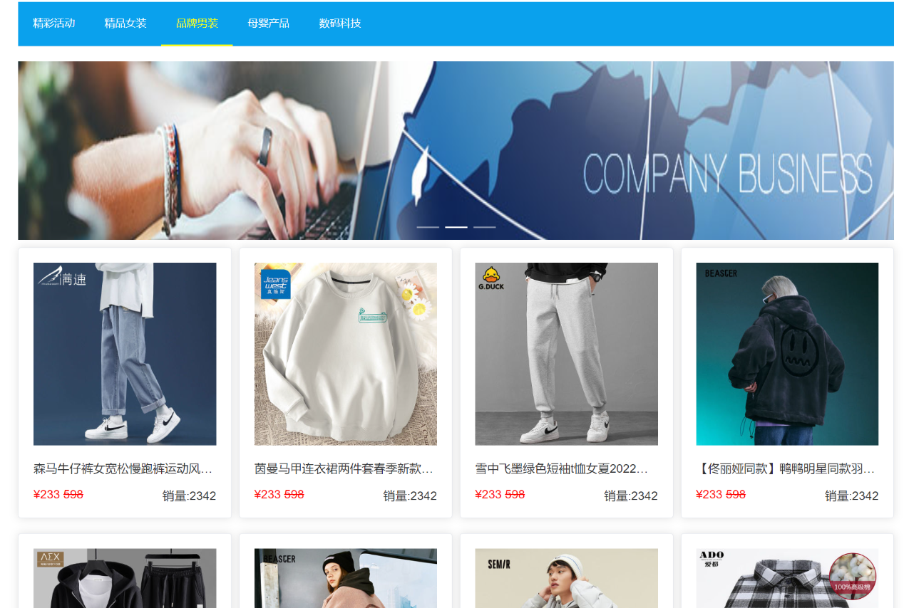
在这里菜单显示模式为水平导航栏,当然,如果想设置为垂直侧边栏就用vertical,暂时设置一级标题就行了,然后设置菜单背景色为蓝色 #0aa1ed,普通菜单项文字颜色为白色 #fff,并默认选中第3个菜单项(基于index)将激活状态的菜单项文字显示为黄色 #ff0
<template><h1>电商网页</h1><el-container><el-header><el-menumode="horizontal"background-color="#0aa1ed"text-color="#fff"default-active="3"active-text-color="#ff0"><el-menu-item index="1">精彩活动</el-menu-item><el-menu-item index="2">精品女装</el-menu-item><el-menu-item index="3">品牌男装</el-menu-item><el-menu-item index="4">母婴产品</el-menu-item><el-menu-item index="5">数码科技</el-menu-item></el-menu></el-header><el-main></el-main><el-footer style="height: 200px;background-color: #282c30;color: #666;padding-top: 40px"><p>Copyright © xxxxxxx</p></el-footer></el-container>
</template>
菜单栏下面的轮播图和各个商品需要采用遍历的方式生成,依赖 Element Plus 的 el-carousel、el-row、el-col、el-card 等组件实现,使用轮播图容器el-carousel,遍历 bannerArr 数组渲染轮播项,固定高度 240px;el-row/el-col为24列栅格系统布局商品,span="6" 表示每列占 1/4 宽度(4 个商品 / 行)商品卡片容器el-card,包含商品图片、标题、价格,原价划掉,现价标红。
<el-main>
<el-carousel style="height: 240px;"><el-carousel-item v-for="item in bannerArr"><img :src="item" style="width: 100%;"></el-carousel-item>
</el-carousel>
<el-row :gutter="10"><el-col :span="6" v-for="p in productArr" style="margin: 10px 0;"><el-card><img :src="p.url" style="width: 100%;"><p style="white-space: nowrap;overflow: hidden;
text-overflow: ellipsis;">{{p.title}}</p><div style="height: 21px;">
<span style="float: left;color: red;">¥{{p.price}}
<s>¥{{p.oldPrice}}</s>
</span></div></el-card></el-col>
</el-row>
</el-main>
这样就完成了一个简单的电商购物网页:
简单的电商页面 · a010ac4 · Admin/前端 - Gitee.com
掌握这些高频组件的用法,能极大提升 Vue 项目的开发效率与代码质量。实际开发中,可结合业务需求对基础组件进行二次封装,形成更贴合项目的组件库。