第三篇布局
一、案例展示及display模式转换
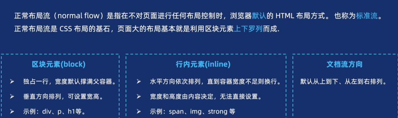
1.1 正常布局流
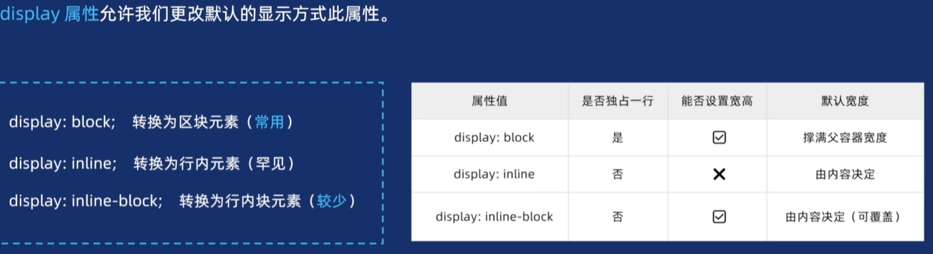
1.2 display属性
【1】语法
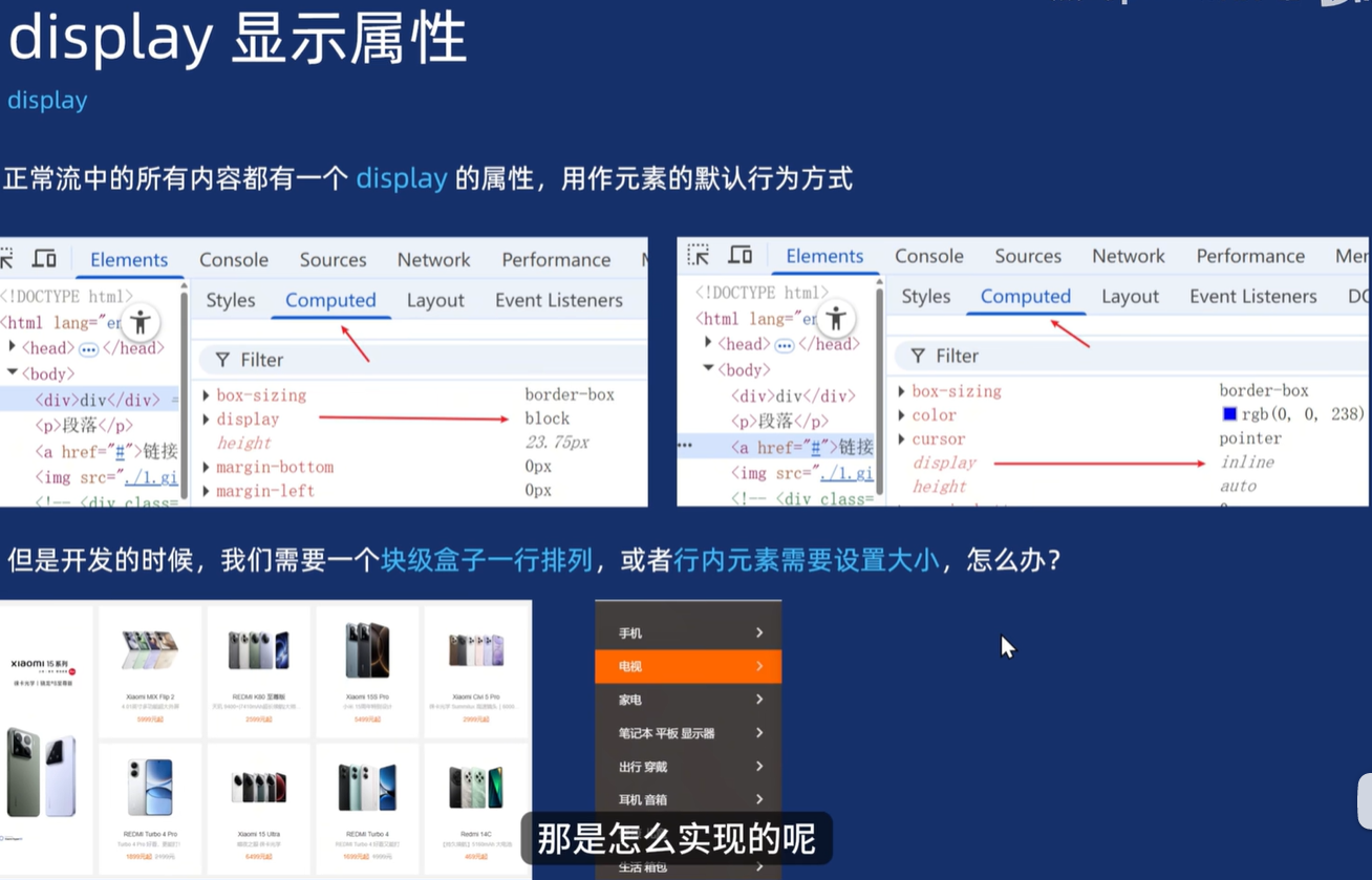
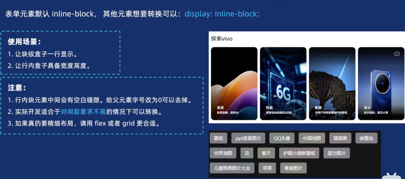
【2】行内元素更改属性之案例
<head><meta charset="UTF-8"><meta name="viewport" content="width=device-width, initial-scale=1.0"><title>Document</title><style>/* 第一步做好相关的初始化 *//* 盒子的样式 */* {margin: 0;padding: 0;box-sizing: border-box;}/* 列表没有小黑点 */ul,li {list-style: none;}/* 链接没有下划线 */a {text-decoration: none;}/* 开始给盒子添加样式 */.subbar {width: 234px;height: 460px;background-color: #9d9b9b;margin: 100px auto;padding: 20px 0;font-size: 14px;}.subbar ul li a {height: 42px;/* 但是把行内元素设置宽高是无效的 所以要用到display */line-height: 42px;/* 所以把链接设置为块级元素 */display: block;color: #fff;padding-left: 20px;}/* 再设置一下鼠标经过的颜色 */.subbar ul li a:hover {background-color: #ff6700}/* .list {width: 400px;height: 400px;border: 1px solid red;margin: 0 auto;} */</style>
</head><body><div class="subbar"><ul><li><a href="#">手机</a></li><li><a href="#">电视</a></li><li><a href="#">笔记本</a></li><li><a href="#">出行</a></li><li><a href="#">智能</a></li><li><a href="#">耳机</a></li><li><a href="#">相机</a></li><li><a href="#">智能</a></li></ul></div><div class="box"><ul><li>第一个元素</li><li>第二个元素</li><li>第三个元素</li><li>第四个元素</li></ul></div>
</body>
【3】块级元素更改属性之案例
<head><meta charset="UTF-8"><meta name="viewport" content="width=device-width, initial-scale=1.0"><title>Document</title><style>/* 第一步做好相关的初始化 *//* 盒子的样式 */* {margin: 0;padding: 0;box-sizing: border-box;}/* 列表没有小黑点 */ul,li {list-style: none;}/* 链接没有下划线 */a {text-decoration: none;}/* 开始给盒子添加样式 */.list {width: 400px;height: 400px;border: 1px solid red;margin: 0 auto;}.list a {/* 转换为行内块元素 */display: inline-block;height: 30px;/* 垂直居中 */line-height: 30px;color: #fff;background-color: #ccc;/* 设置圆角更好看 */border-radius: 5px;margin: 4px;}/* 去掉缝隙的方法就是给父亲的字号改为 0*/.box {font-size: 0;/* 不要忘了去给儿子设置字体大小,否则儿子会继承父亲,字体也为0 */}.box li {/* 转换为行内块 */display: inline-block;width: 200px;height: 300px;background-color: pink;font-size: 30px;}</style>
</head><body><div class="box"><!-- 注意事项演示 --><!-- 其实每个li后面都有一个空白字符所以盒子之间会有缝隙 --><li>第一个元素</li><li>第二个元素</li><li>第三个元素</li><li>第四个元素</li></div><div class="list"><a href="#">风景图</a><a href="#">人物图阿拉蕾</a><a href="#">商品是否图</a><a href="#">其他是图</a><a href="#">大好河艾弗森啊山</a></div>
</body>
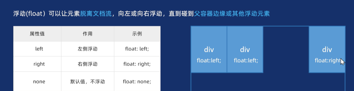
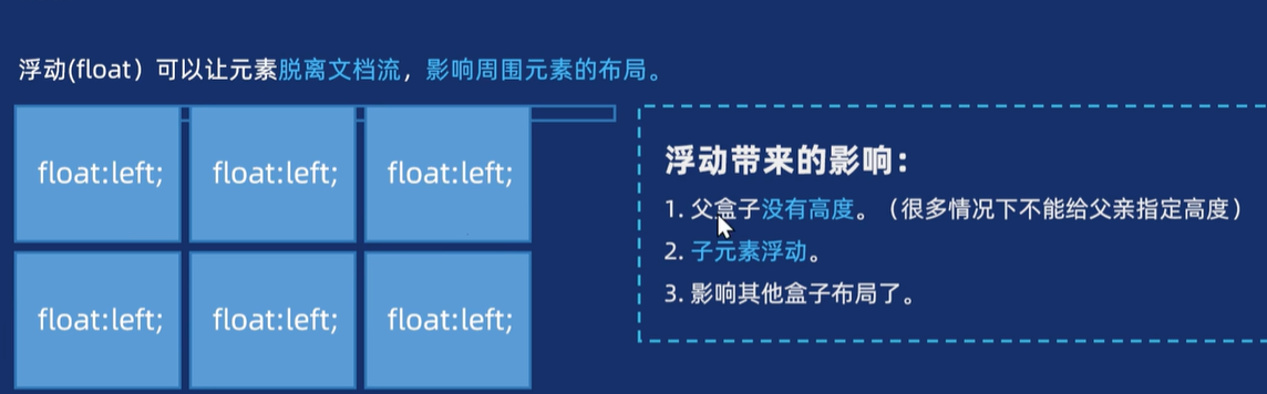
二、 被放弃的浮动float
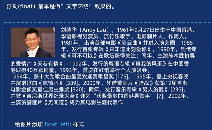
【1】浮动的简单介绍
<head><meta charset="UTF-8"><meta name="viewport" content="width=device-width, initial-scale=1.0"><title>Document</title><style>/* 第一步做好相关的初始化 *//* 盒子的样式 */* {margin: 0;padding: 0;box-sizing: border-box;}/* 列表没有小黑点 */ul,li {list-style: none;}/* 链接没有下划线 */a {text-decoration: none;}/* 开始给盒子添加样式 */.box li {/* 添加浮动效果 */float: left;/* 也可以设置成 左 中 右 的布局,右边是紧贴的 *//* 加一个边距 */margin-right: 15px;width: 190px;height: 200px;}.box li:nth-child(odd) {background-color: pink;}.box li:nth-child(even) {background-color: skyblue;}/* 让最后一个盒子紧挨右边 */.box li:last-child {margin-right: 0;}</style>
</head><body><ul class="box"><li>第一个盒子</li><li>第二个盒子</li><li>第三个盒子</li></ul></body>
【2】浮动带来的影响
<head><meta charset="UTF-8"><meta name="viewport" content="width=device-width, initial-scale=1.0"><title>Document</title><style>/* 第一步做好相关的初始化 *//* 盒子的样式 */* {margin: 0;padding: 0;box-sizing: border-box;}/* 列表没有小黑点 */ul,li {list-style: none;}/* 链接没有下划线 */a {text-decoration: none;}/* 开始给盒子添加样式 */.main {width: 300px;border: 1px solid red;margin: 0 auto;/* 手动加一个高度 */height: 100px;}/* 如果把两个儿子都浮动起来,主盒子就没有高度了,下面盒子会跑上来 *//* 除非给父亲手动加一个高度 */.main .son1 {float: left;width: 100px;height: 100px;background-color: pink;}.main .son2 {float: left;width: 100px;height: 100px;background-color: skyblue;}.footer {width: 500px;height: 100px;background-color: aquamarine;/* 让这个盒子水平居中 */margin: 0 auto;}</style>
</head><body><div class="main"><div class="son1"></div><div class="son2"></div></div><div class="footer"></div>
</body>
【3】解决方法

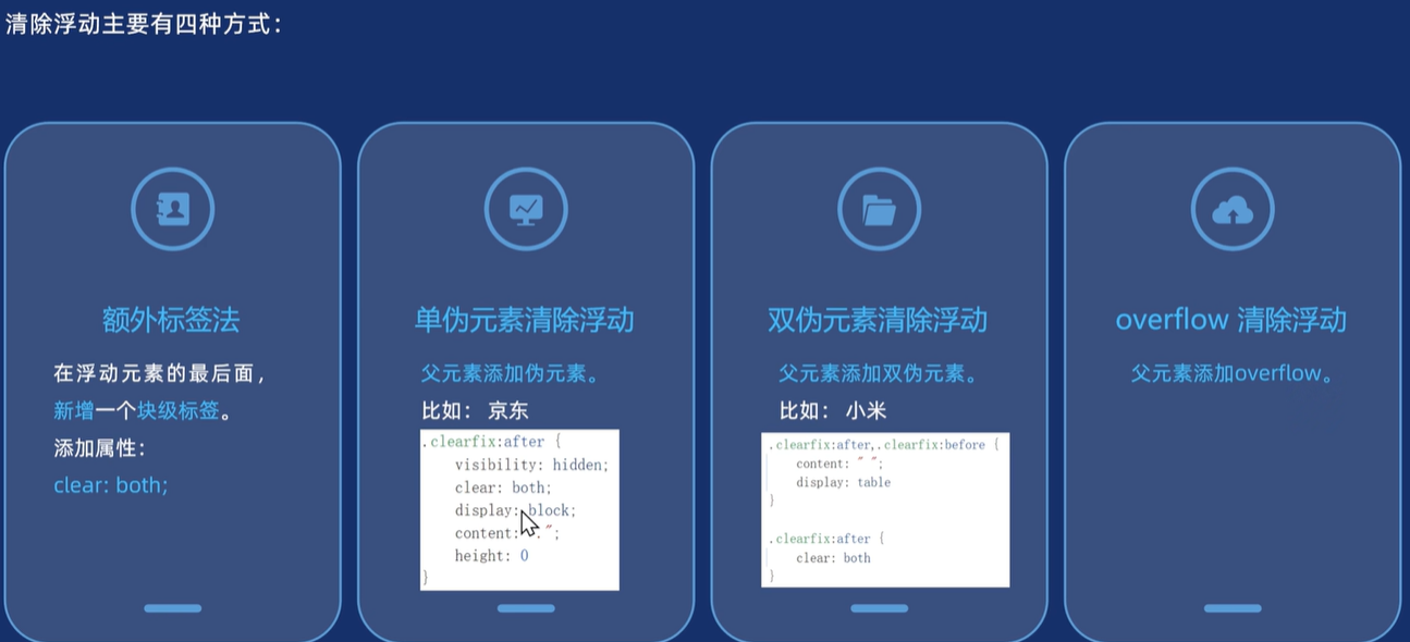
<head><meta charset="UTF-8"><meta name="viewport" content="width=device-width, initial-scale=1.0"><title>Document</title><style>/* 第一步做好相关的初始化 *//* 盒子的样式 */* {margin: 0;padding: 0;box-sizing: border-box;}/* 列表没有小黑点 */ul,li {list-style: none;}/* 链接没有下划线 */a {text-decoration: none;}/* 开始给盒子添加样式 *//* 第四种方法在main里操作 */.main {overflow: hidden;width: 300px;border: 1px solid red;margin: 0 auto;}.main .son1 {float: left;width: 100px;height: 100px;background-color: pink;}.main .son2 {float: left;width: 100px;height: 100px;background-color: skyblue;}.footer {width: 500px;height: 100px;background-color: aquamarine;/* 让这个盒子水平居中 */margin: 0 auto;}/* 额外标签法 - 注释掉clear样式规则 *//* .clear {清除浮动 clear: both;} *//* 第二种方法清除浮动单伪元素方法.clearfix::after {必加的属性 content: "";把行内元素转换为块级元素 display: block;清除浮动 clear: both;只需一会在父亲的类名加个名字即可 } *//* 第三种方法清除浮动双伪元素方法 *//* .clearfix::before,.clearfix::after {必加的属性 content: "";把行内元素转换为块级元素 display: block;清除浮动 clear: both;只需一会在父亲的类名加个名字即可 } */</style>
</head><body><div class="main clearfix"><div class="son1"></div><div class="son2"></div><!-- 第一种方法额外标签法 添加一个块级元素 --><!-- <div class="clear"></div> --></div><div class="footer"></div>
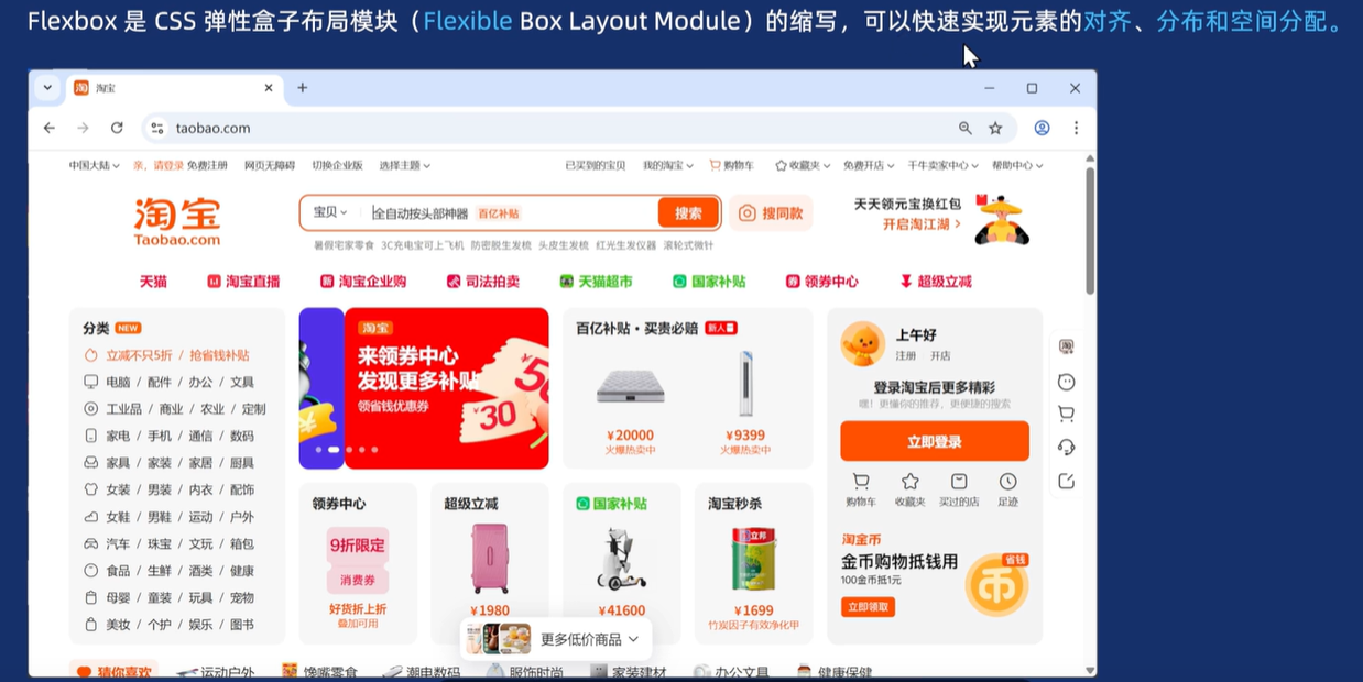
</body>三、弹性盒布局flex
3.1简单介绍
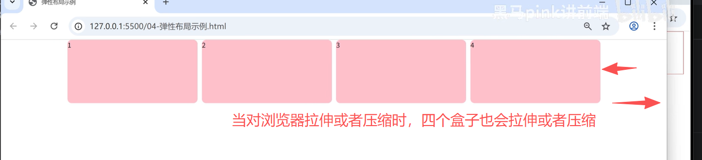
3.2弹性盒子的两大核心
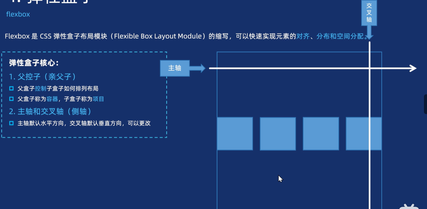
1.里面的盒子会根据主轴的方向进行排列,沿着交叉轴进行移动
2.亲父子!!!不是孙子~~~~
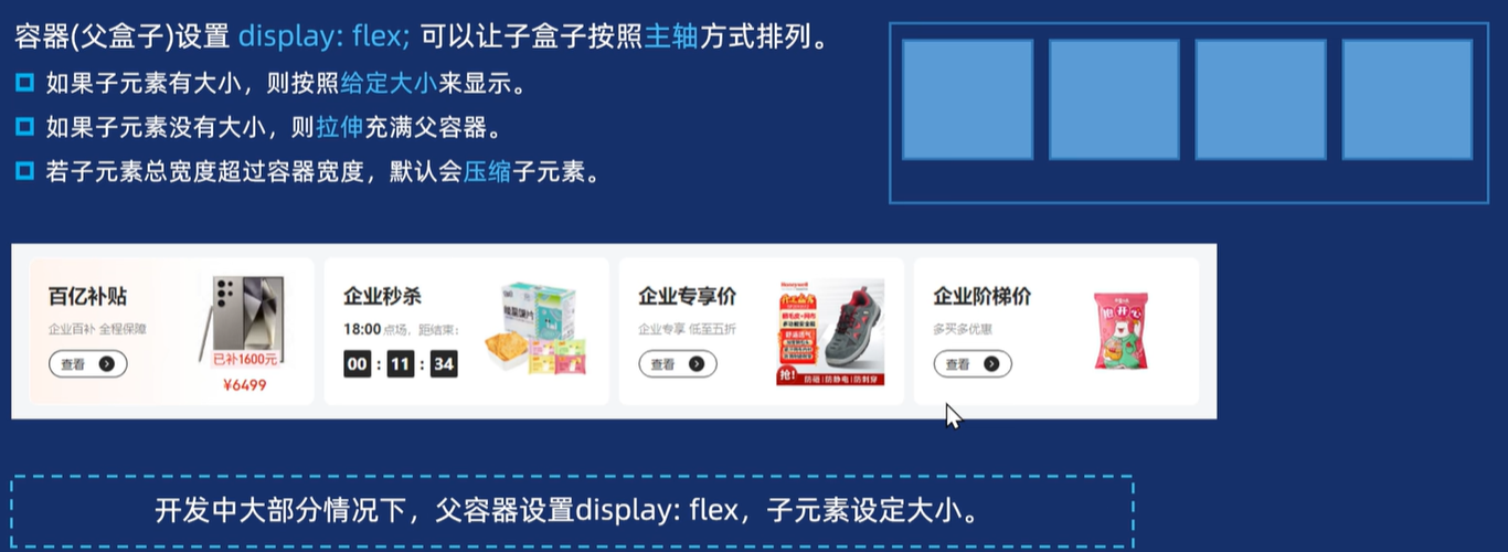
3.2.1 父盒子的属性
父控子,可以把父亲看成容器,儿子看成项目
【1】语法
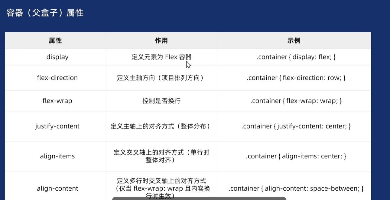
【2】注意事项
3.2.2 子盒子的属性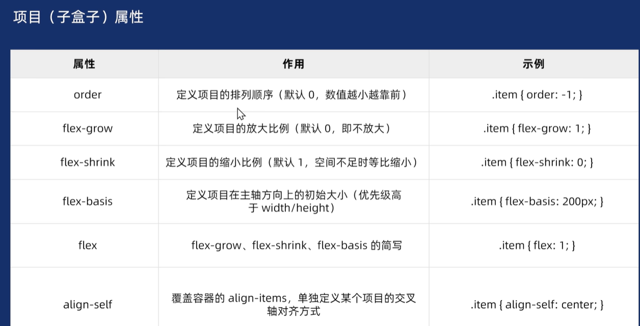
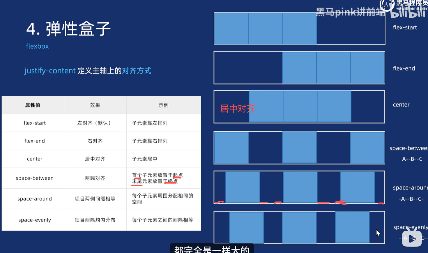
3.3 主轴和交叉轴对齐
【1】沿着主轴来对齐的语法
可以观察A和B之间的-
<head><meta charset="UTF-8"><meta name="viewport" content="width=device-width, initial-scale=1.0"><title>Document</title><style>/* 第一步做好相关的初始化 *//* 盒子的样式 */* {margin: 0;padding: 0;box-sizing: border-box;}/* 列表没有小黑点 */ul,li {list-style: none;}/* 链接没有下划线 */a {text-decoration: none;}/* 开始给盒子添加样式 */.box {/* 添加弹性布局,加上这句话盒子便会水平排列 */display: flex;/* 主轴的对齐方式 *//* justify-content: flex-start; *//* justify-content: flex-end; *//* justify-content: space-between; */width: 500px;height: 100px;border: 1px solid red;}.box .itme {width: 100px;height: 100px;background-color: pink;/* 设置圆角 */border-radius: 10px;}</style>
</head><body><div class="box"><div class="itme">1</div><div class="itme">2</div><div class="itme">3</div><div class="itme">4</div></div>
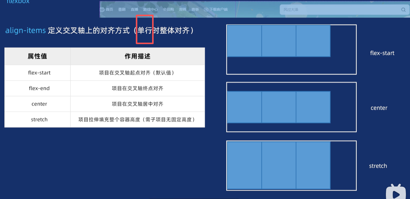
</body>【2】沿着交叉轴来对齐的语法
<head><meta charset="UTF-8"><meta name="viewport" content="width=device-width, initial-scale=1.0"><title>Document</title><style>/* 第一步做好相关的初始化 *//* 盒子的样式 */* {margin: 0;padding: 0;box-sizing: border-box;}/* 列表没有小黑点 */ul,li {list-style: none;}/* 链接没有下划线 */a {text-decoration: none;}/* 开始给盒子添加样式 */.box {/* 添加弹性布局,加上这句话盒子便会水平排列 */display: flex;/* 交叉轴的对齐方式 *//* align-items: flex-start; *//* align-items: flex-end; *//* align-items: center; *//* 还有一个拉伸,但是你想让盒子拉伸,则儿子给盒子不要给高度 */align-items: stretch;width: 500px;height: 300px;border: 1px solid red;}.box .itme {width: 100px;height: 100px;background-color: pink;/* 设置圆角 */border-radius: 10px;}</style>
</head><body><div class="box"><div class="itme">1</div><div class="itme">2</div><div class="itme">3</div><div class="itme">4</div></div>
</body>
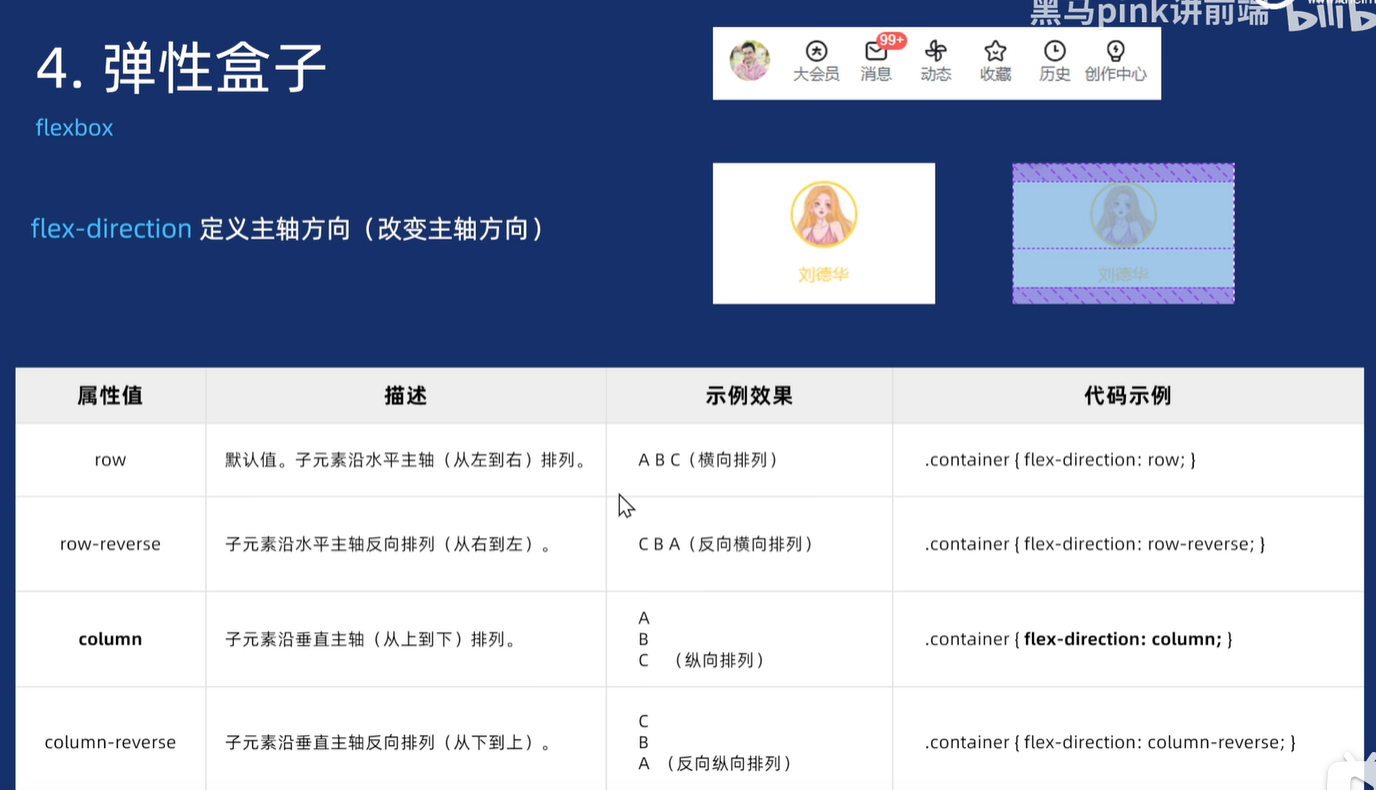
3.4 改变主轴方向flex-direction
[1]语法