图表可视化地理趋势-Telerik WPF Chart
图表可视化地理趋势-Telerik WPF Chart
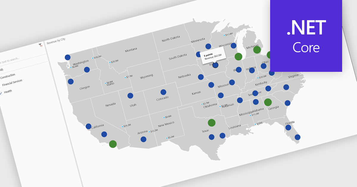
Transform data with vibrant map charts that make it easy to compare values, reveal regional patterns, and uncover actionable insights.

A map chart is a visual representation of data that displays values across geographic regions using colors, shading, or markers, making complex information easier to interpret. By placing data in a spatial context, map charts help users quickly identify regional patterns, trends, and outliers that might be overlooked in traditional tables or graphs. They are particularly useful for comparing values across countries, states, or counties, enabling clearer insights into geographically distributed data. Common use cases include illustrating population density, highlighting election results, analyzing sales performance by region, and presenting economic indicators. The key benefits of map charts include their ability to simplify complex datasets, provide intuitive comparisons, and support data-driven decision-making by visually connecting numbers with real-world locations.
