matplotlib 6 - Gallery Images
文章目录
- 图像、等高线与场
- 图像的仿射变换
- 风向风速符号
- 条形码
- 交互式调整色彩映射范围
- 色彩映射归一化
- LogNorm 对数归一化
- PowerNorm
- SymLogNorm
- 自定义归一化
- BoundaryNorm
- 色彩映射归一化 SymLogNorm 示例
- 等高线角点遮罩
- 等高线演示
- 等高线图像
- 等高线标签演示
- 等高线填充图示例
- 自动等高线层级
- 显式等高线层级
- 扩展设置
- 使用origin关键字定向等高线图
- 等高线填充图案
- 等高线填充与对数颜色标度
- 优化问题解空间的等高线绘制
- BboxImage 演示
- Figimage 演示
- 带注释的热力图
- 简单分类热力图
- 使用辅助函数的代码风格
- 更复杂的热图示例
- 图像重采样
- 降采样与适度上采样
- 上采样
- 避免重采样
- 使用补丁裁剪图像
- 多种绘制图像的方法
- 图像插值
- 带掩码值的图像显示
- 非均匀图像
- 在2D图像中混合透明度与颜色
- 实现透明效果
- 利用透明度突显高幅值数据点
- 修改坐标格式化器
- imshow 插值方法对比
- 不规则间距数据的等高线图
- 使用 Alpha 混合叠加图层
- 使用matshow可视化矩阵
- 多图共享一个色条
- 高级技巧:同步色彩映射表
- 参考文献
- pcolor 图像
- 一个简单的 pcolor 示例
- 比较 pcolor 与相似函数
- 对数刻度下的伪彩色图
- pcolormesh 网格与着色
- 平面着色
- 平面着色与相同形状网格
- 最近邻着色,相同形状网格
- 自动着色
- Gouraud 着色
- pcolormesh
- 基础 pcolormesh 用法
- 非直线型 pcolormesh
- 居中坐标
- 使用归一化(Norms)创建层级
- 流线图
- QuadMesh 演示
- 高级箭头图(quiver)和箭头图例(quiverkey)函数
- Quiver 简单示例
- 地形阴影示例
- 频谱图
- Spy 演示
- 三角网格等高线演示
- 平滑Delaunay三角等高线图
- 平滑用户三角等高线图
- 三色渐变演示
- Triinterp 演示
- 三色图演示
- Triplot 演示
- 水印图像
图像、等高线与场
https://matplotlib.org/stable/gallery/images_contours_and_fields/index.html
图像的仿射变换
图像的仿射变换
风向标
风向标

条形码
条形码
色彩映射表的交互式调整
色彩映射表的交互式调整
色彩映射表归一化
色彩映射表归一化
色彩映射表SymLogNorm归一化
色彩映射表SymLogNorm归一化
等高线角点遮罩
等高线角点遮罩
等高线演示
等高线演示
等高线图像
等高线图像
等高线标签演示
等高线标签演示
填充等高线演示
填充等高线演示
填充等高线阴影
填充等高线阴影
填充等高线与对数色彩标度
填充等高线与对数色彩标度
优化解空间的等高线绘制
优化解空间的等高线绘制
边界框图像演示
边界框图像演示

图图像演示
图图像演示
带注释的热力图
带注释的热力图
图像重采样
图像重采样

使用补丁裁剪图像
使用补丁裁剪图像
多种图像绘制方式
多种图像绘制方式
带掩码值的图像
带掩码值的图像
非均匀图像
非均匀图像
2D图像中的透明度与色彩混合
2D图像中的透明度与色彩混合

修改坐标格式化器
修改坐标格式化器
imshow插值方法
imshow插值方法
不规则间距数据的等高线图
不规则间距数据的等高线图
带alpha混合的图层图像
带alpha混合的图层图像
使用matshow可视化矩阵
使用matshow可视化矩阵
多图像共享色彩条
多图像共享色彩条
pcolor图像
pcolor图像
pcolormesh网格与着色
pcolormesh网格与着色
pcolormesh
pcolormesh
流线图
流线图
QuadMesh演示
QuadMesh演示
高级quiver与quiverkey函数
高级quiver与quiverkey函数
简单quiver演示
简单quiver演示
着色示例
着色示例
频谱图
频谱图
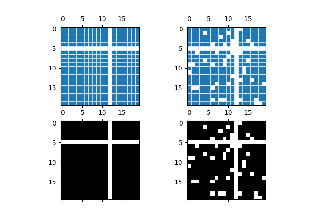
Spy演示
Spy演示
三角剖分等高线演示
三角剖分等高线演示
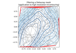
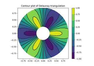
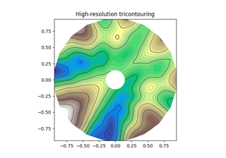
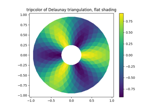
平滑Delaunay三角剖分等高线
平滑Delaunay三角剖分等高线
用户自定义平滑三角剖分等高线
用户自定义平滑三角剖分等高线
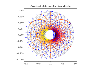
三角剖分梯度演示
三角剖分梯度演示
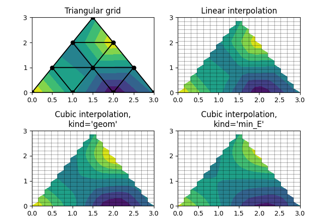
三角剖分插值演示
三角剖分插值演示
三角剖分色彩演示
三角剖分色彩演示
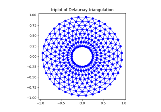
三角剖分绘图演示
三角剖分绘图演示
水印图像
水印图像
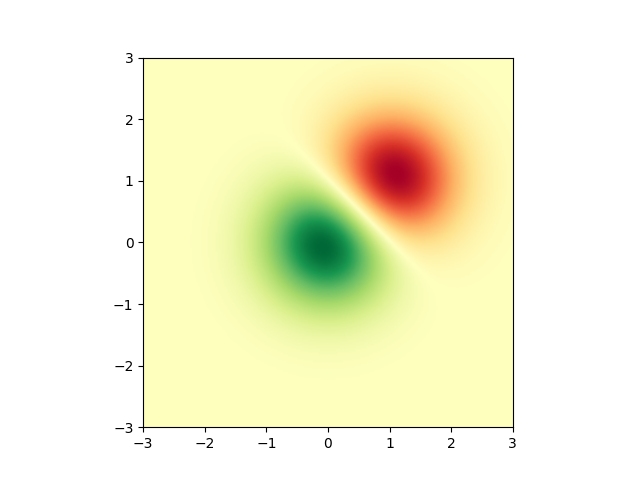
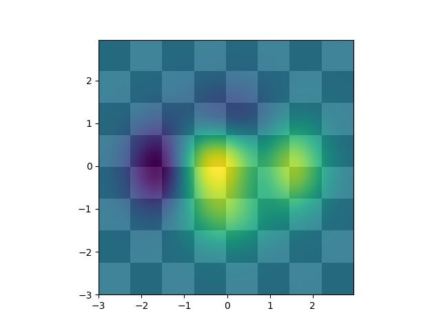
图像的仿射变换
https://matplotlib.org/stable/gallery/images_contours_and_fields/affine_image.html
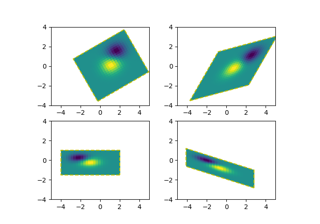
在图像的数据变换前添加一个仿射变换(Affine2D),可以操作图像的形状和方向。这是变换链概念的一个示例。
输出图像的边界应与黄色虚线矩形框相匹配。
import matplotlib.pyplot as plt
import numpy as npimport matplotlib.transforms as mtransformsdef get_image():delta = 0.25x = y = np.arange(-3.0, 3.0, delta)X, Y = np.meshgrid(x, y)Z1 = np.exp(-X**2 - Y**2)Z2 = np.exp(-(X - 1)**2 - (Y - 1)**2)Z = (Z1 - Z2)return Zdef do_plot(ax, Z, transform):im = ax.imshow(Z, interpolation='none',origin='lower',extent=[-2, 4, -3, 2], clip_on=True)trans_data = transform + ax.transDataim.set_transform(trans_data)# display intended extent of the imagex1, x2, y1, y2 = im.get_extent()ax.plot([x1, x2, x2, x1, x1], [y1, y1, y2, y2, y1], "y--",transform=trans_data)ax.set_xlim(-5, 5)ax.set_ylim(-4, 4)# prepare image and figure
fig, ((ax1, ax2), (ax3, ax4)) = plt.subplots(2, 2)
Z = get_image()# image rotation
do_plot(ax1, Z, mtransforms.Affine2D().rotate_deg(30))# image skew
do_plot(ax2, Z, mtransforms.Affine2D().skew_deg(30, 15))# scale and reflection
do_plot(ax3, Z, mtransforms.Affine2D().scale(-1, .5))# everything and a translation
do_plot(ax4, Z, mtransforms.Affine2D().rotate_deg(30).skew_deg(30, 15).scale(-1, .5).translate(.5, -1))plt.show()
参考内容
本示例展示了以下函数、方法、类和模块的使用:
matplotlib.axes.Axes.imshow/matplotlib.pyplot.imshow
matplotlib.transforms.Affine2D
下载Jupyter笔记本: affine_image.ipynb下载Python源代码: affine_image.py下载压缩包: affine_image.zip
图库由Sphinx-Gallery生成
风向风速符号
https://matplotlib.org/stable/gallery/images_contours_and_fields/barb_demo.html
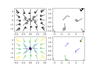
展示风向风速符号图的绘制方法。
import matplotlib.pyplot as plt
import numpy as npx= np.linspace(-5, 5, 5)
X, Y = np.meshgrid(x, x)
U, V = 12 * X, 12 * Ydata = [(-1.5, .5, -6, -6),(1, -1, -46, 46),(-3, -1, 11, -11),(1, 1.5, 80, 80),(0.5, 0.25, 25, 15),(-1.5, -0.5, -5, 40)]data = np.array(data, dtype=[('x', np.float32), ('y', np.float32),('u', np.float32), ('v', np.float32)])fig1, axs1) = plt.subplots(nrows=2, ncols=2)
# Default parameters, uniform grid
axs1)[0, 0].barbs(X, Y, U, V)# Arbitrary set of vectors, make them longer and change the pivot point
# (point around which they're rotated) to be the middle
axs1)[0, 1].barbs(data['x'], data['y'], data['u'], data['v'], length=8, pivot='middle')# Showing colormapping with uniform grid.  Fill the circle for an empty barb,
# don't round the values, and change some of the size parameters
axs1)[1, 0].barbs(X, Y, U, V, np.sqrt(U ** 2 + V ** 2), fill_empty=True, rounding=False,sizes=dict(emptybarb=0.25, spacing=0.2, height=0.3))# Change colors as well as the increments for parts of the barbs
axs1)[1, 1].barbs(data['x'], data['y'], data['u'], data['v'], flagcolor='r',barbcolor=['b', 'g'], flip_barb=True,barb_increments=dict(half=10, full=20, flag=100))# Masked arrays are also supported
masked_u = np.ma.masked_array(data['u'])
masked_u[4] = 1000  # Bad value that should not be plotted when masked
masked_u4] = [np.ma.masked
 与第一幅图中第二个面板完全相同的绘图,但缺少(被遮罩)位于 (0.5, 0.25) 的点
fig2, ax2 = plt.subplots()
ax2.barbs(data['x'], data['y'], masked_u, data['v'], length=8, pivot='middle')plt.show()
参考内容
本示例展示了以下函数、方法、类和模块的使用:
matplotlib.axes.Axes.barbs/matplotlib.pyplot.barbs
脚本总运行时间: (0 分 1.532 秒)
下载 Jupyter notebook: barb_demo.ipynb下载 Python 源代码: barb_demo.py下载压缩包: barb_demo.zip
条形码
https://matplotlib.org/stable/gallery/images_contours_and_fields/barcode_demo.html
本示例演示如何生成条形码。
图形尺寸经过计算,确保像素宽度是数据点数量的整数倍,以避免插值伪影。此外,Axes被定义为覆盖整个图形,且所有Axis均被关闭。
数据渲染采用imshow方法,具体通过:
code.reshape(1, -1)将数据转换为单行的二维数组imshow(..., aspect='auto')允许非正方形像素imshow(..., interpolation='nearest')防止边缘模糊。虽然我们已通过精确调整图形像素宽度来避免此问题,但此设置可确保万无一失。
import matplotlib.pyplot as plt
import numpy as npcode = np.array([1, 0, 1, 0, 1, 1, 1, 0, 1, 1, 0, 0, 0, 1, 0, 0, 1, 0, 1, 0, 0, 1, 1, 1,0, 0, 0, 1, 0, 1, 1, 0, 0, 0, 0, 1, 0, 1, 0, 0, 1, 1, 0, 0, 1, 0, 1, 0,1, 0, 1, 0, 0, 0, 0, 1, 0, 1, 1, 1, 0, 1, 0, 0, 1, 1, 0, 1, 1, 0, 0, 1,1, 0, 0, 1, 1, 0, 1, 0, 1, 1, 1, 0, 0, 1, 0, 0, 0, 1, 0, 0, 1, 0, 1])pixel_per_bar = 4
dpi = 100fig = plt.figure(figsize=(len(code) * pixel_per_bar / dpi, 2), dpi=dpi)
ax = fig.add_axes([0, 0, 1, 1])  # span the whole figure
ax.set_axis_off()
ax.imshow(code.reshape(1, -1), cmap='binary', aspect='auto',interpolation='nearest')
plt.show()

参考内容
本示例展示了以下函数、方法、类和模块的使用:
matplotlib.axes.Axes.imshow/matplotlib.pyplot.imshow
matplotlib.figure.Figure.add_axes
下载Jupyter笔记本: barcode_demo.ipynb
下载Python源代码: barcode_demo.py
下载压缩包: barcode_demo.zip
图库由Sphinx-Gallery生成
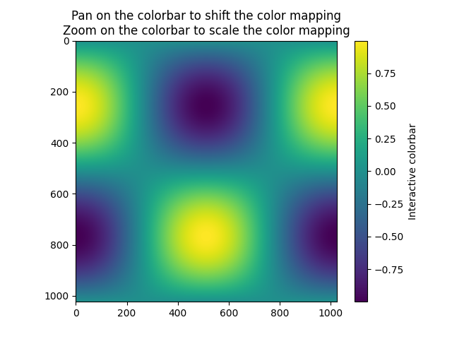
交互式调整色彩映射范围
https://matplotlib.org/stable/gallery/images_contours_and_fields/colormap_interactive_adjustment.html
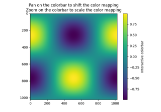
演示如何通过颜色条(colorbar)交互式调整图像色彩映射的范围。要使用交互功能,您需要处于缩放模式(工具栏放大镜按钮)或平移模式(工具栏四向箭头按钮),并在颜色条内部点击。
进行缩放时,缩放区域的边界框将定义新的归一化范围(vmin和vmax)。使用鼠标右键缩放会按比例扩展vmin和vmax范围,这与坐标轴缩放操作方式相同。平移操作时,归一化范围的vmin和vmax会根据移动方向进行偏移。还可以使用主页/后退/前进按钮返回之前的状态。
翻译说明:
1、保留了所有专业术语如"colormap"(色彩映射)、“vmin/vmax”、“norm”(归一化)等
2、将被动语态转换为主动语态,如"can be used"译为"可以通过"
3、拆分长句为多个短句,如原文最后两句合并为更通顺的中文表达
4、保持技术文档的严谨性,准确传达交互操作细节
5、完整保留了图片链接和格式标记
6、对界面元素如"magnifying glass toolbar button"采用括号补充说明的译法
import matplotlib.pyplot as plt
import numpy as npt = np.linspace(0, 2 * np.pi, 1024)
data2d = np.sin(t)[:, np.newaxis] * np.cos(t)[np.newaxis, :]fig, ax = plt.subplots()
im = ax.imshow(data2d)
ax.set_title('Pan on the colorbar to shift the color mapping\n''Zoom on the colorbar to scale the color mapping')fig.colorbar(im, ax=ax, label='Interactive colorbar')plt.show()脚本总运行时间:(0 分钟 2.100 秒)
下载 Jupyter 笔记本:colormap_interactive_adjustment.ipynb下载 Python 源代码:colormap_interactive_adjustment.py下载压缩包:colormap_interactive_adjustment.zip
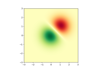
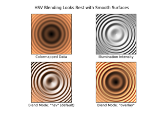
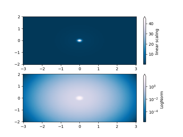
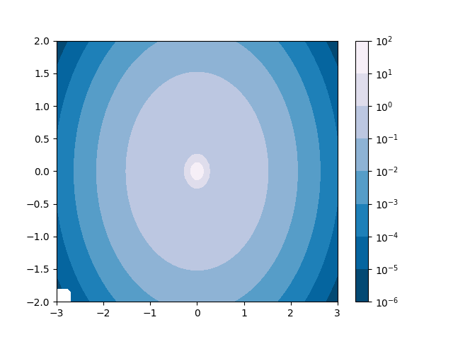
色彩映射归一化
https://matplotlib.org/stable/gallery/images_contours_and_fields/colormap_normalizations.html
演示如何通过归一化(norm)以非线性方式将色彩映射应用到数据上。
import matplotlib.pyplot as plt
import numpy as npimport matplotlib.colors as colorsN = 100
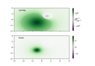
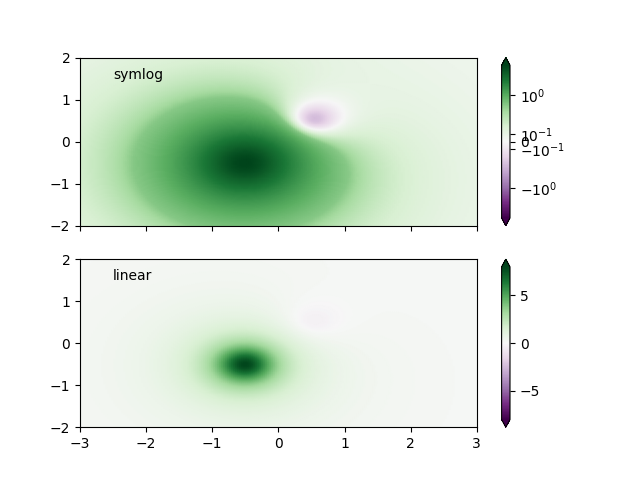
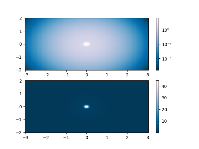
LogNorm 对数归一化
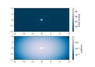
这个示例数据呈现出一个低矮的隆起,中心位置有一个突出的尖峰。如果使用线性色标进行绘制,只能观察到尖峰部分。为了同时显示隆起和尖峰,需要将z轴/颜色轴设置为对数比例。
无需通过pcolor(log10(Z))转换数据,可以直接使用LogNorm实现颜色映射的对数化处理。
X, Y = np.mgrid[-3:3:complex(0, N), -2:2:complex(0, N)]
Z1 = np.exp(-X**2 - Y**2)
Z2 = np.exp(-(x* 10)**2 - (Y * 10)**2)
Z = Z1 + 50 * Z2fig, ax = plt.subplots(2, 1)pcm = ax[0].pcolor(X, Y, Z, cmap='PuBu_r', shading='nearest')
fig.colorbar(pcm, ax=ax[0], extend='max', label='linear scaling')pcm = ax[1].pcolor(X, Y, Z, cmap='PuBu_r', shading='nearest',norm=colors.LogNorm(vmin=Z.min(), vmax=Z.max()))
fig.colorbar(pcm, ax=ax[1], extend='max', label='LogNorm')
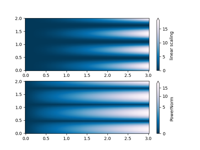
PowerNorm
这个示例数据在X轴上混合了幂律趋势,在Y轴上混合了整流正弦波。如果使用线性颜色标度绘制,X轴的幂律趋势会部分掩盖Y轴的正弦波。
通过使用PowerNorm可以消除幂律影响。
X, Y = np.mgrid[0:3:complex(0, N), 0:2:complex(0, N)]
Z = (1 + np.sin(Y * 10)) * X**2fig, ax = plt.subplots(2, 1)pcm = ax[0].pcolormesh(X, Y, Z, cmap='PuBu_r', shading='nearest')
fig.colorbar(pcm, ax=ax[0], extend='max', label='linear scaling')pcm = ax[1].pcolormesh(X, Y, Z, cmap='PuBu_r', shading='nearest',norm=colors.PowerNorm(gamma=0.5))
fig.colorbar(pcm, ax=ax[1], extend='max', label='PowerNorm')
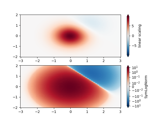
SymLogNorm
该示例数据呈现双峰分布,一个负向峰和一个正向峰,其中正向峰的振幅是负向峰的5倍。如果使用线性色标进行绘制,负向峰的细节会被掩盖。
这里我们使用SymLogNorm分别对正向和负向数据进行对数缩放。
需注意,色标标签的显示效果可能不够理想。
X, Y = np.mgrid[-3:3:complex(0, N), -2:2:complex(0, N)]
Z1 = np.exp(-X**2 - Y**2)
Z2 = np.exp(-(x- 1)**2 - (Y - 1)**2)
Z = (5 * Z1 - Z2) * 2fig, ax = plt.subplots(2, 1)pcm = ax[0].pcolormesh(X, Y, Z, cmap='RdBu_r', shading='nearest',vmin=-np.max(Z))
fig.colorbar(pcm, ax=ax[0], extend='both', label='linear scaling')pcm = ax[1].pcolormesh(X, Y, Z, cmap='RdBu_r', shading='nearest',norm=colors.SymLogNorm(linthresh=0.015,vmin=-10.0, vmax=10.0, base=10))
fig.colorbar(pcm, ax=ax[1], extend='both', label='SymLogNorm')
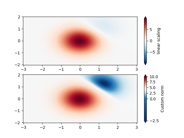
自定义归一化
作为替代方案,上述示例数据可以使用自定义归一化进行缩放。这种归一化方法对负数据和正数据采用不同的处理方式。
# Example of making your own norm.  Also see matplotlib.colors.
# From Joe Kington: This one gives two different linear ramps:
class MidpointNormalize(colors.Normalize):def __init__(self, vmin=None, vmax=None, midpoint=None, clip=False):self.midpoint = midpointsuper().__init__(vmin, vmax, clip)def __call__(self, value, clip=None):# I'm ignoring masked values and all kinds of edge cases to make a         # simple example...x, y = [self.vmin, self.midpoint, self.vmax], [0, 0.5, 1]return np.ma.masked_array(np.interp(value, x, y))
fig, ax = plt.subplots(2, 1)pcm = ax[0].pcolormesh(X, Y, Z, cmap='RdBu_r', shading='nearest',vmin=-np.max(Z))
fig.colorbar(pcm, ax=ax[0], extend='both', label='linear scaling')pcm = ax[1].pcolormesh(X, Y, Z, cmap='RdBu_r', shading='nearest',norm=MidpointNormalize(midpoint=0))
fig.colorbar(pcm, ax=ax[1], extend='both', label='Custom norm')
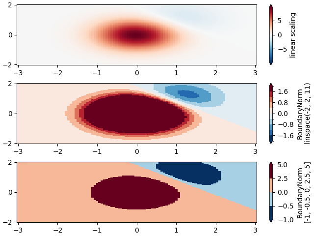
BoundaryNorm
当需要对色阶进行任意划分时,可以使用 BoundaryNorm 规范。该规范通过提供颜色边界值,将第一种颜色应用于第一对边界之间,第二种颜色应用于第二对边界之间,以此类推。
fig, ax = plt.subplots(3, 1, layout='constrained')pcm = ax[0].pcolormesh(X, Y, Z, cmap='RdBu_r', shading='nearest',vmin=-np.max(Z))
fig.colorbar(pcm, ax=ax[0], extend='both', orientation='vertical',label='linear scaling')# Evenly-spaced bounds gives a contour-like effect.
bounds = np.linspace(-2, 2, 11)
norm = colors.BoundaryNorm(boundaries=bounds, ncolors=256)
pcm = ax[1].pcolormesh(X, Y, Z, cmap='RdBu_r', shading='nearest',norm=norm)
fig.colorbar(pcm, ax=ax[1], extend='both', orientation='vertical',label='BoundaryNorm\nlinspace(-2, 2, 11)')# Unevenly-spaced bounds changes the colormapping.
bounds = np.array([-1, -0.5, 0, 2.5, 5])
norm = colors.BoundaryNorm(boundaries=bounds, ncolors=256)
pcm = ax[2].pcolormesh(X, Y, Z, cmap='RdBu_r', shading='nearest',norm=norm)
fig.colorbar(pcm, ax=ax[2], extend='both', orientation='vertical',label='BoundaryNorm\n[-1, -0.5, 0, 2.5, 5]')plt.show()
脚本总运行时间: (0 分 8.297 秒)
下载 Jupyter notebook: colormap_normalizations.ipynb下载 Python 源代码: colormap_normalizations.py下载压缩包: colormap_normalizations.zip
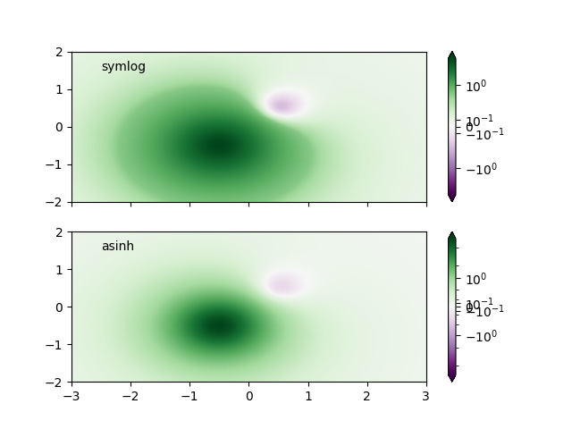
色彩映射归一化 SymLogNorm 示例
https://matplotlib.org/stable/gallery/images_contours_and_fields/colormap_normalizations_symlognorm.html
演示如何通过归一化(norm)以非线性方式将色彩映射应用到数据上。
合成数据集包含两个波峰:一个负波峰和一个正波峰,其中正波峰的振幅是负波峰的8倍。若采用线性缩放,负波峰几乎不可见,且很难观察到其轮廓细节。当对正负值同时应用对数缩放后,可以更清晰地看到每个波峰的形态。
参考 SymLogNorm。
import matplotlib.pyplot as plt
import numpy as npimport matplotlib.colors as colorsdef rbf(x, y):return 1.0 / (1 + 5 * ((x ** 2) + (y ** 2)))N = 200
gain = 8
X, Y = np.mgrid[-3:3:complex(0, N), -2:2:complex(0, N)]
Z1 = rbf(x+ 0.5, Y + 0.5)
Z2 = rbf(x- 0.5, Y - 0.5)
Z = gain * Z1 - Z2shadeopts = {'cmap': 'PRGn', 'shading': 'gouraud'}
colormap = 'PRGn'
lnrwidth = 0.5fig, ax = plt.subplots(2, 1, sharex=True, sharey=True)pcm = ax[0].pcolormesh(X, Y, Z,norm=colors.SymLogNorm(linthresh=lnrwidth, linscale=1,vmin=-gain, vmax=gain, base=10),**shadeopts)
fig.colorbar(pcm, ax=ax[0], extend='both')
ax[0].text(-2.5, 1.5, 'symlog')pcm = ax[1].pcolormesh(X, Y, Z, vmin=-gain, vmax=gain,**shadeopts)
fig.colorbar(pcm, ax=ax[1], extend='both')
ax[1].text(-2.5, 1.5, 'linear')
 为了找到最适合特定数据集的可视化方案,可能需要尝试多种不同的颜色标尺。
除了使用SymLogNorm缩放外,还可以选择使用实验性的AsinhNorm,该缩放方式在数据值"Z"的线性变换区域和对数变换区域之间具有更平滑的过渡。
在下方的图表中,可能会观察到每个峰周围存在类似等高线的伪影,尽管数据集本身并不包含尖锐特征。而采用asinh缩放后,每个峰的着色过渡显得更加平滑。
fig, ax = plt.subplots(2, 1, sharex=True, sharey=True)pcm = ax[0].pcolormesh(X, Y, Z,norm=colors.SymLogNorm(linthresh=lnrwidth, linscale=1,vmin=-gain, vmax=gain, base=10),**shadeopts)
fig.colorbar(pcm, ax=ax[0], extend='both')
ax[0].text(-2.5, 1.5, 'symlog')pcm = ax[1].pcolormesh(X, Y, Z,norm=colors.AsinhNorm(linear_width=lnrwidth,vmin=-gain, vmax=gain),**shadeopts)
fig.colorbar(pcm, ax=ax[1], extend='both')
ax[1].text(-2.5, 1.5, 'asinh')plt.show()
脚本总运行时间: (0 分钟 6.408 秒)
下载 Jupyter 笔记本: colormap_normalizations_symlognorm.ipynb下载 Python 源代码: colormap_normalizations_symlognorm.py下载压缩包: colormap_normalizations_symlognorm.zip
画廊由 Sphinx-Gallery 生成
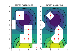
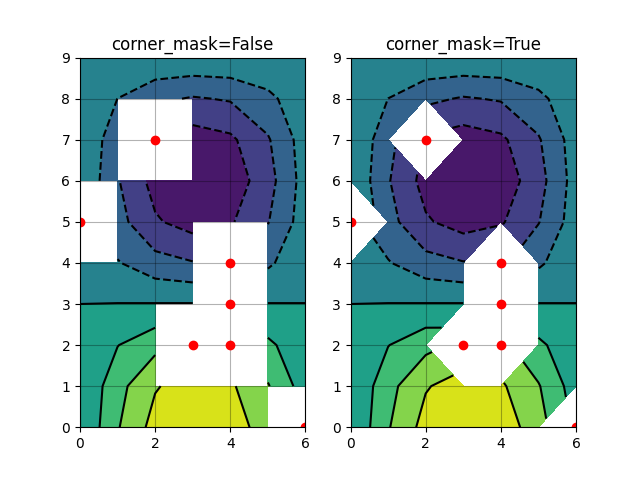
等高线角点遮罩
https://matplotlib.org/stable/gallery/images_contours_and_fields/contour_corner_mask.html
展示在遮罩等高线图中corner_mask=False与corner_mask=True的区别。默认值由[rcParams["contour.corner_mask"]](https://matplotlib.org/stable/users/explain/customizing.html?highlight=contour.corner_mask#matplotlibrc-sample)控制(默认值:True)。
import matplotlib.pyplot as plt
import numpy as np# Data to plot.
x, y= np.meshgrid(np.arange(7), np.arange(10))
z = np.sin(0.5 * x) * np.cos(0.52 * y)# Mask various z values.
mask = np.zeros_like(z, dtype=bool)
mask[2, 3:5] = True
mask[3:5, 4] = True
mask[7, 2] = True
mask[5, 0] = True
mask[0, 6] = True
z = np.ma.array(z, mask=mask)corner_masks = [False, True]
fig, axs = plt.subplots(ncols=2) for ax, corner_mask in zip(axs, corner_masks):cs = ax.contourf(x, y, z, corner_mask=corner_mask)ax.contour(cs, colors='k')ax.set_title(f'{corner_mask=}')# Plot grid.ax.grid(c='k', ls='-', alpha=0.3)# Indicate masked points with red circles.ax.plot(np.ma.array(x, mask=~mask), y, 'ro')plt.show()
参考内容
本示例展示了以下函数、方法、类和模块的使用:
matplotlib.axes.Axes.contour/matplotlib.pyplot.contour
matplotlib.axes.Axes.contourf/matplotlib.pyplot.contourf
下载Jupyter笔记本: contour_corner_mask.ipynb下载Python源代码: contour_corner_mask.py下载压缩包: contour_corner_mask.zip
图库由Sphinx-Gallery生成
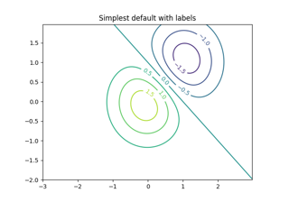
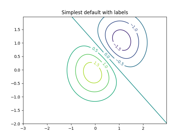
等高线演示
https://matplotlib.org/stable/gallery/images_contours_and_fields/contour_demo.html
展示简单的等高线绘制、带颜色条的图像等高线以及带标签的等高线。
另请参阅等高线图像示例。
import matplotlib.pyplot as plt
import numpy as npimport matplotlib.cm as cmdelta = 0.025
x= np.arange(-3.0, 3.0, delta)
y= np.arange(-2.0, 2.0, delta)
X, Y = np.meshgrid(x, y)
Z1 = np.exp(-X**2 - Y**2)
Z2 = np.exp(-(x- 1)**2 - (Y - 1)**2)
Z = (Z1 - Z2) * 2
使用默认颜色创建一个带标签的简单等高线图。通过clabel的inline参数可以控制标签是否绘制在等高线线段上方,从而移除标签下方的线段。
fig, ax = plt.subplots()
CS = ax.contour(X, Y, Z)
ax.clabel(CS, fontsize=10)
ax.set_title('Simplest default with labels')
 等高线标签可以通过提供坐标位置列表(数据坐标系)手动放置。交互式放置方法请参阅交互功能。
fig, ax = plt.subplots()
CS = ax.contour(X, Y, Z)
manual_locations = [(-1, -1.4), (-0.62, -0.7), (-2, 0.5), (1.7, 1.2), (2.0, 1.4), (2.4, 1.7)]
ax.clabel(CS, fontsize=10, manual=manual_locations)
ax.set_title('labels at selected locations')
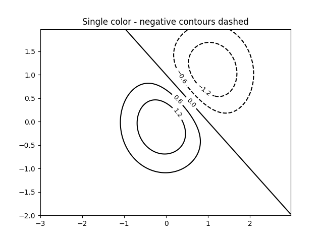
 您可以强制所有等高线使用相同颜色。
fig, ax = plt.subplots()
CS = ax.contour(X, Y, Z, 6, colors='k')  # Negative contours default to dashed.
ax.clabel(CS, fontsize=9)
ax.set_title('Single color - negative contours dashed')
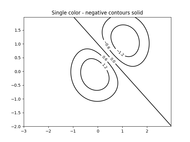
 您可以将负等高线设置为实线而非虚线:
plt.rcParams['contour.negative_linestyle'] = 'solid'
fig, ax = plt.subplots()
CS = ax.contour(X, Y, Z, 6, colors='k')  # Negative contours default to dashed.
ax.clabel(CS, fontsize=9)
ax.set_title('Single color - negative contours solid')
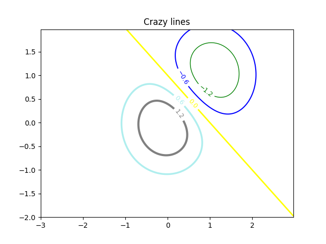
 您可以手动指定等高线的颜色
fig, ax = plt.subplots()
CS = ax.contour(X, Y, Z, 6,linewidths=np.arange(.5, 4, .5),colors=('r', 'green', 'blue', (1, 1, 0), '#afeeee', '0.5'),)
ax.clabel(CS, fontsize=9)
ax.set_title('Crazy lines')
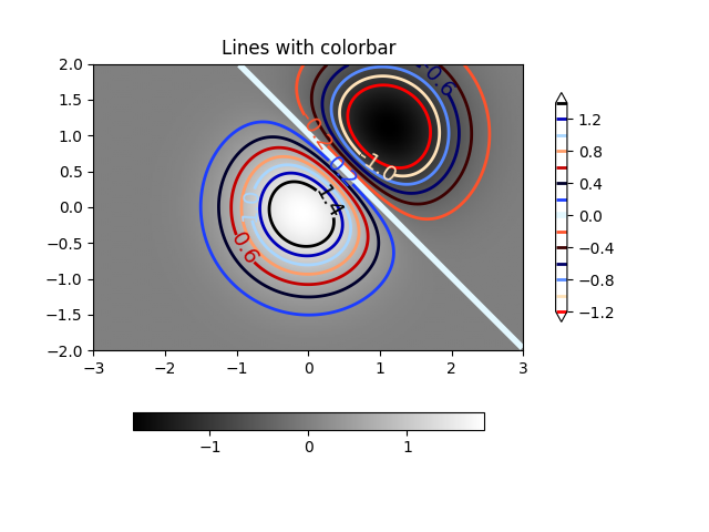
 或者您可以使用颜色映射来指定颜色;默认的颜色映射将用于等高线
fig, ax = plt.subplots()
im = ax.imshow(Z, interpolation='bilinear', origin='lower',cmap=cm.gray, extent=(-3, 3, -2, 2))
levels = np.arange(-1.2, 1.6, 0.2)
CS = ax.contour(Z, levels, origin='lower', cmap='flag', extend='both',linewidths=2, extent=(-3, 3, -2, 2))# Thicken the zero contour.
lws = np.resize(CS.get_linewidth(), len(levels))
lws[6] = 4
CS.set_linewidth(lws)ax.clabel(CS, levels[1::2],  # label every second levelfmt='%1.1f', fontsize=14)# make a colorbar for the contour lines
CB = fig.colorbar(CS, shrink=0.8)ax.set_title('Lines with colorbar')# We can still add a colorbar for the image, too.
CBI = fig.colorbar(im, orientation='horizontal', shrink=0.8)# This makes the original colorbar look a bit out of place,
# so let's improve its position.l, b, w, h = ax.get_position().bounds
ll, bb, ww, hh = CB.ax.get_position().bounds
CB.ax.set_position([ll, b + 0.1*h, ww, h*0.8])plt.show()
参考
本示例展示了以下函数、方法、类和模块的使用:
matplotlib.axes.Axes.contour/matplotlib.pyplot.contour
-
matplotlib.figure.Figure.colorbar/matplotlib.pyplot.colorbar -
matplotlib.axes.Axes.clabel/matplotlib.pyplot.clabel -
matplotlib.axes.Axes.get_position -
matplotlib.axes.Axes.set_position
脚本总运行时间: (0 分钟 6.386 秒)
下载 Jupyter notebook: contour_demo.ipynb下载 Python 源代码: contour_demo.py下载压缩包: contour_demo.zip
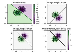
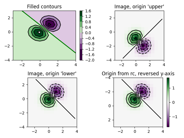
等高线图像
https://matplotlib.org/stable/gallery/images_contours_and_fields/contour_image.html
测试等高线、填充等高线与图像绘制的组合效果。关于等高线标注,可参考等高线演示示例。
本演示重点展示:
1、如何使等高线与图像正确对齐
2、如何按需调整两者的方向
特别提示:注意观察imshow和contour函数中"origin"与"extent"关键字参数的使用方法。
import matplotlib.pyplot as plt
import numpy as npfrom matplotlib import cm# Default delta is large because that makes it fast, and it illustrates
# the correct registration between image and contours.
delta = 0.5extent = (-3, 4, -4, 3)x= np.arange(-3.0, 4.001, delta)
y= np.arange(-4.0, 3.001, delta)
X, Y = np.meshgrid(x, y)
Z1 = np.exp(-X**2 - Y**2)
Z2 = np.exp(-(x- 1)**2 - (Y - 1)**2)
Z = (Z1 - Z2) * 2# Boost the upper limit to avoid truncation errors.
levels = np.arange(-2.0, 1.601, 0.4)norm = cm.colors.Normalize(vmax=abs(Z).max(), vmin=-abs(Z).max())
cmap = cm.PRGnfig, _axs = plt.subplots(nrows=2, ncols=2)
fig.subplots_adjust(hspace=0.3)
axs = _axs.flatten()cset1 = axs[0].contourf(X, Y, Z, levels, norm=norm,cmap=cmap.resampled(len(levels) - 1))
# It is not necessary, but for the colormap, we need only the # number of levels minus 1、 To avoid discretization error, use
# either this number or a large number such as the default (256).# If we want lines as well as filled regions, we need to call
# contour separately; don't try to change the edgecolor or edgewidth
# of the polygons in the collections returned by contourf.
# Use levels output from previous call to guarantee they are the same.cset2 = axs[0].contour(X, Y, Z, cset1.levels, colors='k')# We don't really need dashed contour lines to indicate negative
# regions, so let's turn them off.
cset2.set_linestyle('solid')# It is easier here to make a separate call to contour than
# to set up an array of colors and linewidths.
# We are making a thick green line as a zero contour.
# Specify the zero level as a tuple with only 0 in it.cset3 = axs[0].contour(X, Y, Z, (0,), colors='g', linewidths=2)
axs[0].set_title('Filled contours')
fig.colorbar(cset1, ax=axs[0])axs[1].imshow(Z, extent=extent, cmap=cmap, norm=norm)
axs[1].contour(Z, levels, colors='k', origin='upper', extent=extent)
axs[1].set_title("Image, origin 'upper'")axs[2].imshow(Z, origin='lower', extent=extent, cmap=cmap, norm=norm)
axs[2].contour(Z, levels, colors='k', origin='lower', extent=extent)
axs[2].set_title("Image, origin 'lower'")# We will use the interpolation "nearest" here to show the actual
# image pixels.
# Note that the contour lines don't extend to the edge of the box.
# This is intentional. The Z values are defined at the center of each
# image pixel (each color block on the following subplot), so the # domain that is contoured does not extend beyond these pixel centers.
im = axs[3].imshow(Z, interpolation='nearest', extent=extent,cmap=cmap, norm=norm)
axs[3].contour(Z, levels, colors='k', origin='image', extent=extent)
ylim = axs[3].get_ylim()
axs[3].set_ylim(ylim[::-1])
axs[3].set_title("Origin from rc, reversed y-axis")
fig.colorbar(im, ax=axs[3])fig.tight_layout()
plt.show()
参考内容
本示例展示了以下函数、方法、类和模块的使用:
matplotlib.axes.Axes.contour/matplotlib.pyplot.contour
-
matplotlib.axes.Axes.imshow/matplotlib.pyplot.imshow -
matplotlib.figure.Figure.colorbar/matplotlib.pyplot.colorbar -
matplotlib.colors.Normalize
脚本总运行时间: (0 分 1.765 秒)
下载 Jupyter 笔记本: contour_image.ipynb下载 Python 源代码: contour_image.py下载压缩包: contour_image.zip
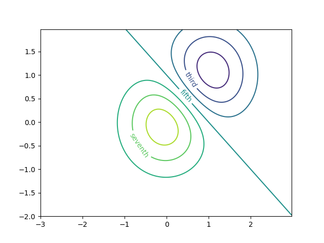
等高线标签演示
https://matplotlib.org/stable/gallery/images_contours_and_fields/contour_label_demo.html
展示了一些可以使用等高线标签实现的更高级功能。
另请参阅等高线演示示例。
import matplotlib.pyplot as plt
import numpy as npimport matplotlib.ticker as ticker
定义我们的表面
delta = 0.025
x= np.arange(-3.0, 3.0, delta)
y= np.arange(-2.0, 2.0, delta)
X, Y = np.meshgrid(x, y)
Z1 = np.exp(-X**2 - Y**2)
Z2 = np.exp(-(x- 1)**2 - (Y - 1)**2)
Z = (Z1 - Z2) * 2
使用自定义层级格式化程序创建等高线标签
# This custom formatter removes trailing zeros, e.g. "1.0" becomes "1", and
# then adds a percent sign.
def fmt(x):s = f"{x:.1f}"if s.endswith("0"):s = f"{x:.0f}"return rf"{s} \%" if plt.rcParams["text.usetex"] else f"{s} %"# Basic contour plot
fig, ax = plt.subplots()
CS = ax.contour(X, Y, Z)ax.clabel(CS, CS.levels, fmt=fmt, fontsize=10)
 使用字典为等高线添加任意字符串标签
fig1, ax1 = plt.subplots()# Basic contour plot
CS1 = ax1.contour(X, Y, Z)fmt = {}
strs = ['first', 'second', 'third', 'fourth', 'fifth', 'sixth', 'seventh']
for l, s in zip(CS1.levels, strs):fmt[l] = s# Label every other level using strings
ax1.clabel(CS1, CS1.levels[::2], fmt=fmt, fontsize=10)
 使用格式化器
fig2, ax2 = plt.subplots()CS2 = ax2.contour(X, Y, 100**Z, locator=plt.LogLocator())
fmt = ticker.LogFormatterMathtext()
fmt.create_dummy_axis()
ax2.clabel(CS2, CS2.levels, fmt=fmt)
ax2.set_title("$100^Z$")plt.show()
 )
)
参考内容
本示例展示了以下函数、方法、类和模块的使用:
matplotlib.axes.Axes.contour/matplotlib.pyplot.contour
-
matplotlib.axes.Axes.clabel/matplotlib.pyplot.clabel -
matplotlib.ticker.LogFormatterMathtext -
matplotlib.ticker.TickHelper.create_dummy_axis
脚本总运行时间: (0 分钟 3.866 秒)
下载 Jupyter notebook: contour_label_demo.ipynb下载 Python 源代码: contour_label_demo.py下载压缩包: contour_label_demo.zip
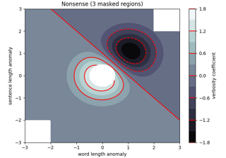
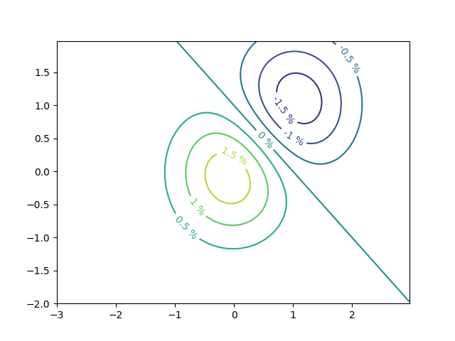
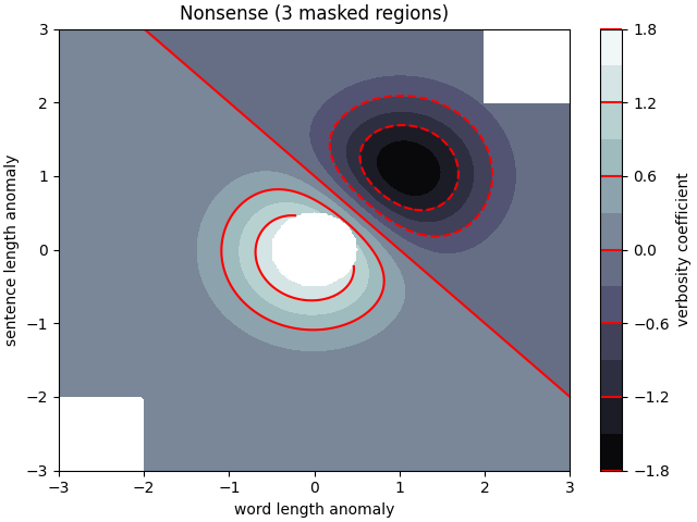
等高线填充图示例
https://matplotlib.org/stable/gallery/images_contours_and_fields/contourf_demo.html
介绍如何使用 axes.Axes.contourf 方法创建填充等高线图。
import matplotlib.pyplot as plt
import numpy as npdelta = 0.025x= y= np.arange(-3.0, 3.01, delta)
X, Y = np.meshgrid(x, y)
Z1 = np.exp(-X**2 - Y**2)
Z2 = np.exp(-(x- 1)**2 - (Y - 1)**2)
Z = (Z1 - Z2) * 2nr, nc = Z.shape# put NaNs in one corner:
Z[-nr // 6:, -nc // 6:] = np.nan
# contourf will convert these to maskedZ = np.ma.array(Z)
# mask another corner:
Z[:nr // 6, :nc // 6] = np.ma.masked# mask a circle in the middle:
interior = np.sqrt(X**2 + Y**2) < 0.5
Zinterior] = [np.ma.masked
自动等高线层级
我们采用了自动选择等高线层级的方式。通常这并不是一个好主意,因为自动生成的层级往往不会落在理想的边界上。但为了演示目的,我们在此仍采用这种方法。
fig1, ax2 = plt.subplots(layout='constrained')
CS = ax2.contourf(X, Y, Z, 10, cmap=plt.cm.bone)# Note that in the following, we explicitly pass in a subset of the contour
# levels used for the filled contours.  Alternatively, we could pass in # additional levels to provide extra resolution, or leave out the *levels*
# keyword argument to use all of the original levels.CS2 = ax2.contour(CS, levels=CS.levels[::2], colors='r')ax2.set_title('Nonsense (3 masked regions)')
ax2.set_xlabel('word length anomaly')
ax2.set_ylabel('sentence length anomaly')# Make a colorbar for the ContourSet returned by the contourf call.
cbar = fig1.colorbar(CS)
cbar.ax.set_ylabel('verbosity coefficient')
# Add the contour line levels to the colorbar
cbar.add_lines(CS2)
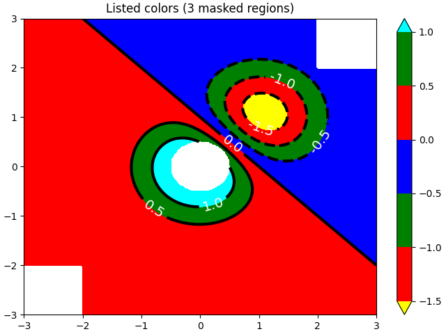
显式等高线层级
现在制作一个指定层级的等高线图,并通过颜色列表自动生成对应的色彩映射。
fig2, ax2 = plt.subplots(layout='constrained')
levels = [-1.5, -1, -0.5, 0, 0.5, 1]
CS3 = ax2.contourf(X, Y, Z, levels, colors=('r', 'g', 'b'), extend='both')
# Our data range extends outside the range of levels; make
# data below the lowest contour level yellow, and above the # highest level cyan:
CS3.cmap.set_under('yellow')
CS3.cmap.set_over('cyan')CS4 = ax2.contour(X, Y, Z, levels, colors=('k',), linewidths=(3,))
ax2.set_title('Listed colors (3 masked regions)')
ax2.clabel(CS4, fmt='%2.1f', colors='w', fontsize=14)# Notice that the colorbar gets all the information it
# needs from the ContourSet object, CS3、fig2.colorbar(CS3)
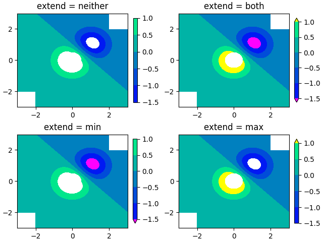
扩展设置
说明所有4种可能的"extend"设置:
extends = ["neither", "both", "min", "max"]
cmap = plt.colormaps["winter"].with_extremes(under="magenta", over="yellow")
# Note: contouring simply excludes masked or nan regions, so
# instead of using the "bad" colormap value for them, it draws
# nothing at all in them.  Therefore, the following would have
# no effect:
# cmap.set_bad("red")fig, axs = plt.subplots(2, 2, layout="constrained")for ax, extend in zip(axs.flat, extends):cs = ax.contourf(X, Y, Z, levels, cmap=cmap, extend=extend)fig.colorbar(cs, ax=ax, shrink=0.9)ax.set_title("extend = %s" % extend)ax.locator_params(nbins=4)plt.show()
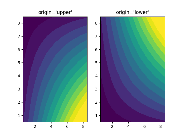
使用origin关键字定向等高线图
这段代码演示了如何通过"origin"关键字来定向等高线图数据
x= np.arange(1, 10)
y= x.reshape(-1, 1)
h = x* yfig, (ax1, ax2) = plt.subplots(ncols=2)ax1.set_title("origin='upper'")
ax2.set_title("origin='lower'")
ax1.contourf(h, levels=np.arange(5, 70, 5), extend='both', origin="upper")
ax2.contourf(h, levels=np.arange(5, 70, 5), extend='both', origin="lower")plt.show()
参考内容
本示例展示了以下函数、方法、类和模块的使用:
matplotlib.axes.Axes.contour/matplotlib.pyplot.contour
-
matplotlib.axes.Axes.contourf/matplotlib.pyplot.contourf -
matplotlib.axes.Axes.clabel/matplotlib.pyplot.clabel -
matplotlib.figure.Figure.colorbar/matplotlib.pyplot.colorbar -
matplotlib.colors.Colormap -
matplotlib.colors.Colormap.set_bad -
matplotlib.colors.Colormap.set_under -
matplotlib.colors.Colormap.set_over
脚本总运行时间: (0 分 6.008 秒)
下载 Jupyter notebook: contourf_demo.ipynb下载 Python 源代码: contourf_demo.py下载压缩包: contourf_demo.zip
画廊由 Sphinx-Gallery 生成
等高线填充图案
https://matplotlib.org/stable/gallery/images_contours_and_fields/contourf_hatching.html
演示带填充图案的等高线图绘制。
import matplotlib.pyplot as plt
import numpy as np# invent some numbers, turning the x and y arrays into simple
# 2d arrays, which make combining them together easier.
x= np.linspace(-3, 5, 150).reshape(1, -1)
y= np.linspace(-3, 5, 120).reshape(-1, 1)
z = np.cos(x) + np.sin(y)# we no longer need x and y to be 2 dimensional, so flatten them.
x, y= x.flatten(), y.flatten()
Plot 1:带颜色条的最简单阴影图
fig1, ax1 = plt.subplots()
cs = ax1.contourf(x, y, z, hatches=['-', '/', '\\', '//'],cmap='gray', extend='both', alpha=0.5)
fig1.colorbar(cs)
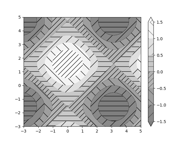 图2:展示无颜色填充的阴影线图例
fig2, ax2 = plt.subplots()
n_levels = 6
ax2.contour(x, y, z, n_levels, colors='black', linestyles='-')
cs = ax2.contourf(x, y, z, n_levels, colors='none',hatches=['.', '/', '\\', None, '\\\\', '*'],extend='lower')# create a legend for the contour set
artists, labels = cs.legend_elements(str_format='{:2.1f}'.format)
ax2.legend(artists, labels, handleheight=2, framealpha=1)
plt.show()
参考内容
本示例展示了以下函数、方法、类和模块的使用:
matplotlib.axes.Axes.contour/matplotlib.pyplot.contour
-
matplotlib.axes.Axes.contourf/matplotlib.pyplot.contourf -
matplotlib.figure.Figure.colorbar/matplotlib.pyplot.colorbar -
matplotlib.axes.Axes.legend/matplotlib.pyplot.legend -
matplotlib.contour.ContourSet -
matplotlib.contour.ContourSet.legend_elements
脚本总运行时间: (0 分 2.245 秒)
下载Jupyter笔记本: contourf_hatching.ipynb下载Python源代码: contourf_hatching.py下载压缩包: contourf_hatching.zip
画廊由Sphinx-Gallery生成
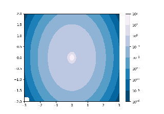
等高线填充与对数颜色标度
https://matplotlib.org/stable/gallery/images_contours_and_fields/contourf_log.html
展示在等高线填充图中使用对数颜色标度的应用
import matplotlib.pyplot as plt
import numpy as np
from numpy import mafrom matplotlib import cm, tickerN = 100
x= np.linspace(-3.0, 3.0, N)
y= np.linspace(-2.0, 2.0, N)X, Y = np.meshgrid(x, y)# A low hump with a spike coming out.
# Needs to have z/colour axis on a log scale, so we see both hump and spike.
# A linear scale only shows the spike.
Z1 = np.exp(-X**2 - Y**2)
Z2 = np.exp(-(x* 10)**2 - (Y * 10)**2)
z = Z1 + 50 * Z2# Put in some negative values (lower left corner) to cause trouble with logs:
z[:5, :5] = -1# The following is not strictly essential, but it will eliminate
# a warning.  Comment it out to see the warning.
z = ma.masked_where(z <= 0, z)# Automatic selection of levels works; setting the # log locator tells contourf to use a log scale:
fig, ax = plt.subplots()
cs = ax.contourf(X, Y, z, locator=ticker.LogLocator(), cmap=cm.PuBu_r)# Alternatively, you can manually set the levels
# and the norm:
# lev_exp = np.arange(np.floor(np.log10(z.min())-1),
#                    np.ceil(np.log10(z.max())+1))
# levs = np.power(10, lev_exp)
# cs = ax.contourf(X, Y, z, levs, norm=colors.LogNorm())cbar = fig.colorbar(cs)plt.show()
参考内容
本示例展示了以下函数、方法、类和模块的使用:
matplotlib.axes.Axes.contourf/matplotlib.pyplot.contourf
-
matplotlib.figure.Figure.colorbar/matplotlib.pyplot.colorbar -
matplotlib.axes.Axes.legend/matplotlib.pyplot.legend -
matplotlib.ticker.LogLocator
脚本总运行时间: (0 分 1.391 秒)
下载 Jupyter notebook: contourf_log.ipynb下载 Python 源代码: contourf_log.py下载压缩包: contourf_log.zip
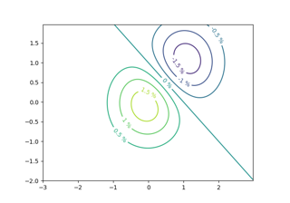
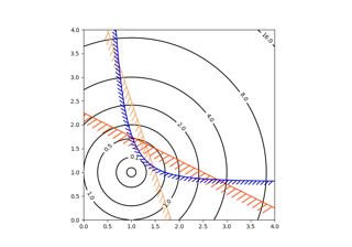
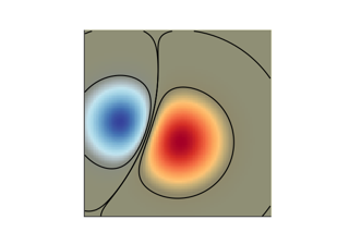
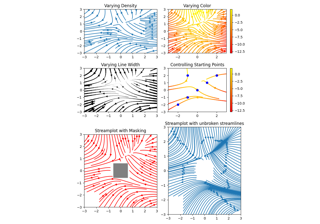
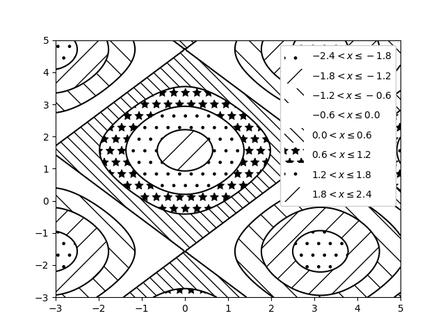
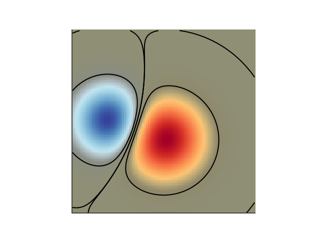
优化问题解空间的等高线绘制
https://matplotlib.org/stable/gallery/images_contours_and_fields/contours_in_optimization_demo.html
在展示优化问题的解空间时,等高线图尤为实用。不仅可以通过 axes.Axes.contour 来呈现目标函数的地形特征,还能用它生成约束函数的边界曲线。使用 TickedStroke 绘制约束线时,可以清晰区分约束边界有效与无效的两侧。
axes.Axes.contour 生成的曲线遵循左侧数值更大的原则。角度参数以正前方为零基准,向左递增。因此,在典型优化问题中使用 TickedStroke 标注约束时,建议将角度设置在0到180度之间。
import matplotlib.pyplot as plt
import numpy as npfrom matplotlib import patheffectsfig, ax = plt.subplots(figsize=(6, 6))nx = 101
ny = 105# Set up survey vectors
xvec = np.linspace(0.001, 4.0, nx)
yvec = np.linspace(0.001, 4.0, ny)# Set up survey matrices.  Design disk loading and gear ratio.
x1, x2 = np.meshgrid(xvec, yvec)# Evaluate some stuff to plot
obj = x1**2 + x2**2 - 2*x1 - 2*x2 + 2
g1 = -(3*x1 + x2 - 5.5)
g2 = -(x1 + 2*x2 - 4.5)
g3 = 0.8 + x1**-3 - x2cntr = ax.contour(x1, x2, obj, [0.01, 0.1, 0.5, 1, 2, 4, 8, 16],colors='black')
ax.clabel(cntr, fmt="%2.1f", use_clabeltext=True)cg1 = ax.contour(x1, x2, g1, [0], colors='sandybrown')
cg1.set(path_effects=[patheffects.withTickedStroke(angle=135)])cg2 = ax.contour(x1, x2, g2, [0], colors='orangered')
cg2.set(path_effects=[patheffects.withTickedStroke(angle=60, length=2)])cg3 = ax.contour(x1, x2, g3, [0], colors='mediumblue')
cg3.set(path_effects=[patheffects.withTickedStroke(spacing=7)])ax.set_xlim(0, 4)
ax.set_ylim(0, 4)plt.show()
脚本总运行时间: (0 分钟 1.221 秒)
下载 Jupyter 笔记本: contours_in_optimization_demo.ipynb下载 Python 源代码: contours_in_optimization_demo.py下载压缩包: contours_in_optimization_demo.zip
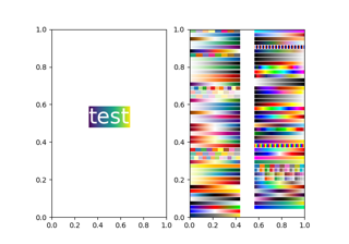
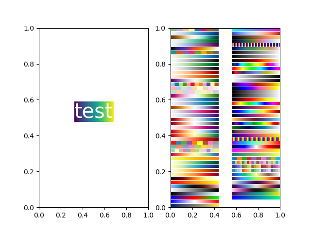
BboxImage 演示
https://matplotlib.org/stable/gallery/images_contours_and_fields/demo_bboximage.html
BboxImage 可用于根据边界框定位图像。本演示展示了如何在 text.Text 的边界框内显示图像,以及如何手动为图像创建边界框。
import matplotlib.pyplot as plt
import numpy as npfrom matplotlib.image import BboxImage
from matplotlib.transforms import Bbox, TransformedBboxfig, (ax1, ax2) = plt.subplots(ncols=2)# ----------------------------
# Create a BboxImage with Text
# ----------------------------
txt = ax1.text(0.5, 0.5, "test", size=30, ha="center", color="w")
ax1.add_artist(BboxImage(txt.get_window_extent, data=np.arange(256).reshape((1, -1))))# ------------------------------------
# Create a BboxImage for each colormap
# ------------------------------------
# List of all colormaps; skip reversed colormaps.
cmap_names = sorted(m for m in plt.colormaps if not m.endswith("_r"))ncol = 2
nrow = len(cmap_names) // ncol + 1xpad_fraction = 0.3
dx = 1 / (ncol + xpad_fraction * (ncol - 1))ypad_fraction = 0.3
dy = 1 / (nrow + ypad_fraction * (nrow - 1))for i, cmap_name in enumerate(cmap_names):ix, iy = divmod(i, nrow)bbox0 = Bbox.from_bounds(ix*dx*(1+xpad_fraction),1 - iy*dy*(1+ypad_fraction) - dy,dx, dy)bbox = TransformedBbox(bbox0, ax2.transAxes)ax2.add_artist(BboxImage(bbox, cmap=cmap_name, data=np.arange(256).reshape((1, -1))))plt.show()
参考内容
本示例展示了以下函数、方法、类和模块的使用:
matplotlib.image.BboxImagematplotlib.transforms.Bboxmatplotlib.transforms.TransformedBboxmatplotlib.text.Text
脚本总运行时间: (0 分钟 1.194 秒)
下载 Jupyter notebook: demo_bboximage.ipynb下载 Python 源代码: demo_bboximage.py下载压缩包: demo_bboximage.zip
Figimage 演示
https://matplotlib.org/stable/gallery/images_contours_and_fields/figimage_demo.html
本示例展示了如何直接在图形中放置图像,而无需使用 Axes 对象。
import matplotlib.pyplot as plt
import numpy as npfig = plt.figure()
Z = np.arange(10000).reshape((100, 100))
Z[:, 50:] = 1im1 = fig.figimage(Z, xo=50, yo=0, origin='lower')
im2 = fig.figimage(Z, xo=100, yo=100, alpha=.8, origin='lower')plt.show()

参考内容
本示例演示了以下函数、方法、类和模块的使用:
matplotlib.figure.Figure
matplotlib.figure.Figure.figimage/matplotlib.pyplot.figimage
下载Jupyter笔记本: figimage_demo.ipynb下载Python源代码: figimage_demo.py下载压缩包: figimage_demo.zip
图库由Sphinx-Gallery生成
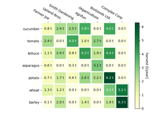
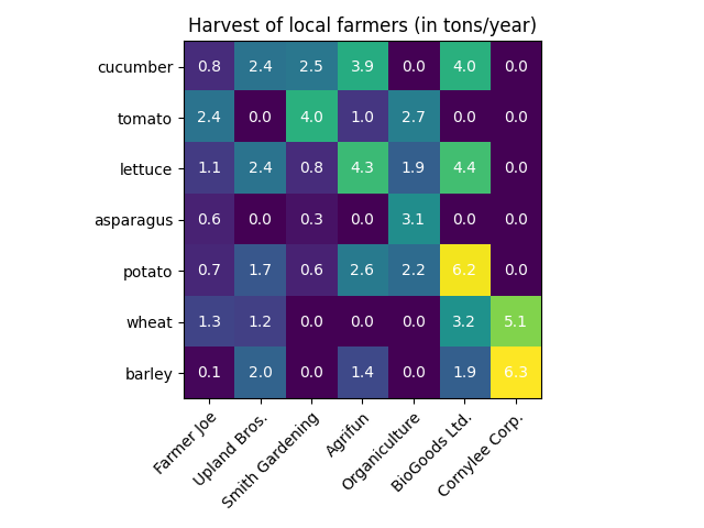
带注释的热力图
https://matplotlib.org/stable/gallery/images_contours_and_fields/image_annotated_heatmap.html
我们经常需要将依赖于两个独立变量的数据以彩色编码的图像形式展示,这种图表通常被称为热力图。如果数据是分类性质的,则可以称为分类热力图。
Matplotlib的imshow函数使得生成此类图表变得特别简单。
以下示例展示了如何创建带注释的热力图。我们将从一个简单示例开始,逐步扩展成一个通用的函数实现。
简单分类热力图
我们可以从定义一些数据开始。需要一个二维列表或数组来定义需要颜色编码的数据。同时还需要两个分类列表或数组,这些列表中的元素数量必须与数据在相应轴上的维度匹配。
热力图本身是一个 imshow 绘图,其标签设置为我们的分类。需要注意的是,必须同时设置刻度位置 (set_xticks) 和刻度标签 (set_xticklabels),否则它们会不同步。刻度位置只是递增的整数,而刻度标签则是要显示的文本。
最后,我们可以通过在每个单元格内创建 Text 来标注数据本身,显示该单元格的值。
import matplotlib.pyplot as plt
import numpy as npimport matplotlib
import matplotlib as mplvegetables = ["cucumber", "tomato", "lettuce", "asparagus","potato", "wheat", "barley"]
farmers = ["Farmer Joe", "Upland Bros.", "Smith Gardening","Agrifun", "Organiculture", "BioGoods Ltd.", "Cornylee Corp."]harvest = np.array([[0.8, 2.4, 2.5, 3.9, 0.0, 4.0, 0.0],[2.4, 0.0, 4.0, 1.0, 2.7, 0.0, 0.0],[1.1, 2.4, 0.8, 4.3, 1.9, 4.4, 0.0],[0.6, 0.0, 0.3, 0.0, 3.1, 0.0, 0.0],[0.7, 1.7, 0.6, 2.6, 2.2, 6.2, 0.0],[1.3, 1.2, 0.0, 0.0, 0.0, 3.2, 5.1],[0.1, 2.0, 0.0, 1.4, 0.0, 1.9, 6.3]])fig, ax = plt.subplots()
im = ax.imshow(harvest)# Show all ticks and label them with the respective list entries
ax.set_xticks(range(len(farmers)), labels=farmers,rotation=45, ha="right", rotation_mode="anchor")
ax.set_yticks(range(len(vegetables)), labels=vegetables)# Loop over data dimensions and create text annotations.
for i in range(len(vegetables)):for j in range(len(farmers)):text = ax.text(j, i, harvest[i, j],ha="center", va="center", color="w")ax.set_title("Harvest of local farmers (in tons/year)")
fig.tight_layout()
plt.show()
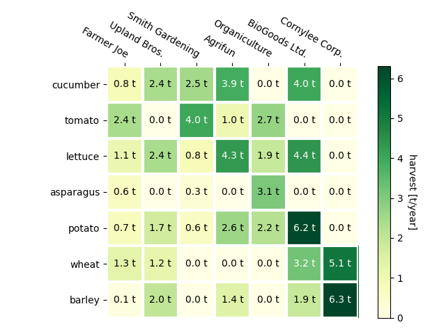
使用辅助函数的代码风格
如编码风格所述,开发者可能希望复用此类代码来为不同输入数据和/或不同坐标轴创建热力图。我们创建一个函数,该函数接收数据和行列标签作为输入,并允许通过参数来自定义绘图。
除了上述功能外,我们还希望添加颜色条,并将标签位置从热力图下方调整至上方。根据设定的阈值,注释文本将采用不同颜色以确保与热力图像素的对比度。最后,我们关闭外围坐标轴线,并创建白色网格线来分隔单元格。
def heatmap(data, row_labels, col_labels, ax=None,cbar_kw=None, cbarlabel="", **kwargs):"""Create a heatmap from a numpy array and two lists of labels.Parameters----------dataA 2D numpy array of shape (M, N).row_labelsA list or array of length M with the labels for the rows.col_labelsA list or array of length N with the labels for the columns.axA `matplotlib.axes.Axes` instance to which the heatmap is plotted. Ifnot provided, use current Axes or create a new one. Optional.cbar_kwA dictionary with arguments to `matplotlib.Figure.colorbar`. Optional.cbarlabelThe label for the colorbar. Optional.**kwargsAll other arguments are forwarded to `imshow`."""if ax is None:ax = plt.gca()if cbar_kw is None:cbar_kw = {}# Plot the heatmapim = ax.imshow(data, **kwargs)# Create colorbarcbar = ax.figure.colorbar(im, ax=ax, **cbar_kw)cbar.ax.set_ylabel(cbarlabel, rotation=-90, va="bottom")# Show all ticks and label them with the respective list entries.ax.set_xticks(range(data.shape[1]), labels=col_labels,rotation=-30, ha="right", rotation_mode="anchor")ax.set_yticks(range(data.shape[0]), labels=row_labels)# Let the horizontal axes labeling appear on top.ax.tick_params(top=True, bottom=False,labeltop=True, labelbottom=False)# Turn spines off and create white grid.ax.spines[:].set_visible(False)ax.set_xticks(np.arange(data.shape[1]+1)-.5, minor=True)ax.set_yticks(np.arange(data.shape[0]+1)-.5, minor=True)ax.grid(which="minor", color="w", linestyle='-', linewidth=3)ax.tick_params(which="minor", bottom=False, left=False)return im, cbardef annotate_heatmap(im, data=None, valfmt="{x:.2f}",textcolors=("black", "white"),threshold=None, **textkw):"""A function to annotate a heatmap.Parameters----------imThe AxesImage to be labeled.dataData used to annotate. If None, the image's data is used. Optional.valfmtThe format of the annotations inside the heatmap. This should eitheruse the string format method, e.g. "$ {x:.2f}", or be a`matplotlib.ticker.Formatter`. Optional.textcolorsA pair of colors. The first is used for values below a threshold,the second for those above. Optional.thresholdValue in data units according to which the colors from textcolors areapplied. If None (the default) uses the middle of the colormap asseparation. Optional.**kwargsAll other arguments are forwarded to each call to `text` used to createthe text labels."""if not isinstance(data, (list, np.ndarray)):data = im.get_array()# Normalize the threshold to the images color range.if threshold is not None:threshold = im.norm(threshold)else:threshold = im.norm(data.max())/2.# Set default alignment to center, but allow it to be# overwritten by textkw.kw = dict(horizontalalignment="center",verticalalignment="center")kw.update(textkw)# Get the formatter in case a string is suppliedif isinstance(valfmt, str):valfmt = matplotlib.ticker.StrMethodFormatter(valfmt)# Loop over the data and create a `Text` for each "pixel".# Change the text's color depending on the data.texts = []for i in range(data.shape[0]):for j in range(data.shape[1]):kw.update(color=textcolors[int(im.norm(data[i, j]) > threshold)])text = im.axes.text(j, i, valfmt(data[i, j], None), **kw)texts.append(text)return texts现在我们可以让实际的绘图创建过程保持非常简洁。
fig, ax = plt.subplots()im, cbar = heatmap(harvest, vegetables, farmers, ax=ax,cmap="YlGn", cbarlabel="harvest [t/year]")
texts = annotate_heatmap(im, valfmt="{x:.1f} t")fig.tight_layout()
plt.show()
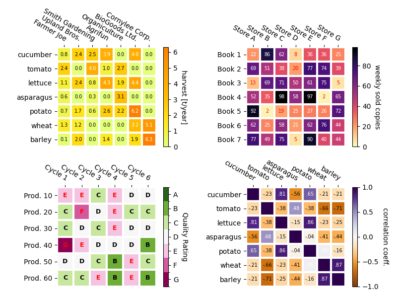
更复杂的热图示例
接下来我们将通过在不同场景下应用之前创建的函数,并采用不同参数,来展示这些函数的多样性。
np.random.seed(19680801)fig, ((ax, ax2), (ax3, ax4)) = plt.subplots(2, 2, figsize=(8, 6))# Replicate the above example with a different font size and colormap.im, _ = heatmap(harvest, vegetables, farmers, ax=ax,cmap="Wistia", cbarlabel="harvest [t/year]")
annotate_heatmap(im, valfmt="{x:.1f}", size=7)# Create some new data, give further arguments to imshow (vmin),
# use an integer format on the annotations and provide some colors.data = np.random.randint(2, 100, size=(7, 7))
y = [f"Book {i}" for i in range(1, 8)]
x = [f"Store {i}" for i in list("ABCDEFG")]
im, _ = heatmap(data, y, x, ax=ax2, vmin=0,cmap="magma_r", cbarlabel="weekly sold copies")
annotate_heatmap(im, valfmt="{x:d}", size=7, threshold=20,textcolors=("red", "white"))# Sometimes even the data itself is categorical. Here we use a
# `matplotlib.colors.BoundaryNorm` to get the data into classes
# and use this to colorize the plot, but also to obtain the class
# labels from an array of classes.data = np.random.randn(6, 6)
y = [f"Prod. {i}" for i in range(10, 70, 10)]
x = [f"Cycle {i}" for i in range(1, 7)]qrates = list("ABCDEFG")
norm = matplotlib.colors.BoundaryNorm(np.linspace(-3.5, 3.5, 8), 7)
fmt = matplotlib.ticker.FuncFormatter(lambda x, pos: qrates[::-1][norm(x)])im, _ = heatmap(data, y, x, ax=ax3,cmap=mpl.colormaps["PiYG"].resampled(7), norm=norm,cbar_kw=dict(ticks=np.arange(-3, 4), format=fmt),cbarlabel="Quality Rating")annotate_heatmap(im, valfmt=fmt, size=9, fontweight="bold", threshold=-1,textcolors=("red", "black"))# We can nicely plot a correlation matrix. Since this is bound by -1 and 1,
# we use those as vmin and vmax. We may also remove leading zeros and hide
# the diagonal elements (which are all 1) by using a
# `matplotlib.ticker.FuncFormatter`.corr_matrix = np.corrcoef(harvest)
im, _ = heatmap(corr_matrix, vegetables, vegetables, ax=ax4,cmap="PuOr", vmin=-1, vmax=1,cbarlabel="correlation coeff.")def func(x, pos):return f"{x:.2f}".replace("0.", ".").replace("1.00", "")annotate_heatmap(im, valfmt=matplotlib.ticker.FuncFormatter(func), size=7)plt.tight_layout()
plt.show()
参考内容
本示例展示了以下函数、方法、类和模块的使用:
matplotlib.axes.Axes.imshow/matplotlib.pyplot.imshowmatplotlib.figure.Figure.colorbar/matplotlib.pyplot.colorbar
脚本总运行时间: (0 分 6.018 秒)
下载 Jupyter notebook: image_annotated_heatmap.ipynb下载 Python 源代码: image_annotated_heatmap.py下载压缩包: image_annotated_heatmap.zip
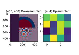
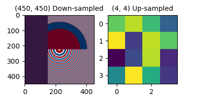
图像重采样
https://matplotlib.org/stable/gallery/images_contours_and_fields/image_antialiasing.html
图像由离散像素点构成,这些像素被赋予颜色值,无论是在屏幕上还是图像文件中。当用户调用 imshow 并传入数据数组时,数据数组的尺寸很少会恰好匹配图中分配给图像的像素数量,因此 Matplotlib 会对数据或图像进行重采样或缩放以适应显示。如果数据数组大于渲染图中分配的像素数量,图像将被"下采样",导致图像信息丢失。反之,如果数据数组小于输出像素数量,每个数据点将对应多个像素,此时图像被"上采样"。
在下图中,第一个数据数组的尺寸为 (450, 450),但图中显示的像素数量远少于该尺寸,因此进行了下采样。第二个数据数组的尺寸为 (4, 4),但显示的像素数量远多于该尺寸,因此进行了上采样。
import matplotlib.pyplot as plt
import numpy as npfig, axs = plt.subplots(1, 2, figsize=(4, 2))# First we generate a 450x450 pixel image with varying frequency content:
N = 450
x= np.arange(N) / N - 0.5
y= np.arange(N) / N - 0.5
aa = np.ones((N, N))
aa[::2, :] = -1X, Y = np.meshgrid(x, y)
R = np.sqrt(X**2 + Y**2)
f0 = 5
k = 100
a = np.sin(np.pi * 2 * (f0 * R + k * R**2 / 2))
# make the left hand side of this
a[:int(N / 2), :][R[:int(N / 2), :] < 0.4] = -1
a[:int(N / 2), :][R[:int(N / 2), :] < 0.3] = 1
aa[:, int(N / 3):] = a[:, int(N / 3):]
alarge = aaaxs[0].imshow(alarge, cmap='RdBu_r')
axs[0].set_title('(450, 450) Down-sampled', fontsize='medium')np.random.seed(19680801+9)
asmall = np.random.rand(4, 4)
axs[1].imshow(asmall, cmap='viridis')
axs[1].set_title('(4, 4) Up-sampled', fontsize='medium')
 Matplotlib的
imshow方法提供了两个关键字参数来控制重采样方式:
interpolation参数用于选择重采样核函数,在降采样时支持抗锯齿滤波处理,在升采样时则用于像素平滑处理。而interpolation_stage参数则决定这个平滑核是应用于原始数据还是RGBA像素。
interpolation_stage='rgba'的处理流程:数据 -> 标准化 -> RGBA转换 -> 插值/重采样
interpolation_stage='data'的处理流程:数据 -> 插值/重采样 -> 标准化 -> RGBA转换
对于这两个参数,Matplotlib默认采用"antialiased"模式,该模式适用于大多数场景(具体行为将在下文说明)。需要注意的是,这个默认模式会根据图像进行降采样或升采样自动调整处理方式,详细说明见下文。
降采样与适度上采样
在进行数据降采样时,通常需要先平滑图像以消除锯齿效应,然后再进行子采样。在 Matplotlib 中,我们有两种平滑处理方式:一种是在将数据映射为颜色之前进行平滑,另一种是直接对 RGB(A) 图像像素进行平滑。这两种方式的差异如下所示,可通过 interpolation_stage 关键字参数进行控制。
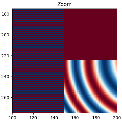
以下图像是从 450 个数据像素降采样至约 125 像素或 250 像素(具体取决于显示设备)。原始图像左侧由交替的 +1 和 -1 条纹构成,其余部分则是波长渐变的(线性调频)图案。如果进行放大操作,我们无需任何降采样就能观察到这些细节:
fig, ax = plt.subplots(figsize=(4, 4), layout='compressed')
ax.imshow(alarge, interpolation='nearest', cmap='RdBu_r')
ax.set_xlim(100, 200)
ax.set_ylim(275, 175)
ax.set_title('Zoom')
 如果进行下采样,最简单的算法是使用最近邻插值对数据进行抽取。我们可以在数据空间或RGBA空间中进行这一操作。
fig, axs = plt.subplots(1, 2, figsize=(5, 2.7), layout='compressed')
for ax, interp, space in zip(axs.flat, ['nearest', 'nearest'],['data', 'rgba']):ax.imshow(alarge, interpolation=interp, interpolation_stage=space,cmap='RdBu_r')ax.set_title(f"interpolation='{interp}'\nstage='{space}'")
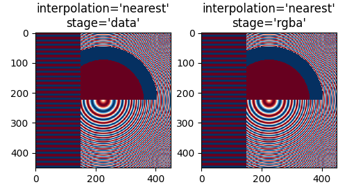 最近邻插值在数据空间和RGBA空间中表现相同,两者都会出现
Moiré波纹图案,这是因为高频数据被降采样后表现为低频
图案。我们可以在渲染前对图像应用抗锯齿滤镜来减少这些波纹图案:
fig, axs = plt.subplots(1, 2, figsize=(5, 2.7), layout='compressed')
for ax, interp, space in zip(axs.flat, ['hanning', 'hanning'],['data', 'rgba']):ax.imshow(alarge, interpolation=interp, interpolation_stage=space,cmap='RdBu_r')ax.set_title(f"interpolation='{interp}'\nstage='{space}'")
plt.show()
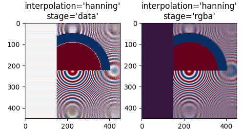 汉宁滤波器通过平滑原始数据,使每个新像素成为原始像素的加权平均值,从而显著减少了莫尔条纹。
但当interpolation_stage设为’data’时,会在图像中引入原始数据中不存在的白色区域——既出现在图像左侧的交替条纹中,也出现在中间大圆红蓝交界处。
在’rgba’阶段进行插值会产生另一种伪影:交替条纹呈现紫色调。尽管原色板中不含紫色,但当蓝色和红色条纹紧密相邻时,人眼会感知到这种混合色。
interpolation参数的默认值为’auto’,当图像缩放倍数小于3倍时,会自动选择汉宁滤波器。interpolation_stage参数同样默认为’auto’,对于缩放倍数小于3倍的图像,默认采用’rgba’插值。
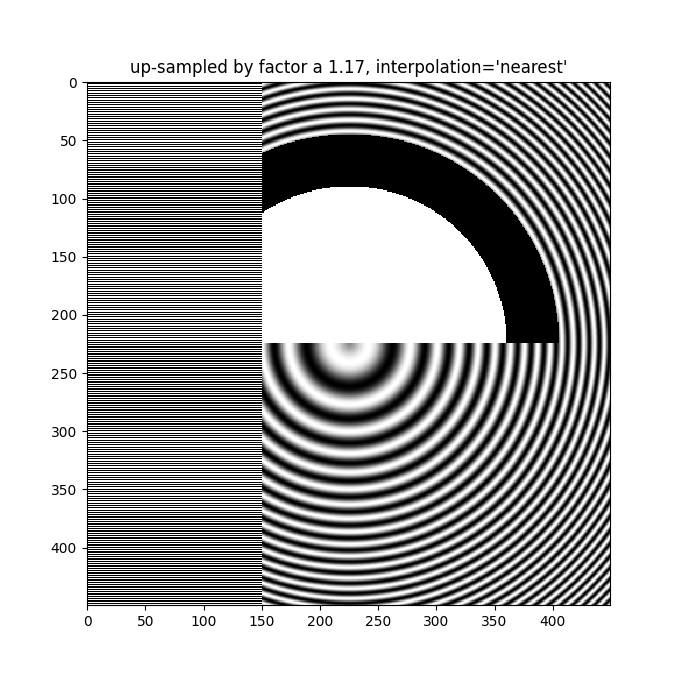
即便在图像放大时也需要抗锯齿滤波。下图将450个数据像素放大为530个渲染像素,可以看到网格状的线条伪影——这些因需要补充额外像素而产生的伪影,在’nearest’插值模式下会复制相邻像素行的特性,导致局部图像拉伸变形。
fig, ax = plt.subplots(figsize=(6.8, 6.8))
ax.imshow(alarge, interpolation='nearest', cmap='grey')
ax.set_title("up-sampled by factor a 1.17, interpolation='nearest'")
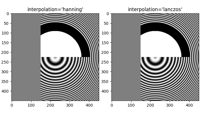
 更好的抗锯齿算法可以减少这种影响:
fig, ax = plt.subplots(figsize=(6.8, 6.8))
ax.imshow(alarge, interpolation='auto', cmap='grey')
ax.set_title("up-sampled by factor a 1.17, interpolation='auto'")
!$1支持多种不同的插值算法,这些算法的效果取决于底层数据,可能表现更好或更差。
fig, axs = plt.subplots(1, 2, figsize=(7, 4), layout='constrained')
for ax, interp in zip(axs, ['hanning', 'lanczos']):ax.imshow(alarge, interpolation=interp, cmap='gray')ax.set_title(f"interpolation='{interp}'")
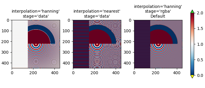
 最后一个示例展示了在使用非平凡插值核时,在RGBA阶段执行抗锯齿处理的必要性。在以下情况中:
上方100行的数据精确为0.0,而内部圆形区域的数据精确为2.0。如果我们在"数据"空间执行interpolation_stage并采用抗锯齿滤波器(第一幅图),浮点精度问题会导致部分数据值略低于零或略高于2.0,从而被分配为欠饱和或过饱和颜色。若不使用抗锯齿滤波器(将interpolation设为’nearest’)可以避免此问题,但这会使数据部分更容易出现莫尔条纹(第二幅图)。因此,对于大多数下采样场景,我们推荐默认采用’hanning’/‘auto’的interpolation参数,以及’rgba’/'auto’的interpolation_stage参数(最后一幅图)。
a = alarge + 1
cmap = plt.get_cmap('RdBu_r')
cmap.set_under('yellow')
cmap.set_over('limegreen')fig, axs = plt.subplots(1, 3, figsize=(7, 3), layout='constrained')
for ax, interp, space in zip(axs.flat,['hanning', 'nearest', 'hanning', ],['data', 'data', 'rgba']):im = ax.imshow(a, interpolation=interp, interpolation_stage=space,cmap=cmap, vmin=0, vmax=2)title = f"interpolation='{interp}'\nstage='{space}'"if ax == axs[2]:title += '\nDefault'ax.set_title(title, fontsize='medium')
fig.colorbar(im, ax=axs, extend='both', shrink=0.8)
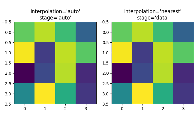
上采样
如果我们进行上采样操作,就可以用多个图像或屏幕像素来表示一个数据像素。在下面的示例中,我们对小型数据矩阵进行了高度过采样处理。
np.random.seed(19680801+9)
a = np.random.rand(4, 4)fig, axs = plt.subplots(1, 2, figsize=(6.5, 4), layout='compressed')
axs[0].imshow(asmall, cmap='viridis')
axs[0].set_title("interpolation='auto'\nstage='auto'")
axs[1].imshow(asmall, cmap='viridis', interpolation="nearest",interpolation_stage="data")
axs[1].set_title("interpolation='nearest'\nstage='data'")
plt.show()
 interpolation 关键字参数可用于在需要时平滑像素。
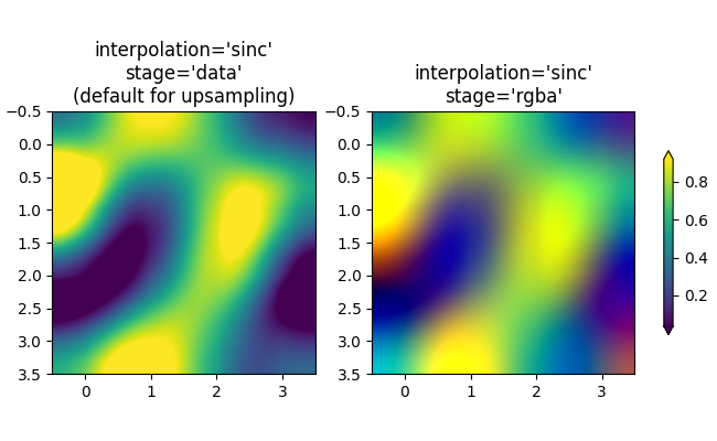
不过,这通常更适合在数据空间而非RGBA空间中进行处理,因为在RGBA空间中,滤波器可能导致插值结果出现色图中不存在的颜色。在以下示例中可以看到,当插值设置为’rgba’时会出现红色伪影。因此,interpolation_stage参数的默认值’auto’会在上采样超过三倍时自动采用与’data’相同的处理方式。
fig, axs = plt.subplots(1, 2, figsize=(6.5, 4), layout='compressed')
im = axs[0].imshow(a, cmap='viridis', interpolation='sinc', interpolation_stage='data')
axs[0].set_title("interpolation='sinc'\nstage='data'\n(default for upsampling)")
axs[1].imshow(a, cmap='viridis', interpolation='sinc', interpolation_stage='rgba')
axs[1].set_title("interpolation='sinc'\nstage='rgba'")
fig.colorbar(im, ax=axs, shrink=0.7, extend='both')
避免重采样
在生成图像时,可以避免对数据进行重采样。一种方法是直接保存到矢量后端(pdf、eps、svg)并使用interpolation='none'。矢量后端允许嵌入图像,但需注意某些矢量图像查看器可能会平滑图像像素。
第二种方法是使坐标轴尺寸与数据尺寸完全匹配。下图精确为2英寸×2英寸,当dpi设为200时,400×400的数据完全不会被重采样。如果下载此图像并在图片查看器中放大,您应能看到左侧的独立条纹(请注意,若您的屏幕非HiDPI或"Retina"屏,HTML可能会提供100×100版本的图像,此时将被下采样。)
fig = plt.figure(figsize=(2, 2))
ax = fig.add_axes([0, 0, 1, 1])
ax.imshow(aa[:400, :400], cmap='RdBu_r', interpolation='nearest')
plt.show()

参考内容
本示例展示了以下函数、方法、类和模块的使用:
matplotlib.axes.Axes.imshow
脚本总运行时间: (0 分钟 10.892 秒)
下载 Jupyter notebook: image_antialiasing.ipynb下载 Python 源代码: image_antialiasing.py下载压缩包: image_antialiasing.zip
使用补丁裁剪图像
https://matplotlib.org/stable/gallery/images_contours_and_fields/image_clip_path.html
演示通过圆形补丁裁剪图像的示例。
import matplotlib.pyplot as pltimport matplotlib.cbook as cbook
import matplotlib.patches as patcheswith cbook.get_sample_data('grace_hopper.jpg') as image_file:image = plt.imread(image_file)fig, ax = plt.subplots()
im = ax.imshow(image)
patch = patches.Circle((260, 200), radius=200, transform=ax.transData)
im.set_clip_path(patch)ax.axis('off')
plt.show()

参考内容
本示例展示了以下函数、方法、类和模块的使用:
matplotlib.axes.Axes.imshow/matplotlib.pyplot.imshow
matplotlib.artist.Artist.set_clip_path
下载Jupyter笔记本: image_clip_path.ipynb
下载Python源代码: image_clip_path.py
下载压缩包: image_clip_path.zip
图库由Sphinx-Gallery生成
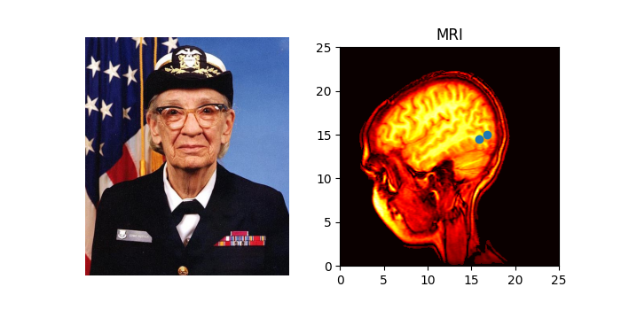
多种绘制图像的方法
https://matplotlib.org/stable/gallery/images_contours_and_fields/image_demo.html
在Matplotlib中绘制图像最常用的方法是使用 imshow。以下示例展示了imshow的大部分功能以及您可以创建的多种图像类型。
import matplotlib.pyplot as plt
import numpy as npimport matplotlib.cbook as cbook
import matplotlib.cm as cm
from matplotlib.patches import PathPatch
from matplotlib.path import Path# Fixing random state for reproducibility
np.random.seed(19680801)
首先,我们将生成一个简单的二元正态分布。
delta = 0.025
x= y= np.arange(-3.0, 3.0, delta)
X, Y = np.meshgrid(x, y)
Z1 = np.exp(-X**2 - Y**2)
Z2 = np.exp(-(x- 1)**2 - (Y - 1)**2)
Z = (Z1 - Z2) * 2fig, ax = plt.subplots()
im = ax.imshow(Z, interpolation='bilinear', cmap=cm.RdYlGn,origin='lower', extent=[-3, 3, -3, 3],vmax=abs(Z).max(), vmin=-abs(Z).max())plt.show()
 同样可以展示图片图像。
# A sample image
with cbook.get_sample_data('grace_hopper.jpg') as image_file:image = plt.imread(image_file)# And another image, using 256x256 16-bit integers.
w, h = 256, 256
with cbook.get_sample_data('s1045.ima.gz') as datafile:s = datafile.read()
A = np.frombuffer(s, np.uint16).astype(float).reshape((w, h))
extent = (0, 25, 0, 25)fig, ax = plt.subplot_mosaic([['hopper', 'mri']
], figsize=(7, 3.5))ax['hopper'].imshow(image)
ax['hopper'].axis('off')  # clear x-axis and y-axisim = ax['mri'].imshow(A, cmap=plt.cm.hot, origin='upper', extent=extent)markers = [(15.9, 14.5), (16.8, 15)]
x, y= zip(*markers)
ax['mri'].plot(x, y, 'o')ax['mri'].set_title('MRI')plt.show()
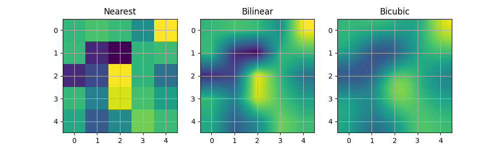
图像插值
在显示图像之前,还可以对其进行插值处理。但需注意,这可能会改变数据的呈现方式,不过有助于实现理想的视觉效果。下面我们将展示同一个(小型)数组,分别采用三种不同插值方法处理后的效果。
像素A[i, j]的中心点位于坐标(i+0.5, i+0.5)处。若使用interpolation='nearest',则(i, j)与(i+1, j+1)围成的区域将呈现相同颜色;若启用插值,像素中心点颜色仍与最近邻插值一致,但其他像素会在相邻像素间进行插值计算。
为防止插值时的边缘效应,Matplotlib会在输入数组边缘填充相同像素:例如对于一个5x5的数组(颜色标记为a-y,如下所示):
a b c d e
f g h i j
k l m n o
p q r s t
u v w xy
Matplotlib 在填充后的数组上计算插值和调整大小
a a b c d e e
a a b c d e e
f f g h i j j
k k l m n o o
p p q r s t t
o u v w xyy
o u v w xyy
然后提取结果的中心区域。(Matplotlib的极旧版本(<0.63)不会填充数组,而是通过调整视图范围来隐藏受影响的边缘区域。)
这种方法允许在不受边缘效应影响的情况下完整绘制数组,例如可以使用不同的插值方法将多个不同尺寸的图像叠加在一起——参见带Alpha混合的图层图像。不过这也意味着性能损耗,因为必须创建这个新的临时填充数组。
复杂的插值同样会导致性能下降;为了获得最佳性能或处理超大图像时,建议使用interpolation='nearest'。
A = np.random.rand(5, 5)fig, axs = plt.subplots(1, 3, figsize=(10, 3))
for ax, interp in zip(axs, ['nearest', 'bilinear', 'bicubic']):ax.imshow(A, interpolation=interp)ax.set_title(interp.capitalize())ax.grid(True)plt.show()
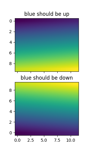
 您可以通过origin参数指定图像绘制时数组原点x[0, 0]位于左上角还是右下角。
您还可以在matplotlibrc配置文件中修改image.origin的默认设置。关于此主题的更多内容,请参阅原点与范围的完整指南。
x= np.arange(120).reshape((10, 12))interp = 'bilinear'
fig, axs = plt.subplots(nrows=2, sharex=True, figsize=(3, 5))
axs[0].set_title('blue should be up')
axs[0].imshow(x, origin='upper', interpolation=interp)axs[1].set_title('blue should be down')
axs[1].imshow(x, origin='lower', interpolation=interp)
plt.show()
 最后,我们将展示一张使用剪切路径的图像。
delta = 0.025
x= y= np.arange(-3.0, 3.0, delta)
X, Y = np.meshgrid(x, y)
Z1 = np.exp(-X**2 - Y**2)
Z2 = np.exp(-(x- 1)**2 - (Y - 1)**2)
Z = (Z1 - Z2) * 2path = Path([[0, 1], [1, 0], [0, -1], [-1, 0], [0, 1]])
patch = PathPatch(path, facecolor='none')fig, ax = plt.subplots()
ax.add_patch(patch)im = ax.imshow(Z, interpolation='bilinear', cmap=cm.gray,origin='lower', extent=[-3, 3, -3, 3],clip_path=patch, clip_on=True)
im.set_clip_path(patch)plt.show()
参考内容
本示例展示了以下函数、方法、类和模块的使用:
matplotlib.axes.Axes.imshow/matplotlib.pyplot.imshow
-
matplotlib.artist.Artist.set_clip_path -
matplotlib.patches.PathPatch
脚本总运行时间: (0 分钟 4.868 秒)
下载 Jupyter notebook: image_demo.ipynb下载 Python 源代码: image_demo.py下载压缩包: image_demo.zip
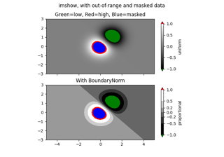
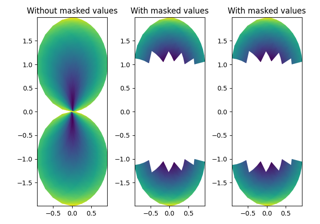
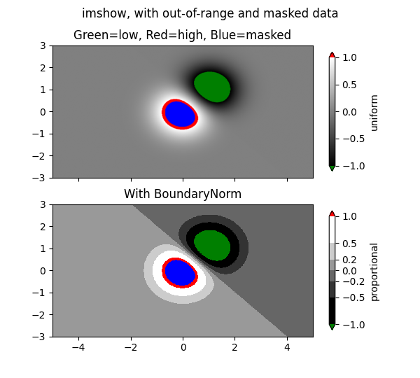
带掩码值的图像显示
https://matplotlib.org/stable/gallery/images_contours_and_fields/image_masked.html
使用掩码数组输入和超范围颜色的imshow示例。
第二个子图展示了如何利用BoundaryNorm实现填充等高线效果。
import matplotlib.pyplot as plt
import numpy as npimport matplotlib.colors as colors# compute some interesting data
x0, x1 = -5, 5
y0, y1 = -3, 3
x= np.linspace(x0, x1, 500)
y= np.linspace(y0, y1, 500)
X, Y = np.meshgrid(x, y)
Z1 = np.exp(-X**2 - Y**2)
Z2 = np.exp(-(x- 1)**2 - (Y - 1)**2)
Z = (Z1 - Z2) * 2# Set up a colormap:
palette = plt.cm.gray.with_extremes(over='r', under='g', bad='b')
# Alternatively, we could use
# palette.set_bad(alpha = 0.0)
# to make the bad region transparent.  This is the default.
# If you comment out all the palette.set* lines, you will see # all the defaults; under and over will be colored with the # first and last colors in the palette, respectively.
Zm = np.ma.masked_where(Z > 1.2, Z)# By setting vmin and vmax in the norm, we establish the # range to which the regular palette color scale is applied.
# Anything above that range is colored based on palette.set_over, etc.# set up the Axes objects
fig, (ax1, ax2) = plt.subplots(nrows=2, figsize=(6, 5.4))# plot using 'continuous' colormap
im = ax1.imshow(Zm, interpolation='bilinear',cmap=palette,norm=colors.Normalize(vmin=-1.0, vmax=1.0),aspect='auto',origin='lower',extent=[x0, x1, y0, y1])
ax1.set_title('Green=low, Red=high, Blue=masked')
cbar = fig.colorbar(im, extend='both', shrink=0.9, ax=ax1)
cbar.set_label('uniform')
ax1.tick_params(axis='x', labelbottom=False)# Plot using a small number of colors, with unevenly spaced boundaries.
im = ax2.imshow(Zm, interpolation='nearest',cmap=palette,norm=colors.BoundaryNorm([-1, -0.5, -0.2, 0, 0.2, 0.5, 1],ncolors=palette.N),aspect='auto',origin='lower',extent=[x0, x1, y0, y1])
ax2.set_title('With BoundaryNorm')
cbar = fig.colorbar(im, extend='both', spacing='proportional',shrink=0.9, ax=ax2)
cbar.set_label('proportional')fig.suptitle('imshow, with out-of-range and masked data')
plt.show()
参考内容
本示例演示了以下函数、方法、类和模块的用法:
matplotlib.axes.Axes.imshow/matplotlib.pyplot.imshow
-
matplotlib.figure.Figure.colorbar/matplotlib.pyplot.colorbar -
matplotlib.colors.BoundaryNorm -
matplotlib.colorbar.Colorbar.set_label
脚本总运行时间: (0 分钟 1.438 秒)
下载Jupyter笔记本: image_masked.ipynb下载Python源代码: image_masked.py下载压缩包: image_masked.zip
图库由Sphinx-Gallery生成
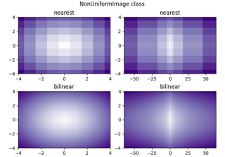
非均匀图像
https://matplotlib.org/stable/gallery/images_contours_and_fields/image_nonuniform.html
NonUniformImage 是一种在直线网格上定义像素的通用图像类型,即它允许每行每列具有独立的高度/宽度。
在 Axes 或 pyplot 上没有直接创建非均匀图像的高级绘图方法。您需要显式实例化该图像,并通过 Axes.add_image 将其添加到坐标轴中。

import matplotlib.pyplot as plt
import numpy as npfrom matplotlib import cm
from matplotlib.image import NonUniformImageinterp = 'nearest'# Linear x array for cell centers:
x= np.linspace(-4, 4, 9)# Highly nonlinear x array:
x2 = x**3y= np.linspace(-4, 4, 9)z = np.sqrt(x[np.newaxis, :]**2 + y[:, np.newaxis]**2)fig, axs = plt.subplots(nrows=2, ncols=2, layout='constrained')
fig.suptitle('NonUniformImage class', fontsize='large')
ax = axs[0, 0]
im = NonUniformImage(ax, interpolation=interp, extent=(-4, 4, -4, 4),cmap=cm.Purples)
im.set_data(x, y, z)
ax.add_image(im)
ax.set_xlim(-4, 4)
ax.set_ylim(-4, 4)
ax.set_title(interp)ax = axs[0, 1]
im = NonUniformImage(ax, interpolation=interp, extent=(-64, 64, -4, 4),cmap=cm.Purples)
im.set_data(x2, y, z)
ax.add_image(im)
ax.set_xlim(-64, 64)
ax.set_ylim(-4, 4)
ax.set_title(interp)interp = 'bilinear'ax = axs[1, 0]
im = NonUniformImage(ax, interpolation=interp, extent=(-4, 4, -4, 4),cmap=cm.Purples)
im.set_data(x, y, z)
ax.add_image(im)
ax.set_xlim(-4, 4)
ax.set_ylim(-4, 4)
ax.set_title(interp)ax = axs[1, 1]
im = NonUniformImage(ax, interpolation=interp, extent=(-64, 64, -4, 4),cmap=cm.Purples)
im.set_data(x2, y, z)
ax.add_image(im)
ax.set_xlim(-64, 64)
ax.set_ylim(-4, 4)
ax.set_title(interp)plt.show()脚本总运行时间:(0 分钟 3.244 秒)
下载 Jupyter 笔记本:image_nonuniform.ipynb下载 Python 源代码:image_nonuniform.py下载压缩包:image_nonuniform.zip
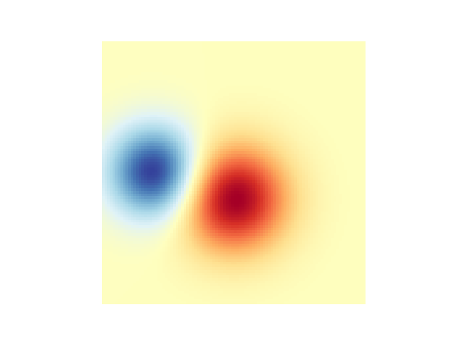
在2D图像中混合透明度与颜色
https://matplotlib.org/stable/gallery/images_contours_and_fields/image_transparency_blend.html
通过混合透明度与颜色,使用imshow突出显示数据部分。
matplotlib.pyplot.imshow的一个常见用途是绘制2D统计图。该函数可以轻松将2D矩阵可视化为图像,并为输出添加透明度。例如,可以绘制统计量(如t统计量),并根据每个像素的p值对其透明度进行着色。本示例演示如何实现这种效果。
首先我们将生成一些数据,在本例中,我们将在2D网格中创建两个"斑点"。一个斑点将为正,另一个为负。
import matplotlib.pyplot as plt
import numpy as npfrom matplotlib.colors import Normalizedef normal_pdf(x, mean, var):return np.exp(-(x - mean)**2 / (2*var))# Generate the space in which the blobs will live
xmin, xmax, ymin, ymax = (0, 100, 0, 100)
n_bins = 100
xx = np.linspace(xmin, xmax, n_bins)
yy = np.linspace(ymin, ymax, n_bins)# Generate the blobs. The range of the values is roughly -.0002 to .0002
means_high = [20, 50]
means_low = [50, 60]
var = [150, 200]gauss_x_high = normal_pdf(xx, means_high[0], var[0])
gauss_y_high = normal_pdf(yy, means_high[1], var[0])gauss_x_low = normal_pdf(xx, means_low[0], var[1])
gauss_y_low = normal_pdf(yy, means_low[1], var[1])weights = (np.outer(gauss_y_high, gauss_x_high)- np.outer(gauss_y_low, gauss_x_low))# We'll also create a grey background into which the pixels will fade
greys = np.full((*weights.shape, 3), 70, dtype=np.uint8)# First we'll plot these blobs using ``imshow`` without transparency.
vmax = np.abs(weights).max()
imshow_kwargs = {'vmax': vmax,'vmin': -vmax,'cmap': 'RdYlBu','extent': (xmin, xmax, ymin, ymax),
}fig, ax = plt.subplots()
ax.imshow(greys)
ax.imshow(weights, **imshow_kwargs)
ax.set_axis_off()
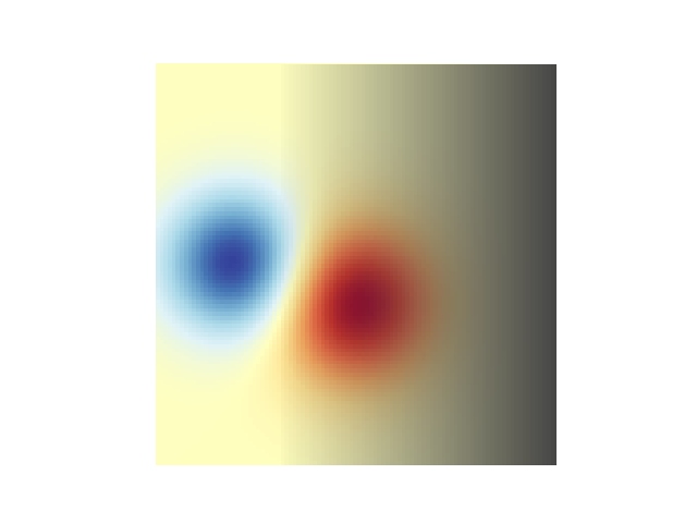
实现透明效果
在使用 matplotlib.pyplot.imshow 绘制数据时,最简单的透明度实现方式是为 alpha 参数传递一个与数据形状匹配的数组。例如,下面我们将创建一个从左到右渐变的透明度效果。
# Create an alpha channel of linearly increasing values moving to the right.
alphas = np.ones(weights.shape)
alphas[:, 30:] = np.linspace(1, 0, 70)# Create the figure and image
# Note that the absolute values may be slightly different
fig, ax = plt.subplots()
ax.imshow(greys)
ax.imshow(weights, alpha=alphas, **imshow_kwargs)
ax.set_axis_off()
利用透明度突显高幅值数据点
最后,我们将重现相同的图表,但这次会通过透明度来强调数据中的极值。这种方法常用于突显具有较小p值的数据点。我们还将添加等高线来强化图像数值的视觉呈现。
# Create an alpha channel based on weight values
# Any value whose absolute value is > .0001 will have zero transparency
alphas = Normalize(0, .3, clip=True)(np.abs(weights))
alphas = np.clip(alphas, .4, 1)  # alpha value clipped at the bottom at .4# Create the figure and image
# Note that the absolute values may be slightly different
fig, ax = plt.subplots()
ax.imshow(greys)
ax.imshow(weights, alpha=alphas, **imshow_kwargs)# Add contour lines to further highlight different levels.
ax.contour(weights[::-1], levels=[-.1, .1], colors='k', linestyles='-')
ax.set_axis_off()
plt.show()ax.contour(weights[::-1], levels=[-.0001, .0001], colors='k', linestyles='-')
ax.set_axis_off()
plt.show()
参考内容
本示例演示了以下函数、方法、类和模块的使用:
matplotlib.axes.Axes.imshow/matplotlib.pyplot.imshow
-
matplotlib.axes.Axes.contour/matplotlib.pyplot.contour -
matplotlib.colors.Normalize -
matplotlib.axes.Axes.set_axis_off
脚本总运行时间: (0 分钟 1.636 秒)
下载Jupyter笔记本: image_transparency_blend.ipynb下载Python源代码: image_transparency_blend.py下载压缩包: image_transparency_blend.zip
图库由Sphinx-Gallery生成
修改坐标格式化器
https://matplotlib.org/stable/gallery/images_contours_and_fields/image_zcoord.html
修改坐标格式化器,使其在给定x和y值时报告最近像素的图像"z"值。此功能默认已内置;本示例仅展示如何自定义 format_coord 函数。
import matplotlib.pyplot as plt
import numpy as np# Fixing random state for reproducibility
np.random.seed(19680801)x= 10*np.random.rand(5, 3)fig, ax = plt.subplots()
ax.imshow(X)def format_coord(x, y):col = round(x)row = round(y)nrows, ncols = X.shapeif 0 <= col < ncols and 0 <= row < nrows:z = X[row, col]return f'x={x:1.4f}, y={y:1.4f}, z={z:1.4f}'else:return f'x={x:1.4f}, y={y:1.4f}'ax.format_coord = format_coord
plt.show()
参考内容
本示例展示了以下函数、方法、类和模块的使用:
matplotlib.axes.Axes.format_coordmatplotlib.axes.Axes.imshow下载 Jupyter notebook: image_zcoord.ipynb
下载 Python 源代码: image_zcoord.py
下载压缩包: image_zcoord.zip
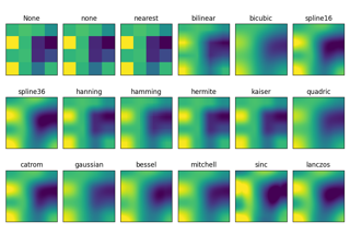
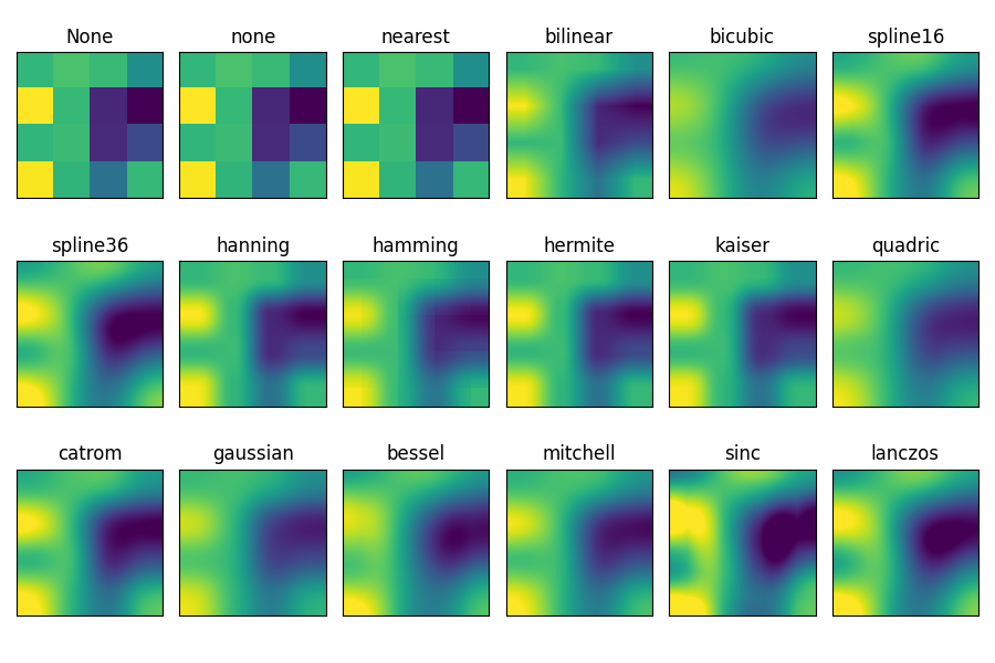
imshow 插值方法对比
https://matplotlib.org/stable/gallery/images_contours_and_fields/interpolation_methods.html
本示例展示 imshow 不同插值方法之间的差异。
如果未指定 interpolation 参数,则默认使用 [rcParams["image.interpolation"]](https://matplotlib.org/stable/users/explain/customizing.html?highlight=image.interpolation#matplotlibrc-sample) 配置值(默认为 'auto')。若设为 'none',则 Agg、ps 和 pdf 后端将不进行插值处理,其他后端会默认采用 'auto' 模式。
对于 Agg、ps 和 pdf 后端:
- 当大尺寸图像被缩小时,
interpolation='none'效果较好 - 当小尺寸图像被放大时,
interpolation='nearest'效果更佳
关于默认的 interpolation='auto' 选项的详细讨论,请参阅 图像重采样 文档。
import matplotlib.pyplot as plt
import numpy as npmethods = [None, 'none', 'nearest', 'bilinear', 'bicubic', 'spline16','spline36', 'hanning', 'hamming', 'hermite', 'kaiser', 'quadric','catrom', 'gaussian', 'bessel', 'mitchell', 'sinc', 'lanczos']# Fixing random state for reproducibility
np.random.seed(19680801)grid = np.random.rand(4, 4)fig, axs = plt.subplots(nrows=3, ncols=6, figsize=(9, 6),subplot_kw={'xticks': [], 'yticks': []})for ax, interp_method in zip(axs.flat, methods):ax.imshow(grid, interpolation=interp_method, cmap='viridis')ax.set_title(str(interp_method))plt.tight_layout()
plt.show()
参考内容
本示例展示了以下函数、方法、类和模块的使用:
matplotlib.axes.Axes.imshow/matplotlib.pyplot.imshow
脚本总运行时间: (0 分 3.820 秒)
下载 Jupyter 笔记本: interpolation_methods.ipynb下载 Python 源代码: interpolation_methods.py下载压缩包: interpolation_methods.zip
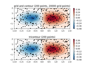
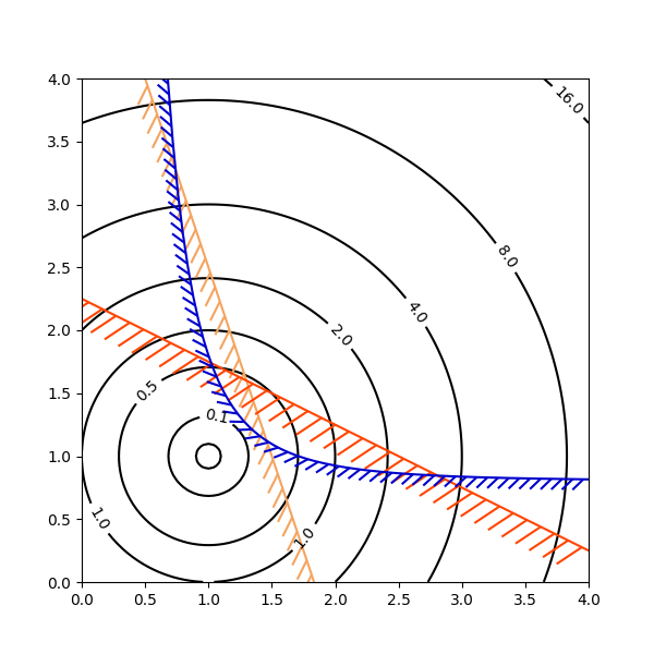
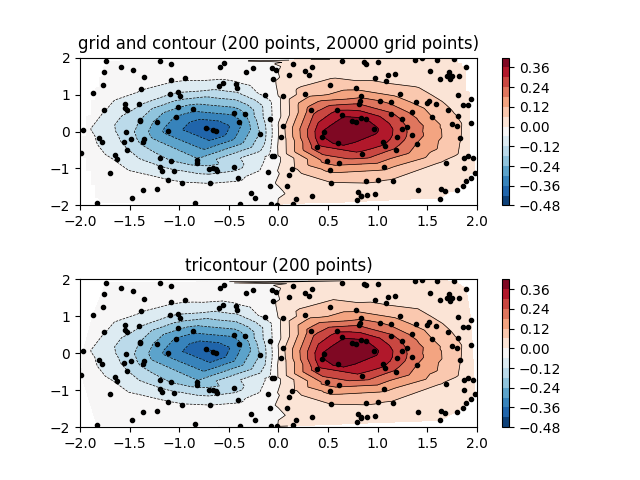
不规则间距数据的等高线图
https://matplotlib.org/stable/gallery/images_contours_and_fields/irregulardatagrid.html
比较两种绘制不规则间距数据等高线图的方法:在规则网格上插值绘制的等高线图 vs 非结构化三角网格的三元等高线图。
由于 contour 和 contourf 要求数据必须位于规则网格上,绘制不规则间距数据的等高线图需要采用不同方法。主要有两种方案:
- 先将数据插值到规则网格。可以使用内置工具如
LinearTriInterpolator,或借助外部功能如scipy.interpolate.griddata,然后使用常规的contour绘制插值后的数据。 - 直接使用
tricontour或tricontourf,这些方法会在内部自动进行三角剖分。
本示例展示了这两种方法的实际应用。
import matplotlib.pyplot as plt
import numpy as npimport matplotlib.tri as trinp.random.seed(19680801)
npts = 200
ngridx = 100
ngridy = 200
x= np.random.uniform(-2, 2, npts)
y= np.random.uniform(-2, 2, npts)
z = x* np.exp(-x**2 - y**2)fig, (ax1, ax2) = plt.subplots(nrows=2)# -----------------------
# Interpolation on a grid
# -----------------------
# A contour plot of irregularly spaced data coordinates
# via interpolation on a grid.# Create grid values first.
xi = np.linspace(-2.1, 2.1, ngridx)
yi = np.linspace(-2.1, 2.1, ngridy)# Linearly interpolate the data (x, y) on a grid defined by (xi, yi).
triang= tri.Triangulation(x, y)
interpolator = tri.LinearTriInterpolator(triang, z)
Xi, Yi = np.meshgrid(xi, yi)
zi = interpolator(Xi, Yi)# Note that scipy.interpolate provides means to interpolate data on a grid
# as well. The following would be an alternative to the four lines above:
# from scipy.interpolate import griddata
# zi = griddata((x, y), z, (xi[None, :], yi[:, None]), method='linear')ax1.contour(xi, yi, zi, levels=14, linewidths=0.5, colors='k')
cntr1 = ax1.contourf(xi, yi, zi, levels=14, cmap="RdBu_r")fig.colorbar(cntr1, ax=ax1)
ax1.plot(x, y, 'ko', ms=3)
ax1.set(xlim=(-2, 2), ylim=(-2, 2))
ax1.set_title('grid and contour (%d points, %d grid points)' %(npts, ngridx * ngridy))# ----------
# Tricontour
# ----------
# Directly supply the unordered, irregularly spaced coordinates
# to tricontour.ax2.tricontour(x, y, z, levels=14, linewidths=0.5, colors='k')
cntr2 = ax2.tricontourf(x, y, z, levels=14, cmap="RdBu_r")fig.colorbar(cntr2, ax=ax2)
ax2.plot(x, y, 'ko', ms=3)
ax2.set(xlim=(-2, 2), ylim=(-2, 2))
ax2.set_title('tricontour (%d points)' % npts)plt.subplots_adjust(hspace=0.5)
plt.show()
参考内容
本示例演示了以下函数、方法、类和模块的使用:
matplotlib.axes.Axes.contour/matplotlib.pyplot.contour
-
matplotlib.axes.Axes.contourf/matplotlib.pyplot.contourf -
matplotlib.axes.Axes.tricontour/matplotlib.pyplot.tricontour -
matplotlib.axes.Axes.tricontourf/matplotlib.pyplot.tricontourf
脚本总运行时间:(0分1.378秒)
下载Jupyter笔记本:irregulardatagrid.ipynb下载Python源代码:irregulardatagrid.py下载压缩包:irregulardatagrid.zip
图库由Sphinx-Gallery生成
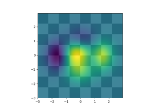
使用 Alpha 混合叠加图层
https://matplotlib.org/stable/gallery/images_contours_and_fields/layer_images.html
通过 Alpha 混合技术将多个图像层层叠加
import matplotlib.pyplot as plt
import numpy as npdef func3(x, y):return (1 - x/ 2 + x**5 + y**3) * np.exp(-(x**2 + y**2))# make these smaller to increase the resolution
dx, dy = 0.05, 0.05x= np.arange(-3.0, 3.0, dx)
y= np.arange(-3.0, 3.0, dy)
X, Y = np.meshgrid(x, y)# when layering multiple images, the images need to have the same
# extent.  This does not mean they need to have the same shape, but
# they both need to render to the same coordinate system determined by # xmin, xmax, ymin, ymax.  Note if you use different interpolations
# for the images their apparent extent could be different due to # interpolation edge effectsextent = np.min(x), np.max(x), np.min(y), np.max(y)
fig = plt.figure(frameon=False)Z1 = np.add.outer(range(8), range(8)) % 2  # chessboard
im1 = plt.imshow(Z1, cmap=plt.cm.gray, interpolation='nearest',extent=extent)Z2 = func3(X, Y)im2 = plt.imshow(Z2, cmap=plt.cm.viridis, alpha=.9, interpolation='bilinear',extent=extent)plt.show()
参考内容
本示例展示了以下函数、方法、类和模块的用法:
matplotlib.axes.Axes.imshow/matplotlib.pyplot.imshow
脚本总运行时间: (0 分 1.287 秒)
下载 Jupyter 笔记本: layer_images.ipynb下载 Python 源代码: layer_images.py下载压缩包: layer_images.zip
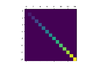
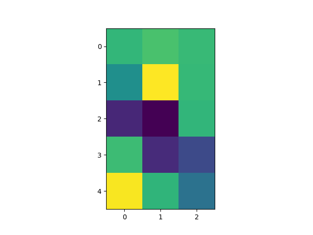
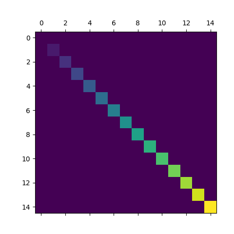
使用matshow可视化矩阵
https://matplotlib.org/stable/gallery/images_contours_and_fields/matshow.html
matshow 可将二维矩阵或数组可视化为彩色编码的图像。
import matplotlib.pyplot as plt
import numpy as np# a 2D array with linearly increasing values on the diagonal
a = np.diag(range(15))plt.matshow(a)plt.show()
参考内容
本示例展示了以下函数、方法、类和模块的用法:
matplotlib.axes.Axes.imshow/matplotlib.pyplot.imshow下载 Jupyter notebook: matshow.ipynb下载 Python 源代码: matshow.py下载压缩包: matshow.zip
多图共享一个色条
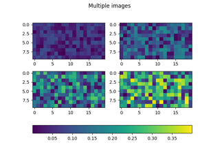
https://matplotlib.org/stable/gallery/images_contours_and_fields/multi_image.html
使用单个色条为多张图片提供统一的色彩映射。
目前,一个色条只能关联到一张图片。这种关联确保了数据着色与色条刻度的一致性(即色条中数值x对应的颜色会被用于图片中数值x的数据着色)。
如果我们希望一个色条能代表多张图片的色彩映射,就必须通过统一的数据标准化处理来确保所有图片的着色一致性。具体实现方式是:显式创建一个norm对象,并将其传递给所有图片绘制方法。
import matplotlib.pyplot as plt
import numpy as npfrom matplotlib import colorsnp.random.seed(19680801)datasets = [(i+1)/10 * np.random.rand(10, 20)for i in range(4)
]fig, axs = plt.subplots(2, 2)
fig.suptitle('Multiple images')# create a single norm to be shared across all images
norm = colors.Normalize(vmin=np.min(datasets), vmax=np.max(datasets))images = [] for ax, data in zip(axs.flat, datasets):images.append(ax.imshow(data, norm=norm))fig.colorbar(images[0], ax=axs, orientation='horizontal', fraction=.1)plt.show()
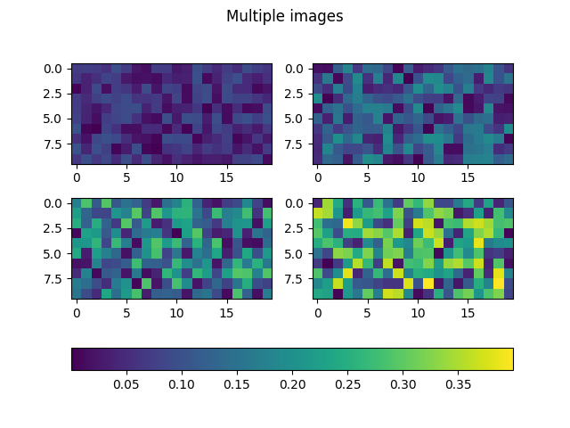 现在当调整缩放比例时(例如通过缩放色条或使用Qt后端的"编辑坐标轴、曲线和图像参数"图形界面),所有图像的颜色都能保持一致。这对于大多数实际应用场景已经足够。
高级技巧:同步色彩映射表
共享同一个归一化(norm)对象可以确保缩放比例同步,因为缩放变化会就地修改该norm对象,从而传播到所有使用此norm的图像。但这种方法无法同步色彩映射表,因为修改图像的色彩映射表(例如通过Qt后端的"编辑坐标轴、曲线和图像参数"图形界面)会导致该图像引用新的色彩映射表对象,因此其他图像不会自动更新。
要使其他图像同步更新,可通过以下代码实现色彩映射表同步:
def sync_cmaps(changed_image):for im in images:if changed_image.get_cmap() != im.get_cmap():im.set_cmap(changed_image.get_cmap())for im in images:im.callbacks.connect('changed', sync_cmaps)
参考文献
本示例展示了以下函数、方法、类和模块的使用:
matplotlib.axes.Axes.imshow/matplotlib.pyplot.imshowmatplotlib.figure.Figure.colorbar/matplotlib.pyplot.colorbarmatplotlib.colors.Normalizematplotlib.cm.ScalarMappable.set_cmapmatplotlib.cbook.CallbackRegistry.connect
脚本总运行时间: (0 分钟 1.012 秒)
下载 Jupyter 笔记本: multi_image.ipynb下载 Python 源代码: multi_image.py下载压缩包: multi_image.zip
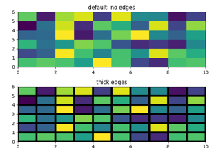
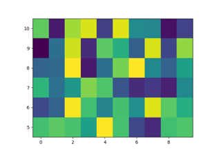
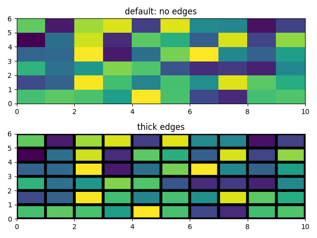
pcolor 图像
https://matplotlib.org/stable/gallery/images_contours_and_fields/pcolor_demo.html
pcolor 可生成二维图像风格的绘图,如下图所示。
import matplotlib.pyplot as plt
import numpy as npfrom matplotlib.colors import LogNorm# Fixing random state for reproducibility
np.random.seed(19680801)
一个简单的 pcolor 示例
Z = np.random.rand(6, 10)fig, (ax0, ax1) = plt.subplots(2, 1)c = ax0.pcolor(Z)
ax0.set_title)('default: no edges')c = ax1.pcolor(Z, edgecolors='k', linewidths=4)
ax1.set_title('thick edges')fig.tight_layout()
plt.show()
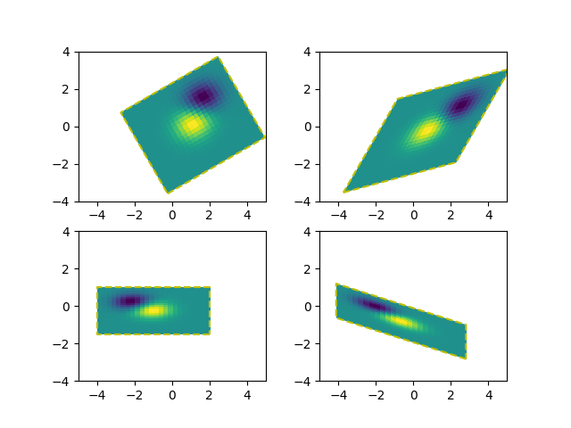
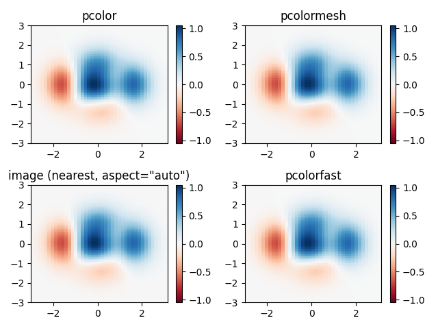
比较 pcolor 与相似函数
展示 pcolor、pcolormesh、imshow 和 pcolorfast 在绘制四边形网格时的相似之处。
注意我们调用 imshow 时设置了 aspect="auto",这样它不会强制数据像素为正方形(默认是 aspect="equal")。
# make these smaller to increase the resolution
dx, dy = 0.15, 0.05# generate 2 2d grids for the x & y bounds
y, x= np.mgrid[-3:3+dy:dy, -3:3+dx:dx]
z = (1 - x/2 + x**5 + y**3) * np.exp(-x**2 - y**2)
# x and y are bounds, so z should be the value *inside* those bounds.
# Therefore, remove the last value from the z array.
z = z[:-1, :-1]
z_min, z_max = -abs(z).max(), abs(z).max()fig, axs = plt.subplots(2, 2)ax = axs[0, 0]
c = ax.pcolor(x, y, z, cmap='RdBu', vmin=z_min, vmax=z_max)
ax.set_title('pcolor')
fig.colorbar(c, ax=ax)ax = axs[0, 1]
c = ax.pcolormesh(x, y, z, cmap='RdBu', vmin=z_min, vmax=z_max)
ax.set_title('pcolormesh')
fig.colorbar(c, ax=ax)ax = axs[1, 0]
c = ax.imshow(z, cmap='RdBu', vmin=z_min, vmax=z_max,extent=[x.min(), x.max(), y.min(), y.max()],interpolation='nearest', origin='lower', aspect='auto')
ax.set_title('image (nearest, aspect="auto")')
fig.colorbar(c, ax=ax)ax = axs[1, 1]
c = ax.pcolorfast(x, y, z, cmap='RdBu', vmin=z_min, vmax=z_max)
ax.set_title('pcolorfast')
fig.colorbar(c, ax=ax)fig.tight_layout()
plt.show()
对数刻度下的伪彩色图
以下展示了对数刻度下的伪彩色图绘制效果。
N = 100
X, Y = np.meshgrid(np.linspace(-3, 3, N), np.linspace(-2, 2, N))# A low hump with a spike coming out.
# Needs to have z/colour axis on a log scale, so we see both hump and spike.
# A linear scale only shows the spike.
Z1 = np.exp(-X**2 - Y**2)
Z2 = np.exp(-(x* 10)**2 - (Y * 10)**2)
Z = Z1 + 50 * Z2fig, (ax0, ax1) = plt.subplots(2, 1)c = ax0.pcolor(X, Y, Z, shading='auto',norm=LogNorm(vmin=Z.min(), vmax=Z.max()), cmap='PuBu_r')
fig.colorbar(c, ax=ax0)c = ax1.pcolor(X, Y, Z, cmap='PuBu_r', shading='auto')
fig.colorbar(c, ax=ax1)plt.show()
参考内容
本示例展示了以下函数、方法、类和模块的使用:
matplotlib.axes.Axes.pcolor/matplotlib.pyplot.pcolor
-
matplotlib.axes.Axes.pcolormesh/matplotlib.pyplot.pcolormesh -
matplotlib.axes.Axes.pcolorfast -
matplotlib.axes.Axes.imshow/matplotlib.pyplot.imshow -
matplotlib.figure.Figure.colorbar/matplotlib.pyplot.colorbar -
matplotlib.colors.LogNorm
脚本总运行时间: (0 分钟 4.989 秒)
下载 Jupyter notebook: pcolor_demo.ipynb下载 Python 源代码: pcolor_demo.py下载压缩包: pcolor_demo.zip
由 Sphinx-Gallery 生成的画廊
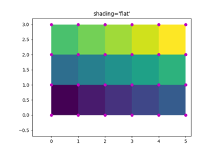
pcolormesh 网格与着色
https://matplotlib.org/stable/gallery/images_contours_and_fields/pcolormesh_grids.html
axes.Axes.pcolormesh 和 pcolor 提供了多种网格布局方式及网格点间着色效果的选项。
通常,若 Z 的维度为 (M, N),则网格 X 和 Y 可指定为 (M+1, N+1) 或 (M, N) 的维度,具体取决于 shading 关键字参数的设置。需要注意的是,下文我们将向量 x 指定为长度 N 或 N+1,y 指定为长度 M 或 M+1,而 pcolormesh 会在内部根据输入向量自动生成网格矩阵 X 和 Y。
import matplotlib.pyplot as plt
import numpy as np
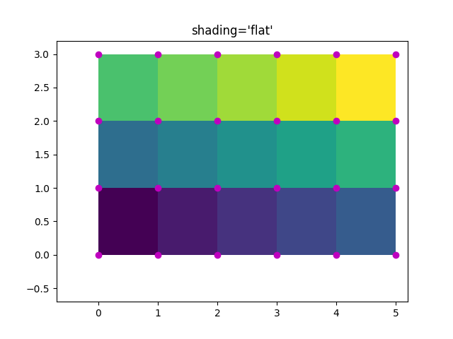
平面着色
shading='flat' 是最少假设的网格规范,当网格在每个维度上比数据大一个单位(即形状为 (M+1, N+1))时适用。此时,X 和 Y 指定了四边形各个角点的坐标,这些四边形将根据 Z 中的值进行着色。本例中,我们通过 (4, 6) 形状的 X 和 Y 数组,定义了 (3, 5) 四边形的边界。
nrows = 3
ncols = 5
Z = np.arange(nrows * ncols).reshape(nrows, ncols)
x= np.arange(ncols + 1)
y= np.arange(nrows + 1)fig, ax = plt.subplots()
ax.pcolormesh(x, y, Z, shading='flat', vmin=Z.min(), vmax=Z.max())def _annotate(ax, x, y, title):# this all gets repeated below:X, Y = np.meshgrid(x, y)ax.plot(X.flat, Y.flat, 'o', color='m')ax.set_xlim(-0.7, 5.2)ax.set_ylim(-0.7, 3.2)ax.set_title(title)_annotate(ax, x, y, "shading='flat'")
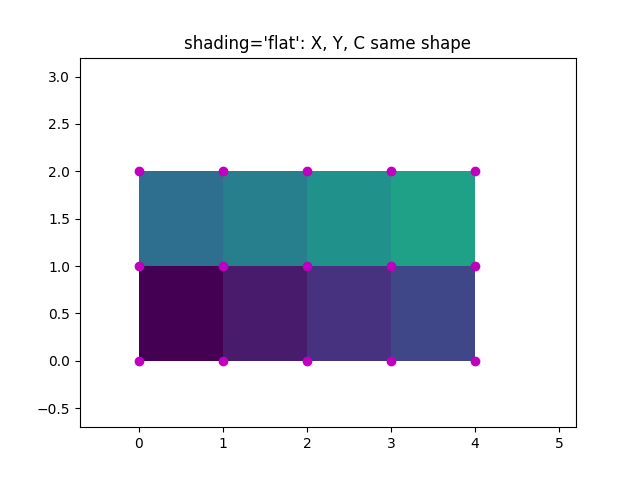
平面着色与相同形状网格
然而,数据通常以X和Y与Z形状相匹配的形式提供。虽然这对其他shading类型有意义,但在shading='flat'时是不允许的。历史上,Matplotlib会静默丢弃Z的最后一行和最后一列,以匹配Matlab的行为。如果仍需要此行为,只需手动删除最后一行和最后一列即可:
x= np.arange(ncols)  # note *not* ncols + 1 as before
y= np.arange(nrows)
fig, ax = plt.subplots()
ax.pcolormesh(x, y, Z[:-1, :-1], shading='flat', vmin=Z.min(), vmax=Z.max())
_annotate(ax, x, y, "shading='flat': X, Y, C same shape")
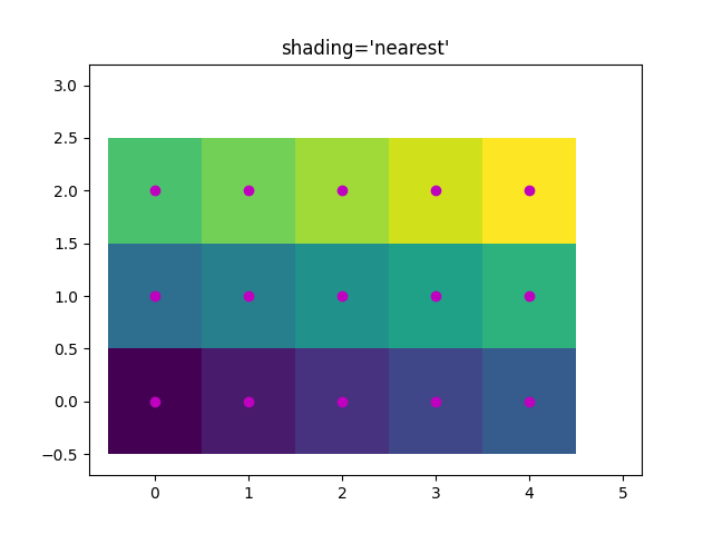
最近邻着色,相同形状网格
通常情况下,当用户将 X、Y 和 Z 设置为相同形状时,删除一行或一列数据并不是他们的本意。为此,Matplotlib 提供了 shading='nearest' 选项,将彩色四边形中心对齐到网格点上。
如果传入形状不正确的网格并设置 shading='nearest',则会引发错误。
fig, ax = plt.subplots()
ax.pcolormesh(x, y, Z, shading='nearest', vmin=Z.min(), vmax=Z.max())
_annotate(ax, x, y, "shading='nearest'")
自动着色
用户可能希望代码能自动选择使用哪种着色方式。在这种情况下,设置 shading='auto' 会根据 X、Y 和 Z 的形状自动决定采用 ‘flat’ 还是 ‘nearest’ 着色模式。
fig, axs = plt.subplots(2, 1, layout='constrained')
ax = axs[0]
x= np.arange(ncols)
y= np.arange(nrows)
ax.pcolormesh(x, y, Z, shading='auto', vmin=Z.min(), vmax=Z.max())
_annotate(ax, x, y, "shading='auto'; X, Y, Z: same shape (nearest)")ax = axs[1]
x= np.arange(ncols + 1)
y= np.arange(nrows + 1)
ax.pcolormesh(x, y, Z, shading='auto', vmin=Z.min(), vmax=Z.max())
_annotate(ax, x, y, "shading='auto'; X, Y one larger than Z (flat)")
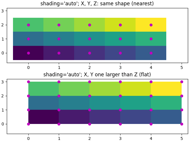
Gouraud 着色
Gouraud 着色也可以被指定,其中四边形中的颜色在网格点之间进行线性插值。X、Y、Z 的形状必须相同。
fig, ax = plt.subplots(layout='constrained')
x= np.arange(ncols)
y= np.arange(nrows)
ax.pcolormesh(x, y, Z, shading='gouraud', vmin=Z.min(), vmax=Z.max())
_annotate(ax, x, y, "shading='gouraud'; X, Y same shape as Z")plt.show()
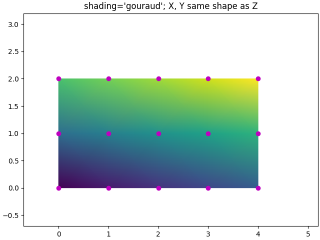
参考内容
本示例展示了以下函数、方法、类和模块的使用:
matplotlib.axes.Axes.pcolormesh/matplotlib.pyplot.pcolormesh
脚本总运行时间: (0 分 5.039 秒)
下载 Jupyter notebook: pcolormesh_grids.ipynb下载 Python 源代码: pcolormesh_grids.py下载压缩包: pcolormesh_grids.zip
pcolormesh
https://matplotlib.org/stable/gallery/images_contours_and_fields/pcolormesh_levels.html
axes.Axes.pcolormesh 可用于生成二维图像式绘图。需要注意的是,它比类似的 pcolor 方法速度更快。
import matplotlib.pyplot as plt
import numpy as npfrom matplotlib.colors import BoundaryNorm
from matplotlib.ticker import MaxNLocator
基础 pcolormesh 用法
我们通常通过定义四边形的边缘和四边形数值来指定 pcolormesh。请注意,这里的 x 和 y 在每个维度上比 Z 多一个元素。
np.random.seed(19680801)
Z = np.random.rand(6, 10)
x= np.arange(-0.5, 10, 1)  # len = 11
y= np.arange(4.5, 11, 1)  # len = 7fig, ax = plt.subplots()
ax.pcolormesh(x, y, Z)
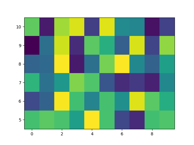
非直线型 pcolormesh
需要注意的是,我们也可以为 X 和 Y 指定矩阵,从而生成非直线型的四边形。
x= np.arange(-0.5, 10, 1)  # len = 11
y= np.arange(4.5, 11, 1)  # len = 7
X, Y = np.meshgrid(x, y)
x= x+ 0.2 * Y  # tilt the coordinates.
Y = Y + 0.3 * Xfig, ax = plt.subplots()
ax.pcolormesh(X, Y, Z)
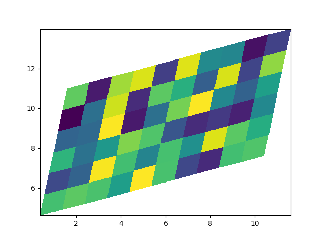
居中坐标
用户经常需要传递与Z尺寸相同的X和Y坐标给axes.Axes.pcolormesh。当设置shading='auto'时(该参数默认值由[rcParams["pcolor.shading"]](https://matplotlib.org/stable/users/explain/customizing.html?highlight=pcolor.shading#matplotlibrc-sample)定义,默认为'auto'),这种操作是被允许的。
在Matplotlib 3.3之前的版本中,shading='flat'会丢弃Z的最后一列和最后一行,但现在会直接报错。如果确实需要这种效果,可以手动删除Z的最后一行和最后一列:
x= np.arange(10)  # len = 10
y= np.arange(6)  # len = 6
X, Y = np.meshgrid(x, y)fig, axs = plt.subplots(2, 1, sharex=True, sharey=True)
axs[0].pcolormesh(X, Y, Z, vmin=np.min(Z), vmax=np.max(Z), shading='auto')
axs[0].set_title("shading='auto' = 'nearest'")
axs[1].pcolormesh(X, Y, Z[:-1, :-1], vmin=np.min(Z), vmax=np.max(Z),shading='flat')
axs[1].set_title("shading='flat'")
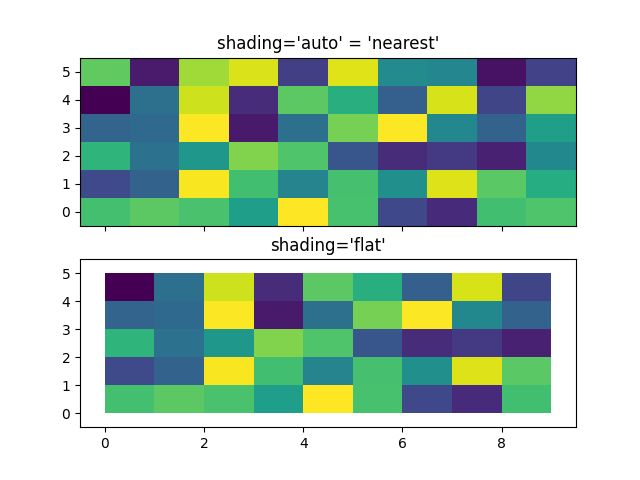
使用归一化(Norms)创建层级
展示如何结合归一化(Normalization)和颜色映射(Colormap)实例,以类似于contour/contourf的levels关键字参数的方式,在以下绘图类型中绘制"层级":
axes.Axes.pcoloraxes.Axes.pcolormeshaxes.Axes.imshow
# make these smaller to increase the resolution
dx, dy = 0.05, 0.05# generate 2 2d grids for the x & y bounds
y, x= np.mgrid[slice(1, 5 + dy, dy),slice(1, 5 + dx, dx)]z = np.sin(x)**10 + np.cos(10 + y*x) * np.cos(x)# x and y are bounds, so z should be the value *inside* those bounds.
# Therefore, remove the last value from the z array.
z = z[:-1, :-1]
levels = MaxNLocator(nbins=15).tick_values(z.min(), z.max())# pick the desired colormap, sensible levels, and define a normalization
# instance which takes data values and translates those into levels.
cmap = plt.colormaps['PiYG']
norm = BoundaryNorm(levels, ncolors=cmap.N, clip=True)fig, (ax0, ax1) = plt.subplots(nrows=2)im = ax0.pcolormesh(x, y, z, cmap=cmap, norm=norm)
fig.colorbar(im, ax=ax0)
ax0.set_title)('pcolormesh with levels')# contours are *point* based plots, so convert our bound into point
# centers
cf = ax1.contourf(x[:-1, :-1] + dx/2.,y[:-1, :-1] + dy/2., z, levels=levels,cmap=cmap)
fig.colorbar(cf, ax=ax1)
ax1.set_title('contourf with levels')# adjust spacing between subplots so `ax1` title and `ax0` tick labels
# don't overlap
fig.tight_layout()plt.show()
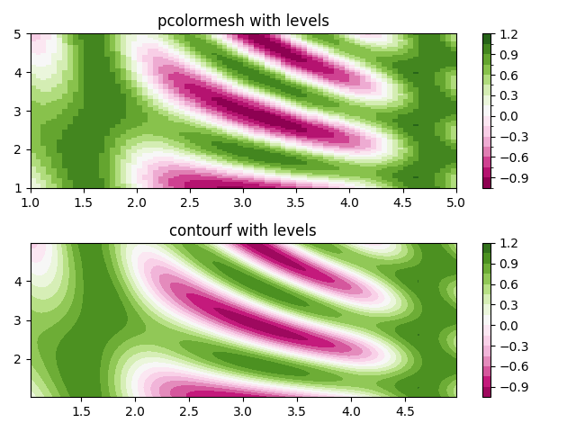
参考
本示例展示了以下函数、方法、类和模块的使用:
matplotlib.axes.Axes.pcolormesh/matplotlib.pyplot.pcolormesh
-
matplotlib.axes.Axes.contourf/matplotlib.pyplot.contourf -
matplotlib.figure.Figure.colorbar/matplotlib.pyplot.colorbar -
matplotlib.colors.BoundaryNorm -
matplotlib.ticker.MaxNLocator
脚本总运行时间: (0 分 3.551 秒)
下载Jupyter笔记本: pcolormesh_levels.ipynb下载Python源代码: pcolormesh_levels.py下载压缩包: pcolormesh_levels.zip
图库由Sphinx-Gallery生成
流线图
https://matplotlib.org/stable/gallery/images_contours_and_fields/plot_streamplot.html
流线图(streamline plot)用于展示二维矢量场。本示例展示了 streamplot 函数的几个特性:
- 沿流线变化颜色
- 调整流线密度
- 沿流线变化线宽
- 控制流线起点
- 流线自动避开掩膜区域和NaN值
- 即使超出单个网格单元内的线条限制,仍能保持流线连续性
(注:所有代码块和API引用保持原样未翻译,符合代码保护原则)
import matplotlib.pyplot as plt
import numpy as npw = 3
Y, x= np.mgrid[-w:w:100j, -w:w:100j]
U = -1 - X**2 + Y
V = 1 + x- Y**2
speed = np.sqrt(U**2 + V**2)fig, axs = plt.subplots(3, 2, figsize=(7, 9), height_ratios=[1, 1, 2])
axs = axs.flat#  Varying density along a streamline
axs[0].streamplot(X, Y, U, V, density=[0.5, 1])
axs[0].set_title('Varying Density')# Varying color along a streamline
strm = axs[1].streamplot(X, Y, U, V, color=U, linewidth=2, cmap='autumn')
fig.colorbar(strm.lines)
axs[1].set_title('Varying Color')#  Varying line width along a streamline
lw = 5*speed / speed.max()
axs[2].streamplot(X, Y, U, V, density=0.6, color='k', linewidth=lw)
axs[2].set_title('Varying Line Width')# Controlling the starting points of the streamlines
seed_points = np.array([[-2, -1, 0, 1, 2, -1], [-2, -1,  0, 1, 2, 2]])strm = axs[3].streamplot(X, Y, U, V, color=U, linewidth=2,cmap='autumn', start_points=seed_points.T)
fig.colorbar(strm.lines)
axs[3].set_title('Controlling Starting Points')# Displaying the starting points with blue symbols.
axs[3].plot(seed_points[0], seed_points[1], 'bo')
axs[3].set(xlim=(-w, w), ylim=(-w, w))# Create a mask
mask = np.zeros(U.shape, dtype=bool)
mask[40:60, 40:60] = True
U[:20, :20] = np.nan
U = np.ma.array(U, mask=mask)axs[4].streamplot(X, Y, U, V, color='r')
axs[4].set_title('Streamplot with Masking')axs[4].imshow(~mask, extent=(-w, w, -w, w), alpha=0.5, cmap='gray',aspect='auto')
axs[4].set_aspect('equal')axs[5].streamplot(X, Y, U, V, broken_streamlines=False)
axs[5].set_title('Streamplot with unbroken streamlines')plt.tight_layout()
plt.show()

参考
本示例展示了以下函数、方法、类和模块的使用:
matplotlib.axes.Axes.streamplot/matplotlib.pyplot.streamplot
matplotlib.gridspec.GridSpec
脚本总运行时间: (0 分 7.131 秒)
下载 Jupyter notebook: plot_streamplot.ipynb下载 Python 源代码: plot_streamplot.py下载压缩包: plot_streamplot.zip
QuadMesh 演示
https://matplotlib.org/stable/gallery/images_contours_and_fields/quadmesh_demo.html
pcolormesh 使用了 QuadMesh,这是 pcolor 的一个更快速的通用版本,但存在一些限制。
本演示展示了 quadmesh 在处理掩码数据时的一个缺陷。
import numpy as npfrom matplotlib import pyplot as pltn = 12
x= np.linspace(-1.5, 1.5, n)
y= np.linspace(-1.5, 1.5, n * 2)
X, Y = np.meshgrid(x, y)
Qx = np.cos(Y) - np.cos(X)
Qz = np.sin(Y) + np.sin(X)
Z = np.sqrt(X**2 + Y**2) / 5
Z = (Z - Z.min()) / (Z.max() - Z.min())# The color array can include masked values.
Zm = np.ma.masked_where(np.abs(Qz) < 0.5 * np.max(Qz), Z)fig, axs = plt.subplots(nrows=1, ncols=3)
axs[0].pcolormesh(Qx, Qz, Z, shading='gouraud')
axs[0].set_title('Without masked values')# You can control the color of the masked region.
cmap= plt.colormaps[plt.rcParams['image.cmap']].with_extremes(bad='y')
axs[1].pcolormesh(Qx, Qz, Zm, shading='gouraud', cmap=cmap)
axs[1].set_title('With masked values')# Or use the default, which is transparent.
axs[2].pcolormesh(Qx, Qz, Zm, shading='gouraud')
axs[2].set_title('With masked values')fig.tight_layout()
plt.show()
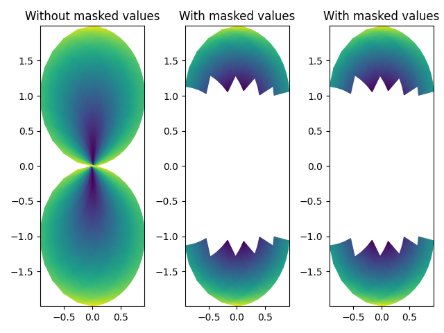
参考
本示例展示了以下函数、方法、类和模块的使用:
matplotlib.axes.Axes.pcolormesh/matplotlib.pyplot.pcolormesh
脚本总运行时间: (0 分钟 2.389 秒)
下载 Jupyter 笔记本: quadmesh_demo.ipynb下载 Python 源代码: quadmesh_demo.py下载压缩包: quadmesh_demo.zip
高级箭头图(quiver)和箭头图例(quiverkey)函数
https://matplotlib.org/stable/gallery/images_contours_and_fields/quiver_demo.html
展示quiver函数的一些更高级选项。如需查看简单示例,请参考基础箭头图示例。
注意:绘图自动缩放功能不会考虑箭头元素,因此边界上的箭头可能会超出图像范围。这个问题很难找到完全通用的解决方案。推荐的处理方法是手动设置坐标轴(Axes)的显示范围。
import matplotlib.pyplot as plt
import numpy as npX, Y = np.meshgrid(np.arange(0, 2 * np.pi, .2), np.arange(0, 2 * np.pi, .2))
U = np.cos(X)
V = np.sin(Y)
fig1, ax1 = plt.subplots()
ax1.set_title('Arrows scale with plot width, not view')
Q = ax1.quiver(X, Y, U, V, units='width')
qk = ax1.quiverkey(Q, 0.9, 0.9, 2, r'$2 \frac{m}{s}$', labelpos='E',coordinates='figure')
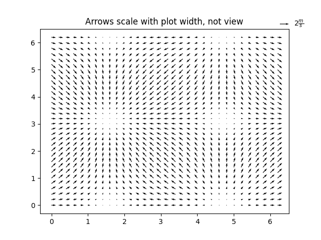
fig2, ax2 = plt.subplots()
ax2.set_title("pivot='mid'; every third arrow; units='inches'")
Q = ax2.quiver(X[::3, ::3], Y[::3, ::3], U[::3, ::3], V[::3, ::3],pivot='mid', units='inches')
qk = ax2.quiverkey(Q, 0.9, 0.9, 1, r'$1 \frac{m}{s}$', labelpos='E',coordinates='figure')
ax2.scatter(X[::3, ::3], Y[::3, ::3], color='r', s=5)
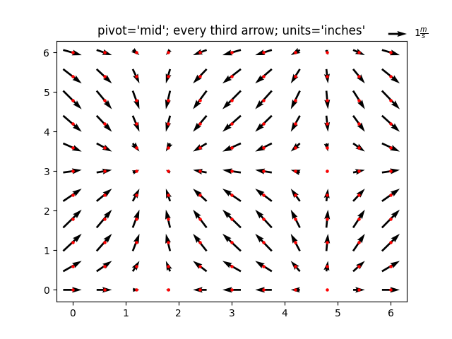
fig3, ax3 = plt.subplots()
ax3.set_title("pivot='tip'; scales with x view")
M = np.hypot(U, V)
Q = ax3.quiver(X, Y, U, V, M, units='x', pivot='tip', width=0.022,scale=1 / 0.15)
qk = ax3.quiverkey(Q, 0.9, 0.9, 1, r'$1 \frac{m}{s}$', labelpos='E',coordinates='figure')
ax3.scatter(X, Y, color='0.5', s=1)plt.show()
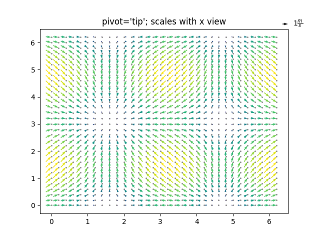
参考内容
本示例展示了以下函数、方法、类和模块的使用:
matplotlib.axes.Axes.quiver/matplotlib.pyplot.quivermatplotlib.axes.Axes.quiverkey/matplotlib.pyplot.quiverkey
脚本总运行时间: (0 分钟 4.446 秒)
下载 Jupyter notebook: quiver_demo.ipynb下载 Python 源代码: quiver_demo.py下载压缩包: quiver_demo.zip
Quiver 简单示例
https://matplotlib.org/stable/gallery/images_contours_and_fields/quiver_simple_demo.html
这是一个使用 quiver 和 quiverkey 绘制的简单示例图。
如需了解更高级的选项,请参阅
高级 quiver 和 quiverkey 函数。
import matplotlib.pyplot as plt
import numpy as npx= np.arange(-10, 10, 1)
Y = np.arange(-10, 10, 1)
U, V = np.meshgrid(X, Y)fig, ax = plt.subplots()
q = ax.quiver(X, Y, U, V)
ax.quiverkey(q, X=0.3, Y=1.1, U=10,label='Quiver key, length = 10', labelpos='E')plt.show()
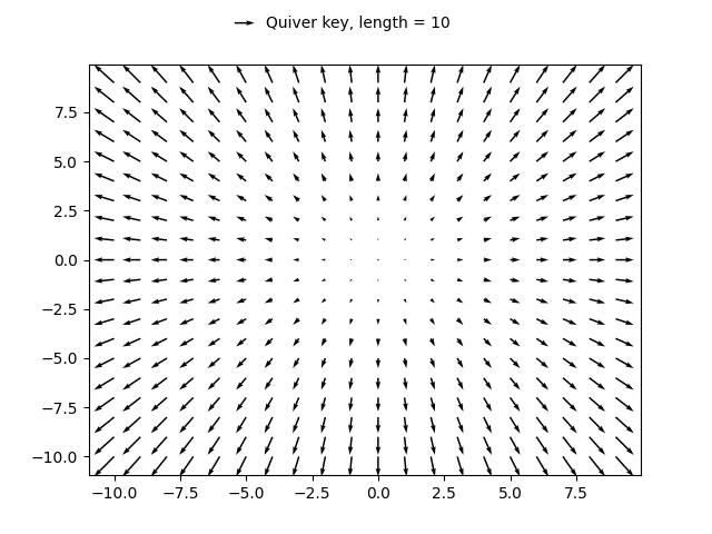
参考内容
本示例展示了以下函数、方法、类和模块的使用:
matplotlib.axes.Axes.quiver/matplotlib.pyplot.quivermatplotlib.axes.Axes.quiverkey/matplotlib.pyplot.quiverkey
脚本总运行时间: (0分钟1.056秒)
下载Jupyter笔记本: quiver_simple_demo.ipynb下载Python源代码: quiver_simple_demo.py下载压缩包: quiver_simple_demo.zip
图库由Sphinx-Gallery生成
地形阴影示例
https://matplotlib.org/stable/gallery/images_contours_and_fields/shading_example.html
本示例展示如何制作类似 Mathematica 或 Generic Mapping Tools 的地形阴影图。
import matplotlib.pyplot as plt
import numpy as npfrom matplotlib import cbook
from matplotlib.colors import LightSourcedef main():# Test datax, y = np.mgrid[-5:5:0.05, -5:5:0.05]z = 5 * (np.sqrt(x**2 + y**2) + np.sin(x**2 + y**2))dem = cbook.get_sample_data('jacksboro_fault_dem.npz')elev = dem['elevation']fig = compare(z, plt.cm.copper)fig.suptitle('HSV Blending Looks Best with Smooth Surfaces', y=0.95)fig = compare(elev, plt.cm.gist_earth, ve=0.05)fig.suptitle('Overlay Blending Looks Best with Rough Surfaces', y=0.95)plt.show()def compare(z, cmap, ve=1):# Create subplots and hide ticksfig, axs = plt.subplots(ncols=2, nrows=2)for ax in axs.flat:ax.set(xticks=[], yticks=[])# Illuminate the scene from the northwestls = LightSource(azdeg=315, altdeg=45)axs[0, 0].imshow(z, cmap=cmap)axs[0, 0].set(xlabel='Colormapped Data')axs[0, 1].imshow(ls.hillshade(z, vert_exag=ve), cmap='gray')axs[0, 1].set(xlabel='Illumination Intensity')rgb = ls.shade(z, cmap=cmap, vert_exag=ve, blend_mode='hsv')axs[1, 0].imshow(rgb)axs[1, 0].set(xlabel='Blend Mode: "hsv" (default)')rgb = ls.shade(z, cmap=cmap, vert_exag=ve, blend_mode='overlay')axs[1, 1].imshow(rgb)axs[1, 1].set(xlabel='Blend Mode: "overlay"')return figif __name__ == '__main__':main()
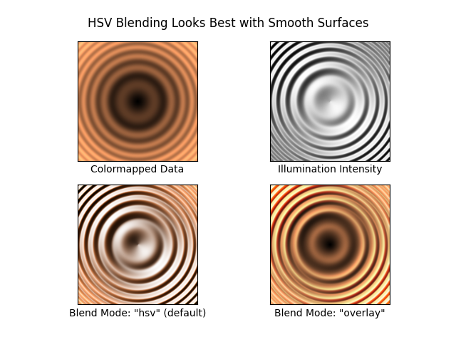
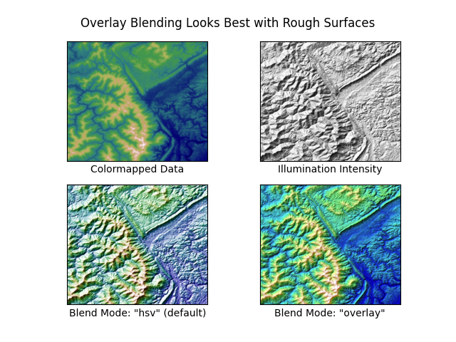
参考内容
本示例展示了以下函数、方法、类和模块的使用:
matplotlib.colors.LightSource
matplotlib.axes.Axes.imshow/matplotlib.pyplot.imshow
脚本总运行时间: (0 分钟 3.072 秒)
下载Jupyter笔记本: shading_example.ipynb下载Python源代码: shading_example.py下载压缩包: shading_example.zip
图库由Sphinx-Gallery生成
频谱图
https://matplotlib.org/stable/gallery/images_contours_and_fields/specgram_demo.html
使用 specgram 绘制频谱图。
import matplotlib.pyplot as plt
import numpy as np# Fixing random state for reproducibility
np.random.seed(19680801)dt = 0.0005
t = np.arange(0.0, 20.5, dt)
s1 = np.sin(2 * np.pi * 100 * t)
s2 = 2 * np.sin(2 * np.pi * 400 * t)# create a transient "chirp"
s2[t <= 10] = s2[12 <= t] = 0# add some noise into the mix
nse = 0.01 * np.random.random(size=len(t))x= s1 + s2 + nse  # the signal
NFFT = 1024  # the length of the windowing segments
Fs = 1/dt  # the sampling frequencyfig, (ax1, ax2) = plt.subplots(nrows=2, sharex=True)
ax1.plot(t, x)
ax1.set_ylabel('Signal')Pxx, freqs, bins, im = ax2.specgram(x, NFFT=NFFT, Fs=Fs)
# The `specgram` method returns 4 objects. They are:
# - Pxx: the periodogram
# - freqs: the frequency vector
# - bins: the centers of the time bins
# - im: the .image.AxesImage instance representing the data in the plot
ax2.set_xlabel('Time (s)')
ax2.set_ylabel('Frequency (Hz)')
ax2.set_xlim(0, 20)plt.show()
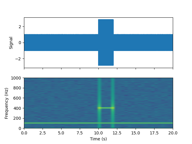
参考内容
本示例展示了以下函数、方法、类和模块的使用:
matplotlib.axes.Axes.specgram/matplotlib.pyplot.specgram
脚本总运行时间: (0 分钟 2.245 秒)
下载 Jupyter notebook: specgram_demo.ipynb下载 Python 源代码: specgram_demo.py下载压缩包: specgram_demo.zip
Spy 演示
https://matplotlib.org/stable/gallery/images_contours_and_fields/spy_demos.html
绘制数组的稀疏模式图。
import matplotlib.pyplot as plt
import numpy as np# Fixing random state for reproducibility
np.random.seed(19680801)fig, axs = plt.subplots(2, 2)
ax1 = axs[0, 0]
ax2 = axs[0, 1]
ax3 = axs[1, 0]
ax4 = axs[1, 1]x= np.random.randn(20, 20)
x[5, :] = 0、x[:, 12] = 0.ax1.spy(x, markersize=5)
ax2.spy(x, precision=0.1, markersize=5)ax3.spy(x)
ax4.spy(x, precision=0.1)plt.show()
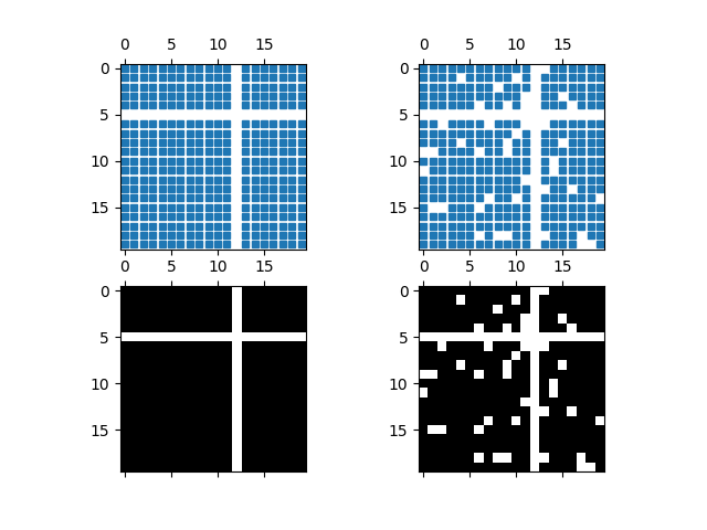
参考内容
本示例展示了以下函数、方法、类和模块的使用:
matplotlib.axes.Axes.spy/matplotlib.pyplot.spy
下载 Jupyter notebook: spy_demos.ipynb
下载 Python 源代码: spy_demos.py
下载压缩包: spy_demos.zip
三角网格等高线演示
https://matplotlib.org/stable/gallery/images_contours_and_fields/tricontour_demo.html
非结构化三角网格的等高线图绘制。
import matplotlib.pyplot as plt
import numpy as npimport matplotlib.tri as tri
在不指定三角形的情况下创建三角剖分会生成这些点的Delaunay三角剖分。
# First create the x and y coordinates of the points.
n_angles = 48
n_radii = 8
min_radius = 0.25
radii = np.linspace(min_radius, 0.95,n_radii)angles = np.linspace(0, 2 * np.pi, n_angles, endpoint=False)
angles = np.repeat(angles[..., np.newaxis],n_radii, axis=1)
angles[:, 1::2] += np.pi / n_anglesx= (radii * np.cos(angles)).flatten()
y= (radii * np.sin(angles)).flatten()
z = (np.cos(radii) * np.cos(3 * angles)).flatten()# Create the Triangulation; no triangles so Delaunay triangulation created.
triang = tri.Triangulation(x, y)# Mask off unwanted triangles.
triang.set_mask(np.hypot(x[triang.triangles].mean(axis=1),y[triang.triangles].mean(axis=1))< min_radius)
pcolor 绘图。
fig1, ax1 = plt.subplots()
ax1.set_aspect('equal')
tcf = ax1.tricontourf(triang, z)
fig1.colorbar(tcf)
ax1.tricontour(triang, z, colors='k')
ax1.set_title('Contour plot of Delaunay triangulation')
 您还可以指定不同的cmap以及填充图案。
fig2, ax2 = plt.subplots()
ax2.set_aspect("equal")
tcf = ax2.tricontourf(triang,z,hatches=["*", "-", "/", "//", "\\", None],cmap="cividis"
)
fig2.colorbar(tcf)
ax2.tricontour(triang, z, linestyles="solid", colors="k", linewidths=2.0)
ax2.set_title("Hatched Contour plot of Delaunay triangulation")
 你也可以生成不带颜色标记的阴影图案。
fig3, ax3 = plt.subplots()
n_levels = 7
tcf = ax3.tricontourf(triang,z,n_levels,colors="none",hatches=[".", "/", "\\", None, "\\\\", "*"],
)
ax3.tricontour(triang, z, n_levels, colors="black", linestyles="-")# create a legend for the contour set
artists, labels = tcf.legend_elements(str_format="{:2.1f}".format)
ax3.legend(artists, labels, handleheight=2, framealpha=1)
 你可以指定自定义的三角剖分方案,而不必对点集执行Delaunay三角剖分。此时每个三角形由构成该三角形的三个点的索引定义,这些索引可按顺时针或逆时针顺序排列。
xy = np.asarray([[-0.101, 0.872], [-0.080, 0.883], [-0.069, 0.888], [-0.054, 0.890],[-0.045, 0.897], [-0.057, 0.895], [-0.073, 0.900], [-0.087, 0.898],[-0.090, 0.904], [-0.069, 0.907], [-0.069, 0.921], [-0.080, 0.919],[-0.073, 0.928], [-0.052, 0.930], [-0.048, 0.942], [-0.062, 0.949],[-0.054, 0.958], [-0.069, 0.954], [-0.087, 0.952], [-0.087, 0.959],[-0.080, 0.966], [-0.085, 0.973], [-0.087, 0.965], [-0.097, 0.965],[-0.097, 0.975], [-0.092, 0.984], [-0.101, 0.980], [-0.108, 0.980],[-0.104, 0.987], [-0.102, 0.993], [-0.115, 1.001], [-0.099, 0.996],[-0.101, 1.007], [-0.090, 1.010], [-0.087, 1.021], [-0.069, 1.021],[-0.052, 1.022], [-0.052, 1.017], [-0.069, 1.010], [-0.064, 1.005],[-0.048, 1.005], [-0.031, 1.005], [-0.031, 0.996], [-0.040, 0.987],[-0.045, 0.980], [-0.052, 0.975], [-0.040, 0.973], [-0.026, 0.968],[-0.020, 0.954], [-0.006, 0.947], [ 0.003, 0.935], [ 0.006, 0.926],[ 0.005, 0.921], [ 0.022, 0.923], [ 0.033, 0.912], [ 0.029, 0.905],[ 0.017, 0.900], [ 0.012, 0.895], [ 0.027, 0.893], [ 0.019, 0.886],[ 0.001, 0.883], [-0.012, 0.884], [-0.029, 0.883], [-0.038, 0.879],[-0.057, 0.881], [-0.062, 0.876], [-0.078, 0.876], [-0.087, 0.872],[-0.030, 0.907], [-0.007, 0.905], [-0.057, 0.916], [-0.025, 0.933],[-0.077, 0.990], [-0.059, 0.993]])
x= np.degrees(xy[:, 0])
y= np.degrees(xy[:, 1])
x0 = -5
y0 = 52
z = np.exp(-0.01 * ((x- x0) ** 2 + (y- y0) ** 2))triangles = np.asarray([[67, 66,  1], [65,  2, 66], [ 1, 66,  2], [64,  2, 65], [63,  3, 64],[60, 59, 57], [ 2, 64,  3], [ 3, 63,  4], [ 0, 67,  1], [62,  4, 63],[57, 59, 56], [59, 58, 56], [61, 60, 69], [57, 69, 60], [ 4, 62, 68],[ 6,  5,  9], [61, 68, 62], [69, 68, 61], [ 9,  5, 70], [ 6,  8,  7],[ 4, 70,  5], [ 8,  6,  9], [56, 69, 57], [69, 56, 52], [70, 10,  9],[54, 53, 55], [56, 55, 53], [68, 70,  4], [52, 56, 53], [11, 10, 12],[69, 71, 68], [68, 13, 70], [10, 70, 13], [51, 50, 52], [13, 68, 71],[52, 71, 69], [12, 10, 13], [71, 52, 50], [71, 14, 13], [50, 49, 71],[49, 48, 71], [14, 16, 15], [14, 71, 48], [17, 19, 18], [17, 20, 19],[48, 16, 14], [48, 47, 16], [47, 46, 16], [16, 46, 45], [23, 22, 24],[21, 24, 22], [17, 16, 45], [20, 17, 45], [21, 25, 24], [27, 26, 28],[20, 72, 21], [25, 21, 72], [45, 72, 20], [25, 28, 26], [44, 73, 45],[72, 45, 73], [28, 25, 29], [29, 25, 31], [43, 73, 44], [73, 43, 40],[72, 73, 39], [72, 31, 25], [42, 40, 43], [31, 30, 29], [39, 73, 40],[42, 41, 40], [72, 33, 31], [32, 31, 33], [39, 38, 72], [33, 72, 38],[33, 38, 34], [37, 35, 38], [34, 38, 35], [35, 37, 36]])
与其创建一个 Triangulation 对象,可以直接将 x、y 和 triangles 数组传递给 tripcolor。如果要多次使用相同的三角剖分以避免重复计算,使用 Triangulation 对象会是更好的选择。
fig4, ax4 = plt.subplots()
ax4.set_aspect('equal')
tcf = ax4.tricontourf(x, y, triangles, z)
fig4.colorbar(tcf)
ax4.set_title('Contour plot of user-specified triangulation')
ax4.set_xlabel('Longitude (degrees)')
ax4.set_ylabel('Latitude (degrees)')plt.show()
参考内容
本示例演示了以下函数、方法、类和模块的使用:
matplotlib.axes.Axes.tricontourf/matplotlib.pyplot.tricontourf
-
matplotlib.tri.Triangulation -
matplotlib.figure.Figure.colorbar/matplotlib.pyplot.colorbar -
matplotlib.axes.Axes.legend/matplotlib.pyplot.legend -
matplotlib.contour.ContourSet.legend_elements
脚本总运行时间: (0 分 3.448 秒)
下载Jupyter笔记本: tricontour_demo.ipynb下载Python源代码: tricontour_demo.py下载压缩包: tricontour_demo.zip
图库由Sphinx-Gallery生成
平滑Delaunay三角等高线图
https://matplotlib.org/stable/gallery/images_contours_and_fields/tricontour_smooth_delaunay.html
本示例展示了如何对随机点集进行高分辨率三角等高线绘制,其中使用matplotlib.tri.TriAnalyzer来提升绘图质量。
本演示的初始数据点和三角网格设置如下:
- 在[-1, 1]×[-1, 1]的正方形区域内生成随机点集
- 对这些点进行Delaunay三角剖分后,用户根据init_mask_frac参数随机掩膜部分三角形,用于模拟无效数据
获取此类数据集的高分辨率等高线图的通用流程如下:
1、使用matplotlib.tri.TriAnalyzer计算扩展掩膜,该操作会从三角剖分边界排除形状不良(扁平)的三角形,并通过set_mask方法将掩膜应用于三角剖分
2、使用matplotlib.tri.UniformTriRefiner对数据进行细化和插值
3、通过tricontour绘制细化后的数据
import matplotlib.pyplot as plt
import numpy as npfrom matplotlib.tri import TriAnalyzer, Triangulation, UniformTriRefiner# ----------------------------------------------------------------------------
# Analytical test function
# ----------------------------------------------------------------------------
def experiment_res(x, y):"""An analytic function representing experiment results."""x = 2 * xr1 = np.sqrt((0.5 - x)**2 + (0.5 - y)**2)theta1 = np.arctan2(0.5 - x, 0.5 - y)r2 = np.sqrt((-x - 0.2)**2 + (-y - 0.2)**2)theta2 = np.arctan2(-x - 0.2, -y - 0.2)z = (4 * (np.exp((r1/10)**2) - 1) * 30 * np.cos(3 * theta1) +(np.exp((r2/10)**2) - 1) * 30 * np.cos(5 * theta2) +2 * (x**2 + y**2))return (np.max(z) - z) / (np.max(z) - np.min(z))# ----------------------------------------------------------------------------
# Generating the initial data test points and triangulation for the demo
# ----------------------------------------------------------------------------
# User parameters for data test points# Number of test data points, tested from 3 to 5000 for subdiv=3
n_test = 200# Number of recursive subdivisions of the initial mesh for smooth plots.
# Values >3 might result in a very high number of triangles for the refine
# mesh: new triangles numbering = (4**subdiv)*ntri
subdiv = 3# Float > 0、adjusting the proportion of (invalid) initial triangles which will
# be masked out. Enter 0 for no mask.
init_mask_frac = 0.0# Minimum circle ratio - border triangles with circle ratio below this will be
# masked if they touch a border. Suggested value 0.01; use -1 to keep all
# triangles.
min_circle_ratio = .01# Random points
random_gen = np.random.RandomState(seed=19680801)
x_test = random_gen.uniform(-1., 1., size=n_test)
y_test = random_gen.uniform(-1., 1., size=n_test)
z_test = experiment_res(x_test, y_test)# meshing with Delaunay triangulation
tri = Triangulation(x_test, y_test)
ntri = tri.triangles.shape[0]# Some invalid data are masked out
mask_init = np.zeros(ntri, dtype=bool)
masked_tri = random_gen.randint(0, ntri, int(ntri * init_mask_frac))
mask_init[masked_tri] = True
tri.set_mask(mask_init)# ----------------------------------------------------------------------------
# Improving the triangulation before high-res plots: removing flat triangles
# ----------------------------------------------------------------------------
# masking badly shaped triangles at the border of the triangular mesh.
mask = TriAnalyzer(tri).get_flat_tri_mask(min_circle_ratio)
tri.set_mask(mask)# refining the data
refiner = UniformTriRefiner(tri)
tri_refi, z_test_refi = refiner.refine_field(z_test, subdiv=subdiv)# analytical 'results' for comparison
z_expected = experiment_res(tri_refi.x, tri_refi.y)# for the demo: loading the 'flat' triangles for plot
flat_tri = Triangulation(x_test, y_test)
flat_tri.set_mask(~mask)# ----------------------------------------------------------------------------
# Now the plots
# ----------------------------------------------------------------------------
# User options for plots
plot_tri = True          # plot of base triangulation
plot_masked_tri = True   # plot of excessively flat excluded triangles
plot_refi_tri = False    # plot of refined triangulation
plot_expected = False    # plot of analytical function values for comparison# Graphical options for tricontouring
levels = np.arange(0., 1., 0.025)fig, ax = plt.subplots()
ax.set_aspect('equal')
ax.set_title("Filtering a Delaunay mesh\n""(application to high-resolution tricontouring)")# 1) plot of the refined (computed) data contours:
ax.tricontour(tri_refi, z_test_refi, levels=levels, cmap='Blues',linewidths=[2.0, 0.5, 1.0, 0.5])
# 2) plot of the expected (analytical) data contours (dashed):
if plot_expected:ax.tricontour(tri_refi, z_expected, levels=levels, cmap='Blues',linestyles='--')
# 3) plot of the fine mesh on which interpolation was done:
if plot_refi_tri:ax.triplot(tri_refi, color='0.97')
# 4) plot of the initial 'coarse' mesh:
if plot_tri:ax.triplot(tri, color='0.7')
# 4) plot of the unvalidated triangles from naive Delaunay Triangulation:
if plot_masked_tri:ax.triplot(flat_tri, color='red')plt.show()
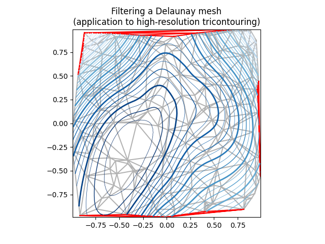
参考内容
本示例展示了以下函数、方法、类和模块的使用:
matplotlib.axes.Axes.tricontour/matplotlib.pyplot.tricontour
-
matplotlib.axes.Axes.tricontourf/matplotlib.pyplot.tricontourf -
matplotlib.axes.Axes.triplot/matplotlib.pyplot.triplot -
matplotlib.tri -
matplotlib.tri.Triangulation -
matplotlib.tri.TriAnalyzer -
matplotlib.tri.UniformTriRefiner
脚本总运行时间: (0分1.725秒)
下载Jupyter笔记本: tricontour_smooth_delaunay.ipynb下载Python源代码: tricontour_smooth_delaunay.py下载压缩包: tricontour_smooth_delaunay.zip
图库由Sphinx-Gallery生成
平滑用户三角等高线图
https://matplotlib.org/stable/gallery/images_contours_and_fields/tricontour_smooth_user.html
展示如何在用户自定义的三角网格上使用matplotlib.tri.UniformTriRefiner实现高分辨率三角等高线绘制。
import matplotlib.pyplot as plt
import numpy as npimport matplotlib.tri as tri# ----------------------------------------------------------------------------
# Analytical test function
# ----------------------------------------------------------------------------
def function_z(x, y):r1 = np.sqrt((0.5 - x)**2 + (0.5 - y)**2)theta1 = np.arctan2(0.5 - x, 0.5 - y)r2 = np.sqrt((-x- 0.2)**2 + (-y- 0.2)**2)theta2 = np.arctan2(-x- 0.2, -y- 0.2)z = -(2 * (np.exp((r1 / 10)**2) - 1) * 30、* np.cos(7、* theta1) +(np.exp((r2 / 10)**2) - 1) * 30、* np.cos(11、* theta2) +0.7 * (x**2 + y**2))return (np.max(z) - z) / (np.max(z) - np.min(z))# ----------------------------------------------------------------------------
# Creating a Triangulation
# ----------------------------------------------------------------------------
# First create the x and y coordinates of the points.
n_angles = 20
n_radii = 10
min_radius = 0.15
radii = np.linspace(min_radius, 0.95,n_radii)angles = np.linspace(0, 2 * np.pi, n_angles, endpoint=False)
angles = np.repeat(angles[..., np.newaxis],n_radii, axis=1)
angles[:, 1::2] += np.pi / n_anglesx= (radii * np.cos(angles)).flatten()
y= (radii * np.sin(angles)).flatten()
z = function_z(x, y)# Now create the Triangulation.
# (Creating a Triangulation without specifying the triangles results in the # Delaunay triangulation of the points.)
triang= tri.Triangulation(x, y)# Mask off unwanted triangles.
triang.set_mask(np.hypot(x[triang.triangles].mean(axis=1),y[triang.triangles].mean(axis=1))< min_radius)# ----------------------------------------------------------------------------
# Refine data
# ----------------------------------------------------------------------------
refiner = tri.UniformTriRefiner(triang)
tri_refi, z_test_refi = refiner.refine_field(z, subdiv=3)# ----------------------------------------------------------------------------
# Plot the triangulation and the high-res iso-contours
# ----------------------------------------------------------------------------
fig, ax = plt.subplots()
ax.set_aspect('equal')
ax.triplot(triang, lw=0.5, color='white')levels = np.arange(0., 1., 0.025)
ax.tricontourf(tri_refi, z_test_refi, levels=levels, cmap='terrain')
ax.tricontour(tri_refi, z_test_refi, levels=levels,colors=['0.25', '0.5', '0.5', '0.5', '0.5'],linewidths=[1.0, 0.5, 0.5, 0.5, 0.5])ax.set_title("High-resolution tricontouring")plt.show()
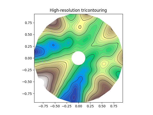
参考内容
本示例展示了以下函数、方法、类和模块的使用:
matplotlib.axes.Axes.tricontour/matplotlib.pyplot.tricontour
-
matplotlib.axes.Axes.tricontourf/matplotlib.pyplot.tricontourf -
matplotlib.tri -
matplotlib.tri.Triangulation -
matplotlib.tri.UniformTriRefiner
脚本总运行时间: (0 分钟 1.392 秒)
下载 Jupyter notebook: tricontour_smooth_user.ipynb下载 Python 源代码: tricontour_smooth_user.py下载压缩包: tricontour_smooth_user.zip
三色渐变演示
https://matplotlib.org/stable/gallery/images_contours_and_fields/trigradient_demo.html
展示如何使用 matplotlib.tri.CubicTriInterpolator 计算渐变效果。
import matplotlib.pyplot as plt
import numpy as npfrom matplotlib.tri import (CubicTriInterpolator, Triangulation,UniformTriRefiner)# ----------------------------------------------------------------------------
# Electrical potential of a dipole
# ----------------------------------------------------------------------------
def dipole_potential(x, y):"""The electric dipole potential V, at position *x*, *y*."""r_sq = x**2 + y**2theta = np.arctan2(y, x)z = np.cos(theta)/r_sqreturn (np.max(z) - z) / (np.max(z) - np.min(z))# ----------------------------------------------------------------------------
# Creating a Triangulation
# ----------------------------------------------------------------------------
# First create the x and y coordinates of the points.
n_angles = 30
n_radii = 10
min_radius = 0.2
radii = np.linspace(min_radius, 0.95,n_radii)angles = np.linspace(0, 2 * np.pi, n_angles, endpoint=False)
angles = np.repeat(angles[..., np.newaxis],n_radii, axis=1)
angles[:, 1::2] += np.pi / n_anglesx= (radii*np.cos(angles)).flatten()
y= (radii*np.sin(angles)).flatten()
V = dipole_potential(x, y)# Create the Triangulation; no triangles specified so Delaunay triangulation
# created.
triang= Triangulation(x, y)# Mask off unwanted triangles.
triang.set_mask(np.hypot(x[triang.triangles].mean(axis=1),y[triang.triangles].mean(axis=1))< min_radius)# ----------------------------------------------------------------------------
# Refine data - interpolates the electrical potential V
# ----------------------------------------------------------------------------
refiner = UniformTriRefiner(triang)
tri_refi, z_test_refi = refiner.refine_field(V, subdiv=3)# ----------------------------------------------------------------------------
# Computes the electrical field (Ex, Ey) as gradient of electrical potential
# ----------------------------------------------------------------------------
tci = CubicTriInterpolator(triang, -V)
# Gradient requested here at the mesh nodes but could be anywhere else:
(Ex, Ey) = tci.gradient(triang.x, triang.y)
E_norm = np.sqrt(Ex**2 + Ey**2)# ----------------------------------------------------------------------------
# Plot the triangulation, the potential iso-contours and the vector field
# ----------------------------------------------------------------------------
fig, ax = plt.subplots()
ax.set_aspect('equal')
# Enforce the margins, and enlarge them to give room for the vectors.
ax.use_sticky_edges = False
ax.margins(0.07)ax.triplot(triang, color='0.8')levels = np.arange(0., 1., 0.01)
ax.tricontour(tri_refi, z_test_refi, levels=levels, cmap='hot',linewidths=[2.0, 1.0, 1.0, 1.0])
# Plots direction of the electrical vector field
ax.quiver(triang.x, triang.y, Ex/E_norm, Ey/E_norm,units='xy', scale=10., zorder=3, color='blue',width=0.007, headwidth=3., headlength=4.)ax.set_title('Gradient plot: an electrical dipole')
plt.show()
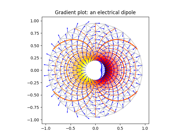
参考内容
本示例展示了以下函数、方法、类和模块的使用:
matplotlib.axes.Axes.tricontour/matplotlib.pyplot.tricontour
-
matplotlib.axes.Axes.triplot/matplotlib.pyplot.triplot -
matplotlib.tri -
matplotlib.tri.Triangulation -
matplotlib.tri.CubicTriInterpolator -
matplotlib.tri.CubicTriInterpolator.gradient -
matplotlib.tri.UniformTriRefiner -
matplotlib.axes.Axes.quiver/matplotlib.pyplot.quiver
脚本总运行时间: (0 分钟 1.621 秒)
下载 Jupyter notebook: trigradient_demo.ipynb下载 Python 源代码: trigradient_demo.py下载压缩包: trigradient_demo.zip
Triinterp 演示
https://matplotlib.org/stable/gallery/images_contours_and_fields/triinterp_demo.html
实现从三角网格到四边形网格的插值计算。
import matplotlib.pyplot as plt
import numpy as npimport matplotlib.tri as mtri# Create triangulation.
x= np.asarray([0, 1, 2, 3, 0.5, 1.5, 2.5, 1, 2, 1.5])
y= np.asarray([0, 0, 0, 0, 1.0, 1.0, 1.0, 2, 2, 3.0])
triangles = [[0, 1, 4], [1, 2, 5], [2, 3, 6], [1, 5, 4], [2, 6, 5], [4, 5, 7],[5, 6, 8], [5, 8, 7], [7, 8, 9]]
triang= mtri.Triangulation(x, y, triangles)# Interpolate to regularly-spaced quad grid.
z = np.cos(1.5 * x) * np.cos(1.5 * y)
xi, yi = np.meshgrid(np.linspace(0, 3, 20), np.linspace(0, 3, 20))interp_lin = mtri.LinearTriInterpolator(triang, z)
zi_lin = interp_lin(xi, yi)interp_cubic_geom = mtri.CubicTriInterpolator(triang, z, kind='geom')
zi_cubic_geom = interp_cubic_geom(xi, yi)interp_cubic_min_E = mtri.CubicTriInterpolator(triang, z, kind='min_E')
zi_cubic_min_E = interp_cubic_min_E(xi, yi)# Set up the figure
fig, axs = plt.subplots(nrows=2, ncols=2)
axs = axs.flatten()# Plot the triangulation.
axs[0].tricontourf(triang, z)
axs[0].triplot(triang, 'ko-')
axs[0].set_title('Triangular grid')# Plot linear interpolation to quad grid.
axs[1].contourf(xi, yi, zi_lin)
axs[1].plot(xi, yi, 'k-', lw=0.5, alpha=0.5)
axs[1].plot(xi.T, yi.T, 'k-', lw=0.5, alpha=0.5)
axs[1].set_title("Linear interpolation")# Plot cubic interpolation to quad grid, kind=geom
axs[2].contourf(xi, yi, zi_cubic_geom)
axs[2].plot(xi, yi, 'k-', lw=0.5, alpha=0.5)
axs[2].plot(xi.T, yi.T, 'k-', lw=0.5, alpha=0.5)
axs[2].set_title("Cubic interpolation,\nkind='geom'")# Plot cubic interpolation to quad grid, kind=min_E
axs[3].contourf(xi, yi, zi_cubic_min_E)
axs[3].plot(xi, yi, 'k-', lw=0.5, alpha=0.5)
axs[3].plot(xi.T, yi.T, 'k-', lw=0.5, alpha=0.5)
axs[3].set_title("Cubic interpolation,\nkind='min_E'")fig.tight_layout()
plt.show()
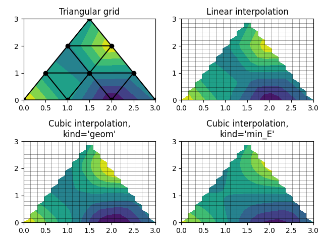
参考内容
本示例演示了以下函数、方法、类和模块的使用:
matplotlib.axes.Axes.tricontourf/matplotlib.pyplot.tricontourf
-
matplotlib.axes.Axes.triplot/matplotlib.pyplot.triplot -
matplotlib.axes.Axes.contourf/matplotlib.pyplot.contourf -
matplotlib.axes.Axes.plot/matplotlib.pyplot.plot -
matplotlib.tri -
matplotlib.tri.LinearTriInterpolator -
matplotlib.tri.CubicTriInterpolator -
matplotlib.tri.Triangulation
脚本总运行时间: (0 分 1.839 秒)
下载 Jupyter notebook: triinterp_demo.ipynb下载 Python 源代码: triinterp_demo.py下载压缩包: triinterp_demo.zip
三色图演示
https://matplotlib.org/stable/gallery/images_contours_and_fields/tripcolor_demo.html
非结构化三角形网格的伪彩色图绘制。
import matplotlib.pyplot as plt
import numpy as npimport matplotlib.tri as tri
不指定三角形而创建的三角剖分会生成这些点的 Delaunay 三角剖分。
# First create the x and y coordinates of the points.
n_angles = 36
n_radii = 8
min_radius = 0.25
radii = np.linspace(min_radius, 0.95,n_radii)angles = np.linspace(0, 2 * np.pi, n_angles, endpoint=False)
angles = np.repeat(angles[..., np.newaxis],n_radii, axis=1)
angles[:, 1::2] += np.pi / n_anglesx= (radii * np.cos(angles)).flatten()
y= (radii * np.sin(angles)).flatten()
z = (np.cos(radii) * np.cos(3 * angles)).flatten()# Create the Triangulation; no triangles so Delaunay triangulation created.
triang= tri.Triangulation(x, y)# Mask off unwanted triangles.
triang.set_mask(np.hypot(x[triang.triangles].mean(axis=1),y[triang.triangles].mean(axis=1))< min_radius)
三色图。
fig1, ax1 = plt.subplots()
ax1.set_aspect('equal')
tpc = ax1.tripcolor(triang, z, shading='flat')
fig1.colorbar(tpc)
ax1.set_title('tripcolor of Delaunay triangulation, flat shading')
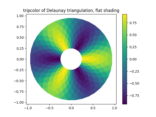 展示Gouraud着色效果。
fig2, ax2 = plt.subplots()
ax2.set_aspect('equal')
tpc = ax2.tripcolor(triang, z, shading='gouraud')
fig2.colorbar(tpc)
ax2.set_title('tripcolor of Delaunay triangulation, gouraud shading')
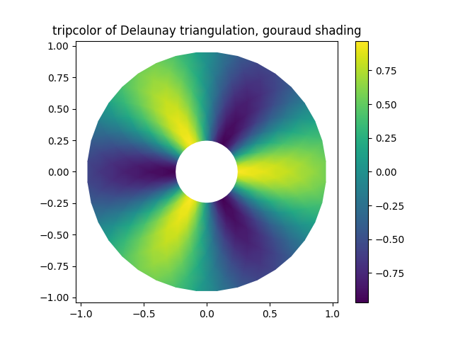 您可以指定自定义的三角剖分方案,而不必对点集执行Delaunay三角剖分。此时每个三角形由构成该三角形的三个点的索引定义,这些索引可按顺时针或逆时针顺序排列。
xy = np.asarray([[-0.101, 0.872], [-0.080, 0.883], [-0.069, 0.888], [-0.054, 0.890],[-0.045, 0.897], [-0.057, 0.895], [-0.073, 0.900], [-0.087, 0.898],[-0.090, 0.904], [-0.069, 0.907], [-0.069, 0.921], [-0.080, 0.919],[-0.073, 0.928], [-0.052, 0.930], [-0.048, 0.942], [-0.062, 0.949],[-0.054, 0.958], [-0.069, 0.954], [-0.087, 0.952], [-0.087, 0.959],[-0.080, 0.966], [-0.085, 0.973], [-0.087, 0.965], [-0.097, 0.965],[-0.097, 0.975], [-0.092, 0.984], [-0.101, 0.980], [-0.108, 0.980],[-0.104, 0.987], [-0.102, 0.993], [-0.115, 1.001], [-0.099, 0.996],[-0.101, 1.007], [-0.090, 1.010], [-0.087, 1.021], [-0.069, 1.021],[-0.052, 1.022], [-0.052, 1.017], [-0.069, 1.010], [-0.064, 1.005],[-0.048, 1.005], [-0.031, 1.005], [-0.031, 0.996], [-0.040, 0.987],[-0.045, 0.980], [-0.052, 0.975], [-0.040, 0.973], [-0.026, 0.968],[-0.020, 0.954], [-0.006, 0.947], [ 0.003, 0.935], [ 0.006, 0.926],[ 0.005, 0.921], [ 0.022, 0.923], [ 0.033, 0.912], [ 0.029, 0.905],[ 0.017, 0.900], [ 0.012, 0.895], [ 0.027, 0.893], [ 0.019, 0.886],[ 0.001, 0.883], [-0.012, 0.884], [-0.029, 0.883], [-0.038, 0.879],[-0.057, 0.881], [-0.062, 0.876], [-0.078, 0.876], [-0.087, 0.872],[-0.030, 0.907], [-0.007, 0.905], [-0.057, 0.916], [-0.025, 0.933],[-0.077, 0.990], [-0.059, 0.993]])
x, y= np.rad2deg(xy).Ttriangles = np.asarray([[67, 66,  1], [65,  2, 66], [ 1, 66,  2], [64,  2, 65], [63,  3, 64],[60, 59, 57], [ 2, 64,  3], [ 3, 63,  4], [ 0, 67,  1], [62,  4, 63],[57, 59, 56], [59, 58, 56], [61, 60, 69], [57, 69, 60], [ 4, 62, 68],[ 6,  5,  9], [61, 68, 62], [69, 68, 61], [ 9,  5, 70], [ 6,  8,  7],[ 4, 70,  5], [ 8,  6,  9], [56, 69, 57], [69, 56, 52], [70, 10,  9],[54, 53, 55], [56, 55, 53], [68, 70,  4], [52, 56, 53], [11, 10, 12],[69, 71, 68], [68, 13, 70], [10, 70, 13], [51, 50, 52], [13, 68, 71],[52, 71, 69], [12, 10, 13], [71, 52, 50], [71, 14, 13], [50, 49, 71],[49, 48, 71], [14, 16, 15], [14, 71, 48], [17, 19, 18], [17, 20, 19],[48, 16, 14], [48, 47, 16], [47, 46, 16], [16, 46, 45], [23, 22, 24],[21, 24, 22], [17, 16, 45], [20, 17, 45], [21, 25, 24], [27, 26, 28],[20, 72, 21], [25, 21, 72], [45, 72, 20], [25, 28, 26], [44, 73, 45],[72, 45, 73], [28, 25, 29], [29, 25, 31], [43, 73, 44], [73, 43, 40],[72, 73, 39], [72, 31, 25], [42, 40, 43], [31, 30, 29], [39, 73, 40],[42, 41, 40], [72, 33, 31], [32, 31, 33], [39, 38, 72], [33, 72, 38],[33, 38, 34], [37, 35, 38], [34, 38, 35], [35, 37, 36]])xmid = x[triangles].mean(axis=1)
ymid = y[triangles].mean(axis=1)
x0 = -5
y0 = 52
zfaces = np.exp(-0.01 * ((xmid - x0) * (xmid - x0) +(ymid - y0) * (ymid - y0)))
与其创建一个 Triangulation 对象,可以直接将 x、y 和 triangles 数组传递给 tripcolor 函数。但如果需要多次使用相同的三角剖分以避免重复计算,使用 Triangulation 对象会是更好的选择。
可以通过 facecolors 关键字参数为每个面(而非每个点)指定一个颜色值。
fig3, ax3 = plt.subplots()
ax3.set_aspect('equal')
tpc = ax3.tripcolor(x, y, triangles, facecolors=zfaces, edgecolors='k')
fig3.colorbar(tpc)
ax3.set_title('tripcolor of user-specified triangulation')
ax3.set_xlabel('Longitude (degrees)')
ax3.set_ylabel('Latitude (degrees)')plt.show()
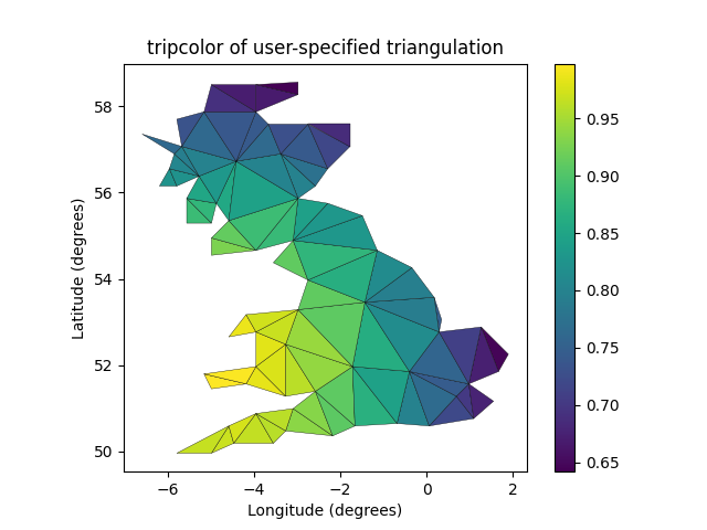
参考内容
本示例展示了以下函数、方法、类和模块的使用:
matplotlib.axes.Axes.tripcolor/matplotlib.pyplot.tripcolor
-
matplotlib.tri -
matplotlib.tri.Triangulation
脚本总运行时间: (0 分 2.673 秒)
下载 Jupyter notebook: tripcolor_demo.ipynb下载 Python 源代码: tripcolor_demo.py下载压缩包: tripcolor_demo.zip
Triplot 演示
https://matplotlib.org/stable/gallery/images_contours_and_fields/triplot_demo.html
创建并绘制非结构化三角形网格。
import matplotlib.pyplot as plt
import numpy as npimport matplotlib.tri as tri
在不指定三角形的情况下创建三角剖分,会生成这些点的Delaunay三角剖分。
# First create the x and y coordinates of the points.
n_angles = 36
n_radii = 8
min_radius = 0.25
radii = np.linspace(min_radius, 0.95,n_radii)angles = np.linspace(0, 2 * np.pi, n_angles, endpoint=False)
angles = np.repeat(angles[..., np.newaxis],n_radii, axis=1)
angles[:, 1::2] += np.pi / n_anglesx= (radii * np.cos(angles)).flatten()
y= (radii * np.sin(angles)).flatten()# Create the Triangulation; no triangles so Delaunay triangulation created.
triang= tri.Triangulation(x, y)# Mask off unwanted triangles.
triang.set_mask(np.hypot(x[triang.triangles].mean(axis=1),y[triang.triangles].mean(axis=1))< min_radius)
绘制三角剖分图。
fig1, ax1 = plt.subplots()
ax1.set_aspect('equal')
ax1.triplot(triang, 'bo-', lw=1)
ax1.set_title('triplot of Delaunay triangulation')
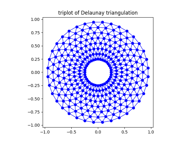 您可以选择指定自定义的三角剖分方案,而不必对点集执行Delaunay三角剖分。在这种方案中,每个三角形由构成该三角形的三个点的索引定义,这些索引可以按顺时针或逆时针顺序排列。
xy = np.asarray([[-0.101, 0.872], [-0.080, 0.883], [-0.069, 0.888], [-0.054, 0.890],[-0.045, 0.897], [-0.057, 0.895], [-0.073, 0.900], [-0.087, 0.898],[-0.090, 0.904], [-0.069, 0.907], [-0.069, 0.921], [-0.080, 0.919],[-0.073, 0.928], [-0.052, 0.930], [-0.048, 0.942], [-0.062, 0.949],[-0.054, 0.958], [-0.069, 0.954], [-0.087, 0.952], [-0.087, 0.959],[-0.080, 0.966], [-0.085, 0.973], [-0.087, 0.965], [-0.097, 0.965],[-0.097, 0.975], [-0.092, 0.984], [-0.101, 0.980], [-0.108, 0.980],[-0.104, 0.987], [-0.102, 0.993], [-0.115, 1.001], [-0.099, 0.996],[-0.101, 1.007], [-0.090, 1.010], [-0.087, 1.021], [-0.069, 1.021],[-0.052, 1.022], [-0.052, 1.017], [-0.069, 1.010], [-0.064, 1.005],[-0.048, 1.005], [-0.031, 1.005], [-0.031, 0.996], [-0.040, 0.987],[-0.045, 0.980], [-0.052, 0.975], [-0.040, 0.973], [-0.026, 0.968],[-0.020, 0.954], [-0.006, 0.947], [ 0.003, 0.935], [ 0.006, 0.926],[ 0.005, 0.921], [ 0.022, 0.923], [ 0.033, 0.912], [ 0.029, 0.905],[ 0.017, 0.900], [ 0.012, 0.895], [ 0.027, 0.893], [ 0.019, 0.886],[ 0.001, 0.883], [-0.012, 0.884], [-0.029, 0.883], [-0.038, 0.879],[-0.057, 0.881], [-0.062, 0.876], [-0.078, 0.876], [-0.087, 0.872],[-0.030, 0.907], [-0.007, 0.905], [-0.057, 0.916], [-0.025, 0.933],[-0.077, 0.990], [-0.059, 0.993]])
x= np.degrees(xy[:, 0])
y= np.degrees(xy[:, 1])triangles = np.asarray([[67, 66,  1], [65,  2, 66], [ 1, 66,  2], [64,  2, 65], [63,  3, 64],[60, 59, 57], [ 2, 64,  3], [ 3, 63,  4], [ 0, 67,  1], [62,  4, 63],[57, 59, 56], [59, 58, 56], [61, 60, 69], [57, 69, 60], [ 4, 62, 68],[ 6,  5,  9], [61, 68, 62], [69, 68, 61], [ 9,  5, 70], [ 6,  8,  7],[ 4, 70,  5], [ 8,  6,  9], [56, 69, 57], [69, 56, 52], [70, 10,  9],[54, 53, 55], [56, 55, 53], [68, 70,  4], [52, 56, 53], [11, 10, 12],[69, 71, 68], [68, 13, 70], [10, 70, 13], [51, 50, 52], [13, 68, 71],[52, 71, 69], [12, 10, 13], [71, 52, 50], [71, 14, 13], [50, 49, 71],[49, 48, 71], [14, 16, 15], [14, 71, 48], [17, 19, 18], [17, 20, 19],[48, 16, 14], [48, 47, 16], [47, 46, 16], [16, 46, 45], [23, 22, 24],[21, 24, 22], [17, 16, 45], [20, 17, 45], [21, 25, 24], [27, 26, 28],[20, 72, 21], [25, 21, 72], [45, 72, 20], [25, 28, 26], [44, 73, 45],[72, 45, 73], [28, 25, 29], [29, 25, 31], [43, 73, 44], [73, 43, 40],[72, 73, 39], [72, 31, 25], [42, 40, 43], [31, 30, 29], [39, 73, 40],[42, 41, 40], [72, 33, 31], [32, 31, 33], [39, 38, 72], [33, 72, 38],[33, 38, 34], [37, 35, 38], [34, 38, 35], [35, 37, 36]])
与其创建一个 Triangulation 对象,可以直接将 x、y 和 triangles 数组传递给 triplot 函数。如果要多次使用相同的三角剖分以避免重复计算,使用 Triangulation 对象会是更好的选择。
fig2, ax2 = plt.subplots()
ax2.set_aspect('equal')
ax2.triplot(x, y, triangles, 'go-', lw=1.0)
ax2.set_title('triplot of user-specified triangulation')
ax2.set_xlabel('Longitude (degrees)')
ax2.set_ylabel('Latitude (degrees)')plt.show()
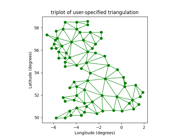
参考内容
本示例展示了以下函数、方法、类和模块的使用:
matplotlib.axes.Axes.triplot/matplotlib.pyplot.triplot
-
matplotlib.tri -
matplotlib.tri.Triangulation
脚本总运行时间: (0 分 1.699 秒)
下载 Jupyter 笔记本: triplot_demo.ipynb下载 Python 源代码: triplot_demo.py下载压缩包: triplot_demo.zip
水印图像
https://matplotlib.org/stable/gallery/images_contours_and_fields/watermark_image.html
通过将图像移至最上层(zorder=3)并设置为半透明(alpha=0.7),在图表上叠加一个图像。
import matplotlib.pyplot as plt
import numpy as npimport matplotlib.cbook as cbook
import matplotlib.image as imagewith cbook.get_sample_data('logo2.png') as file:im = image.imread(file)fig, ax = plt.subplots()np.random.seed(19680801)
x= np.arange(30)
y= x+ np.random.randn(30)
ax.bar(x, y, color='#6bbc6b')
ax.grid()fig.figimage(im, 25, 25, zorder=3, alpha=.7)plt.show()
参考内容
本示例展示了以下函数、方法、类和模块的使用:
matplotlib.image
-
matplotlib.image.imread/matplotlib.pyplot.imread -
matplotlib.figure.Figure.figimage
下载Jupyter笔记本: watermark_image.ipynb下载Python源代码: watermark_image.py下载压缩包: watermark_image.zip
图库由Sphinx-Gallery生成
2025-08-21(四)