一周学会Matplotlib3 Python 数据可视化-绘制误差条形图
锋哥原创的Matplotlib3 Python数据可视化视频教程:
2026版 Matplotlib3 Python 数据可视化 视频教程(无废话版) 玩命更新中~_哔哩哔哩_bilibili
课程介绍
本课程讲解利用python进行数据可视化 科研绘图-Matplotlib,学习Matplotlib图形参数基本设置,绘图参数及主要函数,以及Matplotlib基础绘图,和Matplotlib高级绘图。
绘制误差条形图
误差条形图是数据可视化中展示数据不确定性或变异性的重要工具。Matplotlib提供了强大的功能来创建各种类型的误差条形图,包括对称误差、非对称误差、水平误差条等。
plt.errorbar() 是 Matplotlib 中用于绘制带误差线的数据点的核心函数,常用于科学可视化中展示数据的不确定性。以下是该方法的详细解析:
plt.errorbar(x, y, yerr=None, xerr=None, fmt='', ecolor=None, elinewidth=None, capsize=None, barsabove=False, lolims=False, uplims=False, xlolims=False, xuplims=False, errorevery=1, capthick=None, **kwargs)必需参数
| 参数 | 类型 | 说明 |
|---|---|---|
| x | array | 数据点的 x 坐标值 |
| y | array | 数据点的 y 坐标值 |
🔍 误差线控制参数
-
误差方向
| 参数 | 默认值 | 说明 |
|---|---|---|
| yerr | None | y方向的误差值,支持多种格式: - 标量:所有点使用相同误差值 - 一维数组:每个点单独误差值 - 2xN数组:[下误差, 上误差] |
| xerr | None | x方向的误差值(格式同yerr) |
-
误差线样式
| 参数 | 默认值 | 说明 |
|---|---|---|
fmt | '' | 数据点标记格式(同plt.plot()格式) 例如:'o-'(圆点连线),'s--'(方形虚线) |
ecolor | None | 误差线颜色(默认与数据点相同) |
elinewidth | None | 误差线宽度(默认1.5) |
capsize | None | 误差线端帽长度(单位:点) |
capthick | None | 误差线端帽厚度(默认同误差线) |
-
特殊误差类型
| 参数 | 默认值 | 说明 |
|---|---|---|
lolims/uplims | False | 只显示下/上限的单向误差线 |
xlolims/xuplims | False | x方向的单向误差线 |
barsabove | False | 误差线显示在数据点上方 |
我们看一个对称误差条形图示例:
import matplotlib.pyplot as plt
import numpy as np
# 创建示例数据
categories = ['A', 'B', 'C', 'D', 'E']
values = [23, 45, 56, 32, 67]
errors = [2.5, 3.2, 4.1, 2.8, 3.9] # 对称误差值
plt.figure(figsize=(10, 6))
# 绘制条形图并添加误差条
bars = plt.bar(categories, values, color='skyblue', edgecolor='black', alpha=0.8)
plt.errorbar(categories, values, yerr=errors, fmt='none',ecolor='red', elinewidth=2, capsize=8, capthick=2)
# 添加数据标签
for bar in bars:height = bar.get_height()plt.text(bar.get_x() + bar.get_width() / 2., height + 1,f'{height:.1f}', ha='center', va='bottom', fontsize=10)
# 图表装饰
plt.title('基础对称误差条形图', fontsize=14, pad=20)
plt.xlabel('类别', fontsize=12)
plt.ylabel('测量值', fontsize=12)
plt.grid(axis='y', linestyle='--', alpha=0.7)
plt.ylim(0, 80)
plt.tight_layout()
plt.show()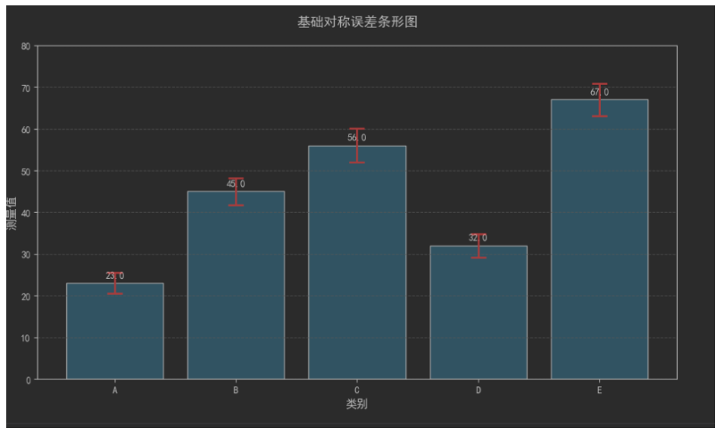
我们在看一个非对称误差条形图示例:
import matplotlib.pyplot as plt
import numpy as np
# 创建示例数据
categories = ['A', 'B', 'C', 'D', 'E']
values = [23, 45, 56, 32, 67]
# 非对称误差数据
lower_errors = [1.8, 2.5, 3.0, 2.0, 3.2] # 下误差
upper_errors = [3.2, 3.8, 5.2, 3.6, 4.6] # 上误差
asymmetric_errors = [lower_errors, upper_errors] # 非对称误差格式
plt.figure(figsize=(10, 6))
# 绘制条形图
bars = plt.bar(categories, values, color='lightgreen', edgecolor='black', alpha=0.8)
# 添加非对称误差条
plt.errorbar(categories, values, yerr=asymmetric_errors, fmt='none',ecolor='purple', elinewidth=2, capsize=8, capthick=2)
# 添加数据标签
for bar in bars:height = bar.get_height()plt.text(bar.get_x() + bar.get_width() / 2., height + 1,f'{height:.1f}', ha='center', va='bottom', fontsize=10)
# 图表装饰
plt.title('非对称误差条形图', fontsize=14, pad=20)
plt.xlabel('类别', fontsize=12)
plt.ylabel('测量值', fontsize=12)
plt.grid(axis='y', linestyle='--', alpha=0.7)
plt.ylim(0, 80)
plt.tight_layout()
plt.show()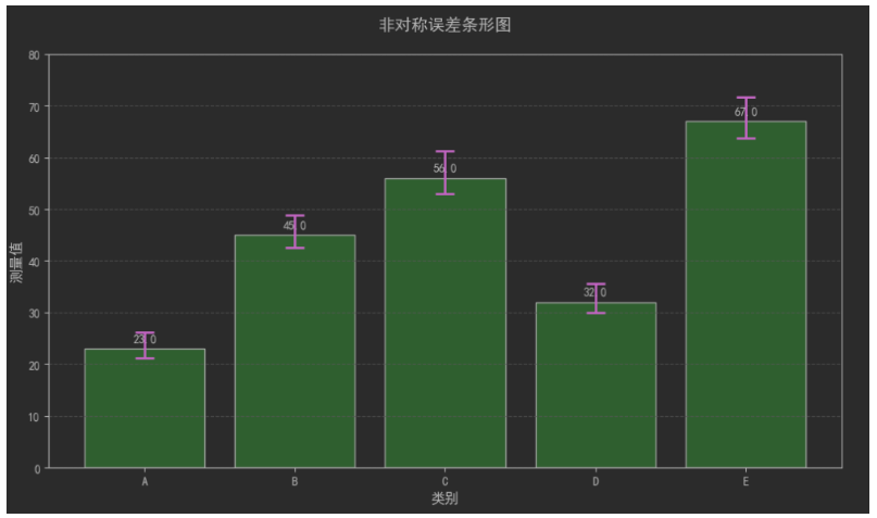
分组误差条形图示例:
import numpy as np
# 创建多组数据
categories = ['Group 1', 'Group 2', 'Group 3', 'Group 4']
men_means = [22, 30, 35, 28]
women_means = [25, 32, 30, 35]
men_errors = [1.8, 2.5, 3.0, 2.5]
women_errors = [2.2, 2.8, 2.5, 3.0]
x = np.arange(len(categories)) # 标签位置
width = 0.35 # 条形宽度
plt.figure(figsize=(12, 7))
# 绘制男性组条形图
rects1 = plt.bar(x - width / 2, men_means, width,label='男性', color='royalblue', alpha=0.8,yerr=men_errors, error_kw=dict(elinewidth=2, ecolor='darkblue', capsize=6))
# 绘制女性组条形图
rects2 = plt.bar(x + width / 2, women_means, width,label='女性', color='lightcoral', alpha=0.8,yerr=women_errors, error_kw=dict(elinewidth=2, ecolor='darkred', capsize=6))
# 添加数据标签
def autolabel(rects):"""在条形图上方附加文本标签,显示条形高度"""for rect in rects:height = rect.get_height()plt.annotate(f'{height:.1f}',xy=(rect.get_x() + rect.get_width() / 2, height),xytext=(0, 3), # 3点垂直偏移textcoords="offset points",ha='center', va='bottom', fontsize=10)
autolabel(rects1)
autolabel(rects2)
# 图表装饰
plt.title('分组误差条形图(按性别)', fontsize=14, pad=20)
plt.xlabel('实验组', fontsize=12)
plt.ylabel('平均得分', fontsize=12)
plt.xticks(x, categories)
plt.legend(loc='upper right', frameon=True)
plt.grid(axis='y', linestyle='--', alpha=0.5)
plt.ylim(0, 45)
plt.tight_layout()
plt.show()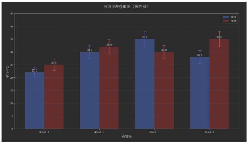
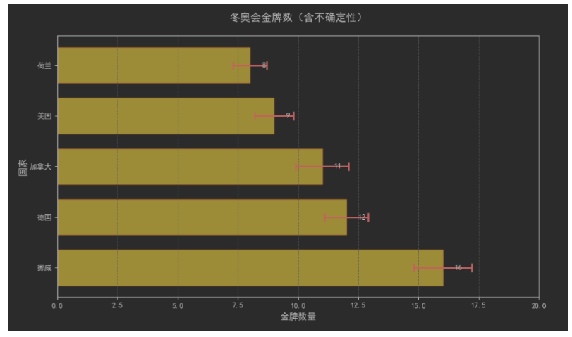
水平误差条形图:
import matplotlib.pyplot as plt
import numpy as np
# 创建水平数据
countries = ['挪威', '德国', '加拿大', '美国', '荷兰']
gold_medals = [16, 12, 11, 9, 8]
errors = [1.2, 0.9, 1.1, 0.8, 0.7] # 水平误差
plt.figure(figsize=(10, 6))
# 绘制水平条形图
bars = plt.barh(countries, gold_medals, color='gold', edgecolor='darkorange', height=0.7, alpha=0.9)
# 添加水平误差条
plt.errorbar(gold_medals, countries, xerr=errors, fmt='none',ecolor='darkred', elinewidth=2, capsize=6, capthick=2)
# 添加数据标签
for bar in bars:width = bar.get_width()plt.text(width + 0.5, bar.get_y() + bar.get_height() / 2,f'{width:.0f}', ha='left', va='center', fontsize=10)
# 图表装饰
plt.title('冬奥会金牌数(含不确定性)', fontsize=14, pad=20)
plt.xlabel('金牌数量', fontsize=12)
plt.ylabel('国家', fontsize=12)
plt.xlim(0, 20)
plt.grid(axis='x', linestyle='--', alpha=0.7)
plt.tight_layout()
plt.show()