echarts一个图例控制多个图表
因为业务需求,需要实现多个环状图由一个实例控制,其实可以使用echarts的encode图表设置实现。但设计图的样式用encode图表的样式无法实现,所以图例和图表需要分开实现
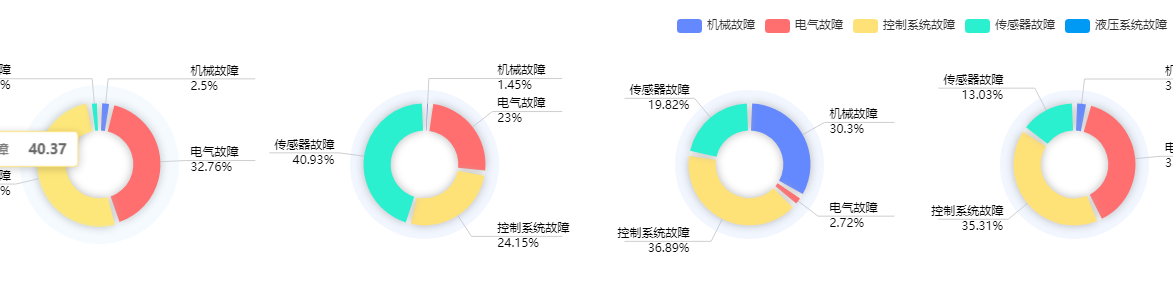
效果如图所示
第一步,先创建一个父组件,引入图例的组件和图表的组件
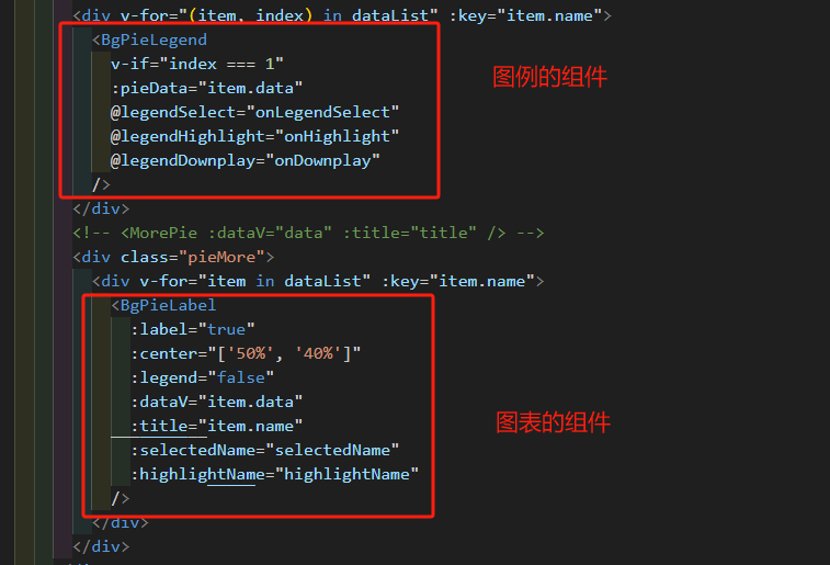
第二步,创建子组件,图表的组件BgPieLabel.vue
<template><div ref="chartRef" style="width: 100%; height: 100%"></div>
</template><script setup>
import { onMounted, ref, watch, onUnmounted } from "vue";
import * as echarts from "echarts";const chartRef = ref(null);
let resizeObserver = null; //监听页面大小变化const props = defineProps({dataV: Object,title: String,legend: Boolean,center: Array,label: Boolean,selectedName: Array, // 当前选中的 namehighlightName: String, // 当前高亮的名称,undefined表示无
});// 键名替换映射
// 解析数据并生成 ECharts 配置
const render = (data) => {const option = {tooltip: {},title: {text: props.title,left: "center", // 标题水平居中bottom: "0",textStyle: {fontWeight: 700,fontSize: "16px",color: "#333333",},},grid: {left: "4%",right: "4%",bottom: "2%",containLabel: true,},legend: {orient: "vertical",top: "center",left: "5%",show: props.legend,},color: ["#6488FE", "#FF6F6F", "#FEE177", "#2AF0CF", "#0099F4"],series: [{radius: ["45%", "55%"],center: props.center,type: "pie",label: {show: false,},labelLine: {show: true,},animation: false,tooltip: {show: false,},itemStyle: {color: "rgba(186, 207, 255, 0.2)",},data: [1],},{type: "pie",radius: ["25%", "45%"],center: props.center,padAngle: 5,label: {formatter: "{name|{b}}\n{time|{c}%}",minMargin: 0,edgeDistance: 10,lineHeight: 15,fontSize: 12,padding: [0, -70],alignTo: "labelLine",color: "#000",rich: {time: {fontSize: 12,color: "#000",},},},itemStyle: {shadowBlur: 10,shadowColor: "rgba(184,184,184,1)",shadowOffsetX: [10, -10],shadowOffsetY: [10, -10],},labelLine: {length: 25,length2: 70,maxSurfaceAngle: 70,lineStyle: {color: "#CECECE", // 线条颜色},},data: data,},],};return option;
};onMounted(() => {const chart = echarts.init(chartRef.value);// 假设 props.dataV 已经包含了解析好的数据const option = render(props.dataV);chart.setOption(option);watch(() => props.dataV,(newData) => {chart.setOption(render(newData));},{ deep: true });// 监听高亮状态watch([() => props.highlightName],([name]) => {chart.dispatchAction({ type: "downplay", seriesIndex: 1 }); // 先全部取消if (name !== undefined) {chart.dispatchAction({type: "highlight",seriesIndex: 1,name: name,});}},{ immediate: true });watch(() => props.selectedName,(arr) => {// arr 为当前需要“显示”的系列名集合chart.dispatchAction({type: "legendAllSelect",});// 先全部选中(防止脏状态)arr.map((name) => {chart.dispatchAction({type: "legendUnSelect",name: name,});});},{ immediate: true, deep: true });// 监听当容器大小变化时随之变化resizeObserver = new ResizeObserver((entries) => {for (let entry of entries) {if (entry.target === chartRef.value) {if (chart != null) {chart.resize();}}}});resizeObserver.observe(chartRef.value);const handleResize = () => chart.resize();// window.addEventListener('resize', handleResize);onUnmounted(() => {window.removeEventListener("resize", handleResize);chart.dispose();});
});
</script>
第三步,图例的组件 BgPieLegend.vue
<template><div ref="pieChart" class="line-box" style="height: 60px"></div>
</template><script setup>
import { onMounted, ref, watch, onUnmounted } from "vue";
import * as echarts from "echarts";
const pieChart = ref(null);
let myChart = null;
let resizeObserver = null; //监听页面大小变化const props = defineProps({pieData: Object,
});
const emit = defineEmits(["legendSelect", "legendHighlight", "legendDownplay"]);const initChart = () => {myChart = echarts.init(pieChart.value);const option = {legend: {orient: "horizontal",top: "center",right: "5%",type: "scroll",},color: ["#6488FE", "#FF6F6F", "#FEE177", "#2AF0CF", "#0099F4"],series: [{type: "pie",radius: ["0%", "1%"],  //设置图表的大小不会展示在页面上center: ["0%", "0%"],data: props.pieData,label: {show: false,},},],};myChart.setOption(option);// 点击图例显示和隐藏对应图例的图表数据myChart.on("legendselectchanged", (params) => {const selectedArr = [];Object.keys(params.selected).map((item, index) => {if (!params.selected[item]) {selectedArr.push(item);}});// 把“真正被选中”的名字状态为false的数组emit("legendSelect", selectedArr);});// hover图例的时候高亮显示对应图例的数据myChart.on("highlight", (params) => {emit("legendHighlight", params.name);});// 取消高亮myChart.on("downplay", (params) => {emit("legendDownplay", "");});
};onMounted(() => {initChart();watch(() => props.pieData,() => {if (myChart) {myChart.setOption({series: [{data: props.pieData,},],});}},{ deep: true });// 监听当容器大小变化时随之变化resizeObserver = new ResizeObserver((entries) => {for (let entry of entries) {if (entry.target === pieChart.value) {if (myChart != null) {myChart.resize();}}}});resizeObserver.observe(pieChart.value);const handleResize = () => myChart.resize();// window.addEventListener('resize', handleResize);onUnmounted(() => {window.removeEventListener("resize", handleResize);myChart.dispose();});
});
</script>
代码如上所示,通过父子传参、emit事件,实现分开的图例和图表,数据可以联动,实现图例hover图表对应高亮及图例点击可以显示和隐藏对应的图表数据。