QML视图组件:ListView、GridView、TableView、PathView
列表视图(ListView)
ListView是QML中最常用的视图组件之一,用于显示垂直或水平列表数据,特别适合展示线性排列的大量数据项。
核心概念与特性
ListView基于模型-视图-委托(Model-View-Delegate)模式构建,具有以下特点:
- 高效渲染:只渲染当前可见的项目,适合大数据量场景
- 灵活布局:支持水平和垂直方向排列
- 交互丰富:内置滚动、选择和高亮功能
- 分组支持:可按属性对项目进行分组显示
常用属性与方法
核心属性
| 属性 | 类型 | 默认值 | 说明 |
|---|---|---|---|
model | variant | - | 数据模型(数字/数组/ListModel/QAbstractItemModel) |
delegate | Component | - | 定义每个项目的可视化组件 |
currentIndex | int | -1 | 当前选中项的索引 |
count | int | - | 只读,模型中的项目总数 |
spacing | real | 0 | 项目之间的间距 |
布局属性
| 属性 | 类型 | 默认值 | 说明 |
|---|---|---|---|
orientation | enum | Vertical | 列表方向(Vertical/Horizontal) |
layoutDirection | enum | LeftToRight | 布局方向(LeftToRight/RightToLeft) |
header | Component | - | 列表头部组件 |
footer | Component | - | 列表尾部组件 |
交互属性
| 属性 | 类型 | 默认值 | 说明 |
|---|---|---|---|
highlight | Component | - | 当前选中项的高亮组件 |
highlightMoveDuration | int | 150 | 高亮移动动画时长(ms) |
highlightResizeDuration | int | 0 | 高亮大小调整动画时长(ms) |
interactive | bool | true | 是否允许用户交互 |
常用方法
| 方法 | 参数 | 返回值 | 说明 | 示例 |
|---|---|---|---|---|
positionViewAtIndex | index, mode | void | 滚动到指定索引位置 | listView.positionViewAtIndex(5, ListView.Center) |
incrementCurrentIndex | - | void | 增加当前索引 | listView.incrementCurrentIndex() |
decrementCurrentIndex | - | void | 减少当前索引 | listView.decrementCurrentIndex() |
itemAt | x, y | Item | 返回指定位置的项 | let item = listView.itemAt(10, 20) |
使用示例
基础列表示例
ListView {width: parent.widthheight: 300model: ListModel {ListElement { name: "Apple"; price: "$2.5" }ListElement { name: "Banana"; price: "$1.2" }ListElement { name: "Orange"; price: "$1.8" }ListElement { name: "Apple"; price: "$2.5" }ListElement { name: "Banana"; price: "$1.2" }ListElement { name: "Orange"; price: "$1.8" }}delegate: ItemDelegate {width: ListView.view.widthtext: model.name + " - " + model.pricehighlighted: ListView.isCurrentItem}highlight: Rectangle {color: "lightblue"radius: 3}} 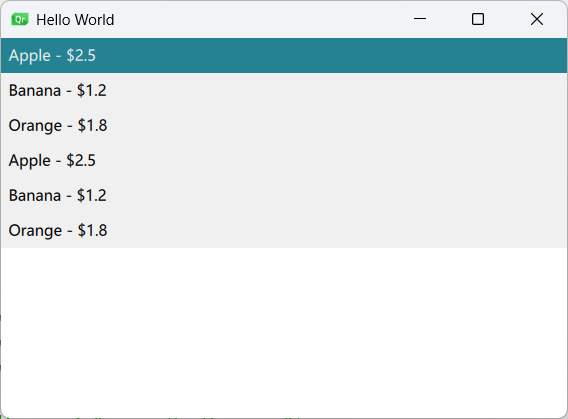
自定义列表项示例
import QtQuick
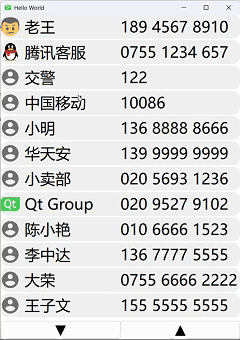
import QtQuick.ControlsWindow {width: 500height: 680visible: truetitle: qsTr("Hello World")ListModel {id: contactModelListElement {name: "周星星"; number: "138 9527 9527"; image: "images/Chow.png"}ListElement {name: "张三"; number: "138 1234 5678"; image: ""}ListElement {name: "李四"; number: "150 9999 9999"; image: ""}ListElement {name: "王五"; number: "178 2323 1111"; image: ""}ListElement {name: "李老板"; number: "152 6666 6666"; image: ""}ListElement {name: "老王"; number: "189 4567 8910"; image: "images/LaoWang.png"}ListElement {name: "腾讯客服"; number: "0755 1234 657"; image: "images/QQ.png"}ListElement {name: "交警"; number: "122"; image: ""}ListElement {name: "中国移动"; number: "10086"; image: ""}ListElement {name: "小明"; number: "136 8888 8666"; image: ""}ListElement {name: "华天安"; number: "139 9999 9999"; image: ""}ListElement {name: "小卖部"; number: "020 5693 1236"; image: ""}ListElement {name: "Qt Group"; number: "020 9527 9102"; image: "images/qt_logo.png"}ListElement {name: "陈小艳"; number: "010 6666 1523"; image: ""}ListElement {name: "李中达"; number: "136 7777 5555"; image: ""}ListElement {name: "大荣"; number: "0755 6666 2222"; image: ""}ListElement {name: "王子文"; number: "155 5555 5555"; image: ""}ListElement {name: "李二柱"; number: "136 9999 0000"; image: ""}}ListView {id: listViewwidth: parent.widthheight: 620model: contactModelspacing: 3snapMode: ListView.SnapOneItemcurrentIndex: 4function firstVisibleItemIndex() {var firstVisibleY = contentY;var index = Math.floor(firstVisibleY / 50);// 如果index是负数或者超过了模型大小,需要进行调整index = Math.max(0, Math.min(index, model.count - 1));return index;}MouseArea {anchors.fill: parentonClicked: {var delegateHeight = 50var spacing = 3var offsetY = mouse.y +listView.firstVisibleItemIndex() * delegateHeight +listView.firstVisibleItemIndex() * spacinglistView.currentIndex = listView.indexAt(mouse.x, offsetY)console.log("visibleFistIndex: " + listView.firstVisibleItemIndex())}}delegate: Item {id: itemDelegatewidth: parent.widthheight: 50Rectangle {id: contactRectanchors.fill: parentcolor: itemDelegate.ListView.isCurrentItem ? "#A0FFA0" : "#F0F0F0"radius: 16Row {width: parent.widthheight: parent.heightImage {id: contactImagewidth: 40height: 40anchors.verticalCenter: parent.verticalCentersource: (image == "") ? "./images/contact.png" : imagefillMode: Image.PreserveAspectFit}Label {id: nameLabelanchors.left: contactImage.rightanchors.leftMargin: 10anchors.verticalCenter: parent.verticalCenterwidth: 200height: 40font.pixelSize: 32verticalAlignment: Text.AlignVCentercolor: "black"text: name}Label {id: numberLabelanchors.left: nameLabel.rightanchors.verticalCenter: parent.verticalCenterwidth: 400height: 40verticalAlignment: Text.AlignVCenterfont.pixelSize: 32color: "black"text: number}}}}}Button {id: decAllContactwidth: parent.width / 2height: 40anchors.left: parent.leftanchors.bottom: parent.bottomtext: "▼"font.pixelSize: 32font.bold: trueonClicked: {var index = listView.currentIndexindex++if(index >= listView.count){listView.currentIndex = listView.count - 1listView.positionViewAtIndex(listView.count - 1, ListView.Visible)}else{listView.currentIndex = indexlistView.positionViewAtIndex(index, ListView.Visible)}}}Button {id: incContactwidth: parent.width / 2height: 40anchors.right: parent.rightanchors.bottom: parent.bottomtext: "▲"font.pixelSize: 32font.bold: trueonClicked: {var index = listView.currentIndexindex--if(index <= 0){listView.currentIndex = 0listView.positionViewAtIndex(0, ListView.Visible)}else{listView.currentIndex = indexlistView.positionViewAtIndex(index, ListView.Visible)}}}
}
栅格视图(GridView)
GridView以二维网格形式排列项目,是构建图库、图标视图等场景的理想选择。
核心概念与特性
GridView具有以下特点:
- 网格布局:项目按行和列排列,形成整齐的网格
- 动态加载:只渲染可见区域的项目,性能高效
- 灵活尺寸:可自定义单元格大小和间距
- 动画支持:内置添加/删除项目的动画效果
常用属性与方法
核心属性
| 属性 | 类型 | 默认值 | 说明 |
|---|---|---|---|
model | variant | - | 数据模型(数字/数组/ListModel等) |
delegate | Component | - | 定义每个单元格的显示组件 |
cellWidth | real | - | 每个单元格的宽度 |
cellHeight | real | - | 每个单元格的高度 |
flow | enum | LeftToRight | 项目排列方向(LeftToRight/TopToBottom) |
布局属性
| 属性 | 类型 | 默认值 | 说明 |
|---|---|---|---|
rows | int | - | 显式设置行数(优先于cellHeight) |
columns | int | - | 显式设置列数(优先于cellWidth) |
layoutDirection | enum | LeftToRight | 布局方向(LeftToRight/RightToLeft) |
verticalLayoutDirection | enum | TopToBottom | 垂直布局方向(TopToBottom/BottomToTop) |
交互属性
| 属性 | 类型 | 默认值 | 说明 |
|---|---|---|---|
highlight | Component | - | 当前选中项的高亮组件 |
highlightFollowsCurrentItem | bool | true | 高亮是否跟随当前项 |
highlightMoveDuration | int | 150 | 高亮移动动画时长(ms) |
interactive | bool | true | 是否允许用户交互 |
常用方法
| 方法 | 参数 | 返回值 | 说明 | 示例 |
|---|---|---|---|---|
positionViewAtIndex | index, mode | void | 滚动到指定索引位置 | gridView.positionViewAtIndex(5, GridView.Beginning) |
forceLayout | - | void | 强制重新布局网格 | gridView.forceLayout() |
moveCurrentIndexUp | - | void | 向上移动当前索引 | gridView.moveCurrentIndexUp() |
moveCurrentIndexDown | - | void | 向下移动当前索引 | gridView.moveCurrentIndexDown() |
使用示例
基础网格示例
import QtQuick 2.15
import QtQuick.Controls 2.15GridView {id :gridViewwidth: 300; height: 300cellWidth: 100; cellHeight: 100model: ListModel {ListElement { color: "red" }ListElement { color: "green" }ListElement { color: "blue" }ListElement { color: "yellow" }}delegate: Rectangle {width: GridView.view.cellWidth - 5height: GridView.view.cellHeight - 5color: model.colorborder.width: GridView.isCurrentItem ? 2 : 0border.color: "black"MouseArea {anchors.fill: parentonClicked: gridView.currentIndex = index // 点击时更新当前选中索引}}}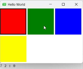
动态增删带动画示例
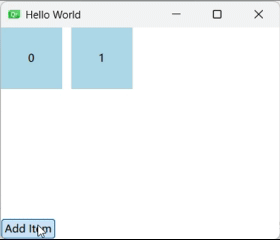
GridView {id: gridViewanchors.fill: parentcellWidth: 80; cellHeight: 80model: ListModel {id: gridModelListElement { index: 0 }ListElement { index: 1 }}delegate: Rectangle {id: wrapperwidth: GridView.view.cellWidth - 10height: GridView.view.cellHeight - 10color: "lightblue"Text {text: indexanchors.centerIn: parent}// 添加动画GridView.onAdd: SequentialAnimation {PropertyAction { target: wrapper; property: "scale"; value: 0 }NumberAnimation { target: wrapper; property: "scale"; to: 1; duration: 200 }}// 删除动画GridView.onRemove: SequentialAnimation {PropertyAction { target: wrapper; property: "GridView.delayRemove"; value: true }NumberAnimation { target: wrapper; property: "scale"; to: 0; duration: 200 }PropertyAction { target: wrapper; property: "GridView.delayRemove"; value: false }}MouseArea {anchors.fill: parentonClicked: gridModel.remove(index)}}}Button {anchors.bottom: parent.bottomtext: "Add Item"onClicked: gridModel.append({"index": gridModel.count})}
图片网格示例
ListModel {id: listModelListElement {name: "Mike"; portrait: "Mike.png"}ListElement {name: "Brown"; portrait: "portrait.png"}ListElement {name: "Jim"; portrait: "portrait.png"}ListElement {name: "Chow"; portrait: "Chow.png"}ListElement {name: "John"; portrait: "portrait.png"}ListElement {name: "Tom"; portrait: "portrait.png"}}Component {id: gridDelegateItem {width: gridView.cellWidthheight: gridView.cellHeightColumn {anchors.centerIn: parentImage {source: portraitwidth: gridView.cellWidth / 2height: gridView.cellHeight / 2anchors.horizontalCenter: parent.horizontalCenterfillMode: Image.PreserveAspectFit}Label {text: nameanchors.horizontalCenter: parent.horizontalCenter}}MouseArea {anchors.fill: parentonClicked: gridView.currentIndex = index // 点击时更新当前选中索引}}}GridView {id: gridViewanchors.fill: parentcellWidth: width / 2cellHeight: height / 2model: listModeldelegate: gridDelegatefocus: truehighlight: Rectangle {color: "lightgreen"radius: gridView.cellHeight / 8}}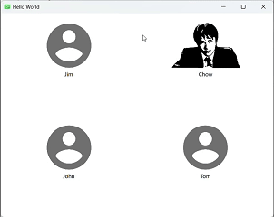
表格视图(TableView)
TableView专门用于显示表格数据,支持多列、表头、排序等功能,适合展示结构化数据。
核心概念与特性
TableView的主要特点包括:
- 多列支持:每列可独立定义宽度、标题和显示方式
- 表头支持:内置可自定义的表头显示
- 灵活模型:支持ListModel、TableModel等多种数据模型
- 性能优化:只渲染可见单元格,适合大数据量
常用属性与方法
核心属性
| 属性 | 类型 | 默认值 | 说明 |
|---|---|---|---|
model | variant | - | 数据模型(ListModel/TableModel等) |
TableViewColumn | Component | - | 定义表格列(role/title/width等) |
rowDelegate | Component | - | 定义行的外观 |
itemDelegate | Component | - | 定义单元格的外观 |
headerDelegate | Component | - | 定义表头的外观 |
布局属性
| 属性 | 类型 | 默认值 | 说明 |
|---|---|---|---|
columnWidthProvider | function | - | 动态计算列宽的函数 |
rowHeightProvider | function | - | 动态计算行高的函数 |
resizableColumns | bool | false | 是否允许调整列宽 |
resizableRows | bool | false | 是否允许调整行高 |
交互属性
| 属性 | 类型 | 默认值 | 说明 |
|---|---|---|---|
selectionMode | enum | NoSelection | 选择模式(NoSelection/SingleSelection/ExtendedSelection等) |
currentRow | int | -1 | 当前选中行 |
currentColumn | int | -1 | 当前选中列 |
sortIndicatorVisible | bool | false | 是否显示排序指示器 |
使用示例
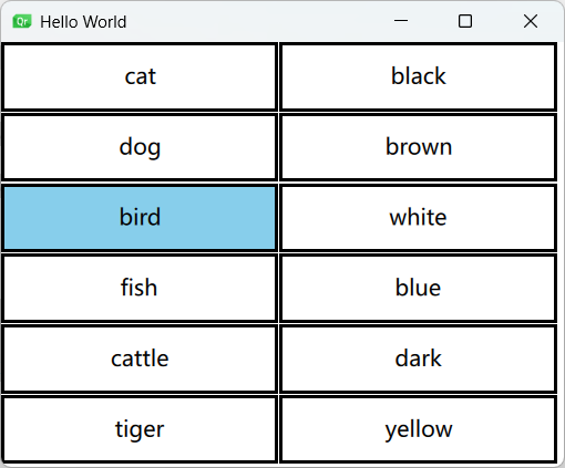
完整表格示例
import QtQuick
import QtQuick.Controls
import Qt.labs.qmlmodelsWindow {width: 640height: 480visible: truetitle: qsTr("Hello World")// 定义一个表格视图组件TableView {id: tableView  // 组件IDanchors.fill: parent  // 填充父组件columnSpacing: 1  // 列间距为1像素rowSpacing: 1  // 行间距为1像素clip: true  // 启用裁剪,超出部分不显示selectionModel: ItemSelectionModel {}  // 选择模型delegate: tableDelegate  // 设置单元格的委托组件// 表格的数据模型model: TableModel {// 定义两列TableModelColumn { display: "name" }  // 第一列名为"name"TableModelColumn { display: "color" }  // 第二列名为"color"// 表格数据行rows: [{"name": "cat", "color": "black"},{"name": "dog", "color": "brown"},{"name": "bird", "color": "white"},{"name": "fish", "color": "blue"},{"name": "cattle", "color": "dark"},{"name": "tiger", "color": "yellow"}]}// 定义单元格的委托组件Component {id: tableDelegate// 每个单元格是一个矩形Rectangle {implicitWidth: 100  // 默认宽度implicitHeight: 50  // 默认高度border.width: 2  // 边框宽度// 当前单元格是否被选中required property bool current// 根据选中状态改变背景色color: current ? "skyblue" : "white"// 当单元格被回收时暂停动画TableView.onPooled: rotationAnimation.pause()// 当单元格被重用时恢复动画TableView.onReused: rotationAnimation.resume()// 单元格中的文本标签Label {id: labeltext: display  // 显示单元格内容anchors.centerIn: parent  // 居中显示font.pixelSize: 16  // 字体大小}// 旋转动画效果RotationAnimation {id: rotationAnimationtarget: label  // 动画目标为标签from: 0  // 起始角度to: 360  // 结束角度duration: (Math.random() * 5000) + 2000  // 随机持续时间(2-7秒)loops: Animation.Infinite  // 无限循环// running: true  // 运行状态}}}// 自定义列宽数组 宽度和高度200*100property var columnWidths: [200, 100]// 列宽提供函数columnWidthProvider: function(column) {return columnWidths[column]}// 定时器,2秒后触发Timer {running: true  // 自动运行interval: 2000  // 间隔2秒onTriggered: {// 修改第二列的宽度为200tableView.columnWidths[1] = 200// 强制重新布局tableView.forceLayout()}}}
}
路径视图(PathView)
PathView允许项目沿自定义路径排列和移动,用于创建轮播图、弧形菜单等非线性布局。
核心概念与特性
PathView的主要特点包括:
- 自定义路径:支持直线、曲线、闭合路径等多种路径类型
- 动态效果:项目可沿路径平滑移动,支持3D变换效果
- 视觉控制:可控制项目在路径不同位置的视觉属性(大小、透明度等)
- 交互灵活:支持拖动、自动轮播等交互方式
常用属性与方法
核心属性
| 属性 | 类型 | 默认值 | 说明 |
|---|---|---|---|
model | variant | - | 数据模型(数字/ListModel/JS数组) |
delegate | Component | - | 定义每个项目的显示组件 |
path | Path | - | 定义项目移动路径(必需) |
currentIndex | int | 0 | 当前选中项的索引 |
offset | real | 0 | 路径上的偏移量(0.0-1.0) |
pathItemCount | int | - | 同时可见的项目数量 |
路径属性
| 属性 | 类型 | 默认值 | 说明 |
|---|---|---|---|
startX | real | - | 路径起始点X坐标 |
startY | real | - | 路径起始点Y坐标 |
PathLine | - | - | 直线路径段 |
PathQuad | - | - | 二次贝塞尔曲线 |
PathCubic | - | - | 三次贝塞尔曲线 |
PathAttribute | - | - | 路径属性(如缩放/透明度) |
交互属性
| 属性 | 类型 | 默认值 | 说明 |
|---|---|---|---|
interactive | bool | true | 是否允许用户拖动 |
snapMode | enum | NoSnap | 吸附模式(NoSnap/SnapToItem) |
flickDeceleration | real | 100 | 拖动减速系数(越大减速越快) |
preferredHighlightBegin | real | 0 | 高亮起始位置(0.0-1.0) |
preferredHighlightEnd | real | 0 | 高亮结束位置(0.0-1.0) |
常用方法
| 方法 | 参数 | 返回值 | 说明 | 示例 |
|---|---|---|---|---|
positionViewAtIndex | index, mode | void | 定位视图到指定索引 | pathView.positionViewAtIndex(3, PathView.Center) |
incrementCurrentIndex | - | void | 增加当前索引 | pathView.incrementCurrentIndex() |
decrementCurrentIndex | - | void | 减少当前索引 | pathView.decrementCurrentIndex() |
使用示例
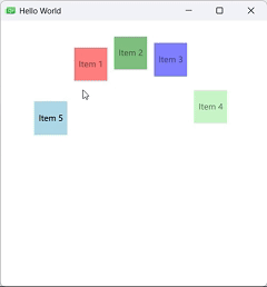
基础路径视图示例
PathView {width: 400; height: 400model: ListModel {ListElement { name: "Item 1"; color: "red" }ListElement { name: "Item 2"; color: "green" }ListElement { name: "Item 3"; color: "blue" }ListElement { name: "Item 4"; color: "lightgreen"}ListElement { name: "Item 5"; color: "lightblue"}}path: Path {startX: 50; startY: 200PathQuad { x: 200; y: 50; controlX: 125; controlY: 25 }PathQuad { x: 350; y: 200; controlX: 275; controlY: 25 }}delegate: Rectangle {width: 50; height: 50color: model.coloropacity: PathView.isCurrentItem ? 1 : 0.5Text {text: model.nameanchors.centerIn: parent}}}
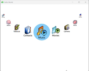
图片按钮轮转示例
import QtQuick
import QtQuick.ControlsWindow {width: 640height: 480visible: truetitle: qsTr("Hello World")// 1. 数据模型:定义9个应用项,每个包含名称(name)和图标路径(icon)属性ListModel {id: appModelListElement { name: "Music"; icon: "images/AudioPlayer_48.png" }ListElement { name: "Movies"; icon: "images/VideoPlayer_48.png" }ListElement { name: "Camera"; icon: "images/Camera_48.png" }ListElement { name: "Pencil"; icon: "images/Pencil_48.png" }ListElement { name: "Calendar"; icon: "images/DateBook_48.png" }ListElement { name: "Message"; icon: "images/EMail_48.png" }ListElement { name: "Search"; icon: "images/Search_48.png" }ListElement { name: "TodoList"; icon: "images/TodoList_48.png" }ListElement { name: "Contacts"; icon: "images/AddressBook_48.png" }}// 2. 委托组件:定义每个应用项的视觉和行为Component {id: appDelegateItem {width: 100height: 100scale: PathView.iconScale  // 绑定路径属性中的动态缩放值// 图标显示(居中,距顶部20像素,开启抗锯齿)Image {id: myIconsource: icon  // 绑定模型中的图标路径y: 20smooth: trueanchors.horizontalCenter: parent.horizontalCenter}// 名称标签(位于图标下方,居中显示)Label {text: namesmooth: trueanchors.top: myIcon.bottomanchors.horizontalCenter: parent.horizontalCenter}// 点击交互:切换当前选中项MouseArea {anchors.fill: parentonClicked: pathView.currentIndex = index  // 通过修改currentIndex实现选中}}}// 3. 高亮组件:定义当前选中项的样式(圆形蓝色背景,尺寸略大于普通项)Component {id: appHighlightRectangle {width: 120height: 120radius: height / 2  // 圆形效果color: "lightskyblue"}}// 4. 路径视图核心组件:沿自定义路径布局项目PathView {id: pathViewanchors.fill: parent  // 填充父容器highlight: appHighlight  // 绑定高亮组件preferredHighlightBegin: 0.5  // 高亮区域居中preferredHighlightEnd: 0.5focus: true  // 允许键盘交互model: appModel  // 绑定数据模型delegate: appDelegate  // 绑定委托组件// 5. 路径定义:通过二次贝塞尔曲线(PathQuad)和动态属性(PathAttribute)实现弧形布局path: Path {startX: 10startY: 50// 路径起点设置图标缩放比例为0.3(最小化)PathAttribute { name: "iconScale"; value: 0.3 }// 第一段二次贝塞尔曲线:从左上到中间,控制点决定曲线弧度PathQuad { x: 300; y: 200; controlX: 50; controlY: 200 }// 路径中点设置图标缩放比例为1.5(最大化)PathAttribute { name: "iconScale"; value: 1.5 }// 第二段二次贝塞尔曲线:从中间到右下PathQuad { x: 590; y: 50; controlX: 550; controlY: 200 }// 路径终点恢复图标缩放比例为0.3PathAttribute { name: "iconScale"; value: 0.3 }}// 6. 信号处理:拖动结束时打印当前选中项索引onMovementEnded: {console.log("currentIndex: " + currentIndex)}}
}
总结
QML提供了丰富多样的视图组件,每种组件都有其独特的优势和适用场景:
- ListView:适合线性列表数据展示,支持分组、页眉页脚等高级功能
- GridView:适合二维网格布局,常用于图库、图标视图等场景
- TableView:专为表格数据设计,支持多列、表头和复杂单元格
- PathView:允许项目沿自定义路径排列,适合轮播图、弧形菜单等
掌握这些视图组件的特性和使用方法,能够帮助开发者构建出更加丰富、动态和用户友好的QML界面。在实际开发中,可以根据具体需求选择合适的组件,甚至组合使用多种组件来实现复杂的界面效果。