波士顿房价预测(线性回归模型)
1.环境准备
确保安装了以下Python库:
pip install numpy pandas matplotlib seaborn scikit-learn
2.完整代码
# 导入所需库
import numpy as np
import pandas as pd
import matplotlib.pyplot as plt
import seaborn as sns
from sklearn.datasets import fetch_openml
from sklearn.model_selection import train_test_split
from sklearn.preprocessing import StandardScaler
from sklearn.linear_model import LinearRegression
from sklearn.metrics import mean_squared_error, r2_score# 设置绘图风格
sns.set(style='whitegrid')# 加载数据集
boston = fetch_openml(name='boston', version=1, as_frame=True)
df = pd.DataFrame(boston.data, columns=boston.feature_names)
df['PRICE'] = boston.target  # 添加房价目标列# 查看数据基本信息
print("="*50)
print("数据集形状:", df.shape)
print("前5行数据:")
print(df.head())# 数据探索分析
print("="*50)
print("描述性统计:")
print(df.describe())# 检查缺失值
print("="*50)
print("缺失值统计:")
print(df.isnull().sum())# 使用matplotlib的rcParams设置字体,否则图片中中文可能会乱码
plt.rcParams['font.sans-serif'] = ['SimHei']
plt.rcParams['axes.unicode_minus'] = False# 可视化分析
plt.figure(figsize=(12, 8))
# 特征相关性热力图
corr = df.corr()
sns.heatmap(corr, annot=True, fmt='.2f', cmap='coolwarm', cbar=True)
plt.title('特征相关性热力图')
plt.tight_layout()
plt.show()# 房价分布直方图
plt.figure(figsize=(8, 5))
sns.histplot(df['PRICE'], bins=30, kde=True)
plt.title('房价分布直方图')
plt.xlabel('价格(千美元)')
plt.show()# 关键特征与房价的关系
fig, axes = plt.subplots(1, 3, figsize=(18, 5))
sns.scatterplot(x='RM', y='PRICE', data=df, ax=axes[0])
sns.scatterplot(x='LSTAT', y='PRICE', data=df, ax=axes[1])
sns.scatterplot(x='PTRATIO', y='PRICE', data=df, ax=axes[2])
plt.tight_layout()
plt.show()# 数据预处理
X = df.drop('PRICE', axis=1)  # 特征矩阵
y = df['PRICE']  # 目标向量# 划分训练集和测试集 (80%训练, 20%测试)
X_train, X_test, y_train, y_test = train_test_split(X, y, test_size=0.2, random_state=42
)# 特征标准化
scaler = StandardScaler()
X_train_scaled = scaler.fit_transform(X_train)
X_test_scaled = scaler.transform(X_test)# 创建并训练线性回归模型
model = LinearRegression()
model.fit(X_train_scaled, y_train)# 模型评估
y_pred = model.predict(X_test_scaled)# 计算性能指标
mse = mean_squared_error(y_test, y_pred)
rmse = np.sqrt(mse)
r2 = r2_score(y_test, y_pred)print("="*50)
print("模型性能评估:")
print(f"均方误差(MSE): {mse:.2f}")
print(f"均方根误差(RMSE): {rmse:.2f}")
print(f"决定系数(R²): {r2:.4f}")# 可视化预测结果 vs 实际值
plt.figure(figsize=(10, 6))
plt.scatter(y_test, y_pred, alpha=0.6)
plt.plot([y.min(), y.max()], [y.min(), y.max()], 'r--')  # 理想对角线
plt.title('实际价格 vs 预测价格')
plt.xlabel('实际价格(千美元)')
plt.ylabel('预测价格(千美元)')
plt.show()# 特征重要性分析(线性回归的系数)
feature_importance = pd.DataFrame({'Feature': X.columns,'Importance': np.abs(model.coef_)
}).sort_values('Importance', ascending=False)plt.figure(figsize=(10, 6))
sns.barplot(x='Importance', y='Feature', data=feature_importance)
plt.title('特征重要性(线性回归系数绝对值)')
plt.tight_layout()
plt.show()# 示例预测
sample_idx = 10
sample_data = X_test.iloc[sample_idx:sample_idx+1]
scaled_data = scaler.transform(sample_data)
predicted_price = model.predict(scaled_data)[0]print("="*50)
print(f"示例预测:")
print(f"样本特征: \n{sample_data}")
print(f"实际价格: {y_test.iloc[sample_idx]:.2f} 千美元")
print(f"预测价格: {predicted_price:.2f} 千美元")
3.代码解析
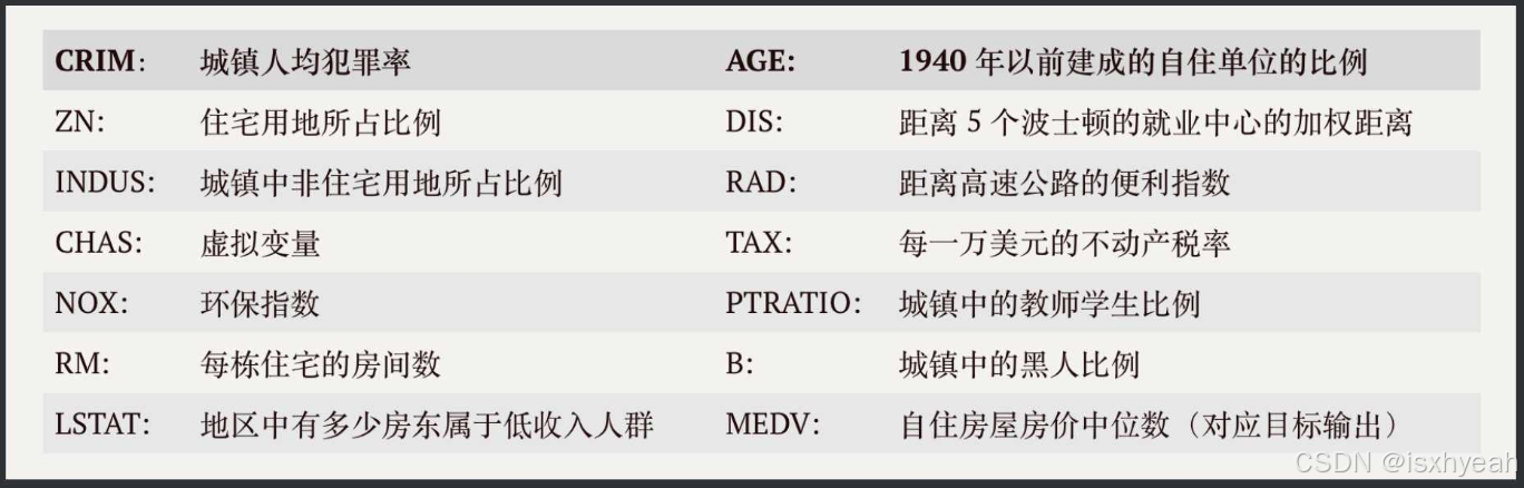
波士顿房价数据集包括506条样本数据,每条样本数据均包含13个特征变量以及该地区的平均房价。 之前简化的例子房价只和卧室数目有关,卧室越多房价越高。波士顿案例中的房价更为复杂,它有13个相关变量如下表所示:
3.1 使用数据集(13个特征,506个样本)
由于波士顿房价数据集在某些库中已被移除,我们将使用sklearn中内置的版本(如果可用)或者使用其他方式加载。但是,在较新版本的scikit-learn中,波士顿房价数据集被移除了,因此我们将使用一个替代方法:从OpenML获取。
这里我们将使用fetch_openml来加载波士顿房价数据集。
# 加载数据集
boston = fetch_openml(name='boston', version=1, as_frame=True)
df = pd.DataFrame(boston.data, columns=boston.feature_names)
df['PRICE'] = boston.target  # 添加房价目标列
3.2查看数据集基本信息
## 查看数据基本信息
print("="*50)
print("数据集形状:", df.shape)
print("前5行数据:")
print(df.head())# 数据探索分析
print("="*50)
print("描述性统计:")
print(df.describe())# 检查缺失值
print("="*50)
print("缺失值统计:")
print(df.isnull().sum())
运行结果:
==================================================
数据集形状: (506, 14)
前5行数据:CRIM    ZN  INDUS CHAS    NOX  ...    TAX  PTRATIO       B LSTAT  PRICE
0  0.00632  18.0   2.31    0  0.538  ...  296.0     15.3  396.90  4.98   24.0
1  0.02731   0.0   7.07    0  0.469  ...  242.0     17.8  396.90  9.14   21.6
2  0.02729   0.0   7.07    0  0.469  ...  242.0     17.8  392.83  4.03   34.7
3  0.03237   0.0   2.18    0  0.458  ...  222.0     18.7  394.63  2.94   33.4
4  0.06905   0.0   2.18    0  0.458  ...  222.0     18.7  396.90  5.33   36.2[5 rows x 14 columns]
==================================================
描述性统计:CRIM          ZN       INDUS  ...           B       LSTAT       PRICE
count  506.000000  506.000000  506.000000  ...  506.000000  506.000000  506.000000
mean     3.613524   11.363636   11.136779  ...  356.674032   12.653063   22.532806
std      8.601545   23.322453    6.860353  ...   91.294864    7.141062    9.197104
min      0.006320    0.000000    0.460000  ...    0.320000    1.730000    5.000000
25%      0.082045    0.000000    5.190000  ...  375.377500    6.950000   17.025000
50%      0.256510    0.000000    9.690000  ...  391.440000   11.360000   21.200000
75%      3.677083   12.500000   18.100000  ...  396.225000   16.955000   25.000000
max     88.976200  100.000000   27.740000  ...  396.900000   37.970000   50.000000[8 rows x 12 columns]
==================================================
缺失值统计:
CRIM       0
ZN         0
INDUS      0
CHAS       0
NOX        0
RM         0
AGE        0
DIS        0
RAD        0
TAX        0
PTRATIO    0
B          0
LSTAT      0
PRICE      0
dtype: int64
3.3 设置图片字体
# 使用matplotlib的rcParams设置字体,否则图片中中文可能会乱码
plt.rcParams['font.sans-serif'] = ['SimHei']
plt.rcParams['axes.unicode_minus'] = False
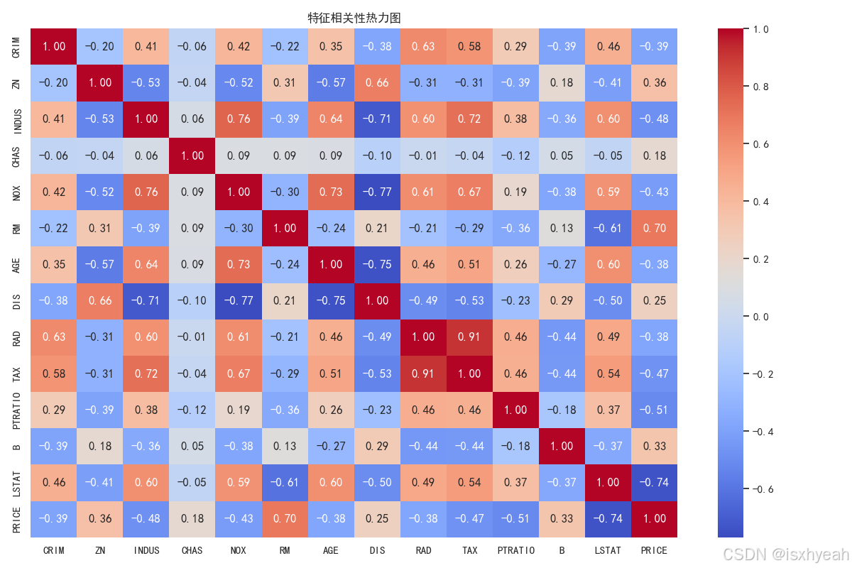
3.4 特征相关性热力图
heatmap 的参数列表,用于绘制热力图。各参数作用如下:
data:输入的二维数据集(如 DataFrame 或 ndarray)。
vmin, vmax:控制颜色映射的范围。
cmap:指定颜色映射方案。
center:设置中心值以支持发散型颜色映射。
robust:是否使用稳健统计量确定颜色范围。
annot:是否在每个单元格中显示数值或自定义注释。
fmt:注释文本的格式化方式。
annot_kws:注释文本的样式设置。
linewidths, linecolor:设置单元格之间的分隔线宽度和颜色。
cbar:是否绘制颜色条。
cbar_kws, cbar_ax:颜色条的额外配置或指定其绘图区域。
square:是否将每个单元格设为正方形。
xticklabels, yticklabels:控制坐标轴标签的显示方式。
mask:用于隐藏某些数据单元的布尔掩码。
ax:指定绘图的 Matplotlib 坐标轴对象。
**kwargs:其他传递给底层绘图函数的参数。
# 可视化分析
plt.figure(figsize=(12, 8))# 特征相关性热力图
corr = df.corr()
sns.heatmap(corr, annot=True, fmt='.2f', cmap='coolwarm', cbar=True)
plt.title('特征相关性热力图')
plt.tight_layout()
plt.show()
运行结果:
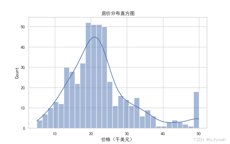
3.5 房价分布直方图
histplot()函数接受许多参数来定制直方图的外观和行为:
bins: 指定直方图的柱子(或箱)的数量。
binwidth: 直接设置每个柱子的宽度,而不是数量,但是binwidth会覆盖bins的效果。
kde: 如果为True,则可以绘制密度曲线。
stat: 指定要在每个柱子上计算的统计量,默认是计数('count')。
# 房价分布直方图
plt.figure(figsize=(8, 5))
sns.histplot(df['PRICE'], bins=30, kde=True)
plt.title('房价分布直方图')
plt.xlabel('价格(千美元)')
plt.show()
运行结果:
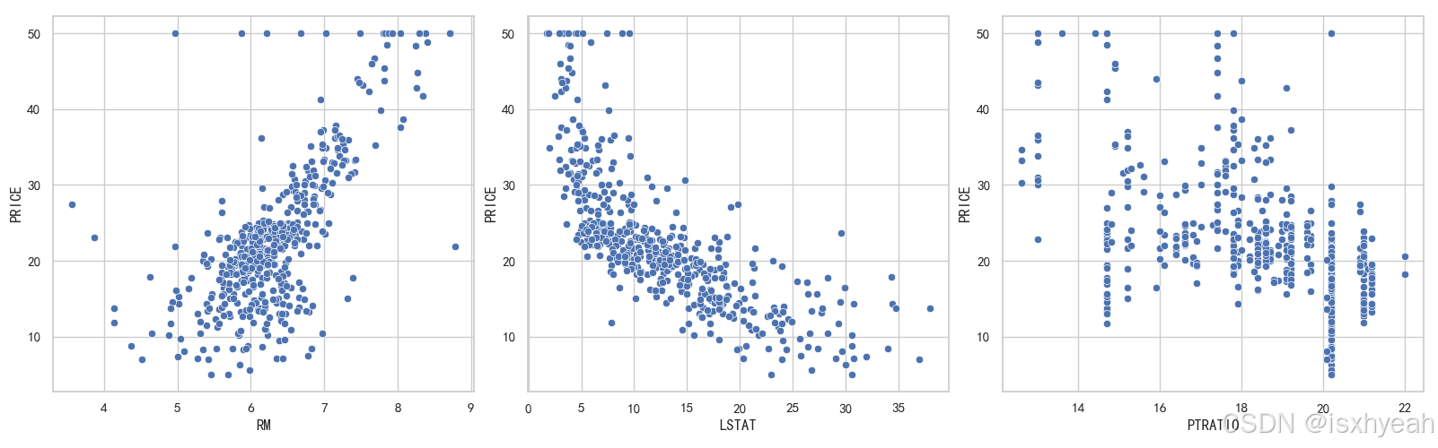
3.6 用散点图表示关键特征与房价的关系
# 关键特征与房价的关系
fig, axes = plt.subplots(1, 3, figsize=(18, 5))
sns.scatterplot(x='RM', y='PRICE', data=df, ax=axes[0])
sns.scatterplot(x='LSTAT', y='PRICE', data=df, ax=axes[1])
sns.scatterplot(x='PTRATIO', y='PRICE', data=df, ax=axes[2])
plt.tight_layout()    #自动调整子图参数,使之填充整个图像区域
plt.show()
运行结果:
3.7 数据预处理(包括划分训练集和测试集)
# 数据预处理
X = df.drop('PRICE', axis=1)  # 特征矩阵
y = df['PRICE']  # 目标向量# 划分训练集和测试集 (80%训练, 20%测试)
X_train, X_test, y_train, y_test = train_test_split(X, y, test_size=0.2, random_state=42
)# 特征标准化
scaler = StandardScaler()
X_train_scaled = scaler.fit_transform(X_train)
X_test_scaled = scaler.transform(X_test)
3.8 建立线性回归模型
- MSE(均方误差):越小越好
- RMSE(均方根误差):与目标变量同量级
- R²(决定系数):接近1表示模型解释力强
# 创建并训练线性回归模型
model = LinearRegression()
model.fit(X_train_scaled, y_train)# 模型评估
y_pred = model.predict(X_test_scaled)# 计算性能指标
mse = mean_squared_error(y_test, y_pred)
rmse = np.sqrt(mse)
r2 = r2_score(y_test, y_pred)print("="*50)
print("模型性能评估:")
print(f"均方误差(MSE): {mse:.2f}")
print(f"均方根误差(RMSE): {rmse:.2f}")
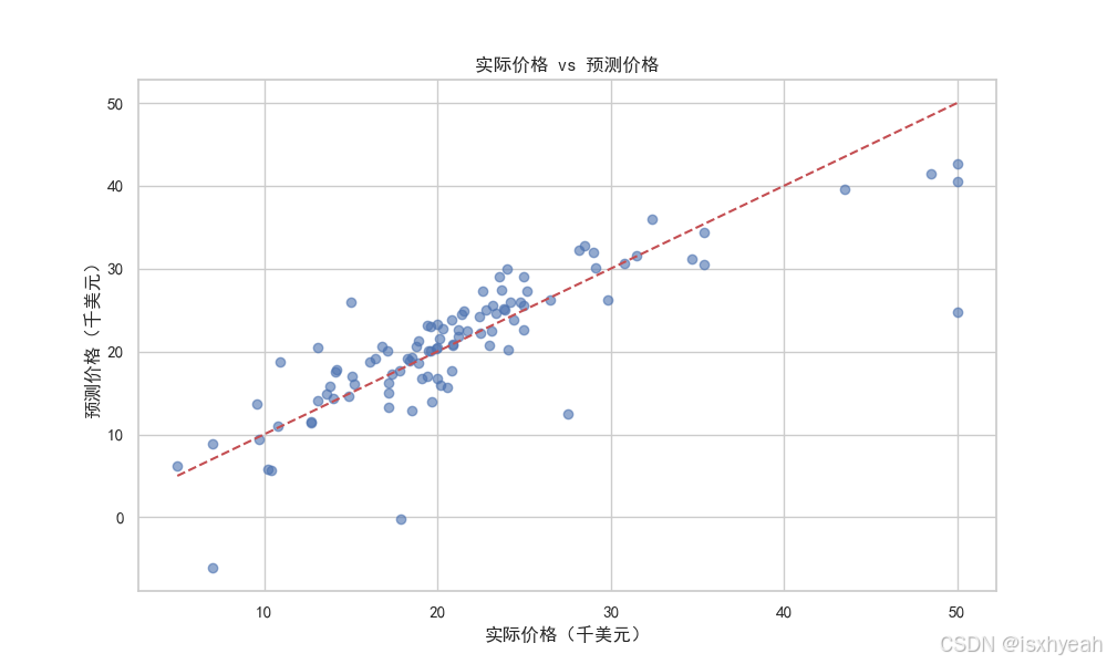
print(f"决定系数(R²): {r2:.4f}")运行结果:
模型性能评估:
均方误差(MSE): 24.29
均方根误差(RMSE): 4.93
决定系数(R²): 0.6688
3.9 比较预测与实际值
# 可视化预测结果 vs 实际值
plt.figure(figsize=(10, 6))
plt.scatter(y_test, y_pred, alpha=0.6)
plt.plot([y.min(), y.max()], [y.min(), y.max()], 'r--')  # 理想对角线
plt.title('实际价格 vs 预测价格')
plt.xlabel('实际价格(千美元)')
plt.ylabel('预测价格(千美元)')
plt.show()
运行结果:
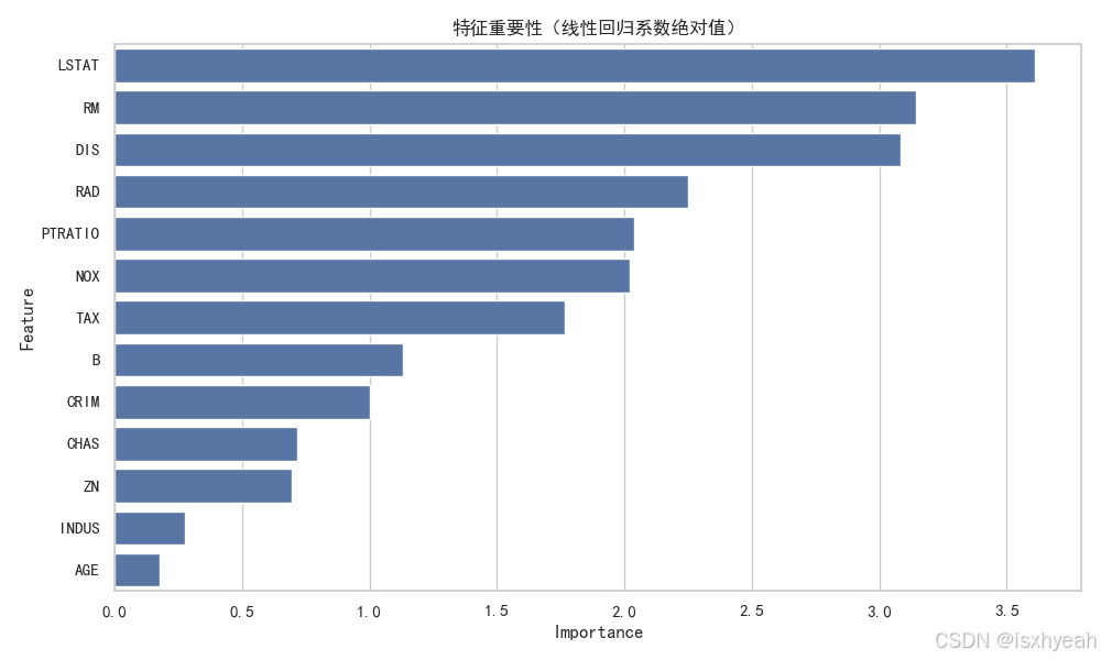
3.10 重要性分析
# 特征重要性分析(线性回归的系数)
feature_importance = pd.DataFrame({'Feature': X.columns,'Importance': np.abs(model.coef_)
}).sort_values('Importance', ascending=False)plt.figure(figsize=(10, 6))
sns.barplot(x='Importance', y='Feature', data=feature_importance)
plt.title('特征重要性(线性回归系数绝对值)')
plt.tight_layout()
plt.show()
运行结果:
3.11 预测
# 示例预测
sample_idx = 10
sample_data = X_test.iloc[sample_idx:sample_idx+1]
scaled_data = scaler.transform(sample_data)
predicted_price = model.predict(scaled_data)[0]print("="*50)
print(f"示例预测:")
print(f"样本特征: \n{sample_data}")
print(f"实际价格: {y_test.iloc[sample_idx]:.2f} 千美元")
print(f"预测价格: {predicted_price:.2f} 千美元")
运行结果:
==================================================
示例预测:
样本特征: CRIM   ZN  INDUS CHAS   NOX  ...  RAD    TAX  PTRATIO      B  LSTAT
218  0.11069  0.0  13.89    1  0.55  ...    5  276.0     16.4  396.9  17.92[1 rows x 13 columns]
实际价格: 21.50 千美元
预测价格: 24.91 千美元
4.改进方向
4.1 尝试更复杂的模型(随机森林回归)
from sklearn.ensemble import RandomForestRegressor
model = RandomForestRegressor(n_estimators=100, random_state=42)
运行结果:
==================================================
模型性能评估:
均方误差(MSE): 7.91
均方根误差(RMSE): 2.81
决定系数(R²): 0.8921
==================================================
示例预测:
样本特征: CRIM   ZN  INDUS CHAS   NOX  ...  RAD    TAX  PTRATIO      B  LSTAT
218  0.11069  0.0  13.89    1  0.55  ...    5  276.0     16.4  396.9  17.92[1 rows x 13 columns]
实际价格: 21.50 千美元
预测价格: 20.03 千美元很明显随机森林模型的精确度要优于线性回归模型。(决定系数R²:0.8921>0.6688)
4.2 特征工程
(1)创建新特征(如房间数与年龄的组合);
(2)处理非线性关系(多项式特征)。
4.3 超参数调优
from sklearn.model_selection import GridSearchCV
param_grid = {'n_estimators': [50, 100, 200]}
grid_search = GridSearchCV(RandomForestRegressor(), param_grid, cv=5)