React 如何封装一个可复用的 Ant Design 组件
文章目录
- 前言
- 一、为什么需要封装组件?
- 二、 仿antd组件的Button按钮
- 三、封装一个可复用的表格组件 (实战)
- 1. 明确需求
- 2. 设计组件 API
- 3. 实现组件代码
- 4. 使用组件
- 三、封装组件的最佳实践
- 四、进阶优化
- 总结
前言
作为一名前端开发工程师,在日常项目中,我们经常会使用 UI 框架(如 Ant Design)来快速搭建界面。然而,直接使用框架组件可能会导致代码重复、样式不统一或功能扩展困难。本文将以封装一个 可复用的表格组件 为例,分享如何基于 Ant Design(antd)封装自己的业务组件,提升开发效率和代码质量。
一、为什么需要封装组件?
- 代码复用:避免重复编写相同的逻辑和样式。
- 统一风格:确保项目中的组件风格一致。
- 功能扩展:在基础组件上添加业务逻辑(如分页、搜索、权限控制等)。
- 降低维护成本:修改一处即可影响所有使用该组件的地方。
二、 仿antd组件的Button按钮
虽然有些人要问,antd组件库有现成的Button为啥不用,还要自己封装,难道你封装的比别人好?在此说明,本篇文章只是讲解封装思想,别人怎么封装的。
- 首先新建一个专门存放组件的文件夹—我的就叫做XLButton了
index.tsx – 存放模板
index.scss存放样式
- 确定模板和样式
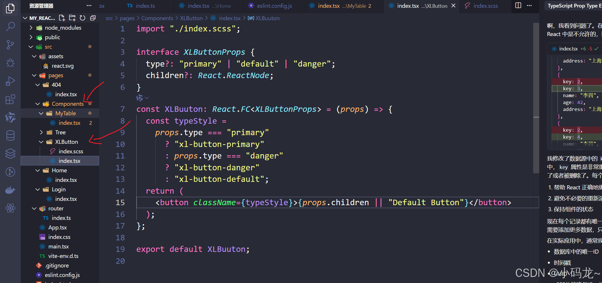
import "./index.scss";interface XLButtonProps {type?: "primary" | "default" | "danger";children?: React.ReactNode;
}
const XLBuuton: React.FC<XLButtonProps> = (props) => {const typeStyle =props.type === "primary"? "xl-button-primary": props.type === "danger"? "xl-button-danger": "xl-button-default";return (<button className={typeStyle}>{props.children || "Default Button"}</button>);
};export default XLBuuton;
button {color: #fff;width: 123px;height: 36px;border-radius: 6px;outline: none;border: none;margin-right: 20px;
}.xl-button-primary,
.xl-button-danger,
.xl-button-default {padding: 8px 16px;border: none;border-radius: 4px;cursor: pointer;transition: all 0.3s ease;
}.xl-button-primary {background-color: #1890ff;color: white;
}.xl-button-danger {background-color: #ff4d4f;color: white;
}.xl-button-default {background-color: #fff;border: 1px solid #d9d9d9;color: #333;
}
.xl-button-default:hover {border-color: #1890ff !important;color: #1890ff;
}.xl-button-danger:hover,
.xl-button-primary:hover {opacity: 0.8;box-shadow: 0 2px 8px rgba(0, 0, 0, 0.15);
}- 使用 -引入组件
import XLBuuton from "../Components/XLButton";
const Home = () => {return (<div><h1>仿antd按钮</h1><XLBuuton type="danger">我是danger</XLBuuton><XLBuuton type="primary">我是primary</XLBuuton><XLBuuton>我是默认</XLBuuton></div>);
};export default Home;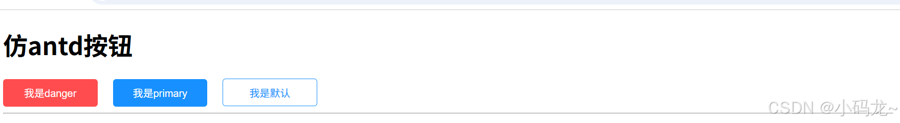
三、封装一个可复用的表格组件 (实战)
有了上面的思想,现在让我们来封装一个自己的表格组件。进一步强化
1. 明确需求
假设我们需要封装一个支持以下功能的表格组件:
- 分页(pagination)
- 搜索(search)
- 列排序(sortable columns)
- 自定义列渲染
- 加载状态(loading)
- 空数据提示(empty text)
2. 设计组件 API
首先,设计组件的 props 接口,明确外部传入的参数:
import React from 'react';import { Table, Input, Button, Space } from 'antd';import type { TableProps, ColumnsType } from 'antd';interface EnhancedTableProps<RecordType extends object = any> {columns: ColumnsType<RecordType>; // 表格列配置dataSource: RecordType[]; // 表格数据loading?: boolean; // 加载状态emptyText?: React.ReactNode; // 空数据提示pagination?: TableProps<RecordType>['pagination']; // 分页配置onSearch?: (value: string) => void; // 搜索回调onSort?: (field: string, order: 'ascend' | 'descend') => void; // 排序回调}
3. 实现组件代码
以下是完整的组件实现代码:
import React, { useState } from "react";
import { Table, Input, Space } from "antd";
import type { TableProps } from "antd";
import type { ColumnsType } from "antd/es/table";
import { SearchOutlined } from "@ant-design/icons";interface EnhancedTableProps<RecordType> {columns: ColumnsType<RecordType>;dataSource: RecordType[];loading?: boolean;emptyText?: React.ReactNode;pagination?: TableProps<RecordType>["pagination"];onSearch?: (value: string) => void;onSort?: (field: string, order: "ascend" | "descend") => void;
}const MyTable = <RecordType extends object>({columns,dataSource,loading = false,emptyText = "暂无数据",pagination,onSearch,onSort,
}: EnhancedTableProps<RecordType>) => {const [searchValue, setSearchValue] = useState("");// 处理搜索const handleSearch = () => {if (onSearch) {onSearch(searchValue.trim());}};// 处理排序const handleChange: TableProps<RecordType>["onChange"] = (pagination,filters,sorter) => {if (Array.isArray(sorter)) {// 处理多列排序的情况const firstSorter = sorter[0];if (firstSorter?.field && onSort) {onSort(firstSorter.field as string,firstSorter.order as "ascend" | "descend");}} else if (sorter?.field && onSort) {// 处理单列排序的情况onSort(sorter.field as string, sorter.order as "ascend" | "descend");}};return (<div>{/* 搜索框 */}<Space style={{ marginBottom: 16 }}><Input.Searchplaceholder="请输入搜索内容"value={searchValue}onChange={(e) => setSearchValue(e.target.value)}onSearch={handleSearch}enterButton={<SearchOutlined />}/></Space>{/* 表格 */}<Table<RecordType>columns={columns}dataSource={dataSource}loading={loading}pagination={pagination}onChange={handleChange}locale={{emptyText,}}/></div>);
};export default MyTable;
4. 使用组件
在其他地方使用封装好的 EnhancedTable 组件:
import XLBuuton from "../Components/XLButton";
import MyTable from "../Components/MyTable";
import type { ColumnsType } from "antd/es/table";interface User {key: number;name: string;age: number;address: string;
}const columns: ColumnsType<User> = [{title: "姓名",dataIndex: "name",key: "name",sorter: (a: User, b: User) => a.name.localeCompare(b.name),},{title: "年龄",dataIndex: "age",key: "age",sorter: (a: User, b: User) => a.age - b.age,},{title: "地址",dataIndex: "address",key: "address",},
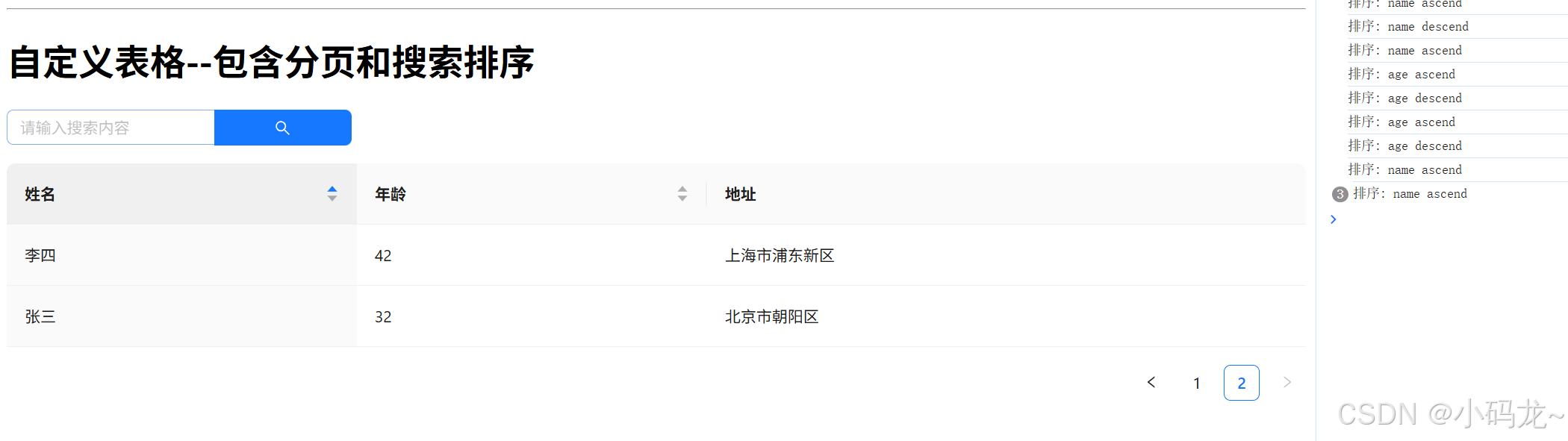
];const dataSource: User[] = [{key: 1,name: "张三",age: 32,address: "北京市朝阳区",},{key: 2,name: "李四",age: 42,address: "上海市浦东新区",},{key: 3,name: "李四",age: 42,address: "上海市浦东新区",},{key: 4,name: "李四",age: 42,address: "上海市浦东新区",},{key: 5,name: "李四",age: 42,address: "上海市浦东新区",},{key: 6,name: "李四",age: 42,address: "上海市浦东新区",},{key: 7,name: "李四",age: 42,address: "上海市浦东新区",},
];const Home = () => {return (<div><h1>仿antd按钮</h1><XLBuuton type="danger">我是danger</XLBuuton><XLBuuton type="primary">我是primary</XLBuuton><XLBuuton>我是默认</XLBuuton><hr /><h1>自定义表格--包含分页和搜索排序</h1><MyTable<User>columns={columns}dataSource={dataSource}pagination={{ pageSize: 5 }}onSearch={(value) => console.log("搜索:", value)}onSort={(field, order) => console.log("排序:", field, order)}/></div>);
};export default Home;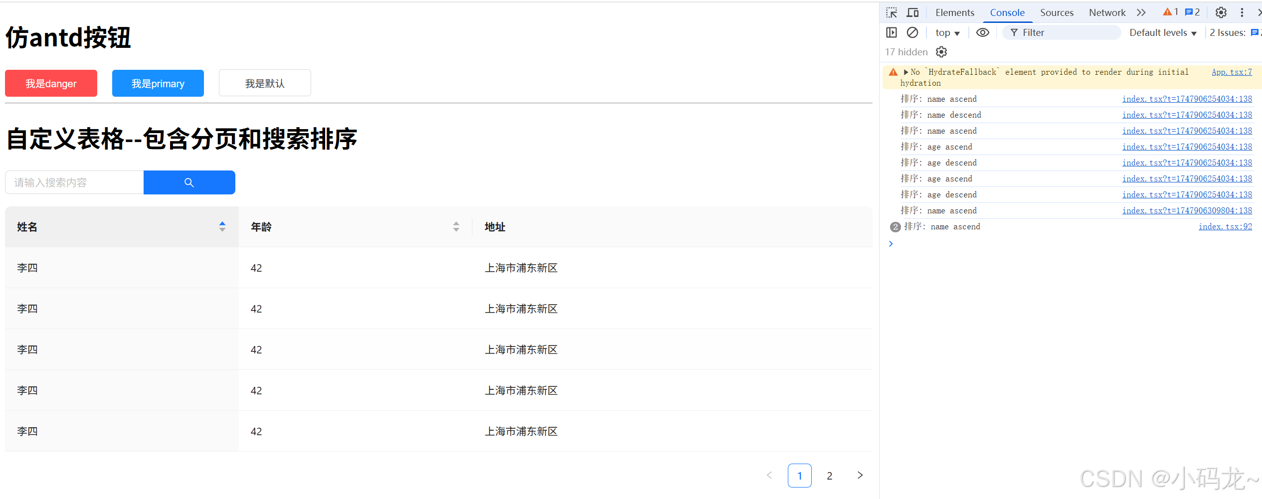
三、封装组件的最佳实践
-
类型安全:
- 使用 TypeScript 定义组件的
props和内部状态。 - 避免使用
any类型,确保类型推断正确。
- 使用 TypeScript 定义组件的
-
可扩展性:
- 通过
props暴露必要的配置项(如分页、搜索、排序等)。 - 支持自定义渲染(如
render函数)。
- 通过
-
默认值:
- 为可选
props提供合理的默认值,减少重复代码。
- 为可选
-
样式隔离:
- 使用 CSS Modules 或 CSS-in-JS 避免样式污染。
- 通过
className或style允许外部覆盖样式。
-
文档和示例:
- 编写清晰的 README,说明组件的用途、API 和使用示例。
- 提供 Storybook 或类似工具展示组件的交互效果。
四、进阶优化
-
国际化(i18n) :
- 支持多语言文本(如空数据提示)。
-
主题定制:
- 通过 CSS 变量或主题配置文件支持主题切换。
-
性能优化:
- 使用
React.memo避免不必要的重渲染。 - 对大数据量表格使用虚拟滚动(如
react-window)。
- 使用
-
单元测试:
- 编写 Jest 或 React Testing Library 测试用例,确保组件行为符合预期。
总结
通过封装 Ant Design 组件,我们可以:
- 提升开发效率,减少重复代码。
- 统一项目风格,降低维护成本。
- 快速响应业务需求变化,扩展组件功能。
封装组件的核心思想是 抽象公共逻辑,暴露灵活配置。希望本文的分享能帮助你在实际项目中更好地复用和扩展 Ant Design 组件!如果你有其他封装组件的经验或问题,欢迎在评论区交流!