QML ComboBox部件的使用
ComboBox 是一个下拉框部件,在编程中是经常使用到的;
1.model
此属性为组合框提供数据模型。
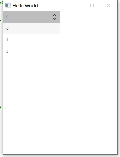
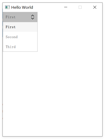
可以设置为数字,例如:model: 3
ComboBox {id: comboboxwidth: 200// 1.填写数字,每一项都为数字model: 3
}
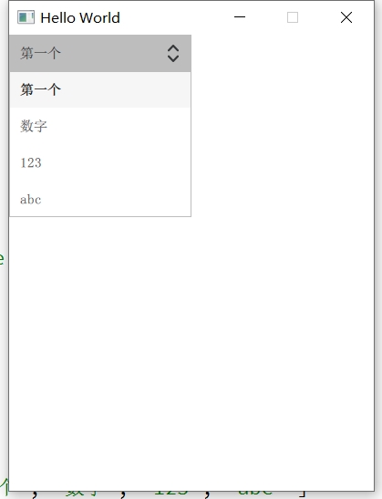
也可以使用数组方式
ComboBox {id: comboboxwidth: 200model: [ "第一个", "数字", "123", "abc" ]
//    model: [
//        { name: "张三", text: "zhangsan" },
//        { name: "李四", text: "lisi" }
//    ]
}
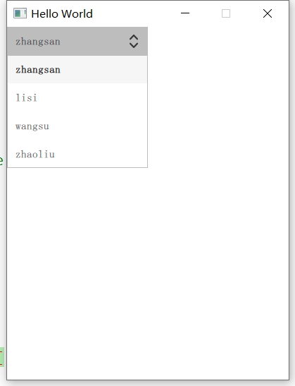
还可以是ListModel等
ComboBox {id: comboboxwidth: 200textRole: "name"model: ListModel {ListElement { text: "first"; name: "zhangsan" }ListElement { text: "第二" ; name: "lisi"}ListElement { text: "123" ; name: "wangsu"}ListElement { text: "abcdefg" ; name: "zhaoliu"}}
}
2.currentIndex
此属性保存组合框中当前项的索引。
即可以通过该值获取当前显示的索引,或者通过设置该值去控制显示;
Button {text: "clike me!"x: 250onClicked: {// 设置ComboBox显示为第一项combobox.currentIndex = 0}
}ComboBox {id: comboboxwidth: 200textRole: "name"model: ListModel {id: modelListElement { text: "first"; name: "zhangsan" }ListElement { text: "第二" ; name: "lisi"}ListElement { text: "123" ; name: "wangsu"}ListElement { text: "abcdefg" ; name: "zhaoliu"}}// 设置初始显示为第三项,下标从0开始currentIndex: 2
}
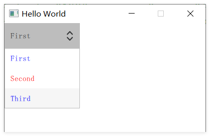
3.textRole
这个属性用于设置显示ComboBox的模型中的属性。
当模型有多个角色时,可以设置textRole来确定应该显示哪个角色。
即如果model中设置的模型,有多个属性值,如果不通过textRole去指定显示,会无法正常显示出来;不信可以自己去尝试一下,注释掉下面的textRole: "key"即可。
ComboBox {textRole: "key"model: ListModel {ListElement { key: "First"; value: 123 }ListElement { key: "Second"; value: 456 }ListElement { key: "Third"; value: 789 }}
}
4.currentText
当前属性保持了当前显示的文本。
如果设置了textRole;那么currentText获取的是textRole设置的属性的当前文本;
onCurrentTextChanged 当currentText发生改变时触发;
ComboBox {textRole: "key"model: ListModel {ListElement { key: "First"; value: 123 }ListElement { key: "Second"; value: 456 }ListElement { key: "Third"; value: 789 }}onCurrentTextChanged: {console.log("CurrentText: ", currentText)}
}
5.valueRole 与 currentValue
valueRole 此属性保存用于存储与模型中每个项目相关联的值的模型角色。
currentValue 当设置了valueRole后,该属性获得valueRole设置相应属性值。
ComboBox {textRole: "key"valueRole: "value"model: ListModel {ListElement { key: "First"; value: 123 }ListElement { key: "Second"; value: 456 }ListElement { key: "Third"; value: 789 }}onCurrentTextChanged: {console.log("CurrentText: ", currentText)}onCurrentValueChanged: {console.log("CurrentValue: ", currentValue)}
}
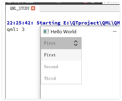
6.count
此属性保存ComboBox的项个数。
ComboBox {model: ListModel {ListElement { key: "First"; value: 123 }ListElement { key: "Second"; value: 456 }ListElement { key: "Third"; value: 789 }}Component.onCompleted: {// count 数字记录的ComboBox的项数console.log(count);}
}
7.editable
此属性设置ComboBox是否可编辑;true,可编辑,false,不可编辑,默认false。
onAccepted 槽函数,当ComboBox为可编辑时,在ComboBox有焦点时,按下回车时触发。
find 函数,如果在ComboBox项中没找到,则返回-1;否则返回找到文本的索引。
editText 属性,保存当前被编辑时的文本。
ComboBox {model: ListModel {ListElement { key: "First"; value: 123 }ListElement { key: "Second"; value: 456 }ListElement { key: "Third"; value: 789 }}// 设置是否可编辑editable: true// 当在editable属性设置为true时,在ComboBox有焦点时,按下回车时触发onAccepted: {// editText 获取当前项正编辑的文本console.log(editText);// 如果在ComboBox项中没找到,则返回-1,然后添加if (-1 === find(editText)) {// 给comboBox添加一项model.append({ key: editText, value: 101 });}}
}
只有敲下回车键后才会触发 onAccepted

8.displayText
此属性可以指定显示当前的文本。
ComboBox {textRole: "key"valueRole: "value"model: ListModel {ListElement { key: "First"; value: 123 }ListElement { key: "Second"; value: 456 }ListElement { key: "Third"; value: 789 }}displayText: currentText + "  " + currentValue
}
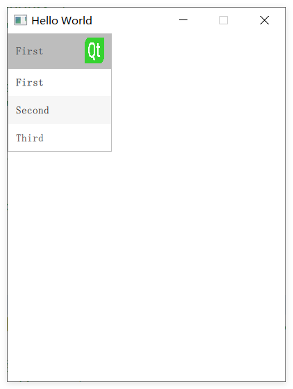
9.indicator
这个属性设置ComboBox右侧图标的绘制。
默认是上箭头和下箭头包裹在一起的,可以通过这个这个属性绘制成任何图案。
也可以设置图片上去。
ComboBox {id: cobwidth: 150height: 50textRole: "key"model: ListModel {ListElement { key: "First"; value: 123 }ListElement { key: "Second"; value: 456 }ListElement { key: "Third"; value: 789 }}indicator: Image {id: imgwidth: 50height: 50anchors.right: cob.right    // 位于父类的右侧anchors.verticalCenter: cob.verticalCenter    // 垂直与父类source: "/qt.png"}
}
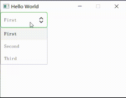
10.background
此属性设置ComboBox的背景绘制;仅仅设置ComboBox,下拉选项不影响。
ComboBox {id: cobwidth: 150height: 50textRole: "key"model: ListModel {ListElement { key: "First"; value: 123 }ListElement { key: "Second"; value: 456 }ListElement { key: "Third"; value: 789 }}background: Rectangle {// 鼠标按下或者释放时设置颜色border.color: cob.pressed ? "#D6577B" : "#21be2b"// 设置圆角radius: 5}
}
11.contentItem
此属性设置ComboBox的当前文本绘制;仅仅设置ComboBox,下拉选项不影响。
ComboBox {id: cobwidth: 150height: 50textRole: "key"model: ListModel {ListElement { key: "First"; value: 123 }ListElement { key: "Second"; value: 456 }ListElement { key: "Third"; value: 789 }}contentItem: Text {id: txttext: qsTr(cob.currentText)font: cob.fontcolor: cob.pressed ? "red" : "blue"verticalAlignment: Text.AlignHCenter | Text.AlignVCenter    // 水平居中anchors.horizontalCenter: cob.horizontalCenter              // 垂直居中}
}
12.delegate
针对model中,每一个项的具体绘制。即下拉选项,非ComboBox。
ComboBox {id: cobwidth: 150height: 50textRole: "key"model: ListModel {ListElement { key: "First"; value: 123 }ListElement { key: "Second"; value: 456 }ListElement { key: "Third"; value: 789 }}// 针对model中,每一个项的具体绘制delegate: ItemDelegate {width: cob.widthcontentItem: Text {text: model.key     // 设置具体某一项的文本color: index % 2 ? "red" : "blue"   // index 获取的是设置到当前项的索引font: cob.fontverticalAlignment: Text.AlignVCenter}// 鼠标悬浮项时的高亮效果highlighted: cob.highlightedIndex === index}
}
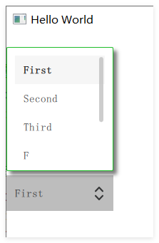
13.popup
绘制整个下拉框部件;(delegate:绘制单个下拉框项)
y 属性:设置下拉项是向下显示,还是向上显示;
background 属性:设置整个下拉属性的背景;
ComboBox {id: coby: 200width: 150height: 50textRole: "key"model: ListModel {ListElement { key: "First"; value: 123 }ListElement { key: "Second"; value: 456 }ListElement { key: "Third"; value: 789 }ListElement { key: "F"; value: 123 }ListElement { key: "S"; value: 456 }ListElement { key: "T"; value: 789 }}// 绘制整个下拉框部件(delegate:绘制单个下拉框项)popup: Popup {// 设置下拉项是向下显示还是向上显示y: -cob.height - 130width: cob.widthcontentItem: ListView {clip: true
//              implicitHeight: contentHeightimplicitHeight: 150model: cob.popup.visible ? cob.delegateModel : nullcurrentIndex: cob.highlightedIndex// 设置鼠标无法点击拖动,默认值为trueinteractive: false// 设置鼠标拖动到尽头时,没有回弹的效果boundsBehavior: Flickable.StopAtBounds// 设置滚动条ScrollBar.vertical: ScrollBar {policy: ScrollBar.AlwaysOn    // 设置滚动条一直显示}}// 设置整个下拉属性的背景background: Rectangle {border.color: "#21be2b"radius: 2}}
}
实现阴影效果:
import QtGraphicalEffects 1.14
在popup的background中添加如下:
// 设置整个下拉属性的背景
background: Rectangle {     border.color: "#21be2b"   radius: 2                 // 实现阴影效果                 layer.enabled: true       layer.effect: DropShadow {verticalOffset: 5     horizontalOffset: 5   radius: 8.0           samples: 17           color: "#80000000"    }
}
14.onActivated
当鼠标选中某一项时,此槽函数会触发,其中可通过index获取选中项的索引;
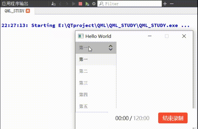
ComboBox {                                                         model: ["第一", "第二", "第三", "第四", "第五"]                          onActivated: {                                                 console.log("index = " + index + "   text:" + currentText);}
}