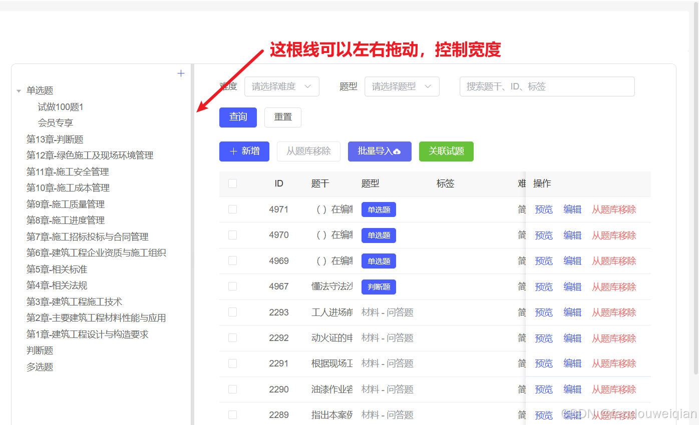
element-plus + splitpanes 实现左右拖动控制宽度
关键代码
- 安装splitpanes
npm install --save-dev @types/splitpanes
- 关键代码
<template><splitpanes class="custom-panes" :min-percent="10" :max-percent="90" @resize="handleResize"><pane :size="leftWidth" :min-size="15" :max-size="40">左侧内容</pane><pane :size="100 - leftWidth">右侧内容</pane></splitpanes>
</template><script lang="ts" setup>
import { Splitpanes, Pane } from 'splitpanes'
import 'splitpanes/dist/splitpanes.css'// 动态宽度(带持久化)
const leftWidth = ref(localStorage.getItem('splitWidth') ? Number(localStorage.getItem('splitWidth')) : 20)const handleResize = (e: any) => {if (e[0]?.size) {leftWidth.value = e[0].sizelocalStorage.setItem('splitWidth', e[0].size.toString())}
}
</script ><style scoped>
/* 容器高度设置 */
.custom-panes {height: calc(100vh - 100px); /* 根据实际布局调整 */
}/* 左侧边框容器 */
.border-container {border: 0;height: 100%;padding: 0;overflow: auto;
}/* 拖拽条样式(穿透作用域)*/
:deep(.splitpanes__splitter) {background: #f0f0f0;width: 6px !important; /* 横向布局时为垂直分割线 */position: relative;&::before {content: '';position: absolute;left: 1px;top: 50%;transform: translateY(-50%);width: 2px;height: 20px;background: #ddd;}&:hover {background: #e0e0e0;}
}/* 响应式处理 */
@media (max-width: 768px) {.custom-panes {flex-direction: column; /* 移动端改为垂直布局 */}:deep(.splitpanes__splitter) {width: 100% !important; /* 横向分割线 */height: 6px !important;&::before {width: 20px;height: 2px;left: 50%;top: 1px;transform: translateX(-50%);}}
}
</style>