组件轮播与样式结构重用实验
任务一:使用“Swiper 轮播组件”对自行选择的图片和文本素材分别进行轮播,且调整对应的“loop”、“autoPlay”“interval”、“vertical”属性,实现不同的轮播效果,使用Swiper 样式自定义,修改默认小圆点和被选中小圆点的尺寸及背景。
任务二:自行选择素材,分别使用“@Extend”、“@Styles”和“@Builder”实现结构或样式或事件的重用。
实验一:
@Entry
@Component
struct Index {@State message: string = 'Hello World';build() {Swiper(){//1.轮播内容Image($r('app.media.ic_swiper_xmyp01'))Image($r('app.media.ic_swiper_xmyp02'))Image($r('app.media.ic_swiper_xmyp03'))Image($r('app.media.ic_swiper_xmyp04'))}//2.设置尺寸(内容会自动拉伸)//tips:给外层设置宽高,未来的子元素都会进行统一的拉伸.width('100%').height(100).loop(true) //是否开启循环.autoPlay(true)  //是否自动播放.interval(4000)  //自动播放时间间隔-4s.vertical(true)  //纵向轮播//定制小圆点.indicator(Indicator.dot()  //小圆点.itemWidth(20)  //默认的宽.itemHeight(5)  //默认的高.color(Color.Gray)  //默认的颜色.selectedItemWidth(30)  //选中的宽.selectedItemHeight(5)  //选中的高.selectedColor(Color.White)  //选中的颜色)}
}
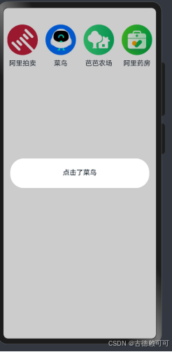
实验二:
//全局 Builder
@Builder
function navItem(icon:ResourceStr,txt:string){Column({space:10}) {Image(icon).width('80%')Text(txt)}.width('25%').onClick(()=>{AlertDialog.show({message:'点击了'+txt})})
}@Entry
@Componentstruct Index {@State message: string = 'Hello World';build() {Row(){Row(){navItem($r('app.media.ic_reuse_01'),'阿里拍卖')navItem($r('app.media.ic_reuse_02'),'菜鸟')navItem($r('app.media.ic_reuse_03'),'芭芭农场')navItem($r('app.media.ic_reuse_04'),'阿里药房')}}}}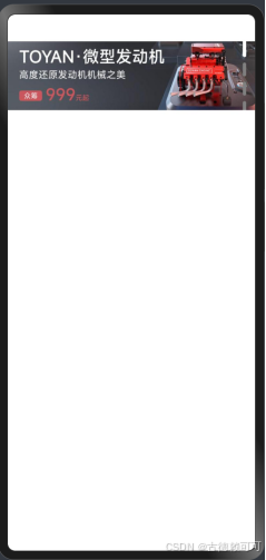
参考资料:75-Swiper-轮播图&常用属性&小米案例_哔哩哔哩_bilibili