Scanpy可视化技巧--UMAP图优化
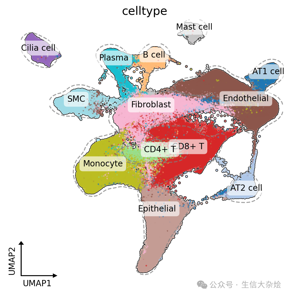
前几天后台有同学私信说想要美化下scanpy绘制的UMAP图,给了篇单细胞文章中的UMAP截图,我们写了一个函数,用于美化scanpy的UMAP图,思路还是比较简单,基本上全部是由deeepseek帮忙实现,能让你的UMAP图拥有:
✓ 细胞亚群轮廓线
✓ 智能标签定位
✓ 科研风坐标轴
✓ 自适应比例标注
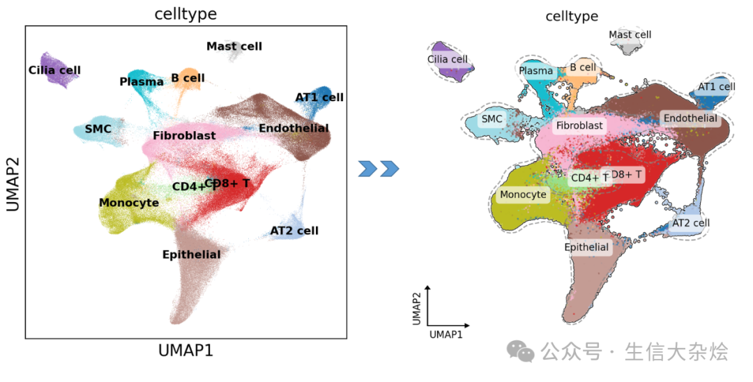
核心美化功能解析
功能1:核密度轮廓线
kde = KernelDensity(bandwidth=0.5)kde.fit(coordinates)plt.contour(xx, yy, Z, levels=[peak*0.1])
-
原理:通过核密度估计寻找细胞聚集区
-
优势:比 convex hull 更贴合真实分布
功能2:智能标签
ax.text(x, y, cell_type, bbox=dict(facecolor='white', alpha=0.9))-
自动计算亚群中位数坐标
-
白色半透明背景增强对比度
-
圆角边框提升美观度
功能3:科研风坐标轴
ax.arrow(x_min, y_min, dx, 0) # X轴箭头ax.text(x_center, y_min-offset, 'UMAP1') # 动态标签
-
自动计算箭头长度比例
-
自适应图像长宽比
-
标签防遮挡设计
完整函数封装
import numpy as npimport pandas as pdimport scanpy as scimport matplotlib.pyplot as pltfrom sklearn.neighbors import KernelDensitydef enhance_umap(adata, color='celltype', figsize=(6,6)):fig, ax = plt.subplots(figsize=figsize)sc.pl.umap(adata,color=color,legend_loc=None,frameon=False,size=15,ax=ax,add_outline=True,show=False)for cell_type in adata.obs[color].unique():# 获取对应细胞类型的UMAP坐标mask = adata.obs[color] == cell_typex = adata.obsm["X_umap"][mask, 0]y = adata.obsm["X_umap"][mask, 1]x_min, x_max = x.min() - 0.5, x.max() + 0.5y_min, y_max = y.min() - 0.5, y.max() + 0.5xx, yy = np.mgrid[x_min:x_max:100j, y_min:y_max:100j]xy_train = np.vstack([x, y]).Txy_test = np.vstack([xx.ravel(), yy.ravel()]).T# 核密度估计kde = KernelDensity(bandwidth=0.5, metric='euclidean')kde.fit(xy_train)# 密度Z = np.exp(kde.score_samples(xy_test))Z = Z.reshape(xx.shape)# 绘制轮廓plt.contour(xx, yy, Z,levels=[Z.max() * 0.1],colors='gray',linestyles='--',linewidths=1.2,alpha=0.75)cell_type_counts = adata.obs[color].value_counts(normalize=True) * 100for cell_type, percentage in cell_type_counts.items():mask = adata.obs[color] == cell_typex = np.median(adata.obsm["X_umap"][mask, 0])y = np.median(adata.obsm["X_umap"][mask, 1])ax.text(# x, y, f"{cell_type} ({percentage:.1f}%)",x, y, f"{cell_type}",fontsize=10,ha="center",color="black",bbox=dict(facecolor='white', # 添加白色背景edgecolor='none',alpha=0.65,boxstyle="round,pad=0.4" # 添加圆角))ax = plt.gca()ax.set_xlabel('UMAP1', fontsize=10)ax.set_ylabel('UMAP2', fontsize=10)# 获取坐标轴数据范围x_min, x_max = ax.get_xlim()y_min, y_max = ax.get_ylim()# 动态计算箭头参数(基于数据范围和图像比例)x_range = x_max - x_miny_range = y_max - y_minaspect_ratio = (fig.get_size_inches()[0] / fig.get_size_inches()[1]) * (y_range / x_range) # 校正宽高比# 箭头长度(数据范围的10%)dx = x_range * 0.1 * aspect_ratiody = y_range * 0.1 * aspect_ratio # 根据实际显示比例调整Y轴长度# 箭头头部参数(与箭头长度成比例)head_width = dy * 0.1head_length = dx * 0.1# 绘制X轴箭头ax.arrow(x_min, y_min,dx, 0,head_width=head_width,head_length=head_length,fc='black',ec='black')# 绘制Y轴箭头ax.arrow(x_min, y_min,0, dy,head_width=head_width,head_length=head_length,fc='black',ec='black')# 计算标签位置(箭头中点+微调偏移)label_offset = dx * 0.15 # 偏移量为箭头长度的15%ax.text(x_min + dx/2,y_min - label_offset, # 向下偏移'UMAP1',ha='center',va='top',fontsize=10)ax.text(x_min - label_offset,y_min + dy/2,'UMAP2',rotation=90,ha='right',va='center',fontsize=10)