QML SpinBox:控件的用法与样式外观
目录
- 引言
- 相关阅读
- 项目结构
- 主要文件说明
- 基础SpinBox实现
- 代码解析
- 运行效果
- 自定义步长的SpinBox
- 代码解析
- 运行效果
- 样式定制SpinBox
- 代码解析
- 运行效果
- 主界面实现
- 运行效果
- 总结
- 下载链接
引言
Qt Quick作为Qt框架的声明式UI开发技术,提供了灵活且强大的SpinBox控件,用于处理数值输入场景。SpinBox不仅支持通过按钮增减数值,还能直接编辑输入,同时提供范围限制和步长控制等功能,使其在仪表盘、设置面板等场景中广泛应用。
本文将通过一个实例项目,详细探讨Qt Quick中SpinBox控件的基础使用、自定义步长和范围设置,以及样式定制,帮助开发者深入理解并灵活运用这一常用控件。
相关阅读
- Qt SpinBox官方文档
项目结构
本项目采用CMake构建系统,使用QML实现界面,展示了SpinBox的三种不同实现方式。项目结构如下:
主要文件说明
- main.cpp: 程序入口,创建QML引擎并加载主QML文件
- Main.qml: 主界面,使用GridLayout布局三个SpinBox示例
- components/: 包含三个SpinBox实现示例的目录
- BasicSpinBox.qml: 基础SpinBox实现
- CustomStepSpinBox.qml: 自定义步长和范围的SpinBox
- StyledSpinBox.qml: 样式完全定制的SpinBox
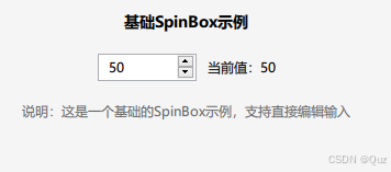
基础SpinBox实现
基础SpinBox示例展示了SpinBox的基本功能,包括值范围设置、可编辑属性等。
import QtQuick
import QtQuick.Controls
import QtQuick.LayoutsRectangle {id: rootcolor: "#f5f5f5"radius: 4property int spinBoxValue: spinBox.valueColumnLayout {id: layoutanchors {top: parent.toptopMargin: 20horizontalCenter: parent.horizontalCenter}spacing: 20Text {Layout.alignment: Qt.AlignHCentertext: "基础SpinBox示例"font.bold: truefont.pixelSize: 14}RowLayout {Layout.fillWidth: trueLayout.alignment: Qt.AlignHCenterspacing: 10SpinBox {id: spinBoximplicitHeight: 25value: 50from: 0to: 100editable: true// 添加数值显示格式化textFromValue: function(value, locale) {return Number(value).toLocaleString(locale, 'f', 0)}// 添加输入验证validator: IntValidator {bottom: spinBox.fromtop: spinBox.to}}Text {text: "当前值:" + spinBox.valueLayout.alignment: Qt.AlignVCenter}}Text {text: "说明:这是一个基础的SpinBox示例,支持直接编辑输入"font.pixelSize: 12color: "#666666"wrapMode: Text.WordWrapLayout.fillWidth: trueLayout.fillHeight: true}}
}
代码解析
属性设置:
value: 50- 设置SpinBox初始值为50from: 0和to: 100- 设置值范围为0到100editable: true- 允许用户直接编辑输入框中的数值
数值格式化:
textFromValue函数用于格式化显示的数值,这里使用了toLocaleString方法
输入验证:
- 使用
IntValidator限制输入只能是整数,且在指定范围内
运行效果
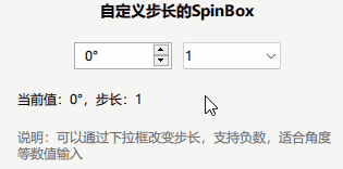
自定义步长的SpinBox
此示例展示了如何创建可调节步长的SpinBox,并支持负值范围。
import QtQuick
import QtQuick.Controls
import QtQuick.LayoutsRectangle {id: rootcolor: "#f5f5f5"radius: 4property int spinBoxValue: spinBox.valueColumnLayout {id: layoutanchors.fill: parentanchors.margins: 20spacing: 20Text {Layout.alignment: Qt.AlignHCentertext: "自定义步长和范围SpinBox"font.bold: truefont.pixelSize: 14}RowLayout {Layout.fillWidth: trueLayout.alignment: Qt.AlignHCenterspacing: 10SpinBox {id: spinBoximplicitHeight: 25from: -100to: 100stepSize: 10value: 0editable: true// 自定义显示格式textFromValue: function(value, locale) {return value + "°"}// 自定义输入处理valueFromText: function(text, locale) {return Number.fromLocaleString(locale, text.replace("°", ""))}}// 步长控制ComboBox {id: stepControlimplicitHeight: 25model: ["1", "5", "10", "15", "20"]onCurrentTextChanged: {spinBox.stepSize = Number(currentText)}}}Text {text: "当前值:" + spinBox.value + "°,步长:" + spinBox.stepSizeLayout.alignment: Qt.AlignLeft}Text {text: "说明:可以通过下拉框改变步长,支持负数,适合角度等数值输入"font.pixelSize: 12color: "#666666"wrapMode: Text.WordWrapLayout.fillWidth: trueLayout.fillHeight: true}}
}
代码解析
自定义步长:
stepSize: 10- 设置默认步长为10- 通过ComboBox控件动态调整步长值
扩展值范围:
from: -100和to: 100- 支持负值范围
自定义显示和输入处理:
textFromValue函数在数值后添加度数符号(“°”)valueFromText函数在转换文本到数值时移除度数符号
运行效果
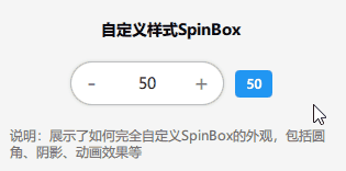
样式定制SpinBox
此示例展示了如何完全定制SpinBox的外观,包括背景、按钮和文本输入区域。
import QtQuick
import QtQuick.Controls
import QtQuick.Controls.Basic
import QtQuick.Layouts
import Qt5Compat.GraphicalEffectsRectangle {id: rootcolor: "#f5f5f5"radius: 4property int spinBoxValue: spinBox.valueColumnLayout {id: layoutanchors.fill: parentanchors.margins: 20spacing: 20Text {Layout.alignment: Qt.AlignHCentertext: "自定义样式SpinBox"font.bold: truefont.pixelSize: 14}RowLayout {Layout.fillWidth: trueLayout.alignment: Qt.AlignHCenterspacing: 10SpinBox {id: spinBoxvalue: 50from: 0to: 100editable: truebackground: Rectangle {implicitWidth: 140implicitHeight: 40radius: height / 2color: spinBox.enabled ? (spinBox.up.pressed || spinBox.down.pressed ? "#e0e0e0" : "white") : "#f0f0f0"border.color: spinBox.focus ? "#2196F3" : "#bdbdbd"border.width: spinBox.focus ? 2 : 1// 添加阴影效果layer.enabled: truelayer.effect: DropShadow {transparentBorder: truecolor: "#20000000"radius: 4samples: 8}}up.indicator: Rectangle {x: parent.width - widthheight: parent.heightimplicitWidth: 40implicitHeight: 40radius: height / 2color: spinBox.up.pressed ? "#e0e0e0" : "transparent"Text {text: "+"font.pixelSize: 20color: spinBox.up.pressed ? "#1976D2" : "#757575"anchors.centerIn: parent}}down.indicator: Rectangle {x: 0height: parent.heightimplicitWidth: 40implicitHeight: 40radius: height / 2color: spinBox.down.pressed ? "#e0e0e0" : "transparent"Text {text: "-"font.pixelSize: 20color: spinBox.down.pressed ? "#1976D2" : "#757575"anchors.centerIn: parent}}contentItem: TextInput {z: 2text: spinBox.textFromValue(spinBox.value, spinBox.locale)font.pixelSize: 14color: "#212121"selectionColor: "#2196F3"selectedTextColor: "white"horizontalAlignment: Qt.AlignHCenterverticalAlignment: Qt.AlignVCenterreadOnly: !spinBox.editablevalidator: spinBox.validatorinputMethodHints: Qt.ImhFormattedNumbersOnly}}// 值显示Rectangle {Layout.alignment: Qt.AlignVCentercolor: "#2196F3"radius: 4width: valueText.width + 20height: valueText.height + 10Text {id: valueTextanchors.centerIn: parenttext: spinBox.valuecolor: "white"font.bold: true}}}Text {text: "说明:展示了如何完全自定义SpinBox的外观,包括圆角、阴影、动画效果等"font.pixelSize: 12color: "#666666"wrapMode: Text.WordWrapLayout.fillWidth: trueLayout.fillHeight: true}}
}
代码解析
自定义背景:
- 通过覆盖
background属性实现圆角矩形 - 根据控件状态(启用/禁用、聚焦/非聚焦)动态改变颜色和边框,使用
DropShadow效果添加阴影
自定义按钮指示器:
- 通过覆盖
up.indicator和down.indicator属性自定义增减按钮 - 使用Text元素显示"+“和”-"符号,根据按下状态改变颜色
自定义内容显示:
- 通过覆盖
contentItem属性自定义文本输入区域,设置文本对齐、颜色、选择颜色等
运行效果
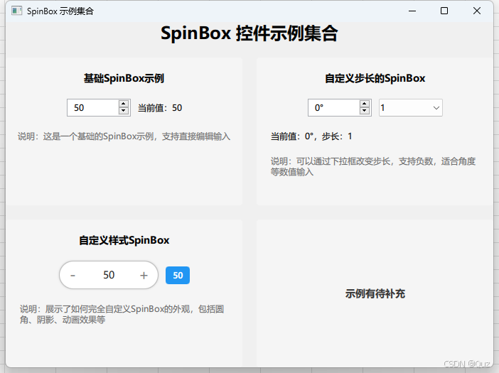
主界面实现
主界面使用GridLayout将三个SpinBox示例以网格形式展示。代码省略 …
运行效果
总结
本文通过一个实际项目,详细讲解了Qt Quick中SpinBox控件的三种实现方式:
- 基础SpinBox:展示了SpinBox的基本属性和功能,包括值范围设置、编辑功能和数值格式化。
- 自定义步长SpinBox:展示了如何创建可调节步长的SpinBox,并支持负值范围,适用于角度等特殊数值输入场景。
- 样式定制SpinBox:展示了如何完全重写SpinBox的视觉组件,实现圆角、阴影、动态颜色变化等现代UI效果。
下载链接
完整项目代码可在以下链接获取:GitCode - QML SpinBox示例