【css酷炫效果】纯CSS实现气泡上升动画
【css酷炫效果】纯CSS实现气泡上升动画
- 缘
- 创作背景
- html结构
- css样式
- 完整代码
- 基础版
- 进阶版(随机气泡)
- 效果图
今天,我们将探讨如何使用纯CSS来实现一个气泡上升动画。
想直接拿走的老板,链接放在这里:https://download.csdn.net/download/u011561335/90490495
缘
创作随缘,不定时更新。
创作背景
刚看到csdn出活动了,赶时间,直接上代码。
html结构
    <div class="bubble-container">
        <div class="bubble"></div>
        <div class="bubble"></div>
        <div class="bubble"></div>
        <div class="bubble"></div>
        <div class="bubble"></div>
        <div class="bubble"></div>
    </div>
css样式
	body {
		margin: 0;
		padding: 0;
		overflow: hidden; /* 防止滚动条出现 */
		background-color: #87CEEB; /* 浅蓝色背景 */
	}

	.bubble-container {
		position: relative;
		width: 100%;
		height: 100vh; /* 视口高度 */
	}

	.bubble {
		position: absolute;
		bottom: -50px; /* 初始位置在视口外 */
		width: 40px;
		height: 40px;
		background-color: rgba(255, 255, 255, 0.7); /* 半透明白色 */
		border-radius: 50%; /* 圆形 */
		opacity: 0; /* 初始透明度为0 */
		animation: rise 4s infinite ease-in-out; /* 应用动画 */
	}

	@keyframes rise {
    0% {
        transform: translateY(0); /* 初始位置(虽然在视口外,但这里设为0是为了动画的连续性) */
        opacity: 0; /* 初始透明度 */
    }
    20% {
        opacity: 1; /* 逐渐增加透明度 */
    }
    100% {
        transform: translateY(-100vh); /* 上升到视口外 */
        opacity: 0; /* 透明度逐渐减小到0 */
    }
}
完整代码
基础版
<!DOCTYPE html>
<html lang="en">
<head>
    <meta charset="UTF-8">
    <meta name="viewport" content="width=device-width, initial-scale=1.0">
    <title>旗袍</title>
	<style>
	body {
		margin: 0;
		padding: 0;
		overflow: hidden; /* 防止滚动条出现 */
		background-color: #87CEEB; /* 浅蓝色背景 */
	}

	.bubble-container {
		position: relative;
		width: 100%;
		height: 100vh; /* 视口高度 */
	}

	.bubble {
		position: absolute;
		bottom: -50px; /* 初始位置在视口外 */
		width: 40px;
		height: 40px;
		background-color: rgba(255, 255, 255, 0.7); /* 半透明白色 */
		border-radius: 50%; /* 圆形 */
		opacity: 0; /* 初始透明度为0 */
		animation: rise 4s infinite ease-in-out; /* 应用动画 */
	}

	@keyframes rise {
    0% {
        transform: translateY(0); /* 初始位置(虽然在视口外,但这里设为0是为了动画的连续性) */
        opacity: 0; /* 初始透明度 */
    }
    20% {
        opacity: 1; /* 逐渐增加透明度 */
    }
    100% {
        transform: translateY(-100vh); /* 上升到视口外 */
        opacity: 0; /* 透明度逐渐减小到0 */
    }
}

	</style>
</head>
<body>
    <div class="bubble-container">
        <div class="bubble"></div>
        <div class="bubble"></div>
        <div class="bubble"></div>
        <div class="bubble"></div>
        <div class="bubble"></div>
        <div class="bubble"></div>
    </div>
</body>
</html>
进阶版(随机气泡)
<!DOCTYPE html>
<html lang="en">
<head>
    <meta charset="UTF-8">
    <meta name="viewport" content="width=device-width, initial-scale=1.0">
    <title>旗袍</title>
	<style>
	body {
		margin: 0;
		padding: 0;
		overflow: hidden; /* 防止滚动条出现 */
		background-color: #87CEEB; /* 浅蓝色背景 */
	}

	.bubble-container {
		position: relative;
		width: 100%;
		height: 100vh; /* 视口高度 */
	}

	.bubble {
		position: absolute;
		bottom: -50px; /* 初始位置在视口外 */
		width: 40px;
		height: 40px;
		background-color: rgba(255, 255, 255, 0.7); /* 半透明白色 */
		border-radius: 50%; /* 圆形 */
		opacity: 0; /* 初始透明度为0 */
		animation: rise 4s infinite ease-in-out; /* 应用动画 */
	}
	.bubble:nth-child(1) {
		left: 10%; /* 第一个气泡的初始位置 */
		animation-delay: 0s; /* 第一个气泡的动画延迟 */
	}

	.bubble:nth-child(2) {
		left: 30%; /* 第二个气泡的初始位置 */
		animation-delay: 1s; /* 第二个气泡的动画延迟 */
		width: 60px; /* 可以为不同气泡设置不同大小 */
		height: 60px;
	}

	.bubble:nth-child(3) {
		left: 50%; /* 第三个气泡的初始位置 */
		animation-delay: 2s; /* 第三个气泡的动画延迟 */
		transform: translateX(-50%); /* 水平居中 */
	}

	/* 可以继续为更多气泡添加样式 */

	@keyframes rise {
    0% {
        transform: translateY(0); /* 初始位置(虽然在视口外,但这里设为0是为了动画的连续性) */
        opacity: 0; /* 初始透明度 */
    }
    20% {
        opacity: 1; /* 逐渐增加透明度 */
    }
    100% {
        transform: translateY(-100vh); /* 上升到视口外 */
        opacity: 0; /* 透明度逐渐减小到0 */
    }
}

	</style>
</head>
<body>
    <div class="bubble-container">
        <div class="bubble"></div>
        <div class="bubble"></div>
        <div class="bubble"></div>
        <div class="bubble"></div>
        <div class="bubble"></div>
        <div class="bubble"></div>
    </div>
</body>
</html>
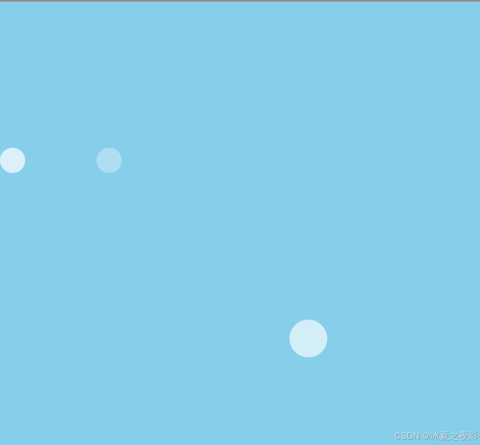
效果图