winform基于antdui中table控件的使用
官方链接gitee:AntdUI/AntdUI
Table表格属性、方法:
属性:
| 名称 | 描述 | 类型 | 默认值 |
| Gap | 间距 | int | 12 |
| Radius 🔴 | 圆角 | int | 0 |
| CheckSize | 复选框大小 | int | 16 |
| SwitchSize 🔴 | 开关大小 | int | 16 |
| TreeButtonSize 🔴 | 树开关按钮大小 | int | 16 |
| FixedHeader | 固定表头 | bool | true |
| VisibleHeader 🔴 | 显示表头 | bool | true |
| Bordered | 显示列边框 | bool | false |
| RowHeight 🔴 | 行高 | int |
|
| RowHeightHeader 🔴 | 表头行高 | int |
|
| EnableHeaderResizing | 手动调整列头宽度 | bool | false |
| ColumnDragSort | 列拖拽排序 | bool | false |
| LostFocusClearSelection | 焦点离开清空选中 | bool | false |
| AutoSizeColumnsMode 🔴 | 列宽自动调整模式 | ColumnsMode | Auto |
| ClipboardCopy | 行复制 | bool | true |
| EditMode | 编辑模式 | TEditMode | None |
| ShowTip | 省略文字提示 | bool | true |
| DefaultExpand 🔴 | 默认是否展开 | bool | false |
| Empty | 是否显示空样式 | bool | true |
| EmptyText | 数据为空显示文字 | string | No data |
| EmptyImage | 数据为空显示图片 | Image |
|
| EmptyHeader | 空是否显示表头 | bool | false |
| RowSelectedBg | 表格行选中背景色 | Color |
|
| RowSelectedFore 🔴 | 表格行选中字色 | Color |
|
| BorderColor 🔴 | 表格边框颜色 | Color |
|
| ColumnFont 🔴 | 表头字体 | Font |
|
| ColumnBack 🔴 | 表头背景色 | Color |
|
| ColumnFore 🔴 | 表头文本色 | Color |
|
| SelectedIndex | 选中行 | int | -1 |
| Columns | 表格列的配置 | ColumnCollection |
|
| DataSource | 数据数组 | object
|
|
方法:
| 名称 | 描述 | 返回值 | 参数 |
| ScrollLine | 滚动到指定行 | void | int i |
| CopyData | 复制表格数据 | void | int row |
| CopyData | 复制表格数据 | void | int row , int column |
| EnterEditMode | 进入编辑模式 | void | int row , int column |
| SortIndex 🔴 | 获取排序序号 | int[] | |
| SortList 🔴 | 获取排序数据 | object[] |
Table表格双击单元格实现修改内容操作,通过调用CellEndEdit事件,处理修改后逻辑:
主要是通过事件参数e,获取当前修改是哪一行var row = e.RowIndex - 1;然后在通过该行索引,获取该行的数据内容,在执行后续的更新逻辑。
private bool table1_CellEndEdit(object sender, AntdUI.TableEndEditEventArgs e)
{
    var newVal = e.Value;
    var row = e.RowIndex - 1; // 当前行数据
    var column = e.ColumnIndex; // 当前列

    var dataSource = table1.DataSource as List<TestClass>;
    if (dataSource == null)
    {
        MessageBox.Show("数据源无效!");
        return false;
    }
    var rowData = dataSource[row];
    var columnName = table1.Columns[column].Key;
    switch (columnName)
    {
        case "Name":
            rowData.Name = newVal.ToString();
            break;
        case "Age":
            rowData.Age = Convert.ToInt32(newVal);
            break;
        case "Job":
            rowData.Job = newVal.ToString();
            break;
        default:
            MessageBox.Show("无效的列名!");
            return false;
    }
    DialogResult result = MessageBox.Show("是否更新数据?", "数据更新", MessageBoxButtons.YesNo);
    if (result == DialogResult.Yes)
    {
        // 保存到数据库
        UpdateToDatabase(rowData);

        // 刷新表格
        table1.DataSource = null; // 清空数据源
        table1.DataSource = dataSource; // 重新绑定数据源
        _logHelper.Log("数据更新成功");
        // 返回 true 表示更新成功
        return true;
    }
    else
    {
        // 返回 false 表示取消更新
        return false;
    }
}
表头类型:
如下用于初始化table表头的创建配置:
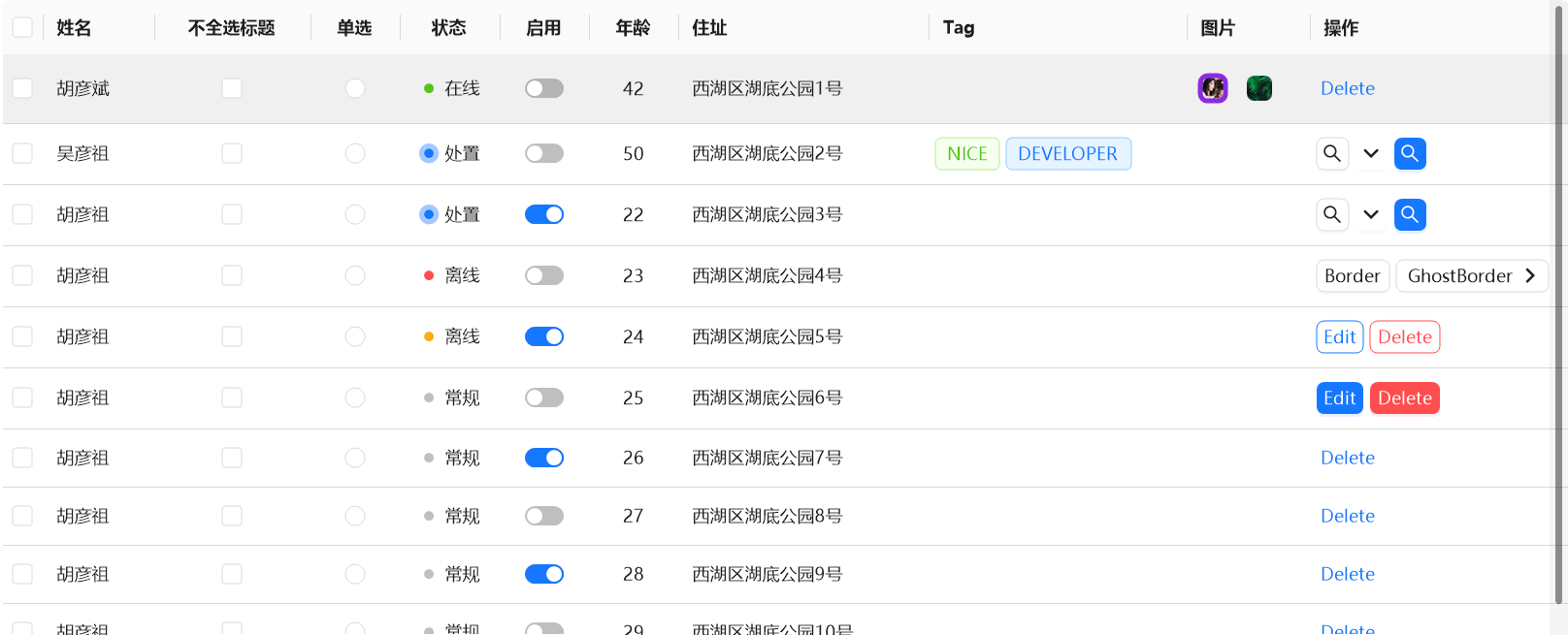
table1.Columns = new AntdUI.ColumnCollection
{
    new AntdUI.ColumnCheck("check").SetFixed(),
    new AntdUI.Column("name", "姓名").SetFixed().SetLocalizationTitleID("Table.Column."),
    new AntdUI.ColumnCheck("checkTitle", "不全选标题").SetColAlign().SetLocalizationTitleID("Table.Column."),
    new AntdUI.ColumnRadio("radio", "单选").SetLocalizationTitleID("Table.Column."),
    new AntdUI.Column("online", "状态", AntdUI.ColumnAlign.Center).SetLocalizationTitleID("Table.Column."),
    new AntdUI.ColumnSwitch("enable", "启用", AntdUI.ColumnAlign.Center)
    {
        LocalizationTitle ="Table.Column.{id}",
        Call = (value, record, i_row, i_col) => {
            System.Threading.Thread.Sleep(2000);
            return value;
        }
    },
    new AntdUI.Column("age", "年龄", AntdUI.ColumnAlign.Center).SetLocalizationTitleID("Table.Column."),
    new AntdUI.Column("address", "住址").SetLocalizationTitleID("Table.Column."),
    new AntdUI.Column("tag", "Tag"),
    new AntdUI.Column("imgs", "图片").SetLocalizationTitleID("Table.Column."),
    new AntdUI.Column("btns", "操作").SetFixed().SetWidth("auto").SetLocalizationTitleID("Table.Column."),
};
| 属性 | 描述 |
| SetFixed() | 使该列固定(在表格滚动时,列内容保持可见)。 |
| SetLocalizationTitleID("Table.Column.") | 为该列标题设置本地化ID,使得可以通过本地化资源文件加载不同语言的标题。 |
| SetColAlign() | 设置该列的对齐方式。 |
| AntdUI.ColumnAlign.Center | 将列内容水平居中对齐 |
| SetWidth("auto") | 列的宽度设置为自动调整。 |
Column
多样表头,可以创建多种形式表头,普通表头、按钮表头、徽标、富文本、进度条等等,按钮表头通过嵌入按钮来实现按钮点击操作:
| 属性名称 | 描述 | 类型 | 必填 | 默认值 |
| Key | 绑定名称 | string | ✅ | |
| Title | 显示文字 | string | ✅ | |
| Visible 🔴 | 是否显示 | bool | ⛔ | true |
| Align | 对齐方式 | ColumnAlign | ⛔ | ColumnAlign.Left |
| ColAlign 🔴 | 表头对齐方式 | ColumnAlign? | ⛔ | null |
| Width | 列宽度 | string? | ⛔ | |
| MaxWidth 🔴 | 列最大宽度 | string? | ⛔ | |
| Fixed | 列是否固定 | bool | ⛔ | false |
| Ellipsis | 超过宽度将自动省略 | bool | ⛔ | false |
| LineBreak 🔴 | 自动换行 | bool | ⛔ | false |
| SortOrder 🔴 | 启用排序 | bool | ⛔ | false |
| KeyTree 🔴 | 树形列 | string? | ⛔ |
ColumnCheck
复选框表头,可以使用该行的勾选状态。继承于 Column
| 名称 | 描述 | 类型 | 必填 | 默认值 |
| Key | 绑定名称 | string | ✅ |
Columnadio
单选框表头。继承于 Column
| 名称 | 描述 | 类型 | 必填 | 默认值 |
| Key | 绑定名称 | string | ✅ | |
| Title | 显示文字 | string | ✅ |
ColumnSwitch
开关表头,可以用来设置改行是否启用。继承于 Column
| 名称 | 描述 | 类型 | 必填 | 默认值 |
| Key | 绑定名称 | string | ✅ | |
| Title | 显示文字 | string | ✅ | |
| Call | 改变回调 | Func<bool, object?, int, int, bool> |
Cell单元格配置
CellText
富文本文本单元格,可以带图标,不同的字体。
| 名称 | 描述 | 类型 | 默认值 |
| Fore | 字体颜色 | Color | |
| Back | 背景颜色 | Color | |
| Font | 字体 | Font | |
| IconRatio 🔴 | 图标比例 | float | 0.7F |
| Prefix 🔴 | 前缀 | Image | |
| PrefixSvg 🔴 | 前缀SVG | string | |
| Suffix 🔴 | 后缀 | Image | |
| SuffixSvg 🔴 | 后缀SVG | string | |
| Text | 文本 | string |
初始化设置:
private CellText cellText;
public CellText CellText
{
get { return cellText; }
set
{
if (cellText == value) return;
cellText = value;
OnPropertyChanged(nameof(CellText));
}
}
CellText = new CellText("这是一个带图标的文本")
{
IconRatio = 0.5f,
PrefixSvg = "<svg viewBox=\"64 64 896 896\" focusable=\"false\" data-icon=\"search\" width=\"1em\" height=\"1em\" fill=\"currentColor\" aria-hidden=\"true\"><path d=\"M909.6 854.5L649.9 594.8C690.2 542.7 712 479 712 412c0-80.2-31.3-155.4-87.9-212.1-56.6-56.7-132-87.9-212.1-87.9s-155.5 31.3-212.1 87.9C143.2 256.5 112 331.8 112 412c0 80.1 31.3 155.5 87.9 212.1C256.5 680.8 331.8 712 412 712c67 0 130.6-21.8 182.7-62l259.7 259.6a8.2 8.2 0 0011.6 0l43.6-43.5a8.2 8.2 0 000-11.6zM570.4 570.4C528 612.7 471.8 636 412 636s-116-23.3-158.4-65.6C211.3 528 188 471.8 188 412s23.3-116.1 65.6-158.4C296 211.3 352.2 188 412 188s116.1 23.2 158.4 65.6S636 352.2 636 412s-23.3 116.1-65.6 158.4z\"></path></svg>"
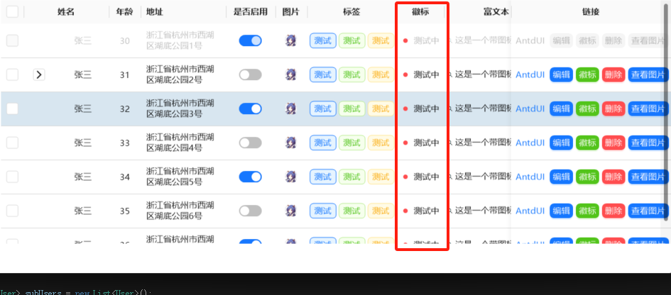
},CellBadge
徽标显示在单元格内
| 名称 | 描述 | 类型 | 默认值 |
| Fore | 字体颜色 | Color | |
| Fill | 颜色 | Color | |
| State | 状态 | TState | Default |
| Text | 文本 | string |
初始化构建:
private CellBadge cellBadge;
public CellBadge CellBadge
{
    get { return cellBadge; }
    set
    {
        if (cellBadge == value) return;
        cellBadge = value;
        OnPropertyChanged(nameof(CellBadge));
    }
}
CellBadge = new CellBadge(TState.Processing, "测试中")TState状态属性,每一个属性对应一种不同的样式:
| 名称 | 描述 |
| Primary | 主要 |
| Default | 默认 |
| Success | 成功 |
| Error | 错误 |
| Processing | 处理中 |
| Warn | 警告 |
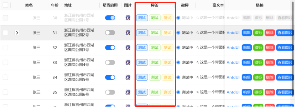
CellTag
标签
| 名称 | 描述 | 类型 | 默认值 |
| Fore | 字体颜色 | Color | |
| Back | 背景颜色 | Color | |
| BorderWidth | 边框宽度 | float | 1F |
| Type | 类型 | TTypeMini | Default |
| Text | 文本 | string |
private CellTag[] cellTags;
public CellTag[] CellTags
{
    get { return cellTags; }
    set
    {
        if (cellTags == value) return;
        cellTags = value;
        OnPropertyChanged(nameof(CellTags));
    }
}
CellTags = new CellTag[] {
    new CellTag("测试", TTypeMini.Primary),
    new CellTag("测试", TTypeMini.Success),
    new CellTag("测试", TTypeMini.Warn) };
如上代码,在CellTags单元格内创建了三个标签,其他类型的单元格也可以通过数组创建多个控件。
TTypeMini类型属性:
| 名称 | 描述 |
| Default | 默认 |
| Primary | 主要 |
| Success | 成功 |
| Error | 错误 |
| Warn | 警告 |
| Info | 信息 |
CellImage
可以在单元格内展示图片
| 名称 | 描述 | 类型 | 默认值 |
| BorderColor | 边框颜色 | Color | |
| BorderWidth | 边框宽度 | float | 0F |
| Radius | 圆角 | int | 6 |
| Round | 圆角样式 | bool | false |
| Size | 自定义大小 | Size | |
| Image | 图片 | Image |
|
| ImageSvg | 图片SVG | string |
|
| FillSvg | SVG填充颜色 | Color | |
| ImageFit | 图片布局 | TFit | Fill |
| Tooltip 🔴 | 文本提示 | string |
private CellImage[] cellImages;
public CellImage[] CellImages
{
 get { return cellImages; }
 set
 {
     if (cellImages == value) return;
     cellImages = value;
     OnPropertyChanged(nameof(CellImages));
 }
}
CellImages = new CellImage[] { new CellImage(Properties.Resources.head) };
// Properties.Resources.head是一个图片资源
// 这里只添加了一个图片,如果要添加多个,就以“,”分割多new几个CellImage出来
TFit 图片布局属性
| 名称 | 描述 |
| Fill | 调整替换后的内容大小,以填充元素的内容框。如有必要,将拉伸或挤压物体以适应该对象 |
| Contain | 缩放替换后的内容以保持其纵横比,同时将其放入元素的内容框 |
| Cover | 调整替换内容的大小,以在填充元素的整个内容框时保持其长宽比。该对象将被裁剪以适应 |
| None | 不对替换的内容调整大小 |
CellLink
超链接,也可以new CellButton
| 名称 | 描述 | 类型 | 默认值 |
| Id | ID | string | |
| Enabled | 启用 | bool | true |
| Text | 文本 | string | |
| TextAlign | 文本位置 | ContentAlignment | MiddleCenter |
| Tooltip 🔴 | 文本提示 | string |
private CellLink[] cellLinks;
public CellLink[] CellLinks
{
    get { return cellLinks; }
    set
    {
        if (cellLinks == value) return;
        cellLinks = value;
        OnPropertyChanged(nameof(CellLinks));
    }
}
CellLinks = new CellLink[] {
    new CellLink("https://gitee.com/antdui/AntdUI", "AntdUI"),  // 超链接
    new CellButton(Guid.NewGuid().ToString(),"编辑",TTypeMini.Primary), // button
    new CellButton(Guid.NewGuid().ToString(),"删除",TTypeMini.Error),
    new CellButton(Guid.NewGuid().ToString(),"查看图片",TTypeMini.Primary)
}; 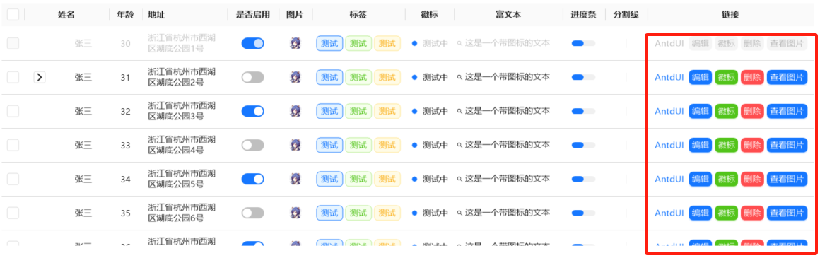
CellButton
按钮控件,继承自CellLink
| 名称 | 描述 | 类型 | 默认值 |
| Fore | 字体颜色 | Color | |
| Back | 背景颜色 | Color | |
| BackHover | 悬停背景颜色 | Color | |
| BackActive | 激活背景颜色 | Color | |
| DefaultBack 🔴 | Default模式背景颜色 | Color | |
| DefaultBorderColor 🔴 | Default模式边框颜色 | Color | |
| Radius | 圆角 | int | 6 |
| BorderWidth | 边框宽度 | float | 0F |
| IconRatio 🔴 | 图标比例 | float | 0.7F |
| Image 🔴 | 图像 | Image |
|
| ImageSvg 🔴 | 图像SVG | string |
|
| ImageHover 🔴 | 悬停图像 | Image |
|
| ImageHoverSvg 🔴 | 悬停图像SVG | string |
|
| ImageHoverAnimation 🔴 | 悬停图像动画时长 | int | 200 |
| Shape | 形状 | TShape | Default |
| Ghost | 幽灵属性 | bool | false |
| ShowArrow | 显示箭头 | bool | false |
| IsLink | 箭头链接样式 | bool | false |
| Type | 类型 | TTypeMini | Default |
| Text | 文本 | string |
创建一个普通的按钮:
new CellButton(Guid.NewGuid().ToString(),"编辑",TTypeMini.Primary),创建一个具有下拉框属性的按钮:
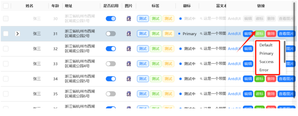
new CellButton(Guid.NewGuid().ToString(), "徽标", TTypeMini.Success)
{
    //支持所有单元格控件
    // 创建下拉列表元素
    DropDownItems = new ISelectItem[]
    {
         new AntdUI.SelectItem(TState.Default),
         new AntdUI.SelectItem(TState.Primary),
         new AntdUI.SelectItem(TState.Success),
         new AntdUI.SelectItem(TState.Error),
         new AntdUI.SelectItem(TState.Warn),
         new AntdUI.SelectItem(TState.Processing),

    },
    // 当下拉列表值改变时触发的事件操作
    // 这里实现的操作是通过下拉选择的不同徽标,将其赋给另外一徽标控件上
    DropDownValueChanged = (value) =>
    {
        string badge = value.ToString();
        switch(badge) {
        case "Default":
                curUser.CellBadge = new CellBadge(TState.Default, badge); break;
        case "Primary":
                curUser.CellBadge = new CellBadge(TState.Primary, badge); break;
        case "Success":
                curUser.CellBadge = new CellBadge(TState.Success, badge); break;
        case "Error":
                curUser.CellBadge = new CellBadge(TState.Error, badge); break;
        case "Warn":
                curUser.CellBadge = new CellBadge(TState.Warn, badge); break;
        case "Processing":
                curUser.CellBadge = new CellBadge(TState.Processing, badge); break;
        }
    }
},
通过调用表格的CellButtonClick点击事件来实现单元格按钮被点击时处理对应业务逻辑:
如下代码通过点击按钮,实现将某一单元格数值置零:
private void Table_base_CellButtonClick(object sender, TableButtonEventArgs e)
{
    // 获取鼠标点击按钮的id值,指定点击的哪一个
    var buttontext = e.Btn.Id;

    if (e.Record is ControlItemStatisticsData info)
    {
        curControlItem = info;
        switch (buttontext)
        {
            //暂不支持进入整行编辑,只支持指定单元格编辑,推荐使用弹窗或抽屉编辑整行数据
            case "BtnUsageReset":
                var result = AntdUI.Modal.open(this, "清零警告!", "确认要清零吗?", TType.Warn);
                if (result == DialogResult.OK)
                    curControlItem.Used = 0;
                break;
            case "BtnAccumulatedReset":
                //超链接内容
                result = AntdUI.Modal.open(this, "清零警告!", "确认要清零吗?", TType.Warn);
                if (result == DialogResult.OK)
                {
                    curControlItem.TotalAccumulatedCount = 0;
                }
                break;
        }
    }
}
CellProgress
进度条
| 名称 | 描述 | 类型 | 默认值 |
| Back | 背景颜色 | Color | |
| Fill | 进度条颜色 | Color | |
| Radius | 圆角 | int | 6 |
| Shape | 形状 | TShape | Default |
| Value | 进度条 | float | 0F |
private CellProgress cellProgress;
public CellProgress CellProgress
{
    get { return cellProgress; }
    set
    {
        if (cellProgress == value) return;
        cellProgress = value;
        OnPropertyChanged(nameof(CellProgress));
    }
}
CellProgress = new CellProgress(0.5f);  // 设置圆角弧度值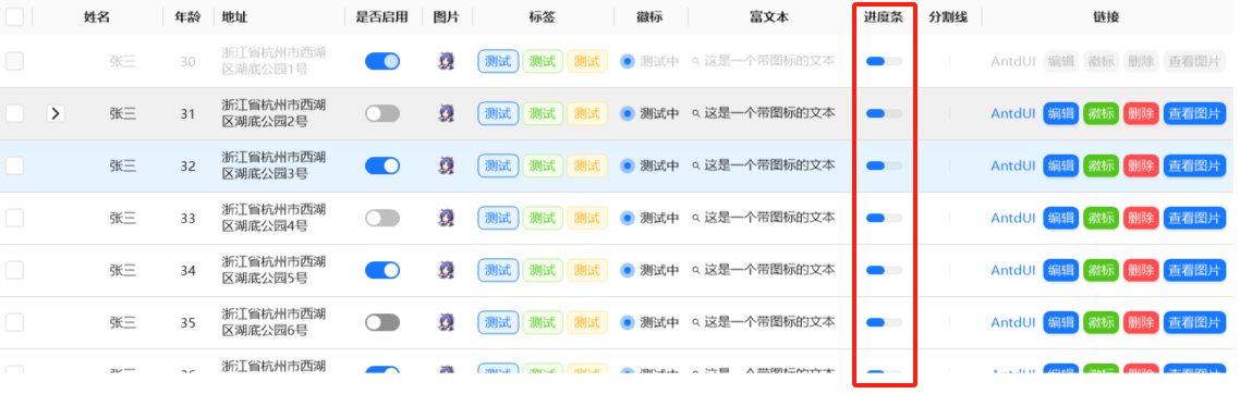
使用 BindingList 或 AntList 作为List,并在设置数据时使用Binding(AntList<T> list)来绑定实现数据在table上的实时更新。
使用类继承 NotifyProperty OR INotifyPropertyChanged,并在set时触发OnPropertyChanged (string 字段名称)
public class TestClass : AntdUI.NotifyProperty
{
    bool _check = false;
    public bool check  // check与表头的key值对应
    {
        get => _check;
        set
        {
            if (_check == value) return;
            _check = value;
            OnPropertyChanged();  // 必须触发该事件,才能将数据映射到对应单元格中
        }
    }
}