css动画
CSS 动画是通过 CSS(层叠样式表)实现的动画效果,它使得网页中的元素能够在页面加载后,或者在用户与页面互动时,发生平滑的视觉变化。CSS 动画可以通过过渡效果(transition)和关键帧动画(@keyframes)来实现。
transform
transform 用于2D/3D 变换,对元素进行 旋转(rotate)、缩放(scale)、倾斜(skew)、移动(translate) 等变换。
它不会影响周围元素的布局,而是直接修改元素的视觉表现。
transform 属性
| 变换类型 | 函数 | 说明 |
|---|---|---|
| 平移 | translate(x, y) | 沿 X、Y 轴移动 |
| 旋转 | rotate(angle) | 围绕原点旋转,顺时针正数,逆时针负数,单位deg度 |
| 缩放 | scale(x, y) | 沿 X、Y 轴缩放 |
| 倾斜 | skew(x-angle, y-angle) | 沿 X、Y 轴倾斜 |
| 矩阵 | matrix(a, b, c, d, e, f) | 直接定义 2D 变换矩阵 a:X 轴的缩放系数。 |
| 3D 平移 | translate3d(x, y, z) | x:沿 X 轴(水平方向)平移的距离。 y:沿 Y 轴(垂直方向)平移的距离。 z:沿 Z 轴(深度方向,表示前后平移)的距离。 |
| 3D 旋转 | rotate3d(x, y, z, angle) | x:旋转轴 X 的方向(通常为 0 或 1),表示旋转是否绕 X 轴进行。 y:旋转轴 Y 的方向(通常为 0 或 1),表示旋转是否绕 Y 轴进行。 z:旋转轴 Z 的方向(通常为 0 或 1),表示旋转是否绕 Z 轴进行。 angle:旋转的角度,单位是度(deg),常见的值为 90deg、180deg 等。 |
| 3D 缩放 | scale3d(x, y, z) | x:沿 X 轴 缩放的比例。 y:沿 Y 轴 缩放的比例。 z:沿 Z 轴 缩放的比例。 |
| 3D 视觉效果 | perspective(distance) | 设置视点距离元素的深度距离,单位通常是像素(px)或者其他长度单位(如 em、rem 等)。这个距离值决定了透视效果的强度。 100px:透视过强,可能导致元素消失 300px:透视较强,元素有明显 3D 效果 500px:适中,3D 效果自然 1000px:透视较弱,元素移动时变化较小 |
translate 示例代码
<style>
.container {
width: 300px;
height: 200px;
border: 2px dashed gray;
}
.box {
width: 100px;
height: 100px;
background-color: skyblue;
text-align: center;
line-height: 100px;
}
/* 鼠标悬停 */
.box:hover {
/* 沿 X、Y 轴移动 */
transform: translate(50px, 20px);
}
</style>
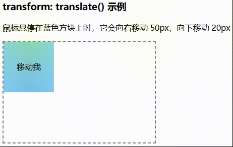
<h3>transform: translate() 示例</h3>
<p>鼠标悬停在蓝色方块上时,它会向右移动 50px,向下移动 20px</p>
<div class="container">
<div class="box">移动我</div>
</div>效果图
translate3d 示例代码
<style>
.container {
/* 设置透视效果,增强 3D 视觉 */
perspective: 500px;
width: 300px;
height: 200px;
border: 2px dashed gray;
display: flex;
align-items: center;
justify-content: center;
}
.box {
width: 100px;
height: 100px;
background-color: skyblue;
text-align: center;
line-height: 100px;
/* 这个是动画效果 */
transition: transform 0.5s ease-in-out;
}
.box:hover {
/* X 右移 50px,Y 下移 20px,Z 轴前移 100px */
transform: translate3d(50px, 20px, 100px);
}
</style>
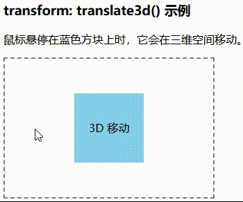
<h3>transform: translate3d() 示例</h3>
<p>鼠标悬停在蓝色方块上时,它会在三维空间移动。</p>
<div class="container">
<div class="box">3D 移动</div>
</div>效果图
rotate 示例代码
<style>
.container {
width: 300px;
height: 200px;
border: 2px dashed gray;
display: flex;
justify-content: center;
align-items: center;
}
.box {
width: 100px;
height: 100px;
background-color: skyblue;
text-align: center;
line-height: 100px;
font-weight: bold;
/* 这是动画效果 */
/* transition: transform 0.5s ease-in-out; */
}
.box:hover {
/* 顺时针旋转 45° ,逆时针就负数*/
transform: rotate(45deg);
}
</style>
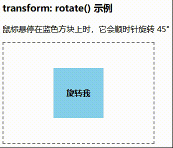
<h3>transform: rotate() 示例</h3>
<p>鼠标悬停在蓝色方块上时,它会顺时针旋转 45°</p>
<div class="container">
<div class="box">旋转我</div>
</div>效果图
rotate3d 示例代码
<style>
.container {
width: 450px;
height: 250px;
border: 2px dashed gray;
display: grid;
grid-template-columns: 1fr 1fr 1fr 1fr;
grid-template-rows: 1fr 1fr;
align-items: center;
justify-content: center;
gap: 10px;
padding: 10px;
}
.container div {
width: 100px;
height: 100px;
background-color: skyblue;
text-align: center;
line-height: 100px;
/* 动画效果 */
transition: transform 0.5s ease-in-out;
}
.box1:hover {
/* 绕 X、Y、z 轴旋转 */
transform: rotate3d(0, 0, 1, 80deg);
}
.box2:hover {
/* 绕 X、Y、z 轴旋转 */
transform: rotate3d(0, 1, 0, 80deg);
}
.box3:hover {
/* 绕 X、Y、z 轴旋转 */
transform: rotate3d(0, 1, 1, 80deg);
}
.box4:hover {
/* 绕 X、Y、z 轴旋转 */
transform: rotate3d(1, 0, 0, 80deg);
}
.box5:hover {
/* 绕 X、Y、z 轴旋转 */
transform: rotate3d(1, 0, 1, 80deg);
}
.box6:hover {
/* 绕 X、Y、z 轴旋转 */
transform: rotate3d(1, 1, 0, 80deg);
}
.box7:hover {
/* 绕 X、Y、z 轴旋转 */
transform: rotate3d(1, 1, 1, 80deg);
}
</style>
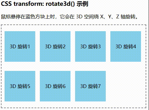
<h3>CSS transform: rotate3d() 示例</h3>
<p>鼠标悬停在蓝色方块上时,它会在 3D 空间绕 X、Y、Z 轴旋转。</p>
<div class="container">
<div class="box1">3D 旋转1</div>
<div class="box2">3D 旋转2</div>
<div class="box3">3D 旋转3</div>
<div class="box4">3D 旋转4</div>
<div class="box5">3D 旋转5</div>
<div class="box6">3D 旋转6</div>
<div class="box7">3D 旋转7</div>
</div>效果图
scale 示例代码
<style>
.container {
width: 300px;
height: 200px;
border: 2px dashed gray;
display: flex;
justify-content: center;
align-items: center;
}
.box {
width: 100px;
height: 100px;
background-color: lightblue;
text-align: center;
line-height: 100px;
/* 动画效果 */
transition: transform 0.5s ease-in-out;
}
.box:hover {
/* X 轴缩小 0.5 倍,Y 轴放大 1.5 倍 */
transform: scale(0.5, 1.5);
}
</style>
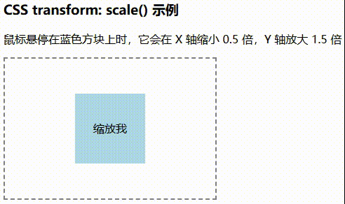
<h3>CSS transform: scale() 示例</h3>
<p>鼠标悬停在蓝色方块上时,它会在 X 轴缩小 0.5 倍,Y 轴放大 1.5 倍</p>
<div class="container">
<div class="box">缩放我</div>
</div>效果图
scale3d 和 scale 类似,示例同上
skew 代码示例
<style>
.container {
width: 300px;
height: 200px;
border: 2px dashed gray;
display: flex;
justify-content: center;
align-items: center;
}
.box {
width: 100px;
height: 100px;
background-color: skyblue;
text-align: center;
line-height: 100px;
/* 动画效果 */
transition: transform 0.5s ease-in-out;
}
.box:hover {
/* X 轴倾斜 30°,Y 轴倾斜 15° */
transform: skew(30deg, 15deg);
}
</style>
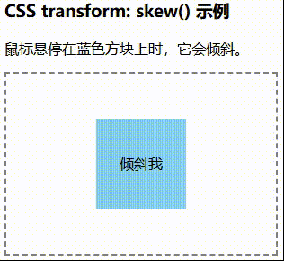
<h3>CSS transform: skew() 示例</h3>
<p>鼠标悬停在蓝色方块上时,它会倾斜。</p>
<div class="container">
<div class="box">倾斜我</div>
</div>效果图
matrix 示例代码
<style>
.container {
width: 350px;
height: 250px;
margin-left: 10px;
border: 2px dashed gray;
display: grid;
grid-template-columns: 1fr 1fr 1fr;
grid-template-rows: 1fr 1fr;
align-items: center;
justify-content: center;
gap: 10px;
padding: 10px;
}
.container div {
width: 100px;
height: 100px;
background-color: skyblue;
text-align: center;
line-height: 100px;
/* 动画效果 */
transition: transform 0.5s ease-in-out;
}
.box1:hover {
/* 复合变换 */
transform: matrix(1, 0.5, -0.5, 1, 50, 100);
}
.box2:hover {
/* 复合变换 */
transform: matrix(1.5, 0.2, -0.2, 1.5, 150, 50);
}
.box3:hover {
/* 复合变换 */
transform: matrix(1, 1, 0, 1, 100, 100);
}
.box4:hover {
/* 复合变换 */
transform: matrix(2, -0.5, 0.5, 2, 50, 150);
}
.box5:hover {
/* 复合变换 */
transform: matrix(1, 0, 0, 1, 100, 100);
}
</style>
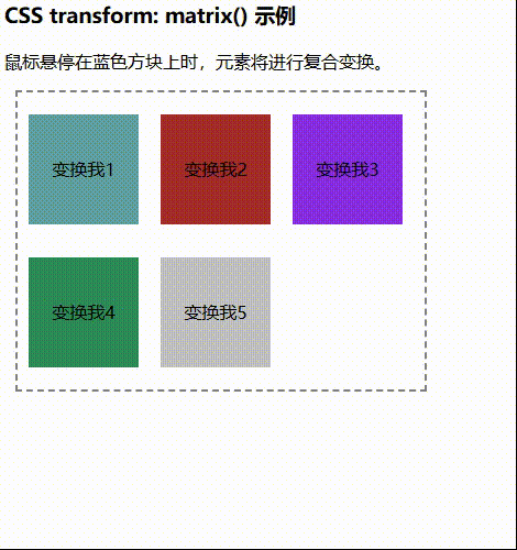
<h3>CSS transform: matrix() 示例</h3>
<p>鼠标悬停在蓝色方块上时,元素将进行复合变换。</p>
<div class="container">
<div class="box1" style="background-color:cadetblue">变换我1</div>
<div class="box2" style="background-color:brown">变换我2</div>
<div class="box3" style="background-color:blueviolet">变换我3</div>
<div class="box4" style="background-color:seagreen">变换我4</div>
<div class="box5" style="background-color:silver">变换我5</div>
</div>效果图
transition
transition 用于控制元素状态变化时的过渡动画的属性。它由多个子属性组成,分别控制不同的动画行为。
transition 生效条件
- :hover(鼠标悬停)
- :focus(表单获取焦点)
- :active(元素被点击)
- 通过 JavaScript 修改样式
不是所有 CSS 属性都能使用 transition,只有数值型的属性才可以
- 颜色属性(color, background-color, border-color)
- 大小属性(width, height, max-width, max-height)
- 透明度(opacity)
- 位置(top, left, right, bottom, transform)
transition 不生效的条件
- display(布局)
- visibility(站位可见性)
- position(定位)
- z-index(堆叠顺序)
- 初始值和目标值相同
- 页面渲染未完成之前
will-change 的作用
- will-change 告诉浏览器某个属性即将发生变化,使其提前进行优化,从而减少卡顿。
- 适用于 transition 频繁变化的场景,比如 hover 或 scroll 触发的动画。
- 注意:不要滥用 will-change,否则可能会占用大量 GPU 资源,导致页面变慢。
JavaScript 监听动画结束
<script>
    const box = document.querySelector('.box');
    box.addEventListener('transitionend', () => {
        console.log('动画已结束!');
    });
</script>
transition 属性
transition: property duration timing-function delay;
- transition-property:指定要应用过渡效果的 CSS 属性
- all:所有可过渡的属性都应用动画(默认)。
- none:不应用过渡效果。
- 指定属性,如 background-color, width, opacity 等。
div { transition-property: background-color, width; }- transition-duration:设置过渡动画持续的时间,单位ms或s
div { transition-duration: 0.5s, 1s; } /* 第一个属性(如 background-color)的过渡时间是 0.5s */ /* 第二个属性(如 width)的过渡时间是 1s */- transition-timing-function:设定动画的时间曲线(加速/减速方式)
- ease(默认):开始和结束时慢,中间快。
- ease-in:动画开始时慢,随后加速。
- ease-out:动画开始时快,随后减速。
- ease-in-out:动画开始和结束时慢,中间快。
- linear:匀速变化。
- cubic-bezier(n,n,n,n):自定义贝塞尔曲线。
div { transition-timing-function: ease-in-out; }- transition-delay:设置动画开始前的延迟时间,单位ms或s
div {
    transition-delay: 0.3s;
}