o2o网站咋建设中国软件园排名前十
页面布局
- 一、常见css布局单位
- 二、两栏布局
- 1.浮动
- 2.float + BFC
- 3.flex
- 4.定位
- 5.定位
- 三、三栏布局
- 1.绝对定位
- 2.flex
- 3.float
- 四、水平垂直居中
- 1.绝对定位+translate
- 2.绝对定位+margin:auto
- 3.绝对定位
- 4.flex
- 五、响应式设计
一、常见css布局单位
| 布局单位 | 描述 |
|---|---|
px(像素) | 一个像素等于计算机屏幕上的一个点;固定像素 |
%(百分比) | 相对单位,基于父元素,实现响应式效果 |
em | 文本相对长度单位,默认行内文本16px |
rem | css3新增,相对于根元素的font-size倍数,实现简单的响应式布局 |
vw | 相对于视窗的宽度,视窗宽度是100vw |
vh | 相对于视窗的高度,视窗高度是100vh |
二、两栏布局
左边一栏宽度固定,右边一栏宽度自适应
<div class="outer"><div class="left"></div><div class="right"></div></div>
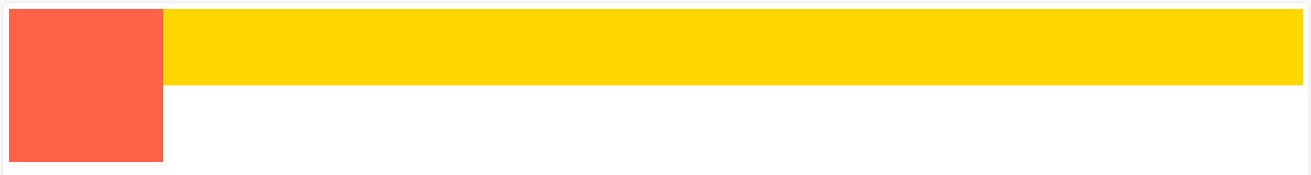
1.浮动

左浮动,宽200px;
右宽auto,margin-left:200px
浮动会使左脱离文档流
//给父元素高度避免浮动带来的高度坍塌
.outer {height: 100px;width: 100%;}.left {float: left;width: 200px;height: 100px;background: tomato;
}.right {margin-left: 200px;width: auto;height: 100px;background: gold;
}
2.float + BFC
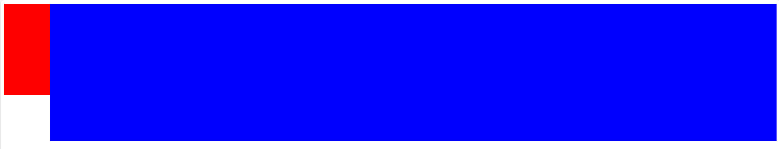
overflow:hidden创建bfc,自动避开浮动元素
.left{width: 100px;height: 200px;background: red;float: left;}.right{height: 300px;background: blue;overflow: hidden;//创建bfc,自动避开浮动元素}3.flex

左边固定,右边flex:1
.outer {display: flex;height: 100px;
}
.left {width: 200px;background: tomato;
}
.right {flex: 1;background: gold;
}
4.定位

父亲相对定位,左边绝对定位
绝对定位会使左边脱离文档流
.outer {position: relative;height: 100px;width: 100%;
}.left {position: absolute;width: 200px;height: 100px;/*background: tomato;*/
}.right {margin-left: 200px;background: gold;height: 100px;;
}
5.定位
父元素相对定位;右边绝对定位
使用绝对定位时,浏览器会自动计算宽高:
/* 浏览器自动计算:height = 父容器高度 - top - bottom /
/ 浏览器自动计算:width = 父容器宽度 - left - right */
.outer {position: relative;height: 100px;
}.left {width: 200px;height: 200px;background: tomato;}.right {position: absolute;top: 0;right: 0;bottom: 0;left: 200px;//如果不给left,无法自动计算宽,right就成了一条线
//因为auto 宽度 + 无内容 = 宽度为 0,background: gold;
}
三、三栏布局
左右固定,中间自适应
<div class="outer"><div class="left"></div><div class="center"></div><div class="right"></div></div>
1.绝对定位
左右绝对定位,中间给margin
.outer {position: relative;height: 100px;
}.left {position: absolute;width: 100px;height: 100px;background: tomato;
}.right {position: absolute;top: 0;right: 0;width: 200px;height: 100px;background: gold;
}.center {margin-left: 100px;margin-right: 200px;height: 100px;background: lightgreen;
}
2.flex
左右固定,中间自适应
.outer {display: flex;height: 100px;
}.left {width: 100px;background: tomato;
}.right {width: 100px;background: gold;
}.center {flex: 1;background: lightgreen;
}
3.float
左右固定并浮动,中间margin,且中间必须放到最后
    <div class="outer"><div class="left"></div><div class="right"></div><div class="center"></div>
//center放最后
//浮动元素会按照HTML顺序依次排列</div>
.outer {height: 100px;
}.left {float: left;width: 100px;height: 100px;background: tomato;
}.right {float: right;width: 200px;height: 100px;background: gold;
}.center {height: 100px;margin-left: 100px;margin-right: 200px;background: lightgreen;
}
四、水平垂直居中
<div class="parent"><div class="child"></div></div>
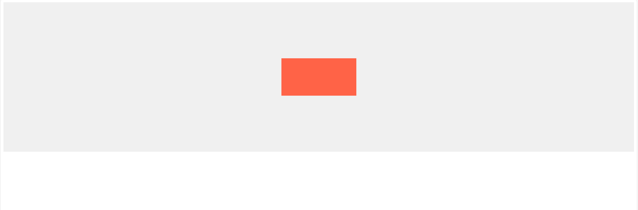
1.绝对定位+translate
给
父元素宽高和相对定位
子元素相对定位;top:50%和left:50%;translate
.parent {position: relative;height: 400px;width: 100%;background-color: #f0f0f0;}.child {position: absolute;//left,top将线定位到中心left: 50%;top: 50%;//translate来调整元素的中心点到页面的中心transform: translate(-50%, -50%);width: 200px;height: 100px;background-color: tomato;
}
2.绝对定位+margin:auto
适用于盒子有宽高
.parent {position: relative;height: 400px;width: 100%;background-color: #f0f0f0;}.child {position: absolute;top: 0;bottom: 0;left: 0;right: 0;margin: auto;width: 200px;height: 100px;background-color: tomato;
}
3.绝对定位
top: 50%; left: 50%;定位到中间,再通过margin负值
.parent {position: relative;height: 400px;width: 100%;background-color: #f0f0f0;}.child {position: absolute;top: 50%;left: 50%;margin-top: -50px;/* 自身 height 的一半 */margin-left: -50px;/* 自身 width 的一半 */width: 200px;height: 100px;background-color: tomato;
}
4.flex
.parent {display: flex;justify-content: center;align-items: center;height: 400px;width: 100%;background-color: #f0f0f0;
}.child {width: 200px;height: 100px;background-color: tomato;
}
五、响应式设计
- 响应式网站设计是一个网站能够兼容多个终端,而不是为每一个终端做一个特定的版本
基本原理是通过媒体查询(@media)查询检测不同的设备屏幕尺寸做处理。关于兼容: 页面头部必须有mate声明的viewport。
<meta name="’viewport’" content="”width=device-width," initial-scale="1." maximum-scale="1,user-scalable=no”"/>