UI学习汇总
UI内容总结学习(上)
1. UILabel
.text
对UILabel的文字赋值
.frame
设置显示位置,为CGRect类型
其中,CGRect是一个结构体,其中有两个结构体origin和size
origin也是一个结构体,包括x,y两个参数,代表控件的位置(以控件左上角为准)
size也是结构体,包括控件的宽度和高度,是空间的矩形大小
.background
设置背景颜色
.font
设置文字的大小和字体
.textColor
文字的颜色
.shadowColor
阴影颜色
.shadowOffset
阴影的偏移位置
.textAlignment
文字的对齐方式,默认为靠左对齐
.numberOfLines
文字的显示的行数,默认为1,其他大于0的行数,文字尽量按照设定的行数显示
值为0,iOS会自动计算所需行数
示例
- (void) createUI {UILabel* label = [[UILabel alloc] init];label.text = @"这是一条内容,但是不止是一条内容,为了凑字数吧还是";label.frame = CGRectMake(30, 100, 360, 240);// 标签的颜色label.backgroundColor = [UIColor clearColor];// 文本的颜色label.textColor = [UIColor blackColor];// 背景的颜色
//    self.view.backgroundColor = [UIColor whiteColor];// 将label显示到屏幕上[self.view addSubview:label];// 文字的大小,使用默认字体label.font = [UIFont systemFontOfSize:24];// label的高级属性// 设定阴影颜色,阴影在后label.shadowColor = [UIColor grayColor];// 阴影的偏移量label.shadowOffset = CGSizeMake(10, 10);// 文字对齐方式label.textAlignment = NSTextAlignmentCenter;// 行数label.numberOfLines = 3;}
效果展示

2. UIButton
普通按钮
[UIButton buttonWithTypeRoundedRect];
初始化一个按钮,类型为圆角
.frame
同上,是位置
[按钮名字 setTitle:@“文本” forState: UIContrdStateNormal];
设置按钮文本,以及对应的状态
.backgroundColor
设置背景颜色
[按钮名字 setTitleColor:[UIColor __] forState:];
设置按钮文字颜色,以及对应的按钮状态
当然也可以使用tintColor设置颜色
forState同样也是对应的状态
.title.font
设置按钮文字样式,同上文中的font相同
[按钮名字 addTrget: - action: forControlEvents ];
设置按钮触发操作,实际上是根据状态来选择是否要触发操作
Target是触发事件的拥有者
action是一个SEL方法指针,来调用函数
状态有以下几种
UIControlEventTouchUpInside当按钮被按下后,弹起瞬间,并且手指位置需要再按钮范围内
UIControlEventTouchDown当按钮被按下后,管你手指位置在哪,直接触发
UIControlEventTouchUpOutside当按钮被按下后,只有松开的时候手指在外边,才会触发
.tag
设置按钮的标签值,方便之后调用
图片按钮
对于图片按钮,需要先载入图片
UIImage* icon01 = [UIImage imageNamed:@"btn01"];
载入图片的名称的后缀名为.png,如果不为.png那需要加后缀名
图片的素材可以从SF符号中导出
对相应状态的按钮设置按钮图片
[btnImage setImage:icon01 forState:UIControlStateNormal];
示例
// 创建普通按钮
- (void) createRectUIButton {// 定义并创建,根据类型创建,圆角类型// 通过类方法创建 类名+方法名(所有)  不能通过init创建,button是自己管理内存UIButton *btn = [UIButton buttonWithType:UIButtonTypeRoundedRect];btn.frame = CGRectMake(100, 100, 140, 60);// 显示到按钮的文字// 显示文字显示的状态类型,正常状态[btn setTitle:@"按钮01" forState:UIControlStateNormal];[btn setTitleColor:[UIColor whiteColor] forState:UIControlStateNormal];// 按钮文字,显示文字的状态,按下状态[btn setTitle:@"按钮按下" forState:UIControlStateHighlighted];[btn setTitleColor:[UIColor redColor] forState:UIControlStateHighlighted];// 设置文字按下后的颜色btn.titleLabel.font = [UIFont systemFontOfSize:24];// 添加事件函数// taget 谁来实现这个事件,即触发方法的方法拥有者// action 调用函数对象,按钮满足事件类型的时候,调用函数// conteolevent 事件处理函数类型    UIControlEventTouchUpInside按钮弹起瞬间 并且手指的位置在按钮范围内// UIControlEventTouchDown 只要碰到就出发[btn addTarget:self action:@selector(pressbtn) forControlEvents:UIControlEventTouchUpInside];
//    [btn addTarget:self action:@selector(pressbtn) forControlEvents:UIControlEventTouchDown];// 只有弹起时,手指位置在按钮范围外
//    [btn addTarget:self action:@selector(pressbtn) forControlEvents:UIControlEventTouchUpOutside];// 按钮标识符,根据按钮标识符来确认哪个按钮被按下btn.tag = 324;[self.view addSubview:btn];// 按钮的背景颜色btn.backgroundColor = [UIColor grayColor];
}- (void) createImageBtn {// 创建一个自定义的btn// 自定义按钮层次从上到下依次为// 按钮标题// 按钮图片// 按钮背景图// 在默认情况下,如果标题和图片同时被设置,会以并排且图片优先地显完整的机制运行UIButton* btnImage = [UIButton buttonWithType:UIButtonTypeCustom];btnImage.frame = CGRectMake(100, 200, 140, 60);// 尝试加入文字[btnImage setTitle:@" 你好" forState:UIControlStateNormal];[btnImage setTitleColor:[UIColor blackColor] forState:UIControlStateNormal];// 图片加载UIImage* icon01 = [UIImage imageNamed:@"btn01"]; // 如果不是png扩展名,要加扩展名,png为默认扩展名UIImage* icon02 = [UIImage imageNamed:@"btn02"];// 显示的图片对像  控件状态[btnImage setImage:icon01 forState:UIControlStateNormal];[btnImage setImage:icon02 forState:UIControlStateHighlighted];[self.view addSubview:btnImage];}
- (void)viewDidLoad {[super viewDidLoad];[self createRectUIButton];[self createImageBtn];// Do any additional setup after loading the view.
}
效果展示

3. View
UIView 视图对象,显示在屏幕上所有的对象的基础类,所有显示在屏幕上的对象一定继承于UIView
UIView是一个矩形对象,有背景颜色,可显示,有层级关系
.frame
确定位置,同上文相同
.background
设置背景颜色
.hidden
控制是否显示该视图
.opaque
设置视图是否不透明
.alpha
控制视图的透明度
[self.view addSubview:viewLearn];
把新建视图加入到父视图上,并且将视图保管起来
[- removeFromSubview];
将视图从父视图中移除
示例
- (void)viewDidLoad {[super viewDidLoad];// 视图的相关方法学习// /*// Do any additional setup after loading the view.// UIView 视图对象,显示在屏幕上所有的对象的基础类// 所有显示在屏幕上的对象一定继承于UIView// UIView是一个矩形对象,有背景颜色,可显示,有层级关系UIView* viewLearn= [[UIView alloc] init];// 位置基本属性viewLearn.frame = CGRectMake(100, 100, 140, 140);viewLearn.backgroundColor = [UIColor colorWithRed:(35/255.0) green:(35/255.0) blue:(35/255.0) alpha:1.0];// 新建视图增加到父视图上 并且将视图管理起来[self.view addSubview:viewLearn];// 是否显示视图,默认为NO
//    view.hidden = YES;// 透明度viewLearn.alpha = 1;// 设置是否显示不透明 用于优化viewLearn.opaque = NO;// 把自己从视图中删除
//    [viewLearn removeFromSuperview];//}
效果:

移动视图的前后顺序
绘图的顺序,取决于添加的顺序,你可以把程序想象成画家,你的addSubview则是命令。但是由于一个画家只有一张纸,所以每次画画都会在之前画过的地方再画,所以先添加先画,后添加后画
bringSubviewToFront
将某一视图到最前方 顺序同样,先调先前
sendSubviewTobook
将某一视图调到最后
subview
管理所有子视图的数组,本质上是一个NSArry,所以可以直接使用数组的方法查阅子视图
示例:
// 视图的层级关系UIView* view1 = [[UIView alloc] init];UIView* view2 = [[UIView alloc] init];UIView* view3 = [[UIView alloc] init];view1.frame = CGRectMake(100, 100, 240, 120);view1.center = CGPointMake(self.view.frame.size.width / 2, 100);view2.frame = CGRectMake(100, 100, 200, 100);view2.center = CGPointMake(self.view.frame.size.width / 2, 125);view3.frame = CGRectMake(100, 100, 180, 80);view3.center = CGPointMake(self.view.frame.size.width / 2, 150);view1.backgroundColor = [UIColor colorWithRed:(35/255.0) green:(35/255.0) blue:(35/255.0) alpha:1.0];view2.backgroundColor = [UIColor redColor];view3.backgroundColor = [UIColor blueColor];// 绘图的顺序取决于添加的顺序 先加先画,后加后画[self.view addSubview:view1];[self.view addSubview:view2];[self.view addSubview:view3];
//    [self.view addSubview:view1];// 将某一视图到最前方 顺序同样,先调先前[self.view bringSubviewToFront:view2];[self.view bringSubviewToFront:view1];// 将某一视图调到最后[self.view sendSubviewToBack:view2];// 还原顺序[self.view sendSubviewToBack:view1];[self.view bringSubviewToFront:view3];// 管理所有self.view的子视图的数组// subview本质是一个NSArryUIView* newFront = self.view.subviews[2];UIView* viewBack = self.view.subviews[0];
4. UIWindow
UIWindow继承来自UIView,但却是UIView的最顶层容器,通过UIController与UIView建立联系
新的UIWindow的函数需要写在SceneDelegate.m文件中,并且不需要手动创建,整个程序中只有一个
虽然UIWindow不需要创建,但是需要创建根视图管理器
当你移动父视图的时候,子视图也会随之移动,是因为子视图是参照父视图的坐标系的
对于每一个view都有一个window属性
直接上代码
- (void)scene:(UIScene *)scene willConnectToSession:(UISceneSession *)session options:(UISceneConnectionOptions *)connectionOptions {// 新版的UIWindow对象不需要创建哩,这里放的是创建函数以及其说明/*// 创建一个UI window对象// 整个程序中只有一个// 表示屏幕窗口// 本质也是继承于UIView// UIScreen: 表示屏幕硬件表示类 mainScreen表示获得主屏幕设备信息// bounds 表示屏幕的宽和高self.window = [[UIWindow alloc] initWithFrame:[UIScreen mainScreen].bounds];*/// 创建一个视图控制器作为UIWindow的视图控制器
//    self.window.rootViewController = [[UIViewController alloc] init];// 设置背景颜色self.window.backgroundColor = [UIColor colorWithRed:35.0 / 255  green:35.0 / 255  blue:35.0 / 255  alpha:1.0];// 使window有效并显示到屏幕上[self.window makeKeyAndVisible];// 可以在window中直接添加windowUIView* view = [[UIView alloc] init];UIView* backview = [[UIView alloc] init];view.frame = CGRectMake(100, 100, 140, 140);backview.frame = CGRectMake(100, 100, 400, 400);view.backgroundColor = [UIColor colorWithRed:226 / 255.0 green:228 / 255.0 blue:229 / 255.0 alpha:1.0];backview.backgroundColor = [UIColor blackColor];view.center = CGPointMake(self.window.bounds.size.width / 2, self.window.bounds.size.height / 2);[backview addSubview:view];// 当父视图移动的时候,子视图必然移动[self.window addSubview:backview];// 每一个view必然有一个window对象
//    view.window;
//    backview.window;
//    self.window;// 整个程序中,只有一个windowif (view.window == backview.window && view.window == self.window && backview.window == self.window) {NSLog(@"三个window相同");}}
.frame,.backgroundColor
同之前一样,不再赘述
[- makeKeyAndVisible]
使window有效,并且可以显示到屏幕上
5. UIViewController
UIViewController 是iOS 开发中的一个核心组件,它负责管理和协调应用中的视图和视图之间的交互。每一个屏幕页面通常都对应于一个 UIViewController 对象
它负责加载和卸载视图,在视图显示或隐藏时接收相关的通知,在设备方向改变时调整视图的布局,在内存不足时释放不需要的资源,协调视图和其他对象之间的交互
- (void)viewDidLoad
视图控制器第一次被加载的时候使用,初始化资源使用
在我们创建的时候,会出现[super viewDidLoad];
是调用父类加载视图函数
- (void) viewWillAppear:(BOOL)animated ,- (void) viewDidAppear:(BOOL)animated ,- (void) viewWillDisappear:(BOOL)animated ,- (void) viewDidDisappear:(BOOL)animated
在使用UIViewController,经常需要重写这几个函数,分别作用于:
- (void) viewWillAppear:(BOOL)animated
在视图即将出现的时候
- (void) viewDidAppear:(BOOL)animated
在视图已经出现的时候
- (void) viewWillDisappear:(BOOL)animated
在视图即将消失的时候
- (void) viewDidDisappear:(BOOL)animated
在视图已经消失的时候
通过UIViewController来实现视图控制器的界面切换
首先要先新建一个UIViewController类,命名为ViewController02
- (void) touchesBegan:(NSSet<UITouch *> *)touches withEvent:(UIEvent *)event
这个函数是当屏幕被点击的时候,调用此函数,在函数中,我们 以模态(modal)方式展示另一个视图控制器
self.con02:这是你代码中定义的另一个控制器实例,是 UIViewController02
animated:YES:表示在跳转时使用动画;
completion:nil:跳转完成后不执行任何额外操作(可以传一个 block)
- (void)viewDidLoad {// 调用父类加载视图函数[super viewDidLoad];self.con02 = [[ViewController02 alloc] init];self.con02.view.backgroundColor = [UIColor whiteColor];NSLog(@"第一次加载视图");UIView* view = [[UIView alloc] init];view.frame = CGRectMake(100, 100, 140, 106);view.backgroundColor = [UIColor colorWithRed:226 / 255.0  green:228 / 255.0  blue:229 / 255.0  alpha:1.0];self.view.backgroundColor = [UIColor colorWithRed:35 / 255.0 green:35 / 255.0 blue:35 / 255.0 alpha:1.0];[self.view addSubview:view];
}
- (void) viewWillAppear:(BOOL)animated {NSLog(@"视图即将出现");
}
- (void) viewDidAppear:(BOOL)animated {NSLog(@"视图已经出现");
}
- (void) viewWillDisappear:(BOOL)animated {NSLog(@"视图即将消失");
}
- (void) viewDidDisappear:(BOOL)animated {NSLog(@"视图已经消失");
}
- (void) touchesBegan:(NSSet<UITouch *> *)touches withEvent:(UIEvent *)event {[self presentViewController:self.con02 animated:YES completion:nil];}
这样我们就可以做到:

6. 计时器 Timer
计时器继承自NSObject,用以提供延迟(周期性)触发的动作。通常,定时器会在指定间隔后自动触发,如果是重复计时器,会在制定间隔后重复触发
同时,由于其特性,注意一定要做定时器的检测,不然就会…

(越来越快根本刹不住车的按钮…)
创建定时器
_timeView = [NSTimer scheduledTimerWithTimeInterval:0.04 target:self selector:@selector(updateTimer) userInfo:nil repeats:YES];
scheduledTimerWithTimeInterval: target: selector userInfo: repeats:
每隔多少时间触发,单位为s,触发函数 selector:
repeats:则为设置是否为重复操作,NO为只完成一次函数调用,返回值为一个新建好的定时器对象
停止定时器
[_timeView invalidate];
停止定时器
给一个示例:
- (void)viewDidLoad {[super viewDidLoad];// Do any additional setup after loading the view.self.view.backgroundColor = [UIColor colorWithRed:35 / 255.0 green:35 / 255.0 blue:35 / 255.0 alpha:1.0];UIButton* btn = [UIButton buttonWithType:UIButtonTypeRoundedRect];btn.frame = CGRectMake(100, 100, 200, 40);btn.center = CGPointMake(self.view.frame.size.width / 2, 100);[btn setTitle:@"定时器,启动!" forState:UIControlStateNormal];[btn addTarget:self action:@selector(pressStart) forControlEvents:UIControlEventTouchUpInside];[self.view addSubview:btn];UIButton* btnstop = [UIButton buttonWithType:UIButtonTypeRoundedRect];btnstop.frame = CGRectMake(100, 300, 200, 40);btnstop.center = CGPointMake(self.view.frame.size.width / 2, 300);[btnstop setTitle:@"定时器,取消!" forState:UIControlStateNormal];[btnstop addTarget:self action:@selector(pressStop) forControlEvents:UIControlEventTouchUpInside];[self.view addSubview:btnstop];UIView* view1 = [[UIView alloc] init];view1.frame = CGRectMake(0, 0, 80, 80);view1.backgroundColor = [UIColor colorWithRed:226 / 255.0 green:228 / 255.0 blue:229 / 255.0 alpha:1.0];view1.tag = 101;[self.view addSubview:view1];
}
- (void) pressStart {// 启动定时器// 每隔多长时间,以s为单位    每个几秒,使用第二个对象调用第三个参数(函数)      传入一个参数到定时器中,无参数使用nil// 定时器是否重复操作 NO为只完成一次函数调用// 返回值为一个新建好的定时器对象_timeView = [NSTimer scheduledTimerWithTimeInterval:0.04 target:self selector:@selector(updateTimer) userInfo:nil repeats:YES];
}
- (void) updateTimer {UIView* view = [self.view viewWithTag:101];view.frame = CGRectMake(view.frame.origin.x + 1, view.frame.origin.y + 1, view.frame.size.width, view.frame.size.height);NSLog(@"你好!");
}
- (void) pressStop {if (_timeView) {// 停止定时器[_timeView invalidate];}
}
效果:

7. UISwitch
UISwitch是一个开关控件,只有两个状态可以切换
.frame
跟之前相同,但是UISwitch的宽高不支持修改,所以你只能修改位置
.backgroundColor
同样也是设置背景颜色,但是由于设置之后很丑,所以不建议使用
[名字 setOn: YES]
设置开关的状态
使用点语法 名.on = YES
也是同样的效果
[名字 setThumbTintColor:]
设置圆钮的颜色
[名字 setTintColor:]
设置整体的颜色
[名字 addTarget:self action: forControlEvents:]
设置触发事件
示例
@implementation ViewController- (void)viewDidLoad {[super viewDidLoad];// Do any additional setup after loading the view.self.mySwitch.on = YES;// [self.mySwitch setOn:YES]// 一样的效果// 宽高不可变的孩子,变了也没用
//    self.mySwitch.frame = CGRectMake(100, 100, 140, 100);
//    self.mySwitch.backgroundColor = [UIColor redColor];// 是否开启动画效果[self.mySwitch setOn:YES animated:YES];[self.mySwitch setOnTintColor:[UIColor colorWithRed:226 / 255.0 green:228 / 255.0 blue:229 / 255.0 alpha:1.0]];// 设置圆钮的颜色
//    [self.mySwitch setThumbTintColor:[UIColor redColor]];// 设置整体颜色
//    [self.mySwitch setTintColor:[UIColor blueColor]];// 向开关控件添加事件函数[self.mySwitch addTarget:self action:@selector(print) forControlEvents:UIControlEventValueChanged];}- (void) print {NSLog(@"开关变化了");
}
效果:

8. 进度条和滑动条 UIProgressView和UISlider
进度条和滑动条相似,但是滑动条可以被操作
进度条 UIProgressView
.frame
位置,但是进度条高度不可变
.progressTintColor
风格默认值,默认为蓝色
.progress
进度值,即你的滑动条或者进度条的进度
.progressViewStyle
设置风格特征
滑动条 UISlider
.frame
同之前的相同
.maximumValue和.minimumValue
分别为设置最大值和最小值
.minimumTrackTintColor和.maximumTrackTintColor和.thumbTintColor
分别设置左右侧和按钮的颜色
[addTarget:self action: forControlEvents: ];
设置滑动条的事件函数
我这里写了一个同步滑动条和进度条的
示例
 - (void)viewDidLoad {[super viewDidLoad];// Do any additional setup after loading the view.self.myprogress = [[UIProgressView alloc] init];// 进度条高度不可变self.myprogress.frame = CGRectMake(50, 100, 200, 40);// 风格颜色值 默认是蓝色self.myprogress.progressTintColor = [UIColor colorWithRed:226 / 255.0 green:228 / 255.0 blue:229 / 255.0 alpha:1.0];self.myprogress.center = CGPointMake(self.view.frame.size.width / 2, self.view.frame.size.height / 2);// 设置进度值,0 - 1self.myprogress.progress = 0.5;// 设置风格特征self.myprogress.progressViewStyle = UIProgressViewStyleDefault;self.mySlider = [[UISlider alloc] init];self.mySlider.frame = CGRectMake(10, 200, 200, 80);self.mySlider.center = CGPointMake(self.view.frame.size.width / 2, 600);self.mySlider.maximumValue = 100;// 最小值可以为负值self.mySlider.minimumValue = 0;// 取决于最大最小,和value的值 floatself.mySlider.value = 50;// 左右侧函数和按钮函数self.mySlider.minimumTrackTintColor = [UIColor blueColor];self.mySlider.maximumTrackTintColor = [UIColor redColor];self.mySlider.thumbTintColor = [UIColor blackColor];// 对滑动条增加事件函数[self.mySlider addTarget:self action:@selector(pressSlider) forControlEvents:UIControlEventValueChanged];[self.view addSubview:self.mySlider];[self.view addSubview:self.myprogress];
}- (void) pressSlider {self.myprogress.progress = self.mySlider.value / self.mySlider.maximumValue;NSLog(@"滑动哩!");
}
效果:

9. 步进器和分栏控件 (UIStepper & UISegmentControl)
9.1 步进器
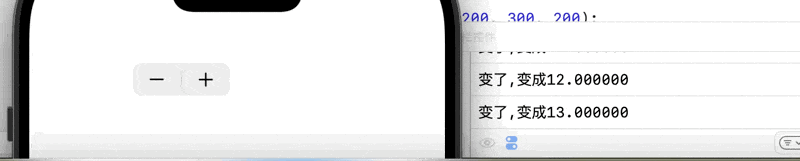
UIStepper步进器包括两个按钮,一个用于增加一个用于减少,一般用于微调一个数值
9.1.1 主要特性
.frame
设置位置和大小,但是步进器的宽高不可变,且不会出现像滑动条那样的背景视图变化
.minimumValue , .maximumValue , .value , .stepValue
都为double类型,分别为设置最小值,最大值,当前值,和步进值
.autorepeat
bool类型,设置是否自动连续改变数值,即一直按住按键的话,值是否会一直改变
.continuous
是否将步进结果通过方法响应
.wrap
bool类型,如果为YES会在达到最大值后,返回到最小值
[名 addTarget: action: forControlEvents: ]
绑定触发操作,forControlEvents的参数一般为UIControlEventValueChanged
示例
_myStepper = [[UIStepper alloc] init];// 宽高不能改变_myStepper.frame = CGRectMake(100, 100, 20, 20);// 设置最小,最大,当前值,步进值_myStepper.minimumValue = 0;_myStepper.maximumValue = 100;_myStepper.value = 10;_myStepper.stepValue = 1;// 是否可以重复响应事件操作,即一直按住_myStepper.autorepeat = YES;// 是否将步进结果通过事件函数响应出来,即值虽然在变化,但是事件函数没有被调用_myStepper.continuous = YES;[_myStepper addTarget:self action:@selector(stepChange) forControlEvents:UIControlEventValueChanged];
效果:
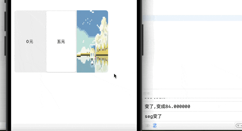
9.2 分栏控件
由一个或多个分段组成,每一个分段代表一个独立的选项
.frame
设置位置和大小
.SelectedSegmentIndex
NSInteger类型,设置或获取当前哪个分段被选中了
.nunberOfSegments
只读属性,表示分段控制器的分段数量
[名 insertSegmentWithTitle: atIndex: animated:]
从左到右依次为,分栏的标题,位置,以及是否启用动画
[名 addTarget: action: forControlEvents: ]
同之前的一样,绑定操作
[名 removeSegmentAtIndex: animated]
移除指定索引的分段
[名 removeAllSegments]
移除所有分段
[名 titleForSegmentAtIndex: ]
查看指定索引的标题
[名 setWidth: forSegmentAtIndex:]
设置指定分段的宽度
[名 setEnabled: forSegmentAtIndex: ]
设置指定索引是否可以被点击
示例:
_mtSeg = [[UISegmentedControl alloc] init];_mtSeg.frame = CGRectMake(10, 200, 300, 200);_mtSeg.tintColor = [UIColor lightGrayColor];// 添加一个按钮元素     按钮文字    按钮索引位置  按钮是否有插入动画[_mtSeg insertSegmentWithTitle:@"0元" atIndex:0 animated:YES];[_mtSeg insertSegmentWithTitle:@"五元" atIndex:1 animated:YES];// 插入图片UIImage *ima = [[UIImage imageNamed:@"2.jpeg"] imageWithRenderingMode:UIImageRenderingModeAlwaysOriginal];[_mtSeg insertSegmentWithImage:ima atIndex:2 animated:YES];
//    [_mtSeg insertSegmentWithImage:resizedImage atIndex:2 animated:YES];_mtSeg.selectedSegmentIndex = 0;[_mtSeg addTarget:self action:@selector(segchanged) forControlEvents:UIControlEventValueChanged];[self.view addSubview:_myStepper];[self.view addSubview:_mtSeg];}
- (void)segchanged {NSLog(@"seg变了");
}
效果
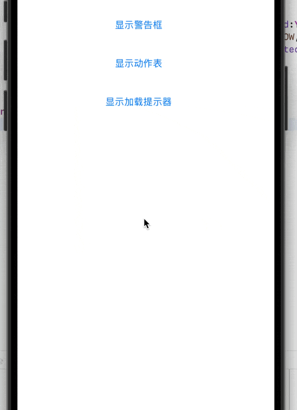
10. 警告对话框和等待提示器 (UIAlertController & UIActivityIndicatorView)
10.1 警告对话框
警告对话框一般用于提醒用户出现严重错误或者选择解决方式,其有两种样式,动作表和警报
.title
设置标题,即对话框顶部的文本(可选)
.message
消息,对话框内容的信息文本(可选)
.perferredStyle
首选样式,有两种,即上文提到的警报(UIAlertControllerStyleAlert)和动作表(UIAlertControllerStyleActionSheet)
示例:
这里只给出创建和添加的方法,按钮绑定省略
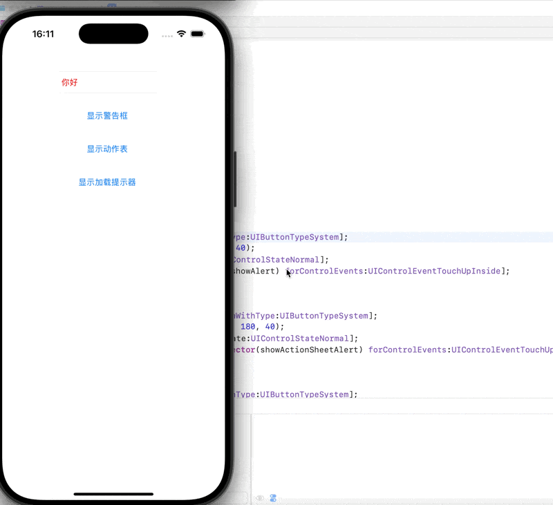
// 显示警告对话框
- (void)showAlert {UIAlertController *alert = [UIAlertController alertControllerWithTitle:@"提示"message:@"这是一个警告对话框"preferredStyle:UIAlertControllerStyleAlert];UIAlertAction *okAction = [UIAlertAction actionWithTitle:@"确定" style:UIAlertActionStyleDefault handler:^(UIAlertAction * _Nonnull action) {NSLog(@"用户点击了确定");}];UIAlertAction *cancelAction = [UIAlertAction actionWithTitle:@"取消" style:UIAlertActionStyleCancel handler:nil];[alert addAction:okAction];[alert addAction:cancelAction];[self presentViewController:alert animated:YES completion:nil];
}// 显示动作表样式的警告框
- (void)showActionSheetAlert {UIAlertController *actionSheet = [UIAlertController alertControllerWithTitle:@"选择操作"message:@"请选择一个选项"preferredStyle:UIAlertControllerStyleActionSheet];UIAlertAction *option1 = [UIAlertAction actionWithTitle:@"选项一" style:UIAlertActionStyleDefault handler:^(UIAlertAction * _Nonnull action) {NSLog(@"用户选择了选项一");}];UIAlertAction *option2 = [UIAlertAction actionWithTitle:@"选项二" style:UIAlertActionStyleDefault handler:^(UIAlertAction * _Nonnull action) {NSLog(@"用户选择了选项二");}];UIAlertAction *option3 = [UIAlertAction actionWithTitle:@"杀!" style:UIAlertActionStyleDestructive handler:^(UIAlertAction * _Nonnull action) {NSLog(@"用户选择了全杀了");}];UIAlertAction *cancelAction = [UIAlertAction actionWithTitle:@"取消" style:UIAlertActionStyleCancel handler:nil];[actionSheet addAction:option1];[actionSheet addAction:option2];[actionSheet addAction:option3];[actionSheet addAction:cancelAction];[self presentViewController:actionSheet animated:YES completion:nil];
}
效果
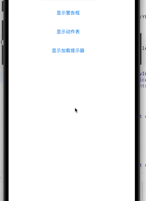
10.2 等待加载提示器
没有明显的进度,仅表示正在加载,请稍候
.actingIndicatorViewStyle
设置大小,有两种尺寸,中尺寸(UIActivityIndicatorViewStyleMedium),大尺寸(UIActivityIndicatorViewStyleLarge)大尺寸
.hidesWhenStopped
停止时是否隐藏,bool类型
为YES时,在stopAnimating方法被调用的时候,等待提示器会自动从父视图中移除
为NO只是不旋转了
[名 startAnimating]
开始播放等待提示器的旋转动画
将start替换为stop为终止旋转
[名 isAnimating]
只读属性,返回一个bool值,表示是否实在播放动画
示例:
// 显示等待提示器
- (void)showLoadingIndicator {UIAlertController *loadingAlert = [UIAlertController alertControllerWithTitle:nilmessage:@"请稍候...\n\n"preferredStyle:UIAlertControllerStyleAlert];UIActivityIndicatorView *indicator = [[UIActivityIndicatorView alloc] initWithActivityIndicatorStyle:UIActivityIndicatorViewStyleMedium];indicator.translatesAutoresizingMaskIntoConstraints = NO;[indicator startAnimating];[loadingAlert.view addSubview:indicator];NSLayoutConstraint *centerX = [NSLayoutConstraint constraintWithItem:indicatorattribute:NSLayoutAttributeCenterXrelatedBy:NSLayoutRelationEqualtoItem:loadingAlert.viewattribute:NSLayoutAttributeCenterXmultiplier:1.0constant:0];NSLayoutConstraint *centerY = [NSLayoutConstraint constraintWithItem:indicatorattribute:NSLayoutAttributeCenterYrelatedBy:NSLayoutRelationEqualtoItem:loadingAlert.viewattribute:NSLayoutAttributeCenterYmultiplier:1.3constant:0];[loadingAlert.view addConstraint:centerX];[loadingAlert.view addConstraint:centerY];[self presentViewController:loadingAlert animated:YES completion:^{dispatch_after(dispatch_time(DISPATCH_TIME_NOW, (int64_t)(2 * NSEC_PER_SEC)), dispatch_get_main_queue(), ^{[loadingAlert dismissViewControllerAnimated:YES completion:nil];});}];
}
效果:
11. UITextField 文本输入
.frame
同上文一样,设置位置大小
.text
文本框内的内容,不同于占位符
.font
设置字体大小和样式
.textColor
设置字体颜色
.boarderStyle
设置边框风格,有如下几种
StyleRoundRect 圆角风格
Line 线框风格
Bezel bezel线框风格
None 无线框风格
.keyboardType
设置虚拟键盘风格
Default 默认风格
PhonePad字母和数字默认组合风格
Numbenpad纯数字风格
.Phoneholder
占位符,提示信息,当text为空时,显示该信息
.secueTextEntry
是否为密码输入限制,即是否加密
.textAlignment
文本的对齐方式
.cleanButtonMode
为UITextFieldViewMode类型,控制清除按钮的显示时机
.returnKeyType
UIReturnKetType类 设置右下角文本显示
委托方法
UITextFieldDelegate
textFieldShouldBeginEditing:/ textFieldDidBeginEditing:
在文本框开始编辑前/后调用
textFieldShouldEndEditing:/ textFieldDidEndEditing:
在文本框结束编辑前/后调用
textField:shouldChangeCharactersInRange:replacementString:
最常用 在用户输入或粘贴文本,导致文本内容即将改变时调用。你可以利用它来验证输入(例如只允许数字)、限制字符长度、或格式化文本
textFieldShouldClear:
用户点击清除按钮时调用
textFieldShouldReturn:
用户点击键盘上的 Return 键时调用。常用于收起键盘或移动到下一个输入框。
示例:
// 文本输入区域// 读取输入// 只能输入单行输入UITextField* myText = [[UITextField alloc] init];myText.frame = CGRectMake(100, 100, 180, 40);// 设置内容myText.text = @"你好";// 设置字体大小myText.font = [UIFont systemFontOfSize:15];// 设置字体颜色myText.textColor = [UIColor redColor];// 设置边框风格// styleRoundRect 圆角风格// Line 线框风格// Bezel Bezel线框// None 无线框风格myText.borderStyle = UITextBorderStyleRoundedRect;// 设置虚拟键盘风格// Default 默认风格// PhonePad 字母和数字组合风格// NUmberPad 纯数字风格myText.keyboardType = UIKeyboardTypePhonePad;// 提示文字信息// 当text为空,显示此条信息// 浅灰色提示文字myText.placeholder = @"请输入";// 是否为密码输入// YES 即原点加密// NO 正常输入myText.secureTextEntry = NO;[self.view addSubview: myText];
效果:
12 导航栏 (UINavigationBar) 和 工具栏 (UIToolbar)
导航栏 (UINavigationBar) 就像一本书的目录或者标题栏。它通常在顶部,告诉你现在看的是哪一章,也可以让你方便地跳到上一章或者主目录
工具栏 (UIToolbar) 则更像一本书的书签或者便签纸,通常在底部,上面可以放一些常用的工具,比如“分享”、“收藏”或者“打印”
12.1 导航栏 (UINavigationBar)
主要用于显示当前视图控制器的标题,并提供返回上一级视图控制器的按钮(例如,左侧的返回按钮)。你也可以在导航栏上添加自定义的按钮(比如右侧的“编辑”或“完成”按钮),但是自定义的按钮,无法实现长按自动选择层级
导航栏通常由 UINavigationController 自动管理。当视图控制器被推入或推出时,导航栏的内容会相应地更新。也可以通过 UINavigationItem 来定制每个视图控制器在导航栏上显示的内容,但从iOS13开始,苹果引入了UINavigationBarAppearance来更细致地控制导航栏的外观以适应不同的滚动状态
12.1.1 主要性质
.titleView:
显示当前页面的标题,可以是文本,也可以是自定义视图
.leftBarButtonItems:
左侧的按钮,通常是返回按钮或自定义按钮
.rightBarButtonItems:
右侧的按钮,通常用于执行一些操作,比如“编辑”、“添加”等
.standardAppearance:
将apperance对象应用到导航栏的“标准外观”上
标准外观是指当内容没有滚动,导航栏处于其正常、非收起状态时的外观
.scrollEdgeAppearance:
将apperance对象应用到导航栏的“滚动边缘外观”上
滚动边缘外观是指当内容滚动到导航栏边缘时(通常是内容刚开始滚动,导航栏显示在顶部)的外观
注意,如果没有设置scrollEdgeAppearance,则会使用standardAppearance
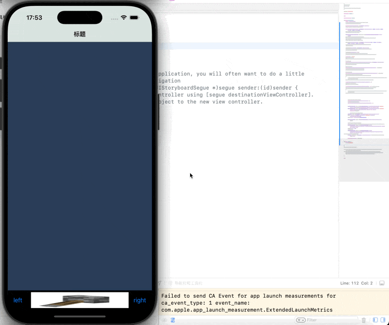
12.2 工具栏 (UIToolbar)
通常位于屏幕底部,提供一组工具按钮,用于执行当前视图的辅助操作,包含一系列 UIBarButtonItem 对象。UIBarButtonItem 可以是文本按钮、图片按钮、固定宽度或可变宽度的间隔
12.2.1 主要性质
.toolbarHidden:
是否隐藏工具栏,默认为YES,即隐藏
.toolbar.translucent:
设置工具栏是否透明,默认为YES
.toolbarItems:
设置工具栏的按钮数组
12.3 示例
- (void)viewDidLoad {[super viewDidLoad];// 这行是调用父类(UIViewController)的viewDidLoad方法。// 这是生命周期的一部分,确保父类也能完成其初始化工作。self.view.backgroundColor = [UIColor redColor];// 设置当前视图控制器(VCroot)的根视图的背景颜色为红色。self.view.backgroundColor = [UIColor colorWithRed:42 / 255.0 green:61 / 255.0 blue:89 / 255.0 alpha:1.0];// 再次设置当前视图控制器的根视图的背景颜色为自定义颜色。// 这行会覆盖上一行,所以最终背景色会是这个深蓝色。UINavigationBarAppearance *apperance = [[UINavigationBarAppearance alloc] init];// 创建一个UINavigationBarAppearance实例。// 从iOS 13开始,苹果引入了UINavigationBarAppearance来更细致地控制导航栏的外观,// 以适应不同的滚动状态(标准外观、滚动外观、紧凑外观)。// 这是一个外观配置对象,你可以在其上设置各种导航栏的样式属性。apperance.backgroundColor = [UIColor colorWithRed:217 / 255.0 green:227 / 255.0 blue:222 / 255.0 alpha:1.0];// 设置UINavigationBarAppearance对象的背景颜色为浅灰色(接近白色)。// 这将是导航栏的背景色。apperance.shadowImage = [[UIImage alloc] init];// 设置UINavigationBarAppearance对象的阴影图片为一个空的UIImage。// 这通常用于移除导航栏底部的默认阴影线。apperance.shadowColor = nil;// 设置UINavigationBarAppearance对象的阴影颜色为nil。// 这是另一种移除导航栏阴影线的方式,与apperance.shadowImage一起使用,以确保阴影被完全移除。self.title = @"标题";// 设置当前视图控制器的标题。// 当这个视图控制器被推入UINavigationController的栈中时,这个标题会显示在导航栏的中间。// 设置导航按钮颜色self.navigationController.navigationBar.tintColor = [UIColor purpleColor];// 设置导航栏中所有UIBarButtonItem(如返回按钮、自定义按钮)的颜色为紫色。// 这是作用于导航栏中可交互元素的颜色。// 设置普通样式的导航栏self.navigationController.navigationBar.standardAppearance = apperance;// 将之前配置好的apperance对象应用到导航栏的“标准外观”上。// 标准外观是指当内容没有滚动,导航栏处于其正常、非收起状态时的外观。// 设置滚动样式的导航栏self.navigationController.navigationBar.scrollEdgeAppearance = apperance;// 将apperance对象应用到导航栏的“滚动边缘外观”上。// 滚动边缘外观是指当内容滚动到导航栏边缘时(通常是内容刚开始滚动,导航栏显示在顶部)的外观。// 如果standardAppearance和scrollEdgeAppearance都设置了,并且scrollEdgeAppearance生效,它会覆盖standardAppearance。// 如果没有设置scrollEdgeAppearance,则会使用standardAppearance。self.navigationController.navigationBar.hidden = NO;// 显式地设置导航栏为不隐藏(显示)。// `hidden`属性控制整个导航栏的可见性。self.navigationController.navigationBarHidden = NO; // Objective-C// 正确控制导航栏显示/隐藏的方法是通过`setNavigationBarHidden:animated:`方法,// 或者直接设置`navigationController.navigationBar.hidden`。// `navigationBarHidden`是`UINavigationController`的一个属性,但在`UIViewController`中直接设置它通常不是最佳实践。// `self.navigationController.navigationBar.hidden = NO;` 已经完成了显示导航栏的任务。//隐藏工具栏,默认为YES:即隐藏;NO:不隐藏self.navigationController.toolbarHidden = NO;//设置工具栏是否透明,默认为YES:半透明self.navigationController.toolbar.translucent = NO;UIBarButtonItem *btn1 = [[UIBarButtonItem alloc] initWithTitle: @"left" style: UIBarButtonItemStylePlain target: nil action: nil];UIBarButtonItem *btn2 = [[UIBarButtonItem alloc] initWithTitle: @"right" style: UIBarButtonItemStylePlain target: self action: @selector(press)];//设置一个自定义类型的button,使用图片创建UIButton *btnC = [UIButton buttonWithType: UIButtonTypeCustom];[btnC setImage: [UIImage imageNamed: @"1.jpg"] forState: UIControlStateNormal];btnC.frame = CGRectMake(0, 0, 30, 30);UIBarButtonItem *btn3 = [[UIBarButtonItem alloc] initWithCustomView: btnC];//设置一个占位按钮,放到数组中可以用来分隔开各按钮//设置宽度固定的占位按钮,注:此处方法名为UIBarButtonSystemItemFixedSpace(FixedSpace!!!!!)UIBarButtonItem *btnF1 = [[UIBarButtonItem alloc] initWithBarButtonSystemItem: UIBarButtonSystemItemFixedSpace target: nil action: nil];btnF1.width = 110;// 自动计算宽度按钮UIBarButtonItem *btnF2 = [[UIBarButtonItem alloc] initWithBarButtonSystemItem: UIBarButtonSystemItemFlexibleSpace target: nil action: nil];
//        btnF2.width = 110;NSArray *arrayBtn = [NSArray arrayWithObjects: btn1, btnF2, btn3, btnF2, btn2, nil];self.toolbarItems = arrayBtn;}
- (void) press {NSLog(@"按下按钮");}
效果:
13 导航控制器 (UINavigationController)
UINavigationController 是一种特殊的容器视图控制器。它通过栈(Stack)的方式来管理一组视图控制器
导航控制器 就像一个图书馆的导览系统。它管理着一系列的书(视图控制器),当你打开一本书,导览系统会帮你记录你现在在看哪本,并且提供一个清晰的路径让你回到你之前看过的书。当你拿起一本新书,它会把它“压”到当前看的书上面,形成一个栈
13.1 主要特性
viewControllers:
一个数组,包含了栈中所有的视图控制器
topViewController:
栈顶的视图控制器,也就是当前显示的视图控制器
pushViewController:animated::
将一个视图控制器推入栈中
popViewControllerAnimated::
将栈顶的视图控制器弹出
popToRootViewControllerAnimated::
弹出所有视图控制器,只留下根视图控制器
popToViewController:animated::
弹出到指定的视图控制器
.barStyle
设置导航栏的风格,默认为default
示例:
SceneDelegate.m- (void)scene:(UIScene *)scene willConnectToSession:(UISceneSession *)session options:(UISceneConnectionOptions *)connectionOptions {self.window.frame = [UIScreen mainScreen].bounds;Rootcontroller* vc = [[Rootcontroller alloc] init];// 创建导航控制器 管理多个视图的切换// 采用层级的方式来管理多个视图的切换// 创建的时候一定要有一个根视图控制器// 设置一个根视图UINavigationController* nav = [[UINavigationController alloc] initWithRootViewController:vc];self.window.rootViewController = nav;[self.window makeKeyAndVisible];// Use this method to optionally configure and attach the UIWindow `window` to the provided UIWindowScene `scene`.// If using a storyboard, the `window` property will automatically be initialized and attached to the scene.// This delegate does not imply the connecting scene or session are new (see `application:configurationForConnectingSceneSession` instead).
}Rootcontroller.m- (void)viewDidLoad {[super viewDidLoad];//设置透明度,yes透明,no不透明self.navigationController.navigationBar.translucent = NO;self.title = @"title";self.navigationItem.title = @"根视图";self.view.backgroundColor = [UIColor blueColor];//设置导航栏的风格默认为Defaultself.navigationController.navigationBar.barStyle = UIBarStyleDefault;UIBarButtonItem* next = [[UIBarButtonItem alloc] initWithTitle:@"下一级别" style:UIBarButtonItemStylePlain target:self action:@selector(pressRight)];self.navigationItem.rightBarButtonItem = next;}
- (void) pressleft {NSLog(@"left");
}
- (void) pressRight {secondController* vc = [[secondController alloc] init];[self.navigationController pushViewController:vc animated:YES];
}
效果

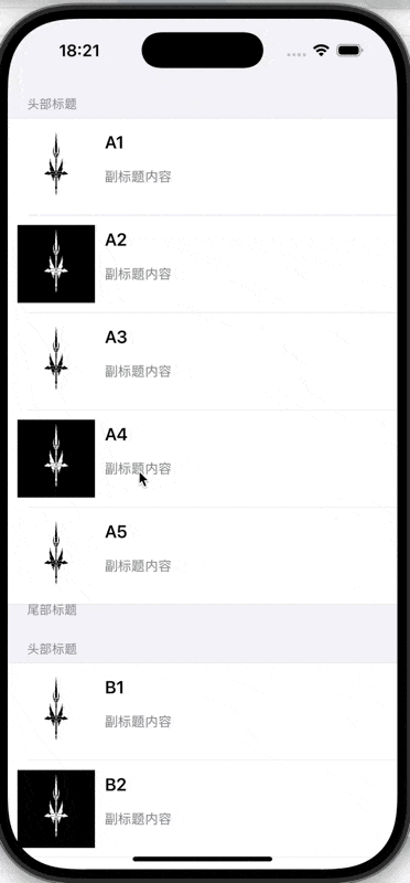
14 UITableView 和 自定义 Cell (UITableViewCell)
UITableView (表视图) 就像一个Excel 表格。它能有效地展示大量数据,每一行都是一个独立的数据项
UITableViewCell (表视图单元格) 就像 Excel 表格中的一个单元格。每个单元格可以显示不同的内容(比如文本、图片),而且你可以根据需要设计它的样式
14.1 UITableView (表视图)
用于展示大量可滚动的数据列表。非常高效,因为它只会渲染当前可见的行,而不是所有的数据
14.1.1 组成部分
分区 (Section): 表格可以分成多个区,每个区有自己的标题和脚注(可选)
行 (Row): 每个区包含多行,每行是一个 UITableViewCell
14.1.2 协议部分(UITableViewDelegate和UITableViewDataSource)
UITableViewDataSource 协议: 负责提供表格的数据,方法包括:
**numberOfSectionsInTableView::**返回分区的数量
**tableView:numberOfRowsInSection::**返回每个分区中行的数量
**tableView:cellForRowAtIndexPath::**返回每一行的 UITableViewCell,这个方法是核心,你在这里配置每一行显示的内容
UITableViewDelegate 协议: 负责处理表格的交互和样式。你需要实现的方法包括:
**tableView:didSelectRowAtIndexPath::**当用户点击某一行时调用。
**tableView:heightForRowAtIndexPath::**设置行高
**tableView:viewForHeaderInSection: / tableView:titleForHeaderInSection::**设置分区头视图或标题
**tableView:canEditRowAtIndexPath::**是否允许编辑某一行(滑动删除、插入等)。
**tableView:commitEditingStyle:forRowAtIndexPath::**处理编辑操作
UITableView 引入了 Cell 的重用机制,这是其高效的关键。当一个 Cell 滚出屏幕时,它会被放入一个重用队列,当需要显示新的 Cell 时,会优先从队列中取出可重用的 Cell,而不是重新创建。这大大节省了内存和 CPU 资源
14.2 UITableViewCell
UITableViewCell是表格中的一个基本单元。系统提供了一些默认的样式,如 Default (标题和可选的图片)、Subtitle (标题和副标题)、Value1 (左标题右值)、Value2 (左标题右值,但样式不同)
当系统提供的样式无法满足需求时,就需要自定义 UITableViewCell
14.2.1自定义cell的不同方式以及其重用机制
使用 Storyboard 或 XIB 文件:
虽然不常用,但是在cell过于复杂的时候,可以使用这种方式来直观的规划cell,由于其可视化,可以直观的看到各个控件的位置和大小
纯代码自定义:
完全使用代码来控制cell,牺牲了可视化,但是对UI布局有最高的控制权
cell的重用机制
在一个大型快递分拣中心工作。每当你需要一个箱子来包装包裹时,你不会每次都去制作一个新的箱子
相反,你会有一个“回收区”,里面放着之前用过的、现在空闲的箱子。当你需要新箱子时,你会优先从回收区找一个合适的尺寸拿出来,擦干净,然后贴上新的标签,装入新包裹。只有当回收区没有合适的空箱子时,你才会去生产一个新的
重用队列: UITableView 内部维护一个或多个重用队列(即上文中的回收区)。每个队列对应一个 reuseIdentifier
dequeueReusableCellWithIdentifier:forIndexPath: 方法
当你调用这个方法时,UITableView 会首先检查对应 reuseIdentifier 的重用队列中是否有可用的 Cell
如果找到: UITableView 会从重用队列中取出一个 Cell,并返回给你。这个 Cell 可能之前被用来显示其他行的数据,但它现在是空闲的
如果没找到: UITableView 会根据你之前注册 Cell 的方式(通过 XIB/Storyboard 或 Class)创建一个新的 Cell 实例,并返回给你
Cell 离开屏幕:
当一个 Cell 滚动出屏幕,不再可见时,它并不会被立即销毁。相反,它会被放入到对应 reuseIdentifier 的重用队列中,等待下一次被重用
配置 Cell:
无论你是获取了一个重用的 Cell 还是一个新的 Cell,你都必须在 tableView:cellForRowAtIndexPath: 方法中重新配置 Cell 的所有内容(文本、图片、颜色、选中状态等等)。 因为重用的 Cell 可能带有上次显示的数据或状态,如果不重新配置,就会出现“数据错乱”的问题
重用标识符 : 这是重用机制的关键。同一个 UITableView 中,不同类型的 Cell 必须使用不同的 reuseIdentifier
14.3 示例
viewcontroller.m
- (void)viewDidLoad {[super viewDidLoad];// Do any additional setup after loading the view.// 分组效果_tableView = [[UITableView alloc] initWithFrame:self.view.bounds style:UITableViewStyleGrouped];_tableView.delegate = self;_tableView.dataSource = self;[self.view addSubview: _tableView];_arrayDate = [[NSMutableArray alloc] init];for (int i = 'A'; i <= 'Z'; i++) {// 定义小数组NSMutableArray* arraysmall = [[NSMutableArray alloc] init];for (int j = 1; j <= 5; j++) {NSString* str = [NSString stringWithFormat:@"%c%d",i,j];[arraysmall addObject:str];}[_arrayDate addObject:arraysmall];}}// 设置每行单元格内容
- (UITableViewCell*)tableView:(UITableView *)tableView cellForRowAtIndexPath:(NSIndexPath *)indexPath {static NSString *cellID = @"myCell";MyCell* cell = [tableView dequeueReusableCellWithIdentifier:cellID];if (cell == nil) {// 使用自定义的 MyCellcell = [[MyCell alloc] initWithStyle:UITableViewCellStyleDefault reuseIdentifier:cellID];}// 设置主标题内容,来自数据源数组NSString *title = _arrayDate[indexPath.section][indexPath.row];cell.mainLabel.text = title;// 设置副标题固定内容cell.subLabel.text = @"副标题内容";// 设置图片,根据行号循环使用 1.jpg 和 2.jpgNSString *imageName = [NSString stringWithFormat:@"%ld.jpeg", indexPath.row % 2 + 1];cell.myImageView.image = [UIImage imageNamed:imageName];return cell;
}// 获取组个数
- (NSInteger) numberOfSectionsInTableView:(UITableView *)tableView {return _arrayDate.count;
}// 获取每组元素个数
- (NSInteger) tableView:(UITableView *)tableView numberOfRowsInSection:(NSInteger)section {NSInteger numRow = [[_arrayDate objectAtIndex:section] count];return numRow;
}// 协议
// 获取单元格的高度
- (CGFloat)tableView:(UITableView *)tableView heightForRowAtIndexPath:(NSIndexPath *)indexPath {return 100;
}// 获取显示在每组头部的标题
- (NSString*)tableView:(UITableView *)tableView titleForHeaderInSection:(NSInteger)section {return @"头部标题";
}// 获取显示在每组尾部的标题
- (NSString*)tableView:(UITableView *)tableView titleForFooterInSection:(NSInteger)section {return @"尾部标题";
}// 获取头部高度
- (CGFloat)tableView:(UITableView *)tableView heightForHeaderInSection:(NSInteger)section {return 40;
}// 获取尾部高度
- (CGFloat)tableView:(UITableView *)tableView heightForFooterInSection:(NSInteger)section {return 20;
}// 设置编辑样式为删除
- (UITableViewCellEditingStyle)tableView:(UITableView *)tableView editingStyleForRowAtIndexPath:(NSIndexPath *)indexPath {return UITableViewCellEditingStyleDelete;
}// 实现滑动删除功能
- (void)tableView:(UITableView *)tableView commitEditingStyle:(UITableViewCellEditingStyle)editingStyle forRowAtIndexPath:(NSIndexPath *)indexPath {if (editingStyle == UITableViewCellEditingStyleDelete) {NSMutableArray *sectionArray = _arrayDate[indexPath.section];[sectionArray removeObjectAtIndex:indexPath.row];[tableView reloadData];}
}// 选中单元格时打印信息
- (void)tableView:(UITableView *)tableView didSelectRowAtIndexPath:(NSIndexPath *)indexPath {NSLog(@"选中第%ld组 第%ld行", indexPath.section, indexPath.row);
}// 取消选中单元格时打印信息
- (void)tableView:(UITableView *)tableView didDeselectRowAtIndexPath:(NSIndexPath *)indexPath {NSLog(@"取消选中第%ld组 第%ld行", indexPath.section, indexPath.row);
}Mycell.m- (instancetype)initWithStyle:(UITableViewCellStyle)style reuseIdentifier:(NSString *)reuseIdentifier {self = [super initWithStyle:style reuseIdentifier:reuseIdentifier];if (self) {// 设置图片视图self.myImageView = [[UIImageView alloc] initWithFrame:CGRectMake(10, 10, 80, 80)];[self.contentView addSubview:self.myImageView];// 设置主标题标签self.mainLabel = [[UILabel alloc] initWithFrame:CGRectMake(100, 10, 200, 30)];self.mainLabel.font = [UIFont boldSystemFontOfSize:18];[self.contentView addSubview:self.mainLabel];// 设置副标题标签self.subLabel = [[UILabel alloc] initWithFrame:CGRectMake(100, 50, 200, 20)];self.subLabel.font = [UIFont systemFontOfSize:14];self.subLabel.textColor = [UIColor grayColor];[self.contentView addSubview:self.subLabel];}return self;
}
- (void)setSelected:(BOOL)selected animated:(BOOL)animated {[super setSelected:selected animated:animated];// Configure the view for the selected state
}
效果: