vue3 双容器自动扩展布局 根据 内容的多少 动态定义宽度
需求:
左右两个列表 挨着排列,当左边内容超出滚动条时,换列显示,右边的列表随之移动
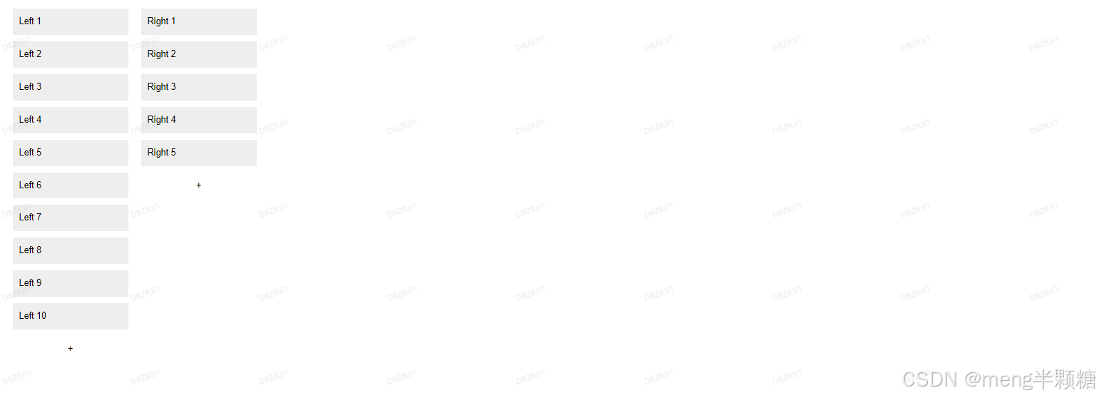
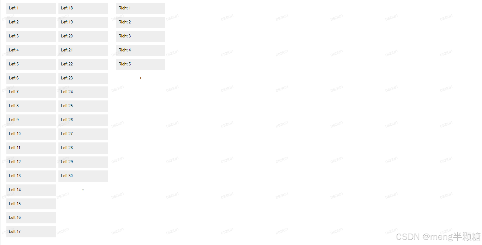
效果图:
1.左边数据:10,右边数据:5
2.左边数据:30,右边数据:5 此时:左边数据分两列显示,右边跟着移动
完整代码:
<template><div class="layout-padding"><div class="layout-padding-auto layout-padding-view" style="overflow: auto"><div class="container1"><div class="left" ref="leftRef"><div v-for="n in leftItems" :key="n" class="item">Left {{ n }}</div><button @click="clickBtn('left')">+</button></div><div class="right" ref="rightRef"><div v-for="n in rightItems" :key="n" class="item">Right {{ n }}</div><button @click="clickBtn('right')">+</button></div></div></div></div>
</template><script setup>
import {ref, onMounted, onUnmounted} from 'vue'const leftItems = ref(180)
const rightItems = ref(50)
const leftRef = ref()
const rightRef = ref()const clickBtn = (type) => {if (type == 'left') {leftItems.value++getData(leftRef.value)} else if (type == 'right') {rightItems.value++getData(rightRef.value)}
}
const getData = (ref) => {if (!ref) returnconst items = ref.querySelectorAll('.item')if (!items.length) returnconst itemHeight = items[0].offsetHeight + 10const containerHeight = ref.offsetHeightconst columns = Math.ceil((items.length + 1) * itemHeight / containerHeight)ref.style.width = `${columns * 200}px`ref.style['min-width'] = `${columns * 200}px`
}
onMounted(async () => {getData(leftRef.value)getData(rightRef.value)
});const updateSize = () => {getData(leftRef.value)getData(rightRef.value)
}onMounted(() => {window.addEventListener('resize', updateSize)
})onUnmounted(() => {window.removeEventListener('resize', updateSize)
})
</script><style scoped>
.container1 {display: flex;height: 100%;overflow: auto;
}.left, .right {display: flex;flex-direction: column;flex-wrap: wrap;align-content: flex-start;gap: 10px;padding: 10px;
}.item {padding: 10px;background: #eee;width: 180px;min-width: 180px;
}button {margin-top: 10px;width: 180px;
}
</style>