uniapp实现的具备丝滑动画的标签工具栏模板
采用 uniapp 实现, 是一款具备丝滑动画的标签工具栏模板,支持 vue2、vue3;适配 web、H5、微信小程序(其他平台小程序未测试过,可自行尝试)
代码实现简约易懂,用户可根据自身需求下载模板,并进行扩展开发
可到插件市场下载尝试: https://ext.dcloud.net.cn/plugin?id=23810
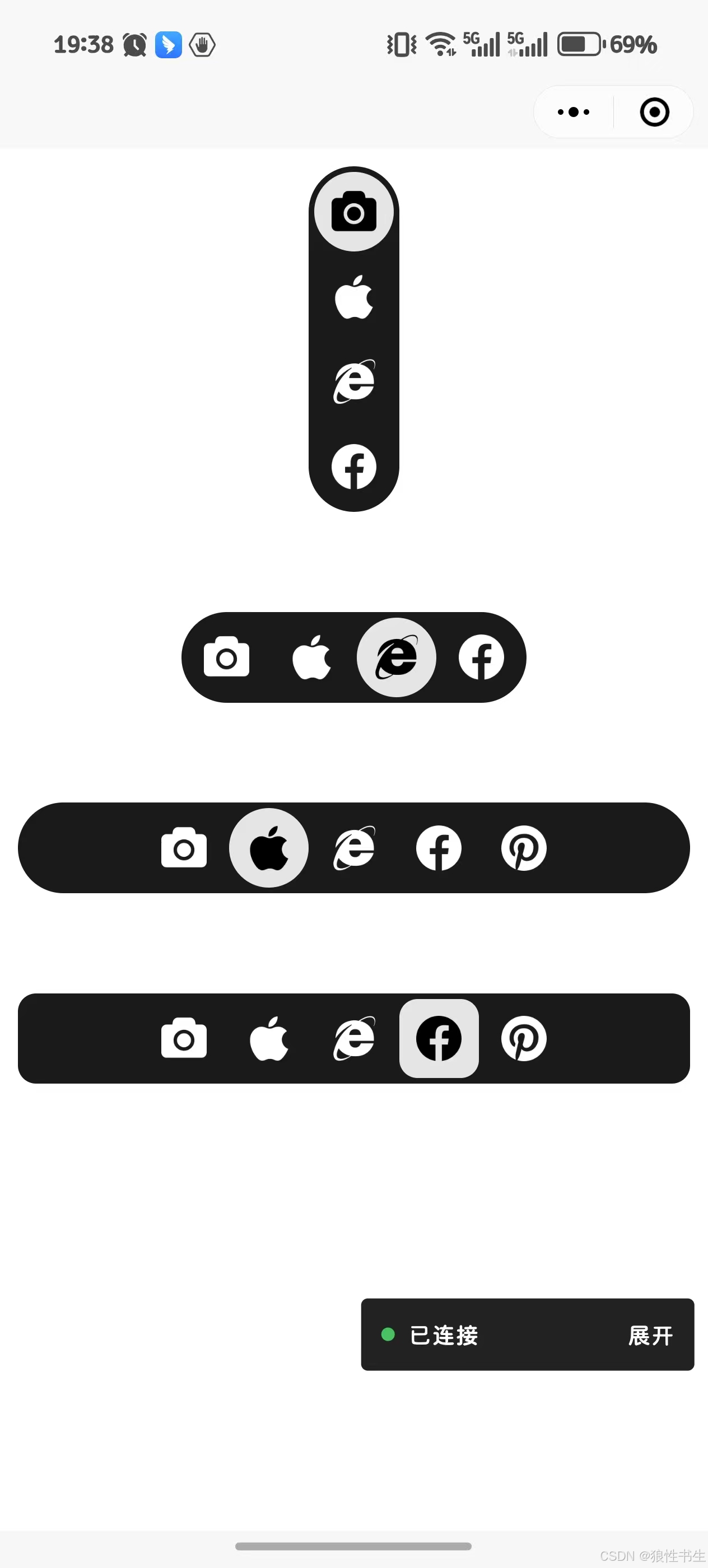
- 示例
props 属性
defaultValue
默认高亮选项
defaultValue: {type: String,default: "unsplash",
},
orientation
设置工具栏排列方向,提供两种选项:horizontal、vertical
orientation: {type: String,default: "horizontal",
},
options
选项数组,必须具备 label、value、icon 字段
options: {type: Object,default: () => {return [{ icon: "https://img.icons8.com/?size=100&id=56579&format=png&color=ffffff", label: "Unsplash", value: "unsplash" },{ icon: "https://img.icons8.com/?size=100&id=890&format=png&color=ffffff", label: "iphone", value: "iphone" },{ icon: "https://img.icons8.com/?size=100&id=12412&format=png&color=ffffff", label: "Browsers", value: "browsers" },{ icon: "https://img.icons8.com/?size=100&id=118504&format=png&color=ffffff", label: "Facebook", value: "facebook" },]}}
事件
@onChange
点击选项时触发,返回 options 中提供的点击的选项值,
使用示例
vue2 使用示例
<template><view style="padding: 0.4em; font-size: 1.7em; height: 60vh;"><view class="flex-center"><view class="bg-circle"><ToolbarComp style="border-radius: inherit;" orientation="vertical"></ToolbarComp></view></view><view class="flex-center" style="padding-top: 60px;"><view class="flex-center bg-circle"><ToolbarComp style="border-radius: inherit;" default-value="browsers"></ToolbarComp></view></view><view class="flex-center" style="padding-top: 60px; width: 100%;"><view style="width: 100%;" class="flex-center bg-circle"><ToolbarComp style="border-radius: inherit;" default-value="iphone" :options="toolbarOptions" @onChange="handleChange"></ToolbarComp></view></view><view class="flex-center" style="padding-top: 60px; width: 100%;"><view style="width: 100%;" class="flex-center bg-react"><ToolbarComp style="border-radius: inherit;" default-value="facebook" :options="toolbarOptions"></ToolbarComp></view></view></view>
</template><script>
import ToolbarComp from './comp/toolbarComp.vue';
export default {components: {ToolbarComp},data() {return {toolbarOptions: [{ icon: "https://img.icons8.com/?size=100&id=56579&format=png&color=ffffff", label: "Unsplash", value: "unsplash" },{ icon: "https://img.icons8.com/?size=100&id=890&format=png&color=ffffff", label: "iphone", value: "iphone" },{ icon: "https://img.icons8.com/?size=100&id=12412&format=png&color=ffffff", label: "Browsers", value: "browsers" },{ icon: "https://img.icons8.com/?size=100&id=118504&format=png&color=ffffff", label: "Facebook", value: "facebook" },{ icon: "https://img.icons8.com/?size=100&id=3529&format=png&color=ffffff", label: "Pinterest", value: "pinterest" },]}},methods: {handleChange(e) {console.log('selected:', e);}}
}
</script><style scoped>
.flex-center {display: flex;justify-content: center;align-items: center;
}
.bg-circle {background-color: hsl(0, 0%, 10%);border-radius: 1em;
}
.bg-react {background-color: hsl(0, 0%, 10%);border-radius: 0.4em;
}
</style>
vue3 使用示例
<template><view style="padding: 0.4em; font-size: 1.7em; height: 60vh;"><view class="flex-center"><view class="bg-circle"><ToolbarComp style="border-radius: inherit;" orientation="vertical"></ToolbarComp></view></view><view class="flex-center" style="padding-top: 60px;"><view class="flex-center bg-circle"><ToolbarComp style="border-radius: inherit;" default-value="browsers"></ToolbarComp></view></view><view class="flex-center" style="padding-top: 60px; width: 100%;"><view style="width: 100%;" class="flex-center bg-circle"><ToolbarComp style="border-radius: inherit;" default-value="iphone" :options="toolbarOptions" @onChange="handleChange"></ToolbarComp></view></view><view class="flex-center" style="padding-top: 60px; width: 100%;"><view style="width: 100%;" class="flex-center bg-react"><ToolbarComp style="border-radius: inherit;" default-value="facebook" :options="toolbarOptions"></ToolbarComp></view></view></view>
</template><script>
import { defineComponent, reactive } from 'vue';
import ToolbarComp from './comp/toolbarComp.vue';export default defineComponent({components: {ToolbarComp},setup() {const toolbarOptions = reactive([{ icon: "https://img.icons8.com/?size=100&id=56579&format=png&color=ffffff", label: "Unsplash", value: "unsplash" },{ icon: "https://img.icons8.com/?size=100&id=890&format=png&color=ffffff", label: "iphone", value: "iphone" },{ icon: "https://img.icons8.com/?size=100&id=12412&format=png&color=ffffff", label: "Browsers", value: "browsers" },{ icon: "https://img.icons8.com/?size=100&id=118504&format=png&color=ffffff", label: "Facebook", value: "facebook" },{ icon: "https://img.icons8.com/?size=100&id=3529&format=png&color=ffffff", label: "Pinterest", value: "pinterest" },]);const handleChange = (e) => {console.log('selected:', e);};return {toolbarOptions,handleChange};}
});
</script><style scoped>
.flex-center {display: flex;justify-content: center;align-items: center;
}
.bg-circle {background-color: hsl(0, 0%, 10%);border-radius: 1em;
}
.bg-react {background-color: hsl(0, 0%, 10%);border-radius: 0.4em;
}
</style>