Xamarin入门笔记(Xamarin已经被MAUI取代)
初级代码游戏的专栏介绍与文章目录-CSDN博客
Xamarin入门
-
概述
-
环境
-
Android开发环境比较简单,自带模拟器,实体机打开开发者模式即可。
iOS开发环境比较复杂,必须搭配Mac电脑,Windows连接Mac开发可能有问题(比如发现选取文件功能无法返回),建议直接使用Mac,项目文件是兼容的。
iOS开发必须有付费开发者账号,免费的只能用免费预配,非常困难,微软都不建议使用。模拟器测试不需要付费开发者账号,但是不能实体机安装意义不大。
Mac上必须安装XCode和XCode命令行工具,不需要额外配置。如果使用Windows开发,Windows可以是虚拟机,但是反应会比较迟缓(即使非VS操作很流畅),微软不建议这样做,16G内存的MBP实测确实如此。
本文是学习微软教程的笔记(Xamarin 入门 - Xamarin | Microsoft Docs)。
本文基于Visual Studio Community 2019 for Mac。
-
-
Xamarin基本功能
-
Xamarin开发使用C#,支持Android、iOS、Windows平台(下一代技术MAUI已经由VS2022preview提供,支持mac应用,开始写作此文时仅可在Windows上开发。MAUI代码大体上兼容Xamarin。)。
支持调用OC、java、C、C++功能。
跨平台代码平均占90%。
Xamarin. Essentials,本机设备功能
Xamarin. Forms,UI框架
-
项目基本结构
-
目录结构
-
目录结构为:
解决方案
项目(共享项目)
项目.iOS
项目.平台
解决方案下分多个项目,无后缀的是共享部分,其余为每个平台的项目。
每个xaml文件都有一个对应的xaml.cs文件,VS将xaml.cs藏在xaml下面,但文件目录里是并列的。Xaml文件描述界面,xaml.cs则是对应的代码。
-
-
项目.iOS
-
main.cs和AppDelegate.cs
-
-
程序从main.cs入口,关键语句:
UIApplication.Main(args, null, typeof(AppDelegate))
此句引用到AppDelegate.cs里定义的类AppDelegate,关键代码:
在FinishedLaunching()里调用
LoadApplication(new App())
此句引用共享项目里定义的App类。
-
-
共享项目
-
AssemblyInfo.cs
-
-
装配信息,程序集级别的项目属性。
-
-
-
App.xaml
-
-
应用程序类,处理应用程序生命周期事件。
关键代码:
MainPage = new AppShell()
此句引入AppShell。
-
-
-
AppShell.xaml
-
-
控制视觉层次。
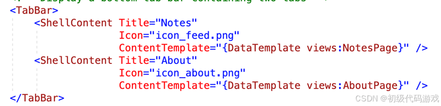 这里定义了TabBar,包含两个视图页面,cs代码里没有实质内容。NotesPage和AboutPage是自定义的视图页面。
-
-
-
自定义的视图页面
-
-
自定义的视图页面包含了主要的功能。
-
示例代码
-
下载示例
-
从微软教程的“下载示例”链接入手,打开链接找到“Browse code”,点击后进入github页面,这是这个子项目的页面,点击左边第一个tab页“code”,注意这里跳转到了整个教程示例的根目录,再点右侧按钮“code”克隆或下载zip包,得到所有示例代码。
-
-
示例代码目录结构
-
入门教程位于GetStarted目录:
FirstApp,首个应用
Notes,快速入门
Tutorials目录,教程的每个项目
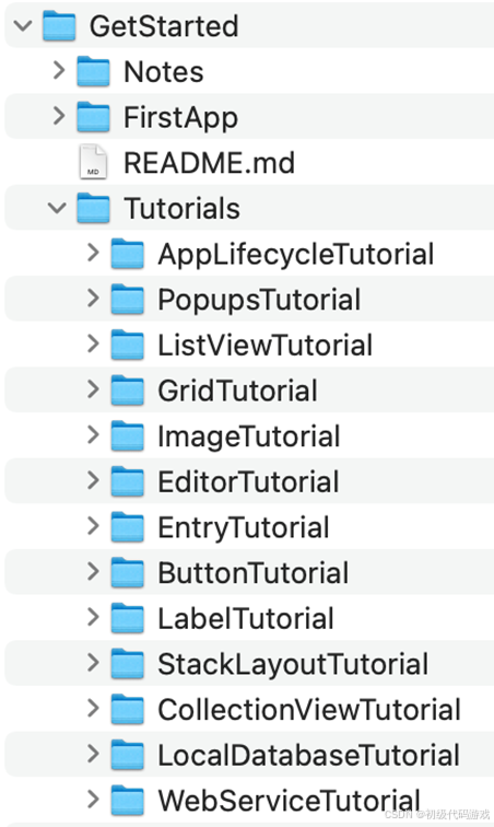
其余目录:
XamlSamples,XAML的综合示例,演示了各种效果,对应《XMAL基础》章节
FormsGallery,控件示例,对应《XAML控件》章节。注意,这个示例似乎有些问题,修改了代码却没有效果。
-
布局
-
StackLayout堆积布局
-
<stacklayout margin=“1,2,3,4”
Orientation="Horizontal"-----子元素方向:横向(默认为垂直)
>
</stacklayout>
Margin,间距,与相邻元素之间的距离
Padding,填充,与子元素的距离,体现为内部的四边空白
-
界面元素
-
Label标签
-
<Label Text="Start"
HorizontalOptions="Start"-----横向布局,默认“fill”
BackgroundColor="Gray" />
VerticalOptions:纵向布局
复杂的多格式文本:
<Label TextColor="Gray"
FontSize="Medium">
<Label.FormattedText>
<FormattedString>
<Span Text="This sentence contains " />
<Span Text="words that are emphasized, "
FontAttributes="Italic" />
<Span Text="and underlined."
TextDecorations="Underline" />
</FormattedString>
</Label.FormattedText>
</Label>
FormattedText 属性是 FormattedString 类型,包含一个或多个 Span 实例。
-
-
Button按钮
-
<Button Text="Click Me” -------按钮上显示的文本
Clicked="Handle_Clicked" 单击事件
TextColor="Blue" 文本色
BackgroundColor="Aqua" 背景色
BorderColor="Red" 边框色
BorderWidth="5" 边框宽度
CornerRadius="5" 圆角半径
WidthRequest="150" 宽度
HeightRequest="75" /> 高度
代码:
void OnButtonClicked(object sender, EventArgs e)
{
(sender as Button).Text = "Click me again!";
}
事件还有Pressed和Released
-
-
Entry条目(单行输入)
-
<Entry Placeholder="Enter text" 占位文本,空时显示
TextChanged="OnEntryTextChanged" 文本改变,参数包含新旧值
Completed="OnEntryCompleted" 按下回车
/>
代码:
void OnEntryTextChanged(object sender, TextChangedEventArgs e)
{
string oldText = e.OldTextValue;
string newText = e.NewTextValue;
}
void OnEntryCompleted(object sender, EventArgs e)
{
string text = ((Entry)sender).Text;
}
密码输入:
<Entry Placeholder="Enter password"
MaxLength="15" 限制长度
IsSpellCheckEnabled="false" 禁用拼写检查
IsTextPredictionEnabled="false" 禁用文本预测
IsPassword="true" 不显示字符而用圆点代替
/>
-
-
Editor编辑器(多行输入)
-
<Editor Placeholder="Enter multi-line text here"
HeightRequest="200"
TextChanged="OnEditorTextChanged" 这两个事件与entry相似
Completed="OnEditorCompleted" iOS上有一个额外的“完成”按钮来触发
AutoSize="TextChanges" 填充文本时自动增加高度
MaxLength="200" 最大输入长度
IsSpellCheckEnabled="false" 禁用拼写检查
IsTextPredictionEnabled="false" 禁用文本预测
/>
Android上会指示高度,iOS却不会指示高度
-
-
Image图像
-
<Image Source="https://.......jpg" 文件、URI或资源
HeightRequest="300"
Aspect="Fill" 填充方式
HeightRequest="{OnPlatform iOS=300, Android=250}" 区分平台设置
WidthRequest="{OnPlatform iOS=300, Android=250}" 区分平台设置
HorizontalOptions="Center" 水平居中
/>
WidthRequest 无需同时指定宽度和高度,默认保持纵横比
图像会自动缓存24小时
Aspect :Fill 改变比例
AspectFill 保持比例,可能会裁剪
AspectFit 保持比例,可能会留白
使用本地资源需要把资源放在项目里,然后Source直接使用资源名称(区分大小写)
iOS:Assets.xcassets
图像为一组,根据设备情况选择最合适的
-
-
Grid网格(表格)
-
<Grid Margin="20,35,20,20">
<Grid.ColumnDefinitions>
<ColumnDefinition Width="0.5*" />
<ColumnDefinition Width="0.5*" />
</Grid.ColumnDefinitions>
<Grid.RowDefinitions>
<RowDefinition Height="50" />
<RowDefinition Height="50" />
</Grid.RowDefinitions>
<Label Text="Column 0, Row 0" />
<Label Grid.Column="1" 指定列,默认为0
Text="Column 1, Row 0" />
<Label Grid.Row="1" 指定行,默认为0
Text="Column 0, Row 1" />
<Label Grid.Column="1"
Grid.Row="1"
Text="Column 1, Row 1" />
</Grid>
宽度和高度:
Auto 自动
数字 指定数值
数字* 比例(星号结尾)
ColumnSpacing 和 RowSpacing 属性设置 Grid 中列和行之间的间距
ColumnSpan和RowSpan设置跨越的行列数
-
-
CollectionView列表视图
-
直接定义数据源
-
-
<CollectionView>
<CollectionView.ItemsSource> 数据源
<x:Array Type="{x:Type x:String}"> 直接定义的数据源
<x:String>Baboon</x:String>
<x:String>Capuchin Monkey</x:String>
<x:String>Blue Monkey</x:String>
</x:Array>
</CollectionView.ItemsSource>
</CollectionView>
-
-
-
代码定义数据源
-
-
先定义数据结构:
public class Monkey
{
public string Name { get; set; }
public string Location { get; set; }
public string ImageUrl { get; set; }
public override string ToString()
{
return Name;
}
}
再添加对象和构造数据:
public partial class MainPage : ContentPage
{
public IList<Monkey> Monkeys { get; private set; }
public MainPage()
{
InitializeComponent();
Monkeys = new List<Monkey>();
Monkeys.Add(new Monkey
{
Name = "Baboon",
Location = "Africa & Asia",
ImageUrl = "https://。。.jpg"
});
Monkeys.Add(new Monkey
{
Name = "Capuchin Monkey",
Location = "Central & South America",
ImageUrl = "https://。。.jpg"
});
BindingContext = this; 将绑定上下文指向自身,所有子对象都可以在这里查找绑定对象
}
}
最后设置列表视图的数据源:
<CollectionView ItemsSource="{Binding Monkeys}"
SelectionMode="Single" 单选,还有Multiple和None
SelectionChanged="OnSelectionChanged"
<CollectionView.ItemTemplate>这一段设置外观,没有的话只显示默认字段
<DataTemplate>
<Grid Padding="10" 用两行两列网格显示
RowDefinitions="Auto, *"
ColumnDefinitions="Auto, *">
<Image Grid.RowSpan="2" 跨两行显示图片
Source="{Binding ImageUrl}"
Aspect="AspectFill"
HeightRequest="60"
WidthRequest="60" />
<Label Grid.Column="1" 第二列第一行显示名称(默认字段)
Text="{Binding Name}"
FontAttributes="Bold" />
<Label Grid.Row="1" 第二列第二行显示地点
Grid.Column="1"
Text="{Binding Location}"
VerticalOptions="End" />
</Grid>
</DataTemplate>
</CollectionView.ItemTemplate>
</CollectionView>
事件处理代码:
void OnSelectionChanged(object sender, SelectionChangedEventArgs e)
{
Monkey selectedItem = e.CurrentSelection[0] as Monkey;
}
-
-
DisplayAlert消息框
-
异步方法DisplayAlert用来弹出消息框,可以指定标题、文本和一个或两个按钮:
await DisplayAlert("Alert", "This is an alert.", "OK");
bool response = await DisplayAlert("Save?", "。。?", "Yes", "No");
按第一个按钮返回true,按第二个按钮返回false。
-
-
DisplayActionSheet操作表
-
异步方法DisplayActionSheet显示操作列表,返回用户选择的操作:
string action = await DisplayActionSheet("Send to?", "Cancel", null, "Email", "Twitter", "Facebook");
第一个参数是最上面的提示,不能点击。
第二个参数是最下面的取消按钮,点击后一样会返回按钮文本(所以所有的按钮返回都是自身的文本)。点击操作表之外的区域也返回取消按钮。
第三个参数按照说法是“析构操作”,具有破坏性,可以为null,iOS上的实际效果是显示为红色(其余则是蓝色)。
-
生命周期
App.xaml.cs里面可以定义三个生命周期事件发生时的操作:
protected override void OnStart() 启动时
{
Console.WriteLine("OnStart");
}
protected override void OnSleep() 放入后台时
{
Console.WriteLine("OnSleep");
}
protected override void OnResume() 从后台恢复时
{
Console.WriteLine("OnResume");
}
注意,没有结束通知,结束相关操作都应该在OnSleep进行。
Application的Properties保存跨周期数据,只需在OnSleep中写入,在OnStart中恢复。无需在OnResume中操作,因为程序还在内存中。
const string displayText = "displayText"; 供其它类使用的数据
public string DisplayText { get; set; }
protected override void OnStart()
{
Console.WriteLine("OnStart");
if (Properties.ContainsKey(displayText)) 要先确认数据存在
{
DisplayText = (string)Properties[displayText];
}
}
protected override void OnSleep()
{
Console.WriteLine("OnSleep");
Properties[displayText] = DisplayText;
}
其它类可以这样访问上面定义的DisplayText:
(Application.Current as App).DisplayText
注意,微软的教程示例代码需要确认输入才会保存数据,通过输入回车来保存。改为处理TextChanged即可实现任何输入都保存。
-
XAML可扩展应用程序标记语言
-
概述
-
XAML是XML。
不能包含代码。
不能包含循环。不影响可视化对象通过某种机制创建多个对象。
不能包含条件处理。
不能实例化没有无参数构造函数的类。
不能调用方法。只能指定事件处理方法。
-
-
基本语法
-
属性和属性元素
-
-
属性的两种等效写法:
<Label Text="Hello, XAML!"---------直接用XML属性
VerticalOptions="Center"
FontAttributes="Bold"
FontSize="Large">
<Label.TextColor>---------属性元素,适合复杂属性
Aqua
</Label.TextColor>
</Label>
复杂的属性值,只能用属性元素来表达:
<Grid>
<Grid.RowDefinitions>
<RowDefinition Height="Auto" />
<RowDefinition Height="*" />
<RowDefinition Height="100" />
</Grid.RowDefinitions>
<Grid.ColumnDefinitions>
<ColumnDefinition Width="Auto" />
<ColumnDefinition Width="*" />
<ColumnDefinition Width="100" />
</Grid.ColumnDefinitions>
...
</Grid>
-
-
-
附加属性(attached)
-
-
每个子元素的 Grid 标记中,可以使用以下属性指定该子项的行和列:
- Grid.Row
- Grid.Column
这些属性的默认值为 0。 还可以指示子级是否跨越多个具有以下属性的行或列:
- Grid.RowSpan
- Grid.ColumnSpan
这两个属性的默认值为 1。
这些属性是特殊的可绑定属性,由子级设置(显然,grid本身设置这些是毫无意义的)。
-
-
-
OnPlatform按平台设置
-
-
代码中如此检测平台:
if (Device.RuntimePlatform == Device.iOS)
{
Padding = new Thickness(0, 20, 0, 0);
}
XAML中如此设置:
<ContentPage.Padding>
<OnPlatform x:TypeArguments="Thickness">
<On Platform="iOS" Value="0, 20, 0, 0" />
<On Platform="Android, UWP" Value="0, 0, 0, 0" />
</OnPlatform>
</ContentPage.Padding>
-
-
XAML标记扩展
-
共享资源
-
-
定义共享资源:
<ContentPage.Resources>
<ResourceDictionary>
<LayoutOptions x:Key="horzOptions"
Alignment="Center" />-------单个属性
<LayoutOptions x:Key="vertOptions"
Alignment="Center"
Expands="True" />----------一组属性
<x:Double x:Key="borderWidth">3</x:Double>-----值
<x:Double x:Key="rotationAngle">-15</x:Double>
<OnPlatform x:Key="textColor"
x:TypeArguments="Color">
<On Platform="iOS" Value="Red" />-------区分平台
<On Platform="Android" Value="Aqua" />
<On Platform="UWP" Value="#80FF80" />
</OnPlatform>
<x:Double x:Key="fontSize">24</x:Double>
</ResourceDictionary>
</ContentPage.Resources>
每个共享资源由一个key和值/一组属性定义,引用时直接引用了值/一组属性:
<Button Text="Do this!"
HorizontalOptions="{StaticResource horzOptions}"
VerticalOptions="{StaticResource vertOptions}"
BorderWidth="{StaticResource borderWidth}"
Rotation="{StaticResource rotationAngle}"
TextColor="{StaticResource textColor}"
FontSize="{StaticResource fontSize}" />
.Resources块可以有多个,逐级向上查找。
-
-
数据绑定
-
页面中一个对象关联到另一个对象:
<StackLayout>
<Label Text="ROTATION"
BindingContext="{x:Reference Name=slider}"-----绑定到本页另一个对象
Rotation="{Binding Path=Value}"------从绑定对象取值
FontAttributes="Bold"
FontSize="Large"
HorizontalOptions="Center"
VerticalOptions="CenterAndExpand" />
<Slider x:Name="slider"---------被绑定的对象
Maximum="360"
VerticalOptions="CenterAndExpand" />
<Label BindingContext="{x:Reference slider}"------省略了Name=
Text="{Binding Value, StringFormat='The angle is {0:F0} degrees'}"-----这里似乎是按位置格式化字符串
FontAttributes="Bold"
FontSize="Large"
HorizontalOptions="Center"
VerticalOptions="CenterAndExpand" />
</StackLayout>
绑定模式:
- Default
- OneWay - 值从源传输到目标
- OneWayToSource - 值从目标传输到源
- TwoWay - 在源和目标之间同时传输值
- OneTime- 数据从源转到目标,但仅在更改时BindingContext
示例:
Value="{Binding Scale, Mode=TwoWay}"
ListView的绑定可以很复杂。具体见示例代码XamlSamples。
绑定值类型或范围不合适,可以通过绑定值转换器转换。
-
-
控件
-
BoxView矩形
-
-
纯色矩形,Color=“颜色”
-
-
-
Ellipse
-
-
椭圆或圆形,Fill=“颜色”
-
-
-
Image图像
-
-
之前已经学习过
-
-
-
Label标签
-
-
之前已经学习过
-
-
-
Line直线
-
-
X1、Y1、X2、Y2,Stroke=“颜色”,有各种线型,比如虚线
-
-
-
Map地图
-
Path复杂形状
-
Polygon多边形
-
Polyline多边形线
-
Rectangle矩形
-
WebView显示网页
-
-
Source=“源”
-
-
-
Button按钮
-
ImageButton图像按钮
-
-
显示图像的按钮。Source=“图像”
-
-
-
RadioButton单选按钮
-
-
GroupName=“组”,CheckedChanged=“方法”,此事件参数为选中的RadioButton对象,但必须在每个单选按钮上设置,因为并不存在按钮组对象。
-
-
-
RefreshView刷新过程
-
-
类似旋转的圆圈。IsRefreshing,是否在刷新中。Command,刷新执行的过程。下拉此对象包含的内容自动调用刷新过程。
-
-
-
SearchBar搜索框
-
-
标准搜索框,SearchButtonPressed可以定制搜索行为。
-
-
-
SwipeView滑动视图
-
-
列表,条目左右滑动显示隐藏内容,常见的如向右滑动显示删除按钮(在左侧出现)。
-
-
-
CheckBox多选框
-
-
IsChecked,是否选中
-
-
-
Slider滑动条
-
-
Value默认介于0和1之间,可设置。
-
-
-
Stepper步进按钮(加减按钮)
-
-
增量是个double值。
-
-
-
Switch开关
-
-
值为IsToggled
-
-
-
DatePicker日期选择
-
TimePicker时间选择
-
Entry单行输入
-
Editor多行输入
-
ActivityIndicator活跃指示
-
-
就是一个在转的圆圈,表示正在处理中,类似RefreshView的动画。
-
-
-
ProgressBar进度条
-
CarouselView旋转视图
-
-
像旋转木马一样可以左右拖动查看下一张、上一张的视图。
-
-
-
CollectionView列表视图
-
IndicatorView指示器视图
-
-
比旋转视图多了下面的一排圆点。
-
-
-
ListView列表视图
-
-
都是列表,但比CollectionView简单。
-
-
-
Picker从列表中选择
-
-
类似Windows的下拉列表,但选项是从底部升起的。
-
-
-
TableView列表视图
-
-
没有统一模板的列表,每一项都需要单独设置。
-
-
XAML标记扩展
-
命名空间
-
每个xaml文件根元素都声明两个命名空间:默认命令空间和x扩展命名空间,都是预先定义好的。
-
-
其它功能
-
可绑定属性
附加属性
资源字典
传递参数
范型
字段修饰符
-
应用程序基础知识