Fiori学习专题四十一:表单控件
上节课我们学习了一些单一控件的使用,但是我们发现在页面内每个控件都占用了一行,这样子就显得不太好看,这节课我们引入一个表单控件来美化一下这个页面。
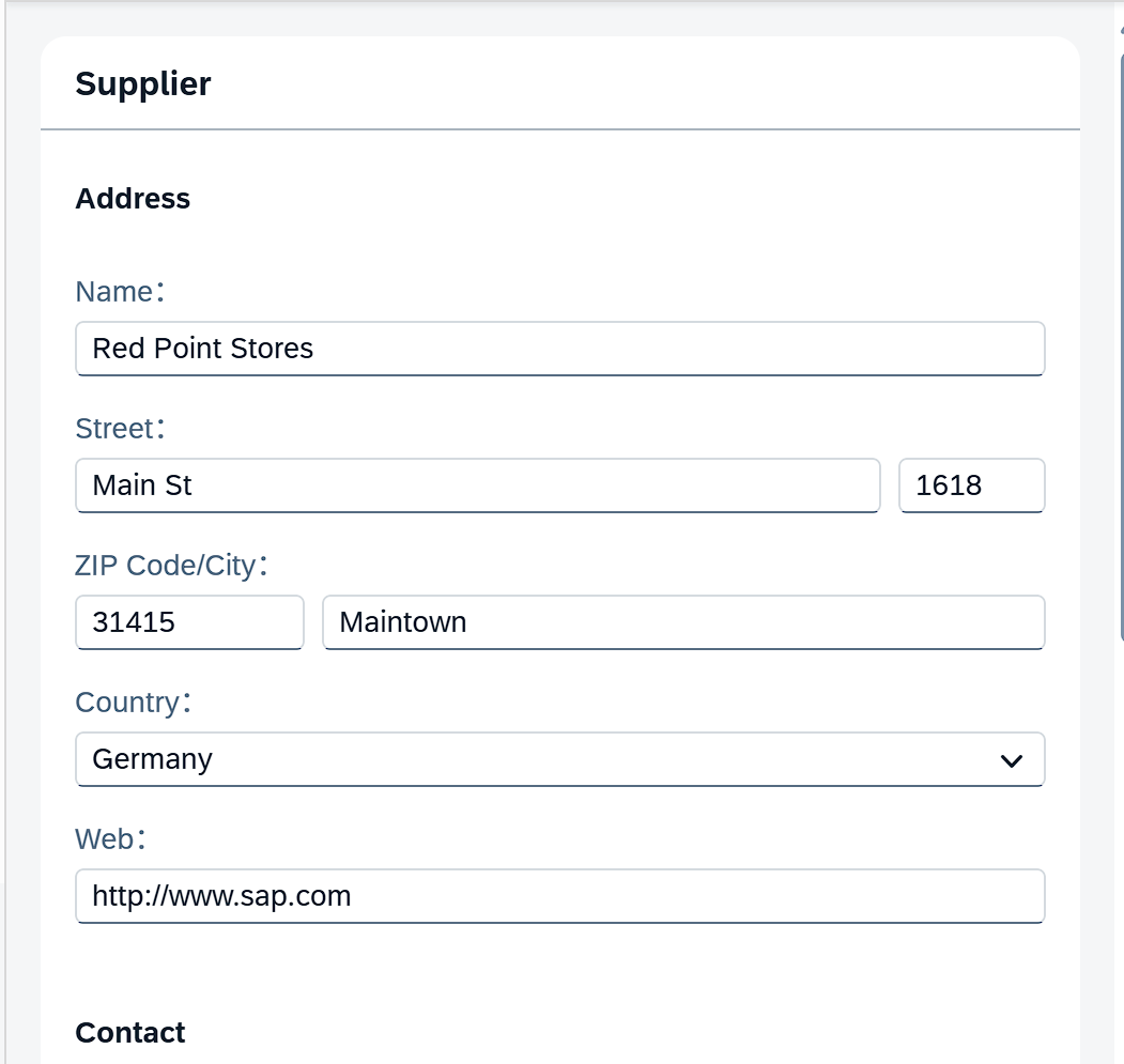
1.学习表单控件FORM之前我们先了解下哪些情况会使用到表单控件,最常见的场景就是需要我们输入一些字段,这时会弹出一个对话框给我们输入,例如这样:
2.那么我们学习使用Form控件。
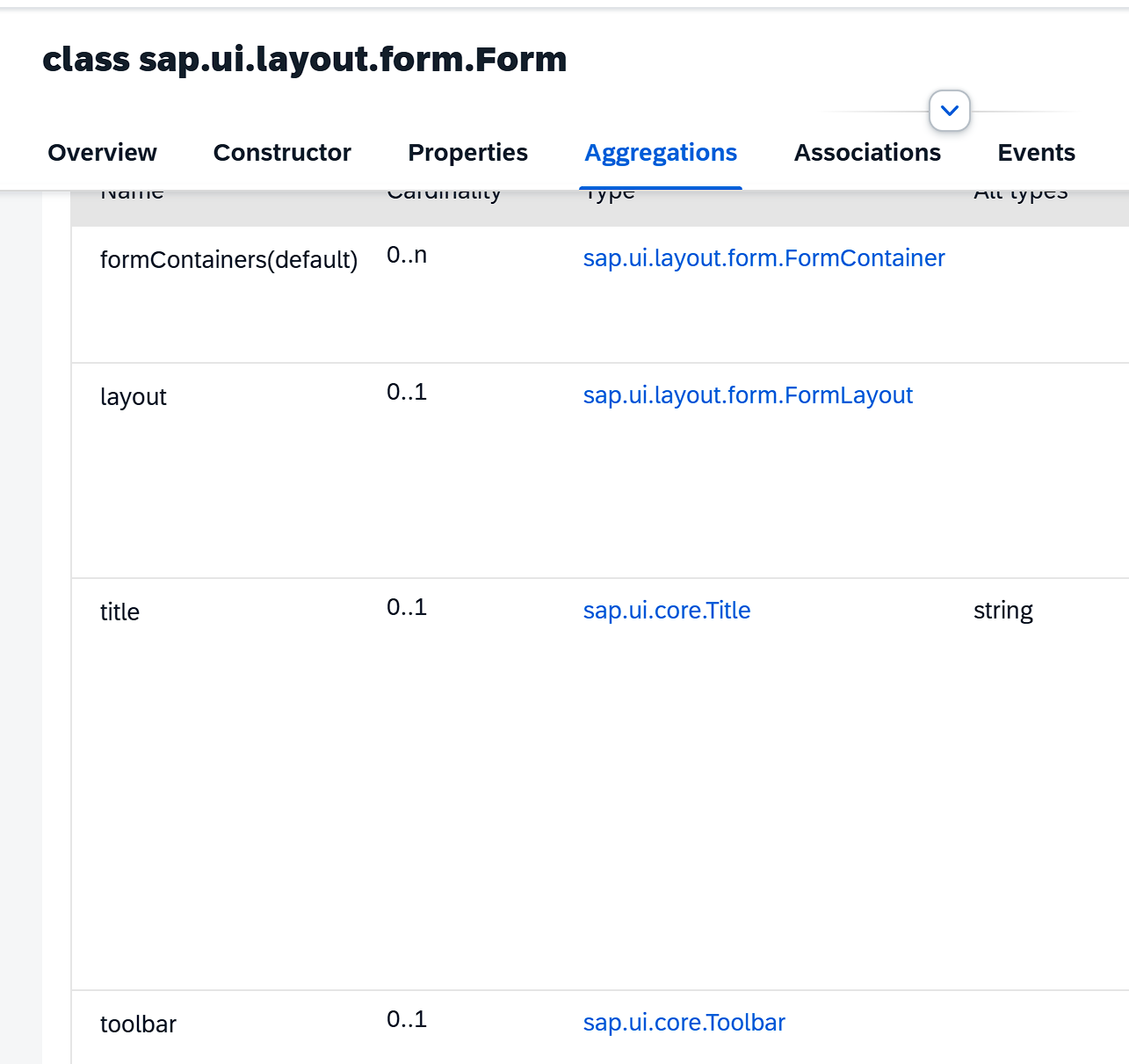
首先打开API参考看下,在class sap.ui.layout.form命名空间下找到Form控件,可以看到Form控件的常用属性,以及其类型,我们同样可以通过类型穿透进去看到其内部又有其他的什么属性:
formContainers:展示Form内容
layout:布局设置
title:标题
toolbar:工具栏
API样例Form。
3.基本上我们的学习思路就是这样,通过API了解控件,再通过样例去熟悉其中的用法。
4.我们根据样例,将上节课的页面修改一下,引入表单控件的命名空间
xmlns:l=“sap.ui.layout”
xmlns:f=“sap.ui.layout.form”
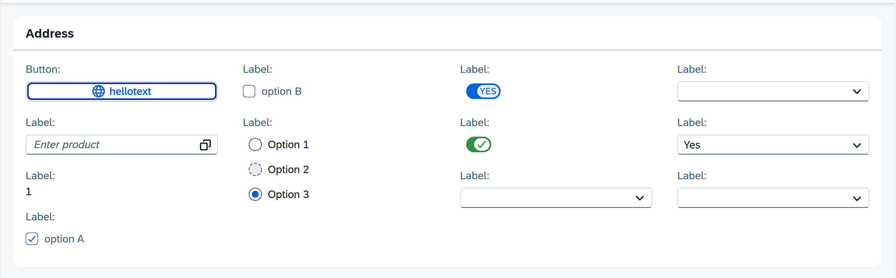
再分别将<f:title><f:formContainers> <f:layout>这几个属性嵌入进去,最后修改完就是这样子。其中layout属性里面有
columnsM=“2”
columnsL=“4”
columnsXL=“4”
指的是表单的列数,其中XL/L/M指的是界面尺寸,可以理解为不同设备展示时列数不同
<mvc:ViewcontrollerName="democontrol.controller.Overview"xmlns:mvc="sap.ui.core.mvc"xmlns="sap.m"xmlns:core="sap.ui.core"xmlns:l="sap.ui.layout"xmlns:f="sap.ui.layout.form"displayBlock="true"
>
<Page id="idpage"><HBox id="Vbox" class="sapUiSmallMargin"><f:Formid="FormDisplayColumn_oneGroup234"editable="false"><f:title><core:Titleid="idformtitle"text="Address"/></f:title><f:layout><f:ColumnLayoutid="idColumnLayout"columnsM="2"columnsL="4"columnsXL="4"/></f:layout><f:formContainers><f:FormContainer id="idFormContainer"><f:formElements><f:FormElementid="idButton"label="Button"><f:fields><Buttonid="button_hello"text="{i18n>hellotext}"press=".onSayHello"icon="sap-icon://world"/></f:fields></f:FormElement><f:FormElementid="idInput"label="Label"><f:fields><Inputid="productInput"placeholder="Enter product"showSuggestion="true"suggestionItems="{invoices>/Invoices}"showValueHelp="true"valueHelpRequest=".onValueHelpRequest"><suggestionItems><core:Itemid="suggestionItem"text="{invoices>ProductName}"/></suggestionItems></Input></f:fields></f:FormElement><f:FormElementid="idText"label="Label"><f:fields><Textid="tetx1"text="{firstModel>/text1}"/></f:fields></f:FormElement><f:FormElementid="idCheckBox1"label="Label"><f:fields><CheckBoxid="CheckBoxA"selected="true"text="option A"select="onSelectCheckBoxA"/></f:fields></f:FormElement><f:FormElementid="idCheckBox2"label="Label"><f:fields><CheckBoxid="CheckBoxB"selected="false"text="option B"select="onSelectCheckBoxB"/></f:fields></f:FormElement><f:FormElementid="idRadioButtonGroup"label="Label"><f:fields><RadioButtonGroupid="rbg2"columns="1"selectedIndex="2"class="sapUiMediumMarginBottom"select="onSelectRadio"><RadioButtonid="RB2-1"text="Option 1"/><RadioButtonid="RB2-2"text="Option 2"editable="false"/><RadioButtonid="RB2-3"text="Option 3"/></RadioButtonGroup></f:fields></f:FormElement><f:FormElementid="idSwitch1"label="Label"><f:fields><Switchid="switchId1"state="true"customTextOn="Yes"customTextOff="No"change="onSwitchChange1"/></f:fields></f:FormElement><f:FormElementid="idSwitch2"label="Label"><f:fields><Switchid="switchId2"type="AcceptReject"state="true"customTextOn="Yes"customTextOff="No"change="onSwitchChange2"/></f:fields></f:FormElement><f:FormElementid="idComboBox1"label="Label"><f:fields><ComboBoxid="comboBox1"change="onChangeCombox"><items><core:Itemid="comboBoxitem1"text="Yes"key="true"/><core:Itemid="comboBoxitem2"text="No"key="false"/></items></ComboBox></f:fields></f:FormElement><f:FormElementid="idComboBox2"label="Label"><f:fields><ComboBoxid="comboBox2"items="{SuggestModel>/}"change="onChangeCombox"selectedKey="{SuggestModel>/}"><items><core:Itemid="comboBox2item"text="{SuggestModel>value}"key="{SuggestModel>key}"/></items></ComboBox></f:fields></f:FormElement><f:FormElementid="idSelect1"label="Label"><f:fields><Select id="select1"><items><core:Itemid="selectitem1"text="Yes"key="true"/><core:Itemid="selectitem2"text="No"key="false"/></items></Select></f:fields></f:FormElement><f:FormElementid="idSelect2"label="Label"><f:fields><Selectid="select2"items="{suggestModel>/}"><items><core:Itemid="select2item"text="{suggestModel>value}"key="{suggestModel>key}"/></items></Select></f:fields></f:FormElement></f:formElements></f:FormContainer></f:formContainers></f:Form></HBox></Page>
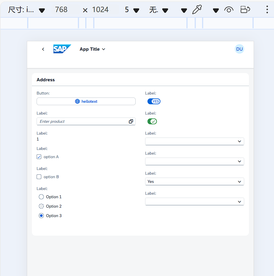
</mvc:View>当我们使用电脑显示时展示为4列
切换为Ipad尺寸时展示为了2列
5.表单控件我们初步了解到这里,有更深入的需求只需要查看样例,基本上都有。