使用原生button封装一个通用按钮组件
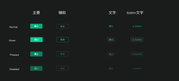
效果图
代码
<script lang="ts" setup>
import { computed, ref, watch } from "vue";/*** 按钮属性接口*/
interface ButtonProps {/** 按钮类型:default(默认)/dark/plain/link */type?: "default" | "dark" | "plain" | "link";/** 禁用状态 */disabled?: boolean;/** 按钮内容 */text?: string;/** 图标组件 */icon?: any;/** 图标宽度 */iconWidth?: number | string;/** 图标高度 */iconHeight?: number | string;/** 按钮宽度 */width?: number | string;/** 按钮高度 */height?: number | string;/** 宽度自适应 */widthAuto?: boolean;/** 高度自适应 */heightAuto?: boolean;/** 水平内边距 */paddingX?: number | string;/** 垂直内边距 */paddingY?: number | string;/** 自定义背景色 */backgroundColor?: string;/** 自定义边框 */border?: string;
}const props = withDefaults(defineProps<ButtonProps>(), {type: "default",disabled: false,text: "",icon: undefined,iconWidth: 14,iconHeight: 14,width: 92,height: 32,widthAuto: false,heightAuto: false,paddingX: 0,paddingY: 0,backgroundColor: "",border: ""
});/*** 导入图标*/
const iconSrc = ref("");/*** 处理图标路径*/
const loadIcon = () => {if (!props.icon) {iconSrc.value = "";return;}// 直接使用传入的图标路径或对象iconSrc.value = props.icon;
};// 初始加载图标
loadIcon();// 监听图标属性变化,重新加载图标
watch(() => props.icon,() => {loadIcon();}
);// 计算样式
const buttonClass = computed(() => {return {"ds-button": true,[`ds-button--${props.type}`]: true,"is-disabled": props.disabled,"is-custom-style": props.backgroundColor || props.border};
});// 计算图标样式
const iconStyle = computed(() => {return {width:typeof props.iconWidth === "number"? `${props.iconWidth}px`: props.iconWidth,height:typeof props.iconHeight === "number"? `${props.iconHeight}px`: props.iconHeight,marginRight: props.text ? "4px" : "0"};
});// 计算按钮样式
const buttonStyle = computed(() => {const paddingXValue = typeof props.paddingX === "number" ? `${props.paddingX}px` : props.paddingX;const paddingYValue = typeof props.paddingY === "number" ? `${props.paddingY}px` : props.paddingY;const style = {width: props.widthAuto ? "auto" : (typeof props.width === "number" ? `${props.width}px` : props.width),height: props.heightAuto ? "auto" : (typeof props.height === "number" ? `${props.height}px` : props.height),padding: props.paddingX || props.paddingY ? `${paddingYValue} ${paddingXValue}` : "",boxSizing: "border-box" as const};// 添加自定义背景色 - 支持所有CSS颜色值(包括rgba、hex、颜色名称、渐变等)if (props.backgroundColor && !props.disabled) {style["background"] = props.backgroundColor;}// 添加自定义边框if (props.border) {style["border"] = props.border;}return style;
});const emit = defineEmits(["click"]);/*** 按钮点击事件处理* @param event 鼠标事件*/
const handleClick = (event: MouseEvent) => {if (props.disabled) return;emit("click", event);
};
</script><template><button:class="buttonClass":style="buttonStyle":disabled="disabled"@click="handleClick"><img v-if="icon" :src="iconSrc" :style="iconStyle" /><span v-if="text">{{ text }}</span><slot v-else /></button>
</template><style lang="scss" scoped>
.ds-button {display: flex;align-items: center;justify-content: center;padding: 4px 16px;font-size: 14px;font-weight: 600;text-align: center;cursor: pointer;border: none;border-radius: 4px;outline: none;transition: all 0.3s;&.is-custom-style {&:hover:not(.is-disabled) {opacity: 0.9;}&:active:not(.is-disabled) {opacity: 0.8;}&.is-disabled {opacity: 0.5;cursor: not-allowed;}}&--default {color: #fff;background: #06ad7e;&:hover:not(.is-disabled) {background: #07ca93;}&:active:not(.is-disabled) {background: #008661;}&.is-disabled {color: rgb(255 255 255 / 50%);cursor: not-allowed;background: rgb(6 173 126 / 50%);}}&--dark {color: #06ad7e;background: rgb(240 251 248 / 10%);&:hover:not(.is-disabled) {background: rgb(240 251 248 / 15%);}&:active:not(.is-disabled) {color: #008661;background: rgb(255 255 255 / 2%);}&.is-disabled {color: rgb(6 173 126 / 50%);cursor: not-allowed;background: rgb(240 251 248 / 5%);}}&--plain {color: #06ad7e;background: transparent;&:hover:not(.is-disabled) {background: rgb(255 255 255 / 5%);}&:active:not(.is-disabled) {color: #008661;background: rgb(255 255 255 / 2%);}&.is-disabled {color: rgb(6 173 126 / 50%);cursor: not-allowed;}}&--link {color: #06ad7e;background: transparent;padding: 4px 0;&:hover:not(.is-disabled) {color: #07ca93;background: transparent;}&:active:not(.is-disabled) {color: #008661;background: transparent;}&.is-disabled {color: rgb(6 173 126 / 50%);cursor: not-allowed;background: transparent;}}
}
</style>
文档
DsButton 按钮组件
一个自定义按钮组件,提供多种样式类型和状态,适用于系统中的各种交互场景。
功能特点
- 支持四种样式类型:默认(default)、暗色(dark)、朴素(plain)和链接(link)
- 可自定义按钮尺寸、内容和图标
- 支持自定义背景色(支持rgba、渐变等所有CSS背景值)和边框样式
- 支持禁用状态
- 支持宽高自适应和自定义内边距
- 响应式设计,适应不同场景
组件API
属性
| 属性名 | 说明 | 类型 | 可选值 | 默认值 |
|---|---|---|---|---|
| type | 按钮类型 | string | default / dark / plain / link | default |
| disabled | 禁用状态 | boolean | true / false | false |
| text | 按钮文本内容 | string | - | ‘’ |
| icon | 图标路径 | string | - | undefined |
| iconWidth | 图标宽度 | number / string | - | 14 |
| iconHeight | 图标高度 | number / string | - | 14 |
| width | 按钮宽度 | number / string | - | 92 |
| height | 按钮高度 | number / string | - | 32 |
| widthAuto | 宽度自适应 | boolean | true / false | false |
| heightAuto | 高度自适应 | boolean | true / false | false |
| paddingX | 水平内边距 | number / string | - | 0 |
| paddingY | 垂直内边距 | number / string | - | 0 |
| backgroundColor | 自定义背景色 | string | 所有CSS颜色值/渐变 | ‘’ |
| border | 自定义边框 | string | CSS边框值 | ‘’ |
事件
| 事件名 | 说明 | 回调参数 |
|---|---|---|
| click | 点击按钮时触发 | event: MouseEvent |
使用示例
基础用法
<template><ds-button text="默认按钮" /><ds-button type="dark" text="暗色按钮" /><ds-button type="plain" text="朴素按钮" /><ds-button type="link" text="链接按钮" />
</template>
禁用状态
<template><ds-button text="默认按钮" disabled /><ds-button type="dark" text="暗色按钮" disabled /><ds-button type="plain" text="朴素按钮" disabled /><ds-button type="link" text="链接按钮" disabled />
</template>
带图标的按钮
<template><ds-button text="添加" icon="/src/assets/icons/add.png" /><ds-button type="plain" text="删除" icon="/src/assets/icons/delete.png" icon-width="16"icon-height="16"/><ds-button type="link" text="链接" icon="/src/assets/icons/link.png" />
</template>
自定义背景色和边框
<template><!-- 自定义背景色 - 十六进制 --><ds-button text="蓝色按钮" background-color="#3a7afe"/><!-- 自定义背景色 - rgba --><ds-button text="半透明按钮" background-color="rgba(58, 122, 254, 0.7)"/><!-- 自定义背景色 - 渐变 --><ds-button text="渐变按钮" background-color="linear-gradient(90deg, #3a7afe, #6c5ce7)"width="120"/><!-- 自定义边框 --><ds-button text="带边框按钮" type="plain"border="1px solid #34564c"/><!-- 背景色和边框都自定义 --><ds-button text="自定义样式" background-color="rgba(255, 103, 0, 0.8)"border="1px solid #ff6700"/>
</template>
自定义尺寸
<template><ds-button text="小按钮" width="80" height="28" /><ds-button text="中等按钮" width="100" height="36" /><ds-button text="大按钮" width="120" height="44" />
</template>
宽高自适应
<template><ds-button text="宽度自适应" width-auto /><ds-button text="高度自适应" height-auto /><ds-button text="宽高都自适应" width-auto height-auto />
</template>
自定义内边距
<template><ds-button text="自定义内边距" padding-x="20" padding-y="10" /><ds-button type="dark" text="更大的内边距" padding-x="30" padding-y="15"width-auto/>
</template>
使用插槽
除了使用text属性设置按钮内容外,还可以使用默认插槽:
<template><ds-button><span style="color: yellow">自定义内容</span></ds-button>
</template>
样式定制
按钮具有四种基本类型,每种类型有不同的样式:
-
default: 绿色背景,白色文字
- 悬停时背景色变亮
- 按下时背景色变暗
- 禁用时透明度降低
-
dark: 半透明背景,绿色文字
- 悬停时背景色变亮
- 按下时文字颜色变暗
- 禁用时透明度降低
-
plain: 透明背景,绿色文字
- 悬停时有轻微背景色
- 按下时文字颜色变暗
- 禁用时透明度降低
-
link: 透明背景,绿色文字,无边框和内边距
- 悬停时文字颜色变亮,无背景色变化
- 按下时文字颜色变暗,无背景色变化
- 禁用时透明度降低,鼠标样式为禁用状态
自定义样式
除了预设的四种类型,还可以通过以下属性自定义按钮样式:
-
backgroundColor: 设置按钮的背景,支持所有CSS背景属性值:
- 十六进制颜色:
#3a7afe - RGB/RGBA颜色:
rgb(58, 122, 254)或rgba(58, 122, 254, 0.7) - 颜色名称:
blue、red等 - 渐变:
linear-gradient(90deg, #3a7afe, #6c5ce7) - 其他CSS背景值
- 十六进制颜色:
-
border: 设置按钮的边框样式,可使用任何有效的CSS边框值
当使用自定义背景色或边框时,按钮的悬停和激活效果会变为透明度变化。
全局注册
该组件已通过index.ts配置为可全局注册:
import DsButton from '@/components/DsButton';app.use(DsButton);
注册后,可在任何组件中直接使用<ds-button>标签,无需单独导入。
注册入口
import type { App } from "vue";
import Button from "./index.vue";/*** 注册按钮组件*/
export default {install(app: App) {app.component("DsButton", Button);}
};export { Button as DsButton };