Day2:前端项目uniapp壁纸实战
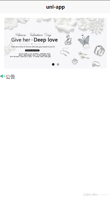
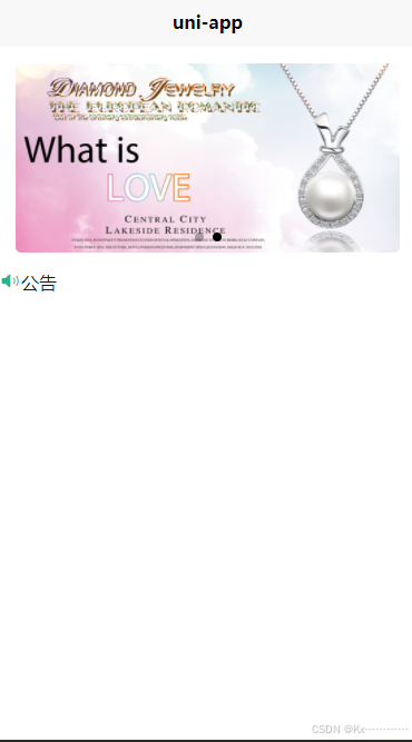
先来做一个轮番图。
效果如下:
common-style.css
view,swiper,swiper-item{
	box-sizing: border-box;
}
index.vue
<template>
<view class="homeLayout">
<view class="banner">
<swiper circular indicator-dots autoplay>
<swiper-item>
<image src="../../common/images/581c367aa65db_1024.jpg"
mode="aspectFill"></image>
</swiper-item>
<swiper-item>
<image src="../../common/images/581c449f64980_1024.jpg"
mode="aspectFill"></image>
</swiper-item>
</swiper>
</view>
</view>
</template>
<script setup>
</script>
<style lang="scss" scoped>
.homeLayout{
.banner{
width: 750rpx;
padding: 30rpx 0;
swiper{
width: 750rpx;
height: 340rpx;
swiper-item{
width: 100%;
height: 100%;
padding: 0 30rpx;
image{
width: 100%;
height: 100%;
border-radius: 10rpx;
}
}
}
}
}
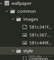
</style>图片素材如下:
 可以自己到网上下载图片素材,放到common下的image下
接下来做公告
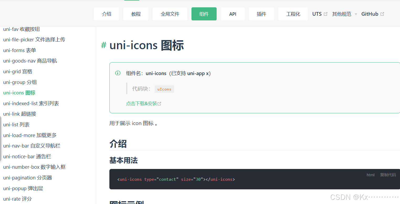
该音量图标到uniapp官网下载,
步骤如下:
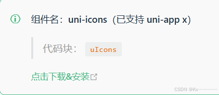
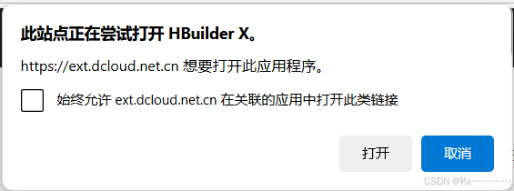
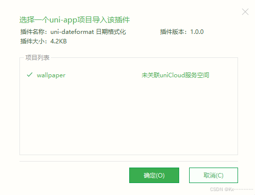
点击下载&安装
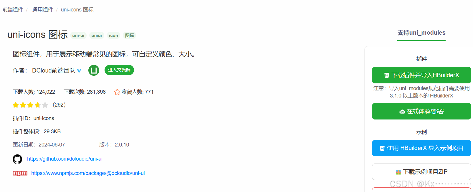
下载并导入
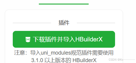
按打开
复制基本用法的代码
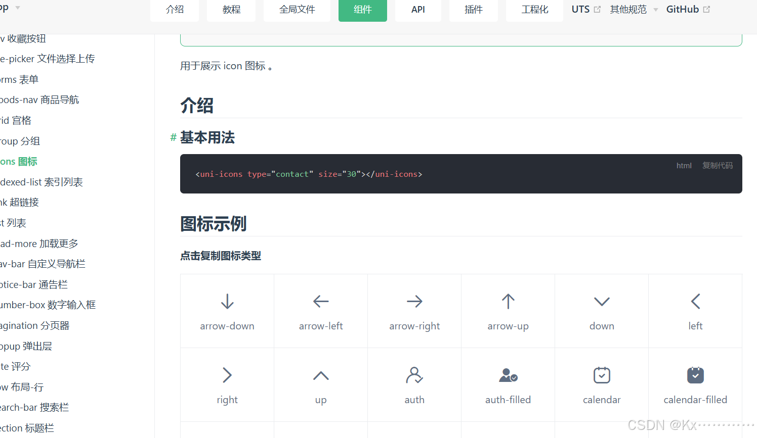
下滑找到音量
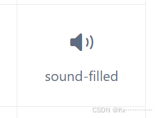
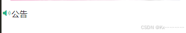
把基本用法的type=“contact”的contact改成sound-filled,可以调整大小和颜色。
如下:
<view class="notice">
<view class="left">
<uni-icons type="sound-filled" size="20" color="#28b389"></uni-icons>
<text class="text">公告</text>
</view>
<view class="center">
</view>
<view class="right">
</view>
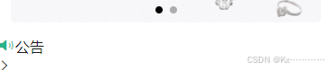
</view>同理,在right下加个箭头
<view class="right">
				<uni-icons type="right" size="16" color="#333"></uni-icons>
			</view>
效果如下:
调整一下:
<view class="notice">
			<view class="left">
				<uni-icons type="sound-filled" size="20" color="#28b389"></uni-icons>
				<text class="text">公告</text>
			</view>
			<view class="center">
				<swiper vertical autoplay interval="1500"  duration="300" circular>
					<swiper-item v-for="item in 4">文字内容文字内容文字内容文字内容文字内容</swiper-item>
				</swiper>
			</view>
			<view class="right">
				<uni-icons type="right" size="16" color="#333"></uni-icons>
			</view>
		</view>
<style lang="scss" scoped>
.homeLayout{
.banner{
width: 750rpx;
padding: 30rpx 0;
swiper{
width: 750rpx;
height: 340rpx;
swiper-item{
width: 100%;
height: 100%;
padding: 0 30rpx;
image{
width: 100%;
height: 100%;
border-radius: 10rpx;
}
}
}
}
.notice{
width: 690rpx;
height: 80rpx;
line-height: 80rpx;
background: #f9f9f9;
margin: 0 auto;
border-radius: 80rpx;
display: flex;
.left{
width: 140rpx;
display: flex;
align-items: center;
justify-content: center;
.text{
color: #28b389;
font-weight: 600;
font-size: 28rpx;
}
}
.center{
flex: 1;
swiper{
height: 100%;
swiper-item{
height: 100%;
font-size: 30rpx;
color: #666;
overflow: hidden;
white-space: nowrap;
text-overflow: ellipsis;
}
}
}
.right{
width: 70rpx;
display: flex;
align-items: center;
justify-content: center;
}
}
}
</style>
效果如下:
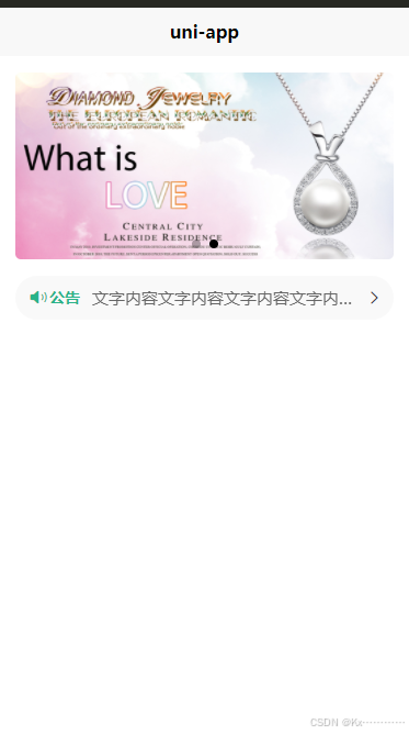
完整代码如下:
<template>
<view class="homeLayout">
<view class="banner">
<swiper circular indicator-dots autoplay>
<swiper-item>
<image src="../../common/images/581c367aa65db_1024.jpg"
mode="aspectFill"></image>
</swiper-item>
<swiper-item>
<image src="../../common/images/581c449f64980_1024.jpg"
mode="aspectFill"></image>
</swiper-item>
</swiper>
</view>
<view class="notice">
<view class="left">
<uni-icons type="sound-filled" size="20" color="#28b389"></uni-icons>
<text class="text">公告</text>
</view>
<view class="center">
<swiper vertical autoplay interval="1500" duration="300" circular>
<swiper-item v-for="item in 4">文字内容文字内容文字内容文字内容文字内容</swiper-item>
</swiper>
</view>
<view class="right">
<uni-icons type="right" size="16" color="#333"></uni-icons>
</view>
</view>
</view>
</template>
<script setup>
</script>
<style lang="scss" scoped>
	.homeLayout{
		.banner{
			width: 750rpx;
			padding: 30rpx 0;
			swiper{
				width: 750rpx;
				height: 340rpx;
				swiper-item{
					width: 100%;
					height: 100%;
					padding: 0 30rpx;
					image{
						width: 100%;
						height: 100%;
						border-radius: 10rpx;
					}
				}
			}
		}
		.notice{
			width: 690rpx;
			height: 80rpx;
			line-height: 80rpx;
			background: #f9f9f9;
			margin: 0 auto;
			border-radius: 80rpx;
			display: flex;
			.left{
				width: 140rpx;
				display: flex;
				align-items: center;
				justify-content: center;
				.text{
					color: #28b389;
					font-weight: 600;
					font-size: 28rpx;
				}
			}
			.center{
				flex: 1;
				swiper{
					height: 100%;
					swiper-item{
						height: 100%;
						font-size: 30rpx;
						color: #666;
						overflow: hidden;
						white-space: nowrap;
						text-overflow: ellipsis;
					}
				}
			}
			.right{
				width: 70rpx;
				display: flex;
				align-items: center;
				justify-content: center;
			}
		}
	}
</style>