flex布局实例:把色子放进盒子里
目录
一、flex布局实例:把色子放进盒子里
1、基础样式
二、justify-content 属性
三、flex-direction 属性
四、align-items 属性
五、flex-wrap 属性
二、flex布局应用到常见场景
非常详细的讲解flex布局,看一看,练一练!
一、色子场景示例
核心知识点:display: flex将容器变为弹性容器,内部元素(色子)变为弹性项目,遵循 flex 布局规则。
假设我们有一个盒子(容器)和1- 6 个色子(项目),每个色子代表一个 flex 项目。如果不了解flex布局,请先阅读 Flex弹性布局
1、基础样式
制作色子布局的基础样式,以下实例都需要用到如下样式:
<style>
/* 主容器:使用Flex布局排列6个色子面 */.dice-container {display: flex;flex-wrap: wrap;gap: 20px;padding: 20px;}/* 每个色子面的基本样式 */.dice {display: flex;width: 100px;height: 100px;border: 2px solid black;border-radius: 10px;background-color: white;padding: 10px;}/* 点的样式 */.dot {width: 20px;height: 20px;border-radius: 50%;background-color: black;}
</style>
二、justify-content 属性

以下是css样式和html代码
.justify-start-example {justify-content: flex-start;}
<div class="dice justify-start-example"><div class="dot"></div>
</div>
以下是css样式和html代码
.justify-end-example {justify-content: flex-end;} <div class="dice justify-end-example"><div class="dot"></div></div>
以下是css样式和html代码
.justify-center-example {justify-content: center;}<div class="dice justify-center-example"><div class="dot"></div></div>
以下是css样式和html代码
.justify-space-between-example {justify-content: space-between;}<div class="dice justify-space-between-example"><div class="dot"></div><div class="dot"></div></div>

以下是css样式和html代码
.justify-space-around-example {justify-content: space-around;}<div class="dice justify-space-around-example"><div class="dot"></div><div class="dot"></div></div>

以下是css样式和html代码
.justify-space-evenly-example {justify-content: space-evenly;}<div class="dice justify-space-evenly-example"><div class="dot"></div><div class="dot"></div></div>三、flex-direction 属性

以下是css样式和html代码
.flex-direction-row {flex-direction: row;}<div class="dice flex-direction-row"><div class="dot"></div><div class="dot"></div></div>
以下是css样式和html代码
.flex-direction-column {flex-direction: column;}<div class="dice flex-direction-column"><div class="dot"></div><div class="dot"></div></div>

以下是css样式和html代码
.flex-direction-row-reverse {flex-direction: row-reverse;}<div class="dice flex-direction-row-reverse"><div class="dot white textcenter">1</div><div class="dot white textcenter">2</div></div>
以下是css样式和html代码
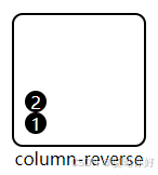
.flex-direction-column-reverse {flex-direction: column-reverse;}<div class="dice flex-direction-column-reverse"><div class="dot white textcenter">1</div><div class="dot white textcenter">2</div></div>
四、align-items 属性

以下是css样式和html代码
.align-items-flex-start {align-items: flex-start;}<div class="dice align-items-flex-start"><div class="dot"></div></div>

以下是css样式和html代码
.align-items-flex-end {align-items: flex-end;}<div class="dice align-items-flex-end"><div class="dot"></div></div>

以下是css样式和html代码
.align-items-center {align-items: center;}<div class="dice align-items-center"><div class="dot"></div></div>

以下是css样式和html代码
.align-items-baseline {align-items: baseline;}<div class="dice align-items-baseline"><div style="background-color: aquamarine; padding: 5px; font-size: 12px;">1</div><div style="background-color: aquamarine; padding: 5px; font-size: 28px;">2</div><div style="background-color: aquamarine; padding: 5px; font-size: 18px;">3</div></div>

以下是css样式和html代码
.align-items-stretch {align-items: stretch;}<div class="dice align-items-stretch"><div style="background-color: aquamarine; padding: 5px; color:#000">1</div><div style="background-color: aquamarine; padding: 5px; color:#000">2</div></div>
五、flex-wrap 属性
以下是css样式和html代码
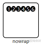
.flex-wrap-nowrap {flex-wrap: nowrap;}<div class="dice flex-wrap-nowrap"><div class="dot white textcenter">1</div><div class="dot white textcenter">2</div><div class="dot white textcenter">3</div><div class="dot white textcenter">4</div><div class="dot white textcenter">5</div><div class="dot white textcenter">6</div></div>
以下是css样式和html代码
.flex-wrap-wrap {flex-wrap: wrap;}<div class="dice flex-wrap-wrap"><div class="dot white textcenter">1</div><div class="dot white textcenter">2</div><div class="dot white textcenter">3</div><div class="dot white textcenter">4</div><div class="dot white textcenter">5</div><div class="dot white textcenter">6</div><div class="dot white textcenter">7</div><div class="dot white textcenter">8</div></div>

以下是css样式和html代码
.flex-wrap-wrap-reverse {flex-wrap: wrap-reverse;}<div class="dice flex-wrap-wrap-reverse"><div class="dot white textcenter">1</div><div class="dot white textcenter">2</div><div class="dot white textcenter">3</div><div class="dot white textcenter">4</div><div class="dot white textcenter">5</div><div class="dot white textcenter">6</div><div class="dot white textcenter">7</div><div class="dot white textcenter">8</div></div>
二、flex布局应用到常见场景

.dice.one {justify-content: center;align-items: center;}
/* 两点:对角 */.dice.two {justify-content: space-between;}.dice.two .dot:nth-child(2) {align-self: flex-end;}
/* 三点:对角 */.dice.three {justify-content: space-between;}.dice.three .dot:nth-child(2) {align-self: center;}.dice.three .dot:nth-child(3) {align-self: flex-end;}
/* 四点:2x2网格 */.dice.four {flex-wrap: wrap;justify-content: space-between;align-content: space-between;}.dice.four .column {flex-basis: 100%;display: flex;justify-content: space-between;}
/* 五点:4角+中心 */.dice.five {flex-wrap: wrap;justify-content: space-between;align-content: space-between;}.dice.five .column {flex-basis: 100%;display: flex;justify-content: space-between;}.dice.five .column:nth-child(2) {justify-content: center;}
/* 六点:3x2网格 */.dice.six {flex-wrap: wrap;justify-content: space-between;align-content: space-between;}.dice.six .column {flex-basis: 100%;display: flex;justify-content: space-between;}实例结合理论【 flex布局基础知识 】一定能做的很好!小伙伴们动手练习起来吧!