微信小程序页面容器弹出层
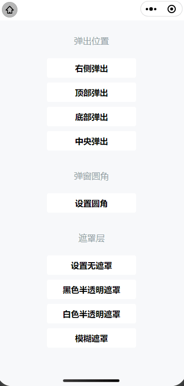
效果图
.JS
Page({data: {show: false,duration: 300,position: 'right',round: false,overlay: true,customStyle: '',overlayStyle: ''},popup(e) {const position = e.currentTarget.dataset.positionlet customStyle = ''let duration = this.data.durationswitch(position) {case 'top':case 'bottom': customStyle = 'height: 30%;'breakcase 'right':break}this.setData({position,show: true,customStyle,duration})},changeRound() {this.setData({round: !this.data.round})},changeOverlay() {this.setData({overlay: !this.data.overlay, show: true})},changeOverlayStyle(e) {let overlayStyle = ''const type = e.currentTarget.dataset.typeswitch(type) {case 'black':overlayStyle = 'background-color: rgba(0, 0, 0, 0.7)'breakcase 'white':overlayStyle = 'background-color: rgba(255, 255, 255, 0.7)'breakcase 'blur':overlayStyle = 'background-color: rgba(0, 0, 0, 0.7); filter: blur(4px);'}this.setData({overlayStyle, show: true})},exit() {this.setData({show: false})},
})
.WXML
<view class="title">弹出位置</view>
<view class="box"><button class="btn" bindtap="popup" data-position="right">右侧弹出</button><button class="btn" bindtap="popup" data-position="top">顶部弹出</button><button class="btn" bindtap="popup" data-position="bottom">底部弹出</button><button class="btn" bindtap="popup" data-position="center">中央弹出</button>
</view><view class="title">弹窗圆角</view>
<view class="box"><button class="btn" bindtap="changeRound">设置{{round ? '直角' : '圆角'}}</button>
</view><view class="title">遮罩层</view>
<view class="box"><button class="btn" bindtap="changeOverlay">设置{{overlay ? '无' : '有'}}遮罩</button><button class="btn" bindtap="changeOverlayStyle" data-type="black">黑色半透明遮罩</button><button class="btn" bindtap="changeOverlayStyle" data-type="white">白色半透明遮罩</button><button class="btn" bindtap="changeOverlayStyle" data-type="blur">模糊遮罩</button></view><page-container show="{{show}}"round="{{round}}"overlay="{{overlay}}"duration="{{duration}}"position="{{position}}"close-on-slide-down="{{false}}"bindbeforeenter="onBeforeEnter"bindenter="onEnter"bindafterenter="onAfterEnter"bindbeforeleave="onBeforeLeave"bindleave="onLeave"bindafterleave="onAfterLeave"bindclickoverlay="onClickOverlay"custom-style="{{customStyle}}"overlay-style="{{overlayStyle}}"
><view class="detail-page"><button type="primary" bindtap="exit">推出</button></view>
</page-container>
.WXSS
page {background-color: #f7f8fa;color: #323232;width: 100%;height: 100%;
}.box {margin: 0 12px;
}.title {margin: 0;padding: 32px 16px 16px;color: rgba(69, 90, 100, 0.6);font-weight: normal;font-size: 18px;line-height: 20px;text-align: center;
}.btn {display: block;width: 100%;margin: 10px 0;background-color: #fff;
}.detail-page {width: 100%;height: 100%;min-height: 300px;display: flex;align-items: center;justify-content: center;
}
官方文档
https://developers.weixin.qq.com/miniprogram/dev/component/page-container.html
遇到问题可以看我主页加我Q,很少看博客,对你有帮助别忘记点赞收藏。