uni-app项目实战笔记2--使用swiper实现纵向轮播图
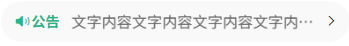
先来看效果:
分析:效果图由左中右三个部分组成:
1.左边:小喇叭和公告,我们可以使用uniapp官方文档的扩展组件中的图标来实现;
2.公告内容;
3.右箭头,使用uniapp官方文档的扩展组件中的图标来实现。
因此在html层面,需要准备3个容器构成左中右3个部分的页面效果。扩展组件的引入在前面文章中有介绍,这里不再赘述,直接上代码:
<view class="notice"><view class="left"><uni-icons type="sound-filled" size="20" color="#28b389"></uni-icons><text class="text">公告</text></view><view class="center"><swiper vertical autoplay interval="1500" duration="300" circular=""><swiper-item v-for="item in 4">文字内容文字内容文字内容文字内容文字内容文字内容文字内容</swiper-item></swiper></view><view class="rignt"><uni-icons type="right" size="16" color="#333"></uni-icons></view>
</view>
代码分析:
1.上面type="sound-filled"实现小喇叭的效果,type=“right”实现右箭头的效果;
2.<swiper vertical autoplay interval="1500" duration="300" circular>实现的效果有:
vertical
轮播方向为 垂直滚动(从上到下或从下到上),默认是水平方向。
autoplay
开启 自动轮播,无需手动滑动。
interval="1500"
自动轮播的间隔时间为 1500毫秒(1.5秒)。
duration="300"
滑动动画的时长为 300毫秒(影响切换的流畅度,值越小越快)。
circular
开启 循环轮播,滑动到最后一项时会无缝衔接回到第一项。
最后来看SCSS样式设置
.notice{width: 690rpx;height: 80rpx;line-height: 80rpx;background: #f9f9f9;border-radius: 80rpx;margin: 0 auto;display: flex;.left{width: 140rpx;display: flex;justify-content: center;align-items: center;.text{color: #28b389 !important;font-weight: 600 !important;font-size: 28rpx !important;}}.center{flex: 1;swiper{height: 100%;swiper-item{height: 100%;font-size: 30rpx;color: #666;overflow: hidden;white-space: nowrap;text-overflow: ellipsis;}}}.rignt{width: 70rpx;display: flex;justify-content: center;align-items: center;}}SCSS代码分析:
1. 外层容器 .notice
.notice {width: 690rpx;          // 宽度为 690rpx(响应式单位)height: 80rpx;          // 固定高度 80rpxline-height: 80rpx;     // 文字垂直居中(单行文本)background: #f9f9f9;    // 浅灰色背景border-radius: 80rpx;   // 圆形圆角(高度的一半,实现胶囊形状)margin: 0 auto;         // 水平居中display: flex;          // 启用 Flex 布局
}效果:
一个 浅灰色胶囊形 的横向容器,宽度占屏,高度固定,内部元素水平排列。
2. 左侧区域 .left
.left {width: 140rpx;                   // 固定宽度display: flex;                   // Flex 子布局justify-content: center;         // 内容水平居中align-items: center;             // 内容垂直居中.text {color: #28b389;                // 文字颜色为绿色font-weight: 600;              //加粗font-size: 28rpx;              // 文字大小 28rpx}
}
效果:
-
左侧是一个固定宽度的区域,内部包含一个 绿色加粗文字(如“公告”图标或文本)。
-
文字强制居中显示。
3. 中间区域 .center
.center {flex: 1;                        // 占据剩余全部空间swiper {                        // 嵌套 swiper 组件height: 100%;                 // 高度撑满父容器swiper-item {                 // 轮播项height: 100%;               // 高度撑满font-size: 30rpx;           // 文字大小color: #666;                // 灰色文字overflow: hidden;           // 超出隐藏white-space: nowrap;        // 禁止换行text-overflow: ellipsis;    // 超出显示省略号}}
}效果:
-
中间区域是一个 横向滚动的轮播容器(
swiper),用于显示公告文字。 -
文字单行显示,超出部分自动截断并显示省略号(
...)。 -
常见用途:滚动公告文字(如“最新活动:XXX...”)。
4. 右侧区域 .right
.right {width: 70rpx;                   // 固定宽度display: flex;                  // Flex 子布局justify-content: center;        // 内容水平居中align-items: center;            // 内容垂直居中
}效果:
-
右侧是一个固定宽度的区域,通常放置图标(如“更多”箭头或关闭按钮)。
-
内容强制居中显示。