css之flex属性
llex属性是css3推出的新的弹性布局
采用flex布局的容器,称为弹性容器,也称为弹性盒子
容器中的子元素也被称为弹性项目
容器里面默认两条轴,分别是主轴和侧轴
容器中的元素,默认是沿主轴排列
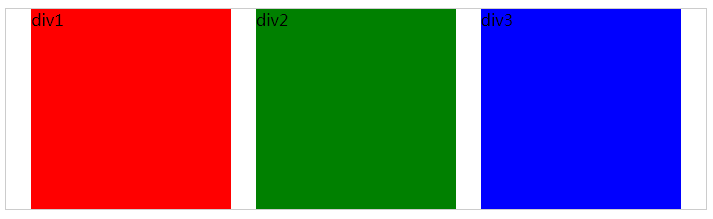
首先设置一个div容器,里面有五个小容器,html代码如下
<div class="container"><div class="d1">div1</div><div class="d2">div2</div><div class="d3">div3</div><div class="d4">div4</div> <div class="d5">div5</div></div>初始css如下
.container {width: 700px;height: 200px;border: 1px solid #ccc;
}.container>div {width: 200px;}.d1 {background: red;}.d2 {background: green;}.d3 {background: blue;}.d4 {background: yellow;}.d5 {background: pink;}
这段css代码表示外边的container盒子宽700,高200,,里面的盒子宽200,不设高,每个盒子均设有不同的背景颜色
效果如下图
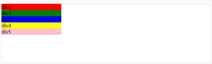
初始设置弹性盒子
css代码如下
.container {width: 700px;height: 200px;border: 1px solid #ccc;display:flex;
}
语法:
在display属性上设置flex属性值
flex需要设置其他属性值
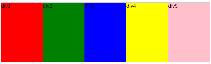
首先是flow-direction属性
默认值是row
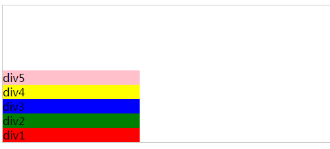
row-reverse,子元素沿水平方向反向排列
.container {width: 700px;height: 200px;border: 1px solid #ccc;display:flex;flex-direction:row-reverse;}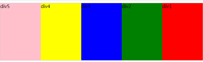
column,子元素沿垂直方向排列
.container {width: 700px;height: 200px;border: 1px solid #ccc;display:flex;flex-direction:column;}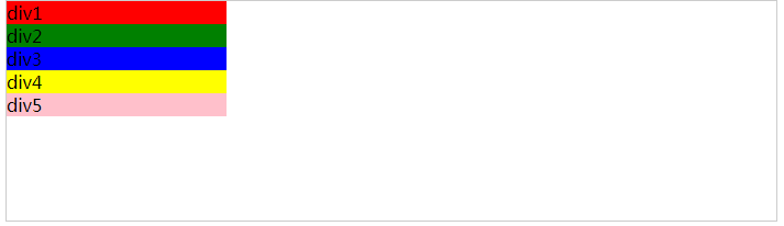
column-reverse:子元素沿垂直方向反向排列,起点在下方
flex-wrap:是否换行
默认值是nowrap,不换行,如果容器宽度不足以容纳子元素,子元素可能会压缩或者溢出
wrap是换行
.container {width: 700px;height: 200px;border: 1px solid #ccc;display:flex;flex-wrap:wrap;}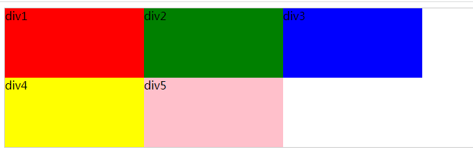
wrap-reverse,与wrap相反,从最后一行向上排列
.container {width: 700px;height: 200px;border: 1px solid #ccc;display:flex;flex-wrap:wrap-reverse;}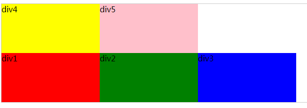
justify-content:设置主轴对齐方式
属性值
flex-start:默认值,从起点开始排列
flex-end:子元素向flex容器的末端对齐
.container {width: 700px;height: 200px;border: 1px solid #ccc;display:flex;justify-content:flex-end;}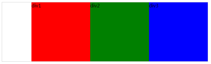
center:子元素居中对齐
.container {width: 700px;height: 200px;border: 1px solid #ccc;display:flex;justify-content:center;}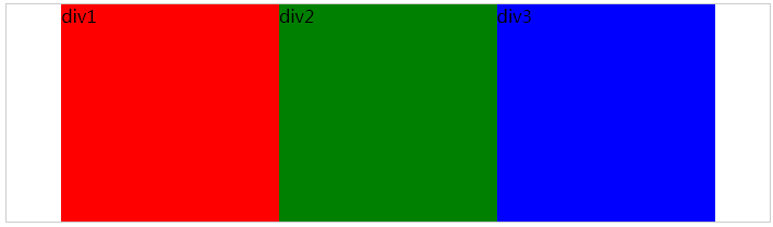
space-between:第一个子元素在起始位置,最后一个在末端,其余均匀分布。
.container {width: 700px;height: 200px;border: 1px solid #ccc;display:flex;justify-content:space-between;}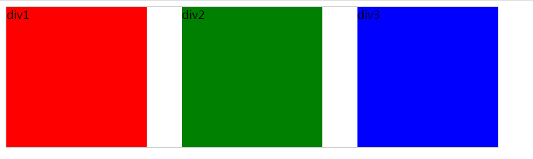
space-around:子元素周围分配等间距,首尾间距为中间间距的一半。
.container {width: 700px;height: 200px;border: 1px solid #ccc;display:flex;justify-content:space-around;}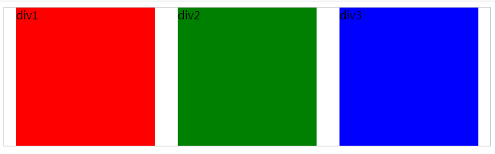
space-evenly:子元素均匀分布,首尾间距与中间间距相同
.container {width: 700px;height: 200px;border: 1px solid #ccc;display:flex;justify-content:space-evenly;}