SAP学习笔记 - 开发32 - 前端Fiori开发 Content Density(内容密度)
上一章讲了Device Adaptation(设备自适应)。
SAP学习笔记 - 开发31 - 前端Fiori开发 Device Adaptation(设备自适应)-CSDN博客
本章继续学习Fiori开发的知识。
目录
1,Content Density(内容密度)
1-1,主要内容
两种模式
应用场景
开发实现
重要性
2,实例
1),Component.js
2),App.controller.js
3),manifest.json
a. 两种密度模式
b. 默认行为
4),运行看效果
3,总结
下面是详细内容。
1,Content Density(内容密度)
Content Density(内容密度)是SAP Fiori设计系统中的一个重要概念,它决定了用户界面元素的视觉紧凑程度。
1-1,主要内容
-
定义:Content Density指的是UI控件和元素在屏幕上的空间分布方式,影响用户界面的紧凑程度。
-
两种模式
-
Cozy(宽松):默认模式,元素间有更多空间,触摸友好
-
Compact(紧凑):元素排列更紧密,适合鼠标操作和高级用户
-
-
应用场景
-
移动设备通常使用Cozy模式
-
桌面应用可以根据用户偏好选择Compact模式
-
数据密集型应用可能更适合Compact模式
-
-
开发实现
-
可以通过CSS类(
sapUiSizeCozy/sapUiSizeCompact)控制 -
可以在组件、视图或应用级别设置
-
支持运行时动态切换
-
-
重要性
-
影响用户体验和可用性
-
适应不同设备和用户群体
-
是Fiori设计准则的一部分
-
在Fiori开发中正确使用Content Density可以确保应用既美观又实用,同时满足不同用户的操作习惯。
下面来看具体的实例。
2,实例
SAPUI5 SDK - Demo Kit
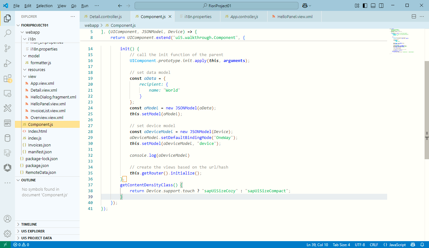
1),Component.js
sap.ui.define(["sap/ui/core/UIComponent","sap/ui/model/json/JSONModel","sap/ui/Device"
], (UIComponent, JSONModel, Device) => {"use strict";return UIComponent.extend("ui5.walkthrough.Component", {metadata: {interfaces: ["sap.ui.core.IAsyncContentCreation"],manifest: "json"},init() {// call the init function of the parentUIComponent.prototype.init.apply(this, arguments);// set data modelconst oData = {recipient: {name: "World"}};const oModel = new JSONModel(oData);this.setModel(oModel);// set device modelconst oDeviceModel = new JSONModel(Device);oDeviceModel.setDefaultBindingMode("OneWay");this.setModel(oDeviceModel, "device");console.log(oDeviceModel)// create the views based on the url/hashthis.getRouter().initialize();},getContentDensityClass() {return Device.support.touch ? "sapUiSizeCozy" : "sapUiSizeCompact";}});
});
- 根据是否触摸设备,来决定CSS
sapUiSizeCozy:宽松设备(比如PC)
sapUiSizeCompact:紧凑设备(比如手机,平板)
getContentDensityClass() {
return Device.support.touch ? "sapUiSizeCozy" : "sapUiSizeCompact";
}
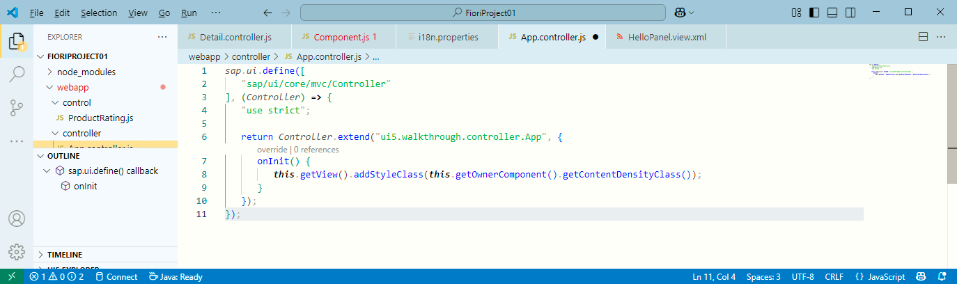
2),App.controller.js
sap.ui.define(["sap/ui/core/mvc/Controller"
], (Controller) => {"use strict";return Controller.extend("ui5.walkthrough.controller.App", {onInit() {this.getView().addStyleClass(this.getOwnerComponent().getContentDensityClass());}});
});
- this.getView().addStyleClass(this.getOwnerComponent().getContentDensityClass());
其实就是调用 Component.js 里面的 getContentDensityClass 方法
3),manifest.json
{"_version": "1.65.0","sap.app": {"id": "ui5.walkthrough","i18n": "i18n/i18n.properties","title": "{{appTitle}}","description": "{{appDescription}}","type": "application","applicationVersion": {"version": "1.0.0"},"dataSources": {"invoiceRemote": {"uri": "V2/Northwind/Northwind.svc/","type": "OData","settings": {"odataVersion": "2.0"}}}},"sap.ui": {"technology": "UI5","deviceTypes": {"desktop": true,"tablet": true,"phone": true}},"sap.ui5": {"dependencies": {"minUI5Version": "1.108.0","libs": {"sap.ui.core": {},"sap.m": {}}},"models": {"i18n": {"type": "sap.ui.model.resource.ResourceModel","settings": {"bundleName": "ui5.walkthrough.i18n.i18n","supportedLocales": [""],"fallbackLocale": ""}},"invoice": {"dataSource": "invoiceRemote"}},"rootView": {"viewName": "ui5.walkthrough.view.App","type": "XML","id": "app"},"resources": {"css": [{"uri": "css/style.css"}]},"routing": {"config": {"routerClass": "sap.m.routing.Router","type": "View","viewType": "XML","path": "ui5.walkthrough.view","controlId": "app","controlAggregation": "pages"},"routes": [{"pattern": "","name": "overview","target": "overview"},{"pattern": "detail/{invoicePath}","name": "detail","target": "detail"}],"targets": {"overview": {"id": "overview","name": "Overview"},"detail": {"id": "detail","name": "Detail"}}},"contentDensities": {"compact": true,"cozy": true}}
}
- 定义两个配置项
"contentDensities": {
"compact": true,
"cozy": true
}
- 定义这个东西的用途:
- 表示应用同时支持 compact 和 cozy 模式
- UI5 会根据运行环境(桌面/移动)自动选择合适的密度
- 开发者也可以手动切换(如通过 sap.ui.getCore().applyThemeDensity("compact"))
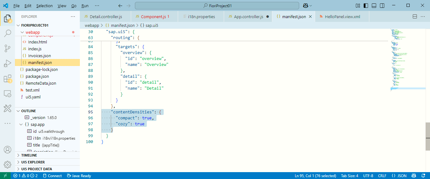
有关密度模式:
a. 两种密度模式
- compact: true
适用于 桌面端(鼠标操作)
UI 控件更紧凑,减少间距,适合数据密集型应用
例如:表格行高较小,按钮间距更窄
- cozy: true
适用于 移动端/触摸设备
UI 控件更大,间距更宽,便于手指操作
例如:列表项更高,按钮更大
b. 默认行为
- 如果 contentDensities 未定义,UI5 会根据 设备类型 自动选择默认密度:
桌面设备 → compact
移动设备 → cozy
- 如果显式配置 contentDensities,则应用仅支持指定的密度模式。
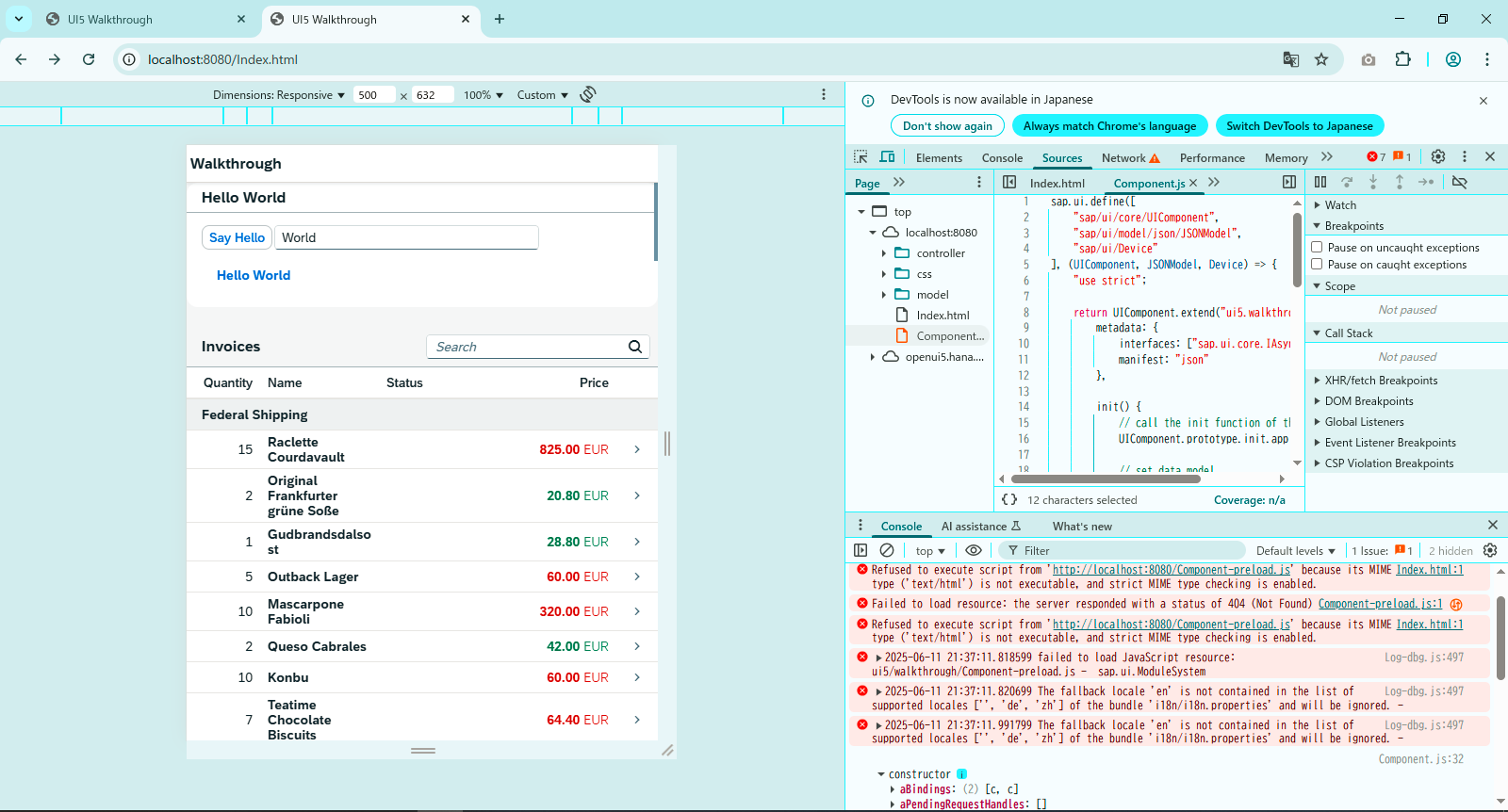
4),运行看效果
<修改前> 从下面文章里面拷贝的图片
SAP学习笔记 - 开发30 - 前端Fiori开发 Responsiveness(响应式设计)-CSDN博客
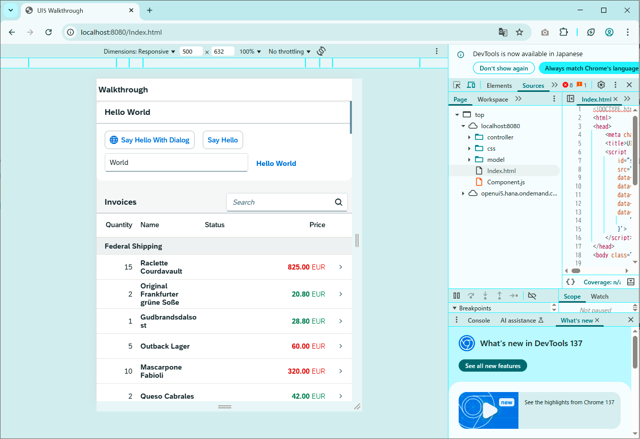
<修改后>
差别不是很大,感觉也就是Textbox框高度小了些,也许字体大小也有点儿不同,差别不大
或许在真的触摸设备上比较明显吧。
3,总结
Fiori的卖点之一就是也可以用在移动设备上。
- 响应式设计 Responsiveness 讲的是某一列的隐藏;
- 设备自适应 Device Adaptation 讲的是某一区域的折叠;
SAP学习笔记 - 开发30 - 前端Fiori开发 Responsiveness(响应式设计)-CSDN博客
SAP学习笔记 - 开发31 - 前端Fiori开发 Device Adaptation(设备自适应)-CSDN博客
- 内容密度 Content Density 讲的是页面总体遵循某一类风格,
当设备切换的时候,会适用某一套CSS
以上就是本篇的全部内容。
更多SAP顾问业务知识请点击下面目录链接或东京老树根的博客主页
https://blog.csdn.net/shi_ly/category_12216766.html
东京老树根-CSDN博客