Uniapp实现多选下拉框
文章目录
- 前言
- 一、效果展示
- 1.1 下拉效果图
- 1.2 下拉选择效果图
- 1.3 选择显示效果图
- 二、组件源码
- 2.1.CustomCheckbox.vue源码
- 2.2.niceui-popup-select.vue源码
- 三、demo.vue代码演示
前言
之前在使用Uniapp时,一直都是下拉框单选。今天某个项目需求需要使用Uniapp实现下拉框多选效果。由于Uniapp自身没有这个功能,因此只能在插件市场选择一个别人封装好的插件,我选择的是niceui-popup-select下拉选择器(支持多选)。可能是我下载的版本问题,实现效果不太满足我们的需求,因此对该插件源码进行修改调整。
一、效果展示
修改后支持动态配置下拉显示字段和选择完成后的显示列表效果
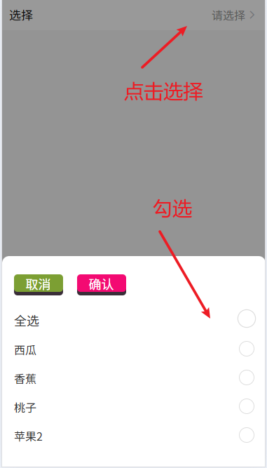
1.1 下拉效果图
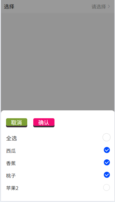
1.2 下拉选择效果图
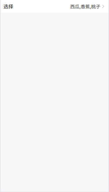
1.3 选择显示效果图
二、组件源码
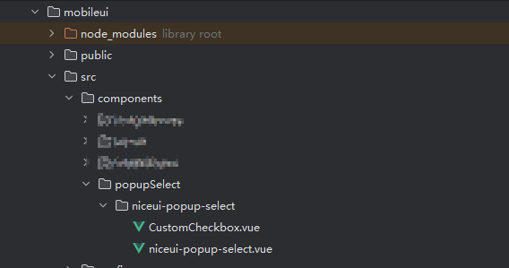
将核心组件代码CustomCheckbox.vue、niceui-popup-select.vue放到components文件下,如果没有components,可以按照图结构进行目录场景
2.1.CustomCheckbox.vue源码
<template><view class="custom-checkbox" :class="[{'is-checked': isChecked}]" @click="toggle" :style="[labelStyle]"><input type="checkbox" :checked="isChecked" @change="onChange" /><text class="checkmark" :style="[circleStyle]"></text><text class="serve-info">{{label}}</text></view>
</template><script>
export default {props: {value: Boolean,disabled: {type: Boolean,default: false},label:{type:[String,Number],default:''},fontSize:{type:String,default:''},color:{type:String,default:''},circleSize:{type:String,default:''},circleColor:{type: String,default:""}},computed: {isChecked: {get() {return this.value;},set(val) {this.$emit('input', val);}},labelStyle() {let styles = {}if (this.fontSize) {styles.fontSize = this.fontSize}if (this.color) {styles.color = this.color}return styles;},circleStyle(){let styles = {}if (this.circleSize) {styles.transform = this.circleSize}if (this.circleColor) {if(this.isChecked){styles.backgroundColor = this.circleColor}}return styles;}},methods: {toggle() {if (!this.disabled) {this.isChecked = !this.isChecked;this.$emit('toggle', !this.isChecked);}},onChange(event) {this.$emit('change', event.target.checked);}}
};
</script><style scoped lang="scss">
.custom-checkbox {display: flex;align-items: center;position: relative;padding-left: 1rpx;margin-bottom: 0rpx;cursor: pointer;font-size: 32rpx;-webkit-user-select: none;-moz-user-select: none;-ms-user-select: none;user-select: none;margin: 35rpx 0;
}.custom-checkbox input {position: absolute;opacity: 0;cursor: pointer;height: 0;width: 0;
}.checkmark {position: absolute;top:1rpx;margin-bottom:0rpx;right: 0;height: 40rpx;width: 40rpx;/* background-color: #eee; */border:solid 1rpx #ddd;border-radius: 50%;
}.custom-checkbox:hover input .checkmark {background-color: #ccc;
}.custom-checkbox input:checked .checkmark {background-color: blue;
}.checkmark:after {content: "";position: absolute;display: none;
}.custom-checkbox input:checked .checkmark:after {display: block;
}.custom-checkbox .checkmark:after {left: 13rpx;top: 6rpx;width: 12rpx;height: 19rpx;border: solid white;border-width: 0 5rpx 5rpx 0;-webkit-transform: rotate(45deg);-ms-transform: rotate(45deg);transform: rotate(45deg);
}.is-checked .checkmark {background-color: blue;border:solid 0rpx #ddd;
}.is-checked .checkmark:after {display: block;
}.big-area{width: 160rpx;height: 220rpx;position: absolute;z-index:10;top: -155rpx;left: -85rpx;
}
.checkbox-all{margin-top: 160rpx;margin-left: 63rpx;
}
</style>
2.2.niceui-popup-select.vue源码
<template><uni-popup ref="popup" :animation="false" :isMaskClick="1===0" :maskClick="1===0"><view class="popup-content"><view class="popup-content-main"><view class="picker__toolbar justify-between"><view class="picker__cancel" @click="cancel">取消</view><view class="picker__confirm" @click="onConfirm">确认</view></view><scroll-view class="picker__content" scroll-y="true"><view class="uni-list" v-if="multiple"><custom-checkbox v-model="checkedAll" label="全选" @toggle="toggleAll"fontSize="36rpx" circleSize="scale(1.2)" :color="color" :circleColor="circleColor"/></view><view class="uni-list" v-if="multiple"><template v-if="columnsData.length>0"><custom-checkbox v-model="item.checked" :label="item[option.label]" @toggle="toggleIt($event,item,index)" v-for="(item,index) in columnsData" :key="item[option.value]":fontSize="labelFontSize" :circleSize="circleSize" :color="color" :circleColor="circleColor"/></template><template v-else><view class="no__data">{{noData}}</view></template></view><view class="uni-list" v-else><template v-if="columnsData.length>0"><custom-checkbox v-model="item.checked" :label="item[option.label]" @toggle="toggleIt($event,item,index)" v-for="(item,index) in columnsData" :key="item[option.value]":fontSize="labelFontSize" :circleSize="circleSize" :color="color" :circleColor="circleColor"/></template><template v-else><view class="no__data">{{noData}}</view></template></view>	</scroll-view></view></view></uni-popup>
</template><script>
import CustomCheckbox from './CustomCheckbox.vue'
export default {name: 'NiceuiPopupSelect',components:{CustomCheckbox},props: {columns: {type: Array,default: function () {return []}},selectValue: {type: Array,default: function () {return []}},option: {type: Object,default: function () {return { label: 'label', value: 'value'}}},multiple: {type: Boolean,default: true},labelFontSize:{type: String,default:"32rpx"},color:{type: String,default:"#333"},circleSize:{type: String,default:"scale(1)"},circleColor:{type: String,default:"#004aff"}},data () {return {searchKey: '',columnsData: [],checkedValue:[],checkedAll: false,resultValue:[],noData:'没有更多内容了',value:false}},methods: {getData (val) {const res = this.columnsData?.filter(item => {return val.indexOf(item[this.option.value]) > -1})return res},onConfirm () {const ck = this.columnsData.filter(d=>d.checked==true)const ids = ck.map(d=>d.id)this.$emit('confirm', ids, this.getData(ids))},cancel () {this.closePopup()},showPopup(){this.columnsData = JSON.parse(JSON.stringify(this.columns))this.columnsData.forEach(d=>d.checked=false)this.checkedValue = JSON.parse(JSON.stringify(this.selectValue))if(this.checkedValue&&this.checkedValue.length>0){this.columnsData.forEach(d=>{if(this.checkedValue.includes(d.id)){d.checked = true}})if(this.checkedValue.length!=this.columnsData.length){this.checkedAll = false}else{this.checkedAll = true}}else{this.checkedAll = false}this.$refs.popup.open('bottom')},closePopup(){this.$refs.popup.close()},toggleIt(v,item,index){if(this.multiple){item.checked= vthis.$set(this.columnsData,index,item)if(!v){this.checkedAll = false}else{const ck = this.columnsData.filter(d=>d.checked===false)if(ck.length===0){this.checkedAll = true}}}else{this.columnsData.forEach(d=>d.checked=false)item.checked=truethis.$set(this.columnsData,index,item)}},toggleAll (v) {this.checkedAll = vif(this.checkedAll){this.columnsData.forEach(d=>d.checked=true)}else{this.columnsData.forEach(d=>d.checked=false)}},}
}
</script><style lang="scss" scoped>//结果弹窗::v-deep .close-view{height: 130rpx;image{width: 100rpx;height: 100rpx;}}::v-deep .popup-content{border-top-left-radius: 20rpx;border-top-right-radius: 20rpx;background-color: #fff;padding: 1rpx;width: 100vw;// height: 70vh;// overflow-y: scroll;.popup-content-main{margin: 50rpx auto 30rpx;.picker__toolbar{box-sizing: border-box;margin:20rpx 32rpx;font-size:$uni-font-size-lg;display: flex;align-items: center;.picker__cancel{width: 70px;height: 25px;border: none;text-align: center;border-radius: 5px;color: #fff;font-size: 18px;background-color: #7c9f33;box-shadow: 0 5px 0 #3a2e38;cursor: pointer;outline: none;}.picker__confirm{margin-left: 20px;width: 70px;height: 25px;border: none;text-align: center;border-radius: 5px;color: #fff;font-size: 18px;background-color: #f30a72;box-shadow: 0 5px 0 #3a2e38;cursor: pointer;outline: none;}.picker__title{font-size: 38rpx;color:#6f6f6f;}}.picker__content{max-height:500rpx;overflow-y:auto;.keyword-input{font-size: 35rpx;}.check__all{box-sizing: border-box;margin:20rpx 23rpx 20rpx 32rpx;padding:20rpx 0rpx;border-bottom:solid 1rpx #f7f7f7;display: flex;justify-content: space-between;.check__all_left{color:#666;font-size: 32rpx;}.check__all_right{}}.uni-list{box-sizing: border-box;margin:20rpx 32rpx;label{padding:20rpx 0rpx;border-bottom:solid 1rpx #f7f7f7;}.uni-list-cell{.cell-label{font-size: 35rpx;}checkbox{//transform:scale(0.8,0.8)}}.no__data{color:#999;font-size: 30rpx;text-align: center;margin-top: 50rpx;}}}}}.bottom-line{border-bottom: solid 3rpx #eee;margin:20rpx 32rpx;height: 72rpx;}
</style>
三、demo.vue代码演示
demo代码演示了如何使用组件实现自己想要的下拉效果,直接复制运行即可实现章节一的展示效果
<template><view class="content"><view class="uni-list-cell"><view class="uni-list-cell-left">选择</view><view class="uni-list-cell-db"><view class="as-input" @click="openSelectPopup"><view class="placeholder" v-if="checkedDynamicComputed===undefined||checkedDynamicComputed===''">请选择</view><view class="as-content" v-else>{{checkedDynamicComputed}}</view><uni-icons type="forward" size="16" color="#c0c4cc" class="customer-icon"></uni-icons></view></view></view><niceui-popup-select ref="showFruit" :columns="selectList" :selectValue="checkedResult" :is-search="false" :option="{label:selectLabel, value:selectKey}" @confirm="confirmCheck"/></view>
</template><script>
import NiceuiPopupSelect from '@/components/popupSelect/niceui-popup-select/niceui-popup-select.vue'
export default {components:{NiceuiPopupSelect},data() {return {selectLabel:"code",//下拉框选项显示时,显示指定字段的值selectKey:"id",//下拉框选择时,选中后获取的字段值selectList:[{id:1,code:'西瓜',},{id:2,code:'香蕉'},{id:3,code:'桃子'},{id:4,code:'苹果2'},],checkedResult:[],checkedLabels:[],}},computed:{checkedDynamicComputed(){return this.checkedLabels.join(",");},},methods: {openSelectPopup(){this.$refs.showFruit.showPopup()},/**** @param selectKeysValues 选中中的selectKey列的值集合* @param data  选中多行数据的集合*/confirmCheck(selectKeysValues,data) {this.checkedResult = selectKeysValuesthis.checkedLabels=[];//清除原始内容data.map(item=>{//对显示内容进行处理,可以进行多个字段进行拼接// this.checkedLabels.push(item[this.selectLabel]+"_"+item[this.selectKey])//可以指定将某字段作为显示值this.checkedLabels.push(item[this.selectLabel])})this.$refs.showFruit.closePopup()},}
}
</script><style lang="scss" scoped>
.content{background-color: #f7f7f7;width: 100vw;height: 100vh;}
.uni-title{font-size: 33rpx;font-weight: bold;padding: 20rpx 20rpx;
}
.uni-list-cell{background-color: #fff;display: flex;justify-content: space-between;align-items: center;padding: 20rpx 20rpx;.uni-list-cell-left{font-size: 35rpx;}
}
.uni-list-cell-db{flex:1
}
.as-input{width: 100%;display: flex;align-items: center;justify-content: flex-end;.customer-icon{padding: 0 0 0 5rpx;}.placeholder{font-size:33rpx;color:#999;}.as-content{color: #333;font-size: 33rpx;width: 370rpx;text-align: right;}
}
</style>