Python绘图库及图像类型之基础图表
折线图(plot)
绘图库介绍
Python中绘制折线图的全面指南_python绘制折线图-CSDN博客![]() https://blog.csdn.net/2301_81064905/article/details/139689644
https://blog.csdn.net/2301_81064905/article/details/139689644
| 核心作用 | 说明 |
|---|---|
| 趋势分析 | 揭示数据随时间推移的上升/下降趋势、周期性波动或转折点 |
| 变化对比 | 在单一图表中对比多个变量(如不同产品销量)的变化轨迹 |
| 异常检测 | 快速识别数据中的突变点(如系统故障、市场异动) |
| 连续性表达 | 强调数据在连续维度(时间、顺序)上的演变过程 |
| 预测参考 | 基于历史趋势推断未来走向(需结合统计模型) |
| 场景分类 | 具体案例 | 图表特点 |
|---|---|---|
| 时间序列分析 | • 股票价格波动 • 月度销售额变化 • 年度气温趋势 | X轴为时间单位 Y轴为连续数值 |
| 性能监控 | • 服务器CPU使用率 • 网站日活用户数 • 应用程序响应延迟 | 常需实时更新 突出异常阈值 |
| 科学实验 | • 化学试剂浓度变化 • 物理实验测量值 • 生物种群数量追踪 | 强调变量间关系 需误差线辅助 |
| 商业决策 | • 不同渠道获客成本对比 • 产品迭代的用户留存率 • 营销活动ROI趋势 | 多线对比 标注关键节点 |
| 健康管理 | • 患者体温监测 • 运动心率变化 • 血糖水平记录 | 个人数据跟踪 关联事件标记 |
基础参数(Underlying Parameter)
plt.plot(x, y, fmt, **kwargs)
#或者
ax.plot(x, y, fmt, **kwargs)| 参数 | 描述 | 示例 |
|---|---|---|
x | X轴数据 (可迭代对象) | [1, 2, 3, 4] |
y | Y轴数据 (可迭代对象) | [5, 3, 8, 2] |
fmt | 格式字符串 (颜色-标记-线型) | 'ro--' (红色圆圈虚线) |
颜色 (Color)
| 代码 | 颜色 | 示例 |
|---|---|---|
'b' | 蓝色 | 'b' |
'g' | 绿色 | 'g' |
'r' | 红色 | 'r' |
'c' | 青色 | 'c' |
'm' | 品红 | 'm' |
'y' | 黄色 | 'y' |
'k' | 黑色 | 'k' |
'w' | 白色 | 'w' |
标记 (Marker)
| 代码 | 标记 | 示例 |
|---|---|---|
'.' | 点 | '.' |
'o' | 圆圈 | 'o' |
's' | 正方形 | 's' |
'D' | 菱形 | 'D' |
'^' | 上三角 | '^' |
'v' | 下三角 | 'v' |
'+' | 加号 | '+' |
'x' | 叉号 | 'x' |
'*' | 星号 | '*' |
线型 (Linestyle)
| 代码 | 线型 | 示例 |
|---|---|---|
'-' | 实线 | '-' |
'--' | 虚线 | '--' |
'-.' | 点划线 | '.-' |
':' | 点线 | ':' |
如果想实现更加精细的控制可以用下述的参数。
线条控制(Line Control)
-
color/c: 线条颜色 (名称或十六进制) -
linestyle/ls: 线型样式 -
linewidth/lw: 线宽 (浮点数) -
alpha: 透明度 (0-1)
标记控制(Mark Control)
-
marker: 标记样式 -
markersize/ms: 标记大小 -
markeredgecolor/mec: 标记边缘颜色 -
markerfacecolor/mfc: 标记填充颜色
其他控制(Other Controls)
-
label: 图例标签 -
visible: 是否显示 (True/False) -
zorder: 绘图顺序 (数值越大越靠前)
特殊参数(Special Parameters)
-
data: 指定数据来源对象 (如DataFrame) -
scalex,scaley: 是否自动缩放坐标轴 (默认为True)
返回值(Returned Value)
plot() 函数返回一个包含 Line2D 对象的列表,每个对象代表绘制的一条线。这些对象可用于后续的图形操作。
示例代码
import matplotlib.pyplot as plt
import numpy as np# 设置中文显示
plt.rcParams['font.sans-serif'] = ['SimHei']  # 用来正常显示中文标签
plt.rcParams['axes.unicode_minus'] = False    # 用来正常显示负号# 创建数据
months = ['1月', '2月', '3月', '4月', '5月', '6月','7月', '8月', '9月', '10月', '11月', '12月']
sales = [85, 70, 92, 88, 78, 95, 105, 112, 98, 120, 135, 150]# 创建图表和坐标轴
fig, ax = plt.subplots(figsize=(12, 8))  # 增加高度以容纳表格# 绘制折线图
line, = ax.plot(months, sales, marker='o', linestyle='-', color='#1f77b4',linewidth=2, markersize=8, label='月销售额')# 添加数据点标签
for i, (m, s) in enumerate(zip(months, sales)):ax.annotate(f'{s}万',  # 标签文本xy=(i, s),  # 数据点位置xytext=(0, 10),  # 文本位置偏移量textcoords='offset points',ha='center',  # 水平居中fontsize=9,color='dimgray')# 添加最高点注解
max_index = sales.index(max(sales))
ax.annotate('年度最高销售额',xy=(max_index, sales[max_index]),xytext=(max_index-1, sales[max_index]-20),arrowprops=dict(arrowstyle='->', color='red', connectionstyle="arc3"),fontsize=10,bbox=dict(boxstyle="round,pad=0.3", fc="white", ec="red", alpha=0.8),color='red')# 添加趋势线(线性回归)
x = np.arange(len(months))
fit = np.polyfit(x, sales, 1)
trend_line = np.polyval(fit, x)
ax.plot(months, trend_line, 'r--', label='销售趋势')# 添加标题和标签
ax.set_title('2023年公司月度销售额分析', fontsize=16, pad=20)
ax.set_xlabel('月份', fontsize=12, labelpad=10)
ax.set_ylabel('销售额 (万元)', fontsize=12, labelpad=10)# 设置网格线
ax.grid(True, linestyle='--', alpha=0.7)# 设置Y轴范围
ax.set_ylim(60, 160)# 添加图例
ax.legend(loc='upper left', frameon=True, shadow=True)# 修正后的数据表格 - 使用更合理的布局
# 准备表格数据
table_data = [['月份'] + months,['销售额(万)'] + [str(s) for s in sales]
]# 创建表格
table = plt.table(cellText=table_data,cellLoc='center',loc='bottom',bbox=[0, -0.25, 1, 0.15]  # 调整表格位置和大小
)# 设置表格样式
table.auto_set_font_size(False)
table.set_fontsize(10)
table.scale(1, 1.5)  # 增加行高# 设置表头样式
for i in range(2):table[(0, i)].set_facecolor('#f0f0f0')table[(0, i)].set_text_props(weight='bold')# 设置最高值单元格样式
table[(1, max_index+1)].set_facecolor('#ffdddd')
table[(1, max_index+1)].set_text_props(color='red', weight='bold')# 调整布局
plt.subplots_adjust(bottom=0.2)  # 为表格留出适当空间# 添加脚注
plt.figtext(0.5, 0.01, '数据来源: 公司财务部 | 制图日期: 2023-12-31 | 单位: 万元',ha='center', fontsize=9, color='gray')
# 保存图表为图片
plt.savefig('line_chart.png',dpi=300,bbox_inches='tight',facecolor='white',  # 设置背景色edgecolor='none'    # 去除边框
)# 显示图表
plt.show()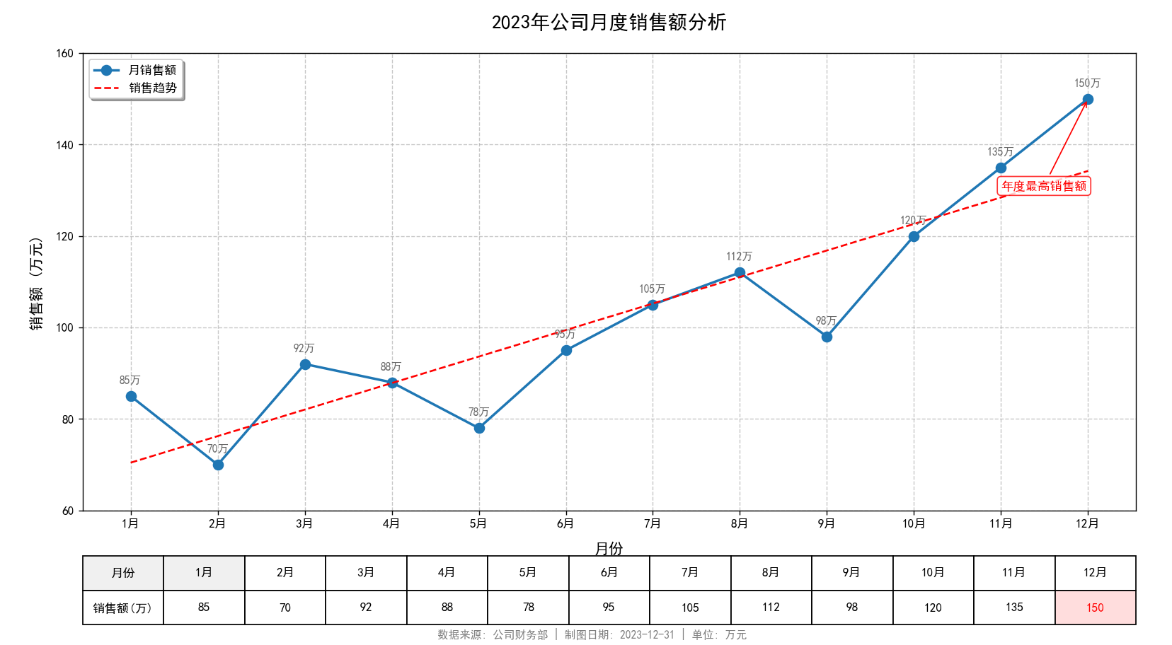
散点图(scatter)
绘图库介绍
建筑兔零基础自学python记录8|学画散点图/Scatter plot-CSDN博客![]() https://blog.csdn.net/tzcnancy/article/details/145395941
https://blog.csdn.net/tzcnancy/article/details/145395941
| 核心作用 | 说明 |
|---|---|
| 相关性分析 | 直观展示变量间的正相关/负相关/无相关关系 |
| 分布模式识别 | 发现数据聚类、离群点或非线性模式 |
| 异常值检测 | 快速定位偏离主体分布的异常数据点 |
| 变量关系探索 | 为回归分析、聚类等建模提供前期洞察 |
| 多维数据映射 | 通过颜色/大小添加第三、第四维度信息 |
| 场景分类 | 具体案例 | 图表特点 |
|---|---|---|
| 科学研究 | • 身高与体重的关系 • 药物剂量与疗效关联 • 基因表达相关性 | 常配合回归线 使用颜色区分实验组 |
| 商业分析 | • 广告投入与销售额 • 用户年龄与消费金额 • 产品特性偏好 | 气泡大小表示交易量 多组数据对比 |
| 金融风控 | • 收入与信用评分 • 交易频率与金额 • 欺诈行为识别 | 突出异常点 划分风险区域 |
| 工业制造 | • 温度与产品良率 • 压力与材料强度 • 设备参数优化 | 标注控制边界 显示误差范围 |
| 地理信息 | • 城市人口与GDP • 气候站温湿度分布 • 疫情传播热点 | 结合地图坐标 热力图叠加 |
函数签名(Function Signature)
plt.scatter(x, y,                     # 必需:点的坐标s=None,                   # 点的大小c=None,                   # 点的颜色marker=None,              # 点的形状cmap=None,                # 颜色映射norm=None,                # 颜色归一化vmin=None, vmax=None,     # 颜色范围限制alpha=None,               # 透明度linewidths=None,          # 边缘线宽edgecolors=None,          # 边缘颜色plotnonfinite=False,      # 是否绘制非有限值data=None,                # 数据源**kwargs                  # 其他属性
)
必需参数(Required Parameter)
| 参数 | 类型 | 说明 |
|---|---|---|
| x, y | array-like | 点的 x 和 y 坐标数据(长度必须相同) |
主要可选参数(Main Selectable Parameters)
| 参数 | 类型 | 默认值 | 说明 |
|---|---|---|---|
| s | scalar or array | None (20) | 点的大小(以点为单位,是面积的平方) |
| c | color or array | None ('b') | 点的颜色(单一颜色或数值数组) |
| marker | str | 'o' | 点的形状('o', 's', '^', 'D' 等) |
| alpha | scalar | None | 透明度(0-1,0完全透明) |
| linewidths | scalar or array | None (1.5) | 点边缘的线宽 |
| edgecolors | color or array | 'face' | 点边缘的颜色('face'表示与填充色相同) |
颜色映射参数(Color Mapping Parameters)
| 参数 | 说明 |
|---|---|
| cmap | 颜色映射对象或名称(如 'viridis', 'jet', 'coolwarm') |
| norm | 归一化对象(用于将数值映射到 [0,1] 区间) |
| vmin, vmax | 与 norm 结合使用,定义颜色映射的数据范围 |
其他参数(Other Parameters)
| 参数 | 说明 |
|---|---|
| plotnonfinite | 是否绘制 NaN 或 inf 值(默认 False) |
| data | 数据源对象(可使用列名代替数据数组) |
| label | 用于图例的标签 |
| zorder | 绘图顺序(数值越大越靠上) |
示例代码
import matplotlib.pyplot as plt
import numpy as np
import matplotlib.font_manager as fm
from scipy.stats import pearsonr# 在绘图代码前添加字体设置
plt.rcParams['font.sans-serif'] = ['Arial Unicode MS', 'SimHei', 'Arial']  # 优先使用支持符号的字体
plt.rcParams['axes.unicode_minus'] = False  # 解决负号显示问题# ==================== 解决中文显示问题 ====================
# 方法1:尝试使用系统自带的中文字体
try:# Windows 系统常用中文字体路径font_path = 'C:/Windows/Fonts/simhei.ttf'  # 黑体# font_path = 'C:/Windows/Fonts/msyh.ttc'  # 微软雅黑chinese_font = fm.FontProperties(fname=font_path)plt.rcParams['font.family'] = 'sans-serif'font_entry = fm.findfont(fm.FontProperties(fname=font_path))plt.rcParams['font.sans-serif'] = [fm.get_font(font_entry).family_name]use_custom_font = True
except:# 方法2:尝试使用Matplotlib内置的中文支持plt.rcParams['font.sans-serif'] = ['SimHei', 'Microsoft YaHei', 'KaiTi', 'FangSong', 'STXihei', 'sans-serif']plt.rcParams['axes.unicode_minus'] = False  # 解决负号显示问题use_custom_font = False# 方法3:如果上述方法都不行,使用英文标题
use_english = False  # 设为True则使用英文标题# ==================== 创建模拟数据 ====================
# 设置随机种子确保结果可复现
np.random.seed(42)# 生成数据点数量
n = 150# 创建正相关数据
positive_x = np.random.randn(n) * 2
positive_y = positive_x * 1.5 + np.random.randn(n) * 1.5# 创建负相关数据
negative_x = np.random.randn(n) * 2 + 8
negative_y = negative_x * (-1.2) + np.random.randn(n) * 1.8 + 15# 创建无相关数据
random_x = np.random.randn(n) * 2 + 4
random_y = np.random.randn(n) * 3 + 8# 组合所有数据
all_x = np.concatenate([positive_x.ravel(), negative_x.ravel(), random_x.ravel()])
all_y = np.concatenate([positive_y.ravel(), negative_y.ravel(), random_y.ravel()])
categories = np.array(['正相关'] * n + ['负相关'] * n + ['无相关'] * n)
sizes = np.abs(np.random.randn(3 * n) * 30 + 20)  # 点的大小
colors = np.random.rand(3 * n)  # 点的颜色值# ==================== 创建散点图 ====================
plt.figure(figsize=(14, 10))# 绘制不同类别的散点
for i, category in enumerate(['正相关', '负相关', '无相关']):idx = categories == categoryplt.scatter(all_x[idx], all_y[idx],s=sizes[idx],c=colors[idx],alpha=0.7,  # 透明度edgecolor='black',  # 点边缘颜色linewidths=0.5,  # 点边缘宽度label=category,  # 图例标签cmap='viridis')  # 颜色映射# ==================== 添加注解和装饰 ====================# 添加标题和坐标轴标签
if use_english or not use_custom_font:plt.title('Scatter Plot with Detailed Annotations', fontsize=18, pad=20)plt.xlabel('X Variable', fontsize=14)plt.ylabel('Y Variable', fontsize=14)
else:plt.title('带详细注解的散点图示例', fontsize=18, pad=20)plt.xlabel('X 变量', fontsize=14)plt.ylabel('Y 变量', fontsize=14)# 添加网格线
plt.grid(True, linestyle='--', alpha=0.3)# 添加图例
plt.legend(title='相关类型' if not use_english else 'Correlation Type',loc='upper right',frameon=True,shadow=True,fancybox=True)# 计算并显示相关系数
corr_pos, _ = pearsonr(positive_x, positive_y)
corr_neg, _ = pearsonr(negative_x, negative_y)
corr_rand, _ = pearsonr(random_x, random_y)if use_english or not use_custom_font:plt.text(-7, 25, f'Positive Correlation: r = {corr_pos:.2f}',fontsize=12, bbox=dict(facecolor='white', alpha=0.8))plt.text(5, 25, f'Negative Correlation: r = {corr_neg:.2f}',fontsize=12, bbox=dict(facecolor='white', alpha=0.8))plt.text(0, -5, f'No Correlation: r = {corr_rand:.2f}',fontsize=12, bbox=dict(facecolor='white', alpha=0.8))# 添加解释性文本plt.text(-7, 22, '• Points show clear upward trend\n• Strong positive relationship',fontsize=10, bbox=dict(facecolor='lightyellow', alpha=0.7))plt.text(5, 22, '• Points show clear downward trend\n• Strong negative relationship',fontsize=10, bbox=dict(facecolor='lightyellow', alpha=0.7))plt.text(0, -8, '• Points are randomly scattered\n• No discernible relationship',fontsize=10, bbox=dict(facecolor='lightyellow', alpha=0.7))
else:plt.text(-7, 25, f'正相关: r = {corr_pos:.2f}',fontsize=12, bbox=dict(facecolor='white', alpha=0.8))plt.text(5, 25, f'负相关: r = {corr_neg:.2f}',fontsize=12, bbox=dict(facecolor='white', alpha=0.8))plt.text(0, -5, f'无相关: r = {corr_rand:.2f}',fontsize=12, bbox=dict(facecolor='white', alpha=0.8))# 添加解释性文本plt.text(-7, 22, '• 点呈现明显上升趋势\n• 强正相关关系',fontsize=10, bbox=dict(facecolor='lightyellow', alpha=0.7))plt.text(5, 22, '• 点呈现明显下降趋势\n• 强负相关关系',fontsize=10, bbox=dict(facecolor='lightyellow', alpha=0.7))plt.text(0, -8, '• 点随机分布\n• 无明显相关关系',fontsize=10, bbox=dict(facecolor='lightyellow', alpha=0.7))# 添加趋势线
z_pos = np.polyfit(positive_x, positive_y, 1)
p_pos = np.poly1d(z_pos)
plt.plot(positive_x, p_pos(positive_x), "r--", linewidth=1.5)z_neg = np.polyfit(negative_x, negative_y, 1)
p_neg = np.poly1d(z_neg)
plt.plot(negative_x, p_neg(negative_x), "b--", linewidth=1.5)# 添加颜色条
scatter = plt.scatter([], [], c=[], cmap='viridis')  # 创建用于颜色条的空散点图
cbar = plt.colorbar(scatter, shrink=0.8)
if use_english or not use_custom_font:cbar.set_label('Color Value', rotation=270, labelpad=15)
else:cbar.set_label('颜色值', rotation=270, labelpad=15)# 添加尺寸图例(气泡大小表示)
sizes_legend = [30, 60, 90]
for size in sizes_legend:plt.scatter([], [], s=size, c='gray', alpha=0.6, edgecolor='black',label=f'{size} px' if use_english or not use_custom_font else f'{size} 像素')
plt.legend(title='点尺寸' if not use_english else 'Point Size',loc='lower right',frameon=True,labelspacing=1.5,handletextpad=1.5)# 添加脚注
plt.figtext(0.5, 0.01,'数据来源: 模拟数据 | 制图日期: 2023-10-15 | 点的大小和颜色代表额外维度信息'if not use_english and use_custom_fontelse 'Data Source: Simulated Data | Date: 2023-10-15 | Size and color represent additional dimensions',ha='center', fontsize=9, color='gray')# 调整布局
plt.tight_layout(pad=3.0)
plt.subplots_adjust(bottom=0.1)  # 为脚注留出空间# ==================== 保存和显示图表 ====================
plt.savefig('scatter_diagram.png', dpi=300, bbox_inches='tight')  # 保存高分辨率图片
plt.show()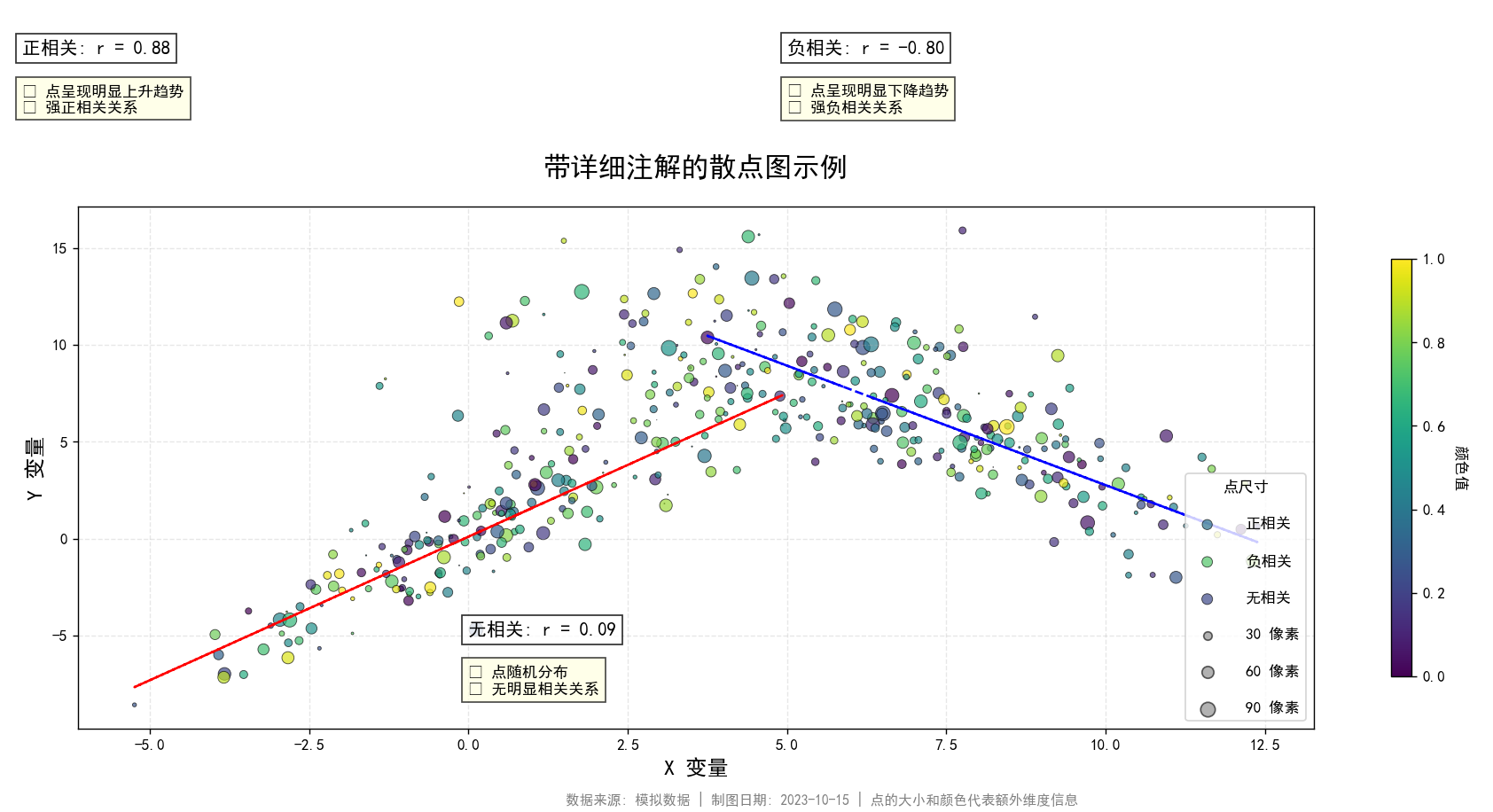
柱状图/条形图(bar/barh)
绘图库介绍
Python可视化 --柱形图_python 柱状图-CSDN博客![]() https://blog.csdn.net/m0_73299799/article/details/136437184
https://blog.csdn.net/m0_73299799/article/details/136437184
最全Python绘制条形图(柱状图)_数据分析-CSDN专栏![]() https://download.csdn.net/blog/column/10599192/113642589
https://download.csdn.net/blog/column/10599192/113642589
| 核心作用 | 关键说明 | 适用场景 |
|---|---|---|
| 类别比较 | 清晰对比不同分类项目的数值差异 | 产品销量对比、部门绩效评估 |
| 分布展示 | 显示离散数据的频率分布情况 | 用户年龄分布、故障类型统计 |
| 趋势分析 | 展示数据随时间变化的趋势(离散时间点) | 月度销售额、季度增长率 |
| 排名呈现 | 直观显示项目的排序位置 | 城市GDP排名、热门商品排行 |
| 构成分析 | 展示整体中各部分的组成关系 | 收入来源构成、时间分配比例 |
函数签名(Function Signature)
ax.bar(x,                # 条形的x坐标height,            # 条形的高度(y值)width=0.8,         # 条形的宽度(默认0.8)bottom=None,       # 条形的底部基准(用于堆叠图)align='center',    # 条形对齐方式:'center' 或 'edge'**kwargs           # 其他样式参数(颜色、边框等)
)ax.barh(y, width, height=0.8, left=None, *, align='center', **kwargs
)
关键参数详解
bar函数
| 参数 | 类型 | 说明 |
|---|---|---|
x | float 或 array-like | 条形的中心位置(若 align='center')或左侧边缘(若 align='edge') |
height | float 或 array-like | 条形的高度(y轴方向的值) |
width | float 或 array-like | 条形的宽度(默认0.8)。值范围建议 [0, 1],避免重叠 |
bottom | float 或 array-like | 条形的起始高度(y轴基准),用于堆叠图(默认从0开始) |
align | {'center', 'edge'} | 对齐方式: - 'center':条形中心位于 x 坐标处- 'edge':条形左侧边缘位于 x 坐标处 |
barh函数
| 参数 | 说明 | 示例值 |
|---|---|---|
y | 条形在 y 轴的位置(类别) | [0, 1, 2] |
width | 条形的长度(数值) | [30, 50, 20] |
height | 条形的粗细(高度) | 0.5 |
left | 条形起始的 x 坐标(用于堆叠) | [0, 30, 80] |
align | 对齐方式 | 'center' 或 'edge' |
color | 条形颜色 | 'skyblue', ['r','g','b'] |
edgecolor | 边框颜色 | 'black' |
linewidth | 边框宽度 | 1.5 |
alpha | 透明度 | 0.7 |
label | 图例标签 | 'Sales' |
xerr/yerr | 误差线 | 数组或标量 |
常用样式参数 (**kwargs)
bar函数
| 参数 | 说明 |
|---|---|
color | 填充颜色(支持颜色名、十六进制码、RGB元组) 例: color='skyblue'、color=['r','g','b'] |
edgecolor | 边框颜色(默认:'black') |
linewidth | 边框宽度(默认:1.0) |
alpha | 透明度(0透明 ~ 1不透明) |
label | 图例标签(用于ax.legend()) |
tick_label | 替换x轴刻度的标签(长度需与x一致)例: tick_label=['A','B','C'] |
返回值
返回一个 BarContainer 对象,包含所有条形(Rectangle 实例),可通过它进一步调整样式。
柱状图和条形图对比
| 特征 | 柱状图 (Column Chart) | 条形图 (Bar Chart) |
|---|---|---|
| 方向 | 垂直 (↑) | 水平 (→) |
| 坐标轴 | x轴=分类,y轴=数值 | y轴=分类,x轴=数值 |
| 最佳场景 | 时间序列、少量类别 | 长文本标签、大量类别、排名 |
| Matplotlib函数 | ax.bar() | ax.barh() |
| 阅读顺序 | 从左到右 | 从上到下 |
| 数据限制 | 类别名过长时标签会重叠 | 处理长类别名更友好 |
示例代码
import matplotlib.pyplot as plt
import numpy as np# 设置中文字体支持
plt.rcParams['font.sans-serif'] = ['SimHei', 'Microsoft YaHei', 'Arial Unicode MS']
plt.rcParams['axes.unicode_minus'] = False# 创建数据
categories = ['苹果', '香蕉', '橙子', '葡萄', '芒果']
values_bar = [35, 28, 42, 25, 38]
values_barh = [120, 95, 150, 80, 130]
colors = ['#FF6B6B', '#4ECDC4', '#45B7D1', '#FFBE0B', '#FB5607']# 创建画布
fig = plt.figure(figsize=(14, 10), facecolor='#f8f9fa')
fig.suptitle('水果销售数据分析', fontsize=20, fontweight='bold', color='#2a4d69')# 创建柱状图
ax1 = fig.add_subplot(2, 2, 1)
bars = ax1.bar(categories, values_bar, color=colors, edgecolor='white', linewidth=2, alpha=0.9)
ax1.set_title('水果销售额柱状图', fontsize=14, pad=20, color='#2a4d69')
ax1.set_ylabel('销售额 (万元)', fontsize=12)
ax1.set_ylim(0, 50)
ax1.grid(axis='y', linestyle='--', alpha=0.7)# 添加数据标签
for bar in bars:height = bar.get_height()ax1.annotate(f'{height}',xy=(bar.get_x() + bar.get_width() / 2, height),xytext=(0, 3),  # 3 points vertical offsettextcoords="offset points",ha='center', va='bottom',fontsize=10, fontweight='bold')# 添加箭头注解
ax1.annotate('橙子销量最高',xy=(2, 42),xytext=(3, 45),arrowprops=dict(arrowstyle='->', color='#2a4d69', lw=1.5, connectionstyle="arc3,rad=0.2"),fontsize=10, color='#2a4d69', bbox=dict(boxstyle="round,pad=0.3", fc='white', ec='#2a4d69', alpha=0.8))# 创建水平条形图
ax2 = fig.add_subplot(2, 2, 2)
bars_h = ax2.barh(categories, values_barh, color=colors, edgecolor='white', linewidth=2, alpha=0.9)
ax2.set_title('水果销量条形图', fontsize=14, pad=20, color='#2a4d69')
ax2.set_xlabel('销量 (吨)', fontsize=12)
ax2.set_xlim(0, 170)
ax2.grid(axis='x', linestyle='--', alpha=0.7)# 添加数据标签
for bar in bars_h:width = bar.get_width()ax2.annotate(f'{width}',xy=(width, bar.get_y() + bar.get_height() / 2),xytext=(5, 0),  # 向右偏移5点textcoords="offset points",ha='left', va='center',fontsize=10, fontweight='bold')# 添加圆圈注解
ax2.annotate('芒果销量突出',xy=(130, 4),xytext=(140, 3.5),arrowprops=dict(arrowstyle='->', color='#2a4d69', lw=1.5),fontsize=10, color='#2a4d69',bbox=dict(boxstyle="circle,pad=0.3", fc='#FB5607', ec='white', alpha=0.7))# 创建堆叠柱状图
ax3 = fig.add_subplot(2, 2, 3)
quarter = ['第一季度', '第二季度', '第三季度', '第四季度']
fruit_a = [20, 35, 30, 25]
fruit_b = [15, 25, 20, 30]
fruit_c = [10, 20, 25, 15]bottom = np.zeros(len(quarter))
fruits = [fruit_a, fruit_b, fruit_c]
fruit_names = ['苹果', '香蕉', '橙子']for i, fruit in enumerate(fruits):bars = ax3.bar(quarter, fruit, bottom=bottom, color=colors[i],edgecolor='white', linewidth=1, alpha=0.9, label=fruit_names[i])bottom += fruit# 在每段上添加标签for j, bar in enumerate(bars):height = bar.get_height()if height > 0:  # 仅当高度大于0时添加标签ax3.annotate(f'{height}',xy=(bar.get_x() + bar.get_width() / 2, bar.get_y() + height / 2),ha='center', va='center',color='white', fontsize=9, fontweight='bold')ax3.set_title('季度水果销量堆叠图', fontsize=14, pad=20, color='#2a4d69')
ax3.set_ylabel('销量 (吨)', fontsize=12)
ax3.legend(loc='upper right')
ax3.grid(axis='y', linestyle='--', alpha=0.7)# 添加区域注解
ax3.annotate('香蕉销量显著增长',xy=(1, 45),xytext=(0.5, 60),arrowprops=dict(arrowstyle='fancy', color='#4ECDC4', lw=1.5, connectionstyle="arc3,rad=0.3"),fontsize=10, color='#2a4d69',bbox=dict(boxstyle="round,pad=0.3", fc='#4ECDC4', ec='#2a4d69', alpha=0.3))# 创建分组条形图
ax4 = fig.add_subplot(2, 2, 4)
x = np.arange(len(quarter))
width = 0.25# 创建分组数据
bars1 = ax4.bar(x - width, fruit_a, width, color=colors[0], label='苹果', alpha=0.9)
bars2 = ax4.bar(x, fruit_b, width, color=colors[1], label='香蕉', alpha=0.9)
bars3 = ax4.bar(x + width, fruit_c, width, color=colors[2], label='橙子', alpha=0.9)ax4.set_title('季度水果销量对比', fontsize=14, pad=15, color='#2a4d69')
ax4.set_xticks(x)
ax4.set_xticklabels(quarter)
ax4.legend()
ax4.grid(axis='y', linestyle='--', alpha=0.7)# 添加数据标签
for bars in [bars1, bars2, bars3]:for bar in bars:height = bar.get_height()ax4.annotate(f'{height}',xy=(bar.get_x() + bar.get_width() / 2, height),xytext=(0, 3),textcoords="offset points",ha='center', va='bottom',fontsize=9)# 添加连接线注解
ax4.annotate('橙子销量在第三季度最高',xy=(2.25, 25),xytext=(2.1, 40),arrowprops=dict(arrowstyle='->', color='#45B7D1', lw=1.5, connectionstyle="arc3,rad=0.3"),fontsize=10, color='#2a4d69',bbox=dict(boxstyle="round,pad=0.3", fc='#45B7D1', ec='#2a4d69', alpha=0.3))# 添加图例说明
fig.text(0.5, 0.02, '数据来源: 2023年水果市场销售报告 | 可视化: Matplotlib',ha='center', fontsize=10, color='#4b86b4', alpha=0.7)# 调整布局
plt.tight_layout(rect=(0, 0.03, 1, 0.95))  # 将方括号改为圆括号
plt.subplots_adjust(wspace=0.3, hspace=0.3)# 保存为图片
plt.savefig('bar_Graph.png', dpi=300, bbox_inches='tight', facecolor=fig.get_facecolor())# 添加自定义水印
fig.text(0.5, 0.5, '可视化示例',fontsize=60, color='gray', alpha=0.1,ha='center', va='center', rotation=30)plt.show()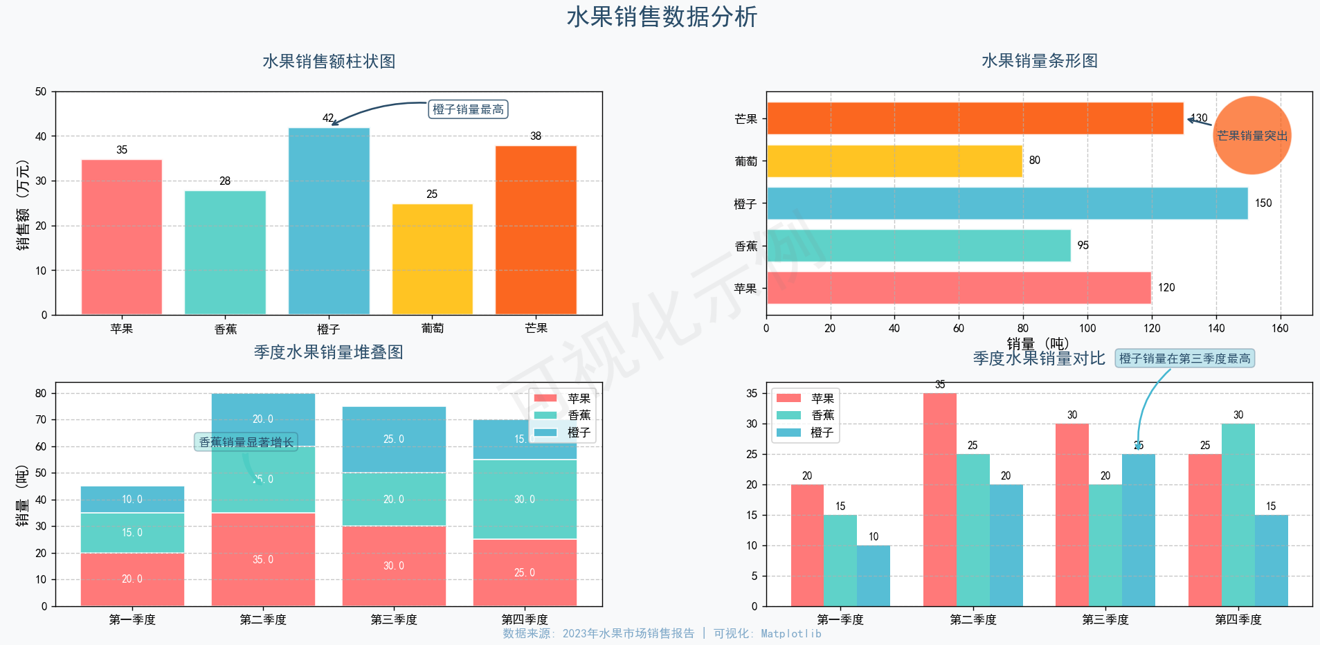
饼图/环形图(pie)
绘图库介绍
python画图|饼图绘制教程_python画饼图-CSDN博客![]() https://blog.csdn.net/weixin_44855046/article/details/141863459
https://blog.csdn.net/weixin_44855046/article/details/141863459
| 核心作用 | 关键说明 | 优势 |
|---|---|---|
| 比例可视化 | 直观显示部分在整体中的占比 | 一眼看懂构成关系 |
| 重点突出 | 强调关键组成部分的主导地位 | 聚焦核心要素 |
| 简单对比 | 快速比较2-5个部分的相对大小 | 避免复杂数据处理 |
| 整体意识 | 强化"100%"的整体概念 | 自然传达完整性 |
函数签名(Function Signature)
ax.pie(x, explode=None, labels=None, colors=None, autopct=None, pctdistance=0.6,shadow=False, labeldistance=1.1, startangle=0, radius=1, counterclock=True,wedgeprops=None, textprops=None, center=(0, 0), frame=False, rotatelabels=False,*, normalize=True, data=None
)
核心参数详解
| 参数 | 类型 | 说明 | 默认值 |
|---|---|---|---|
x | 数组 | 每个扇形的数值(自动归一化计算百分比) | 必填 |
explode | 数组 | 扇形偏移中心的距离(比例值,如 [0, 0.1, 0]) | None |
labels | 列表 | 每个扇形的标签文本 | None |
colors | 列表 | 扇形颜色(支持颜色名或 HEX) | 当前色彩循环 |
autopct | 字符串/函数 | 显示百分比的格式(如 '%1.1f%%') | None |
pctdistance | 浮点数 | 百分比文本离圆心的距离(半径比例) | 0.6 |
labeldistance | 浮点数 | 标签文本离圆心的距离(半径比例) | 1.1 |
startangle | 浮点数 | 起始绘制角度(0 表示正东方向,逆时针旋转) | 0 |
radius | 浮点数 | 饼图半径 | 1 |
wedgeprops | 字典 | 扇形属性(如边缘颜色、线宽:{'edgecolor': 'black', 'linewidth': 2}) | None |
textprops | 字典 | 文本属性(如字体大小、颜色:{'fontsize': 12, 'color': 'red'}) | None |
rotatelabels | 布尔值 | 是否旋转标签至对应扇形角度 | False |
shadow | 布尔值 | 是否添加阴影效果 | False |
返回值
返回三个对象组成的元组:
-
wedges: 扇形对象列表(matplotlib.patches.Wedge) -
texts: 标签文本对象列表(Text) -
autotexts: 百分比文本对象列表(若autopct=None则为空列表)
饼图和环形图对比
| 特性 | 饼状图 | 环形图 | 嵌套环形图 |
|---|---|---|---|
| 结构 | 实心圆 | 空心圆 | 多层同心空心圆 |
| 中心区域 | 无特殊用途 | 可放置汇总数据 | 通常留空 |
| 数据维度 | 单层数据 | 单层数据 | 多层数据 |
| 比例表示 | 扇形面积 | 弧长 | 弧长 |
| Matplotlib参数 | 默认 | wedgeprops={'width':x} | 多pie()调用+不同radius |
| 视觉重心 | 整体比例 | 部分与整体关系 | 跨数据集比较 |
示例代码
import matplotlib.pyplot as plt# 设置中文字体支持
plt.rcParams['font.sans-serif'] = ['SimHei']
plt.rcParams['axes.unicode_minus'] = False# 创建1行3列的子图布局,调整宽度比例
fig, axes = plt.subplots(1, 3, figsize=(20, 7),gridspec_kw={'width_ratios': [1, 1, 1.2]}) # 增加第三个子图宽度# -------------------- 第一个子图:基础饼图 --------------------
ax1 = axes[0]
labels1 = ['苹果', '香蕉', '橙子', '葡萄']
sizes1 = [30, 25, 20, 25]
colors1 = ['#FF9999', '#66B3FF', '#99FF99', '#FFCC99']
explode = (0.05, 0, 0, 0)wedges1, texts1, autotexts1 = ax1.pie(sizes1,explode=explode,labels=labels1,colors=colors1,autopct='%1.1f%%',startangle=90,shadow=True,textprops={'fontsize': 10}
)for autotext in autotexts1:autotext.set_color('white')autotext.set_fontweight('bold')ax1.set_title('基础饼图', fontsize=14, pad=15)
ax1.axis('equal')# -------------------- 第二个子图:环形图 --------------------
ax2 = axes[1]
labels2 = ['苹果', '香蕉', '橙子', '葡萄', '其他']
sizes2 = [25, 30, 15, 20, 10]
colors2 = ['#FF6B6B', '#4ECDC4', '#FFE66D', '#6A0572', '#1A535C']wedges2, texts2, autotexts2 = ax2.pie(sizes2,colors=colors2,startangle=90,wedgeprops=dict(width=0.4, edgecolor='w'),autopct=lambda p: f'{p:.1f}%' if p > 5 else '',pctdistance=0.85
)centre_circle = plt.Circle((0,0), 0.3, fc='white')
ax2.add_artist(centre_circle)
ax2.text(0, 0, '水果总销量', ha='center', va='center', fontsize=12)ax2.set_title('环形图', fontsize=14, pad=15)
ax2.axis('equal')# -------------------- 第三个子图:嵌套环形图 --------------------
ax3 = axes[2]# 数据
inner_labels = ['苹果', '香蕉', '其他']
inner_sizes = [40, 35, 25]
outer_labels = ['红富士', '青苹果', '进口蕉', '本地蕉', '橙子', '葡萄', '草莓']
outer_sizes = [15, 25, 20, 15, 10, 10, 5]# 颜色
inner_colors = ['#FF6B6B','#4ECDC4','#1A535C']
outer_colors = ['#FF9999', '#FF6B6B', '#88D8C0', '#4ECDC4', '#FFE66D', '#6A0572', '#1A535C']# 绘制外环(缩小尺寸)
wedges_outer, _, autotexts_outer = ax3.pie(outer_sizes,radius=1.0, # 缩小半径colors=outer_colors,wedgeprops=dict(width=0.3, edgecolor='w'), # 减小环宽startangle=90,pctdistance=0.85,autopct=lambda p: f'{p:.1f}%' if p > 4 else ''
)# 绘制内环
wedges_inner, _, autotexts_inner = ax3.pie(inner_sizes,radius=1.0 - 0.3, # 相应缩小内环半径colors=inner_colors,wedgeprops=dict(width=0.3, edgecolor='w'),startangle=90,pctdistance=0.75,autopct='%1.1f%%'
)# 添加中心文字
ax3.text(0, 0, '水果分类', ha='center', va='center', fontsize=12, weight='bold')# 优化图例:放在下方并分两列显示
legend = ax3.legend(wedges_outer + wedges_inner,outer_labels + inner_labels,title="水果种类",loc='upper center',bbox_to_anchor=(-0.68, 0), # 放在下方ncol=3, # 分三列显示fontsize=9
)
legend.get_title().set_fontsize(10) # 图例标题字号ax3.set_title('嵌套环形图', fontsize=14, pad=15)
ax3.axis('equal')# -------------------- 整体设置和保存 --------------------
plt.suptitle('水果销售数据可视化分析', fontsize=18, weight='bold')# 调整子图间距和整体布局
plt.tight_layout()
plt.subplots_adjust(top=0.85, bottom=0.2, wspace=0.3) # 增加底部空间和子图间距# 保存图像(提高DPI)
plt.savefig('pie_charts_comparison.png', dpi=300, bbox_inches='tight')
plt.savefig('pie_charts_comparison.pdf', bbox_inches='tight') # PDF格式更清晰print("图像已保存为 'pie_charts_comparison.png' 和 'pie_charts_comparison.pdf'")# 显示图像
plt.show()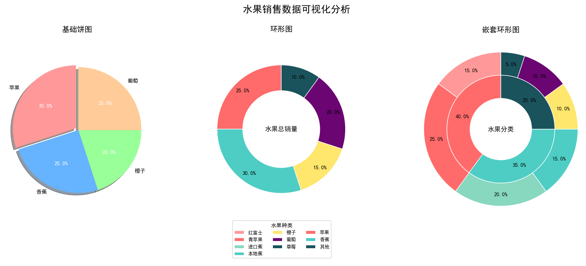 直方图(hist)
绘图库介绍
Python绘图-5直方图_python绘制直方图-CSDN博客![]() https://blog.csdn.net/2202_75971130/article/details/135192791
https://blog.csdn.net/2202_75971130/article/details/135192791
| 作用 | 说明 |
|---|---|
| 1. 展示数据分布 | 揭示数据集中在哪些区间、分散程度如何(如单峰、双峰、左偏/右偏)。 |
| 2. 识别中心趋势 | 通过最高柱子的位置快速定位数据密集区(众数所在区间)。 |
| 3. 分析离散程度 | 柱子宽度和分散情况反映数据波动范围(越分散说明数据差异越大)。 |
| 4. 检测异常值 | 远离主分布区的孤立柱子可能暗示异常值。 |
| 5. 判断分布形状 | 对称(正态分布)、左偏(数据集中在右侧)、右偏(数据集中在左侧)、多峰等。 |
| 6. 比较不同数据集 | 叠加多个直方图可对比不同群体的分布差异(如A/B测试结果)。 |
函数签名(Function Signature)
n, bins, patches = ax.hist(x, bins=None, range=None, density=False, weights=None, cumulative=False, bottom=None, histtype='bar', align='mid', orientation='vertical', rwidth=None, log=False, color=None, label=None, stacked=False, **kwargs
)
核心参数详解
| 参数 | 默认值 | 类型 | 说明 | 常用值/示例 |
|---|---|---|---|---|
x | 必填 | 数组 | 输入数据 | [1, 2, 3, 4, 5] |
bins | 'auto' | int/序列/str | 分箱数量或边界 | 10(分10箱)[0,5,10,20](自定义边界)'sturges'(自动计算) |
range | None | 元组 | 数据范围限制 | (0, 100)(仅统计0-100) |
density | False | bool | 归一化处理 | True(面积=1的概率密度) |
weights | None | 数组 | 数据点权重 | [0.1, 0.2, 0.3, ...] |
cumulative | False | bool/int | 累积分布 | True(正向累积)-1(反向累积) |
bottom | None | 标量/数组 | 基线位置 | 10(所有柱子从y=10开始) |
histtype | 'bar' | str | 直方图类型 | 'bar'(传统柱状)'step'(线框)'stepfilled'(填充线框) |
align | 'mid' | str | 柱子对齐方式 | 'mid'(居中)'left'(左对齐)'right'(右对齐) |
orientation | 'vertical' | str | 方向 | 'vertical'(垂直)'horizontal'(水平) |
rwidth | None | float | 柱子相对宽度 | 0.8(占bin宽80%) |
log | False | bool | 对数坐标 | True(y轴对数化) |
color | None | str/列表 | 颜色 | 'skyblue'['r','g','b'] |
label | None | str | 图例标签 | 'Male' |
stacked | False | bool | 堆叠显示 | True(多组数据堆叠) |
alpha | 1.0 | float | 透明度 | 0.7(半透明效果) |
返回值
-
n: 数组,每个 bin 的频数(或密度值)。 -
bins: 数组,bin 的边界值(长度为len(n)+1)。 -
patches: 直方图矩形对象列表(用于自定义样式)。
直方图和柱状图对比
| 特征 | 直方图 (Histogram) | 柱状图 (Bar Chart) |
|---|---|---|
| 数据性质 | 连续数值数据 | 分类数据(或离散数值) |
| X轴含义 | 数值区间(Bin) | 类别标签(如国家、产品) |
| 柱子间距 | 无间距(表示连续区间) | 有间距(强调独立性) |
| 柱子宽度 | 可不等宽(由数据分布决定) | 通常等宽 |
| 排序 | 按数值大小自动排序 | 任意排序(可按需调整) |
| 统计目标 | 展示数据分布/频率 | 比较各类别数量大小 |
| 数学基础 | 概率密度估计 | 分类计数 |
| 空值处理 | 空区间高度=0(必须显示所有区间) | 缺失类别可省略 |
| 坐标轴 | 仅数值轴 | 一轴数值,另一轴分类 |
| 示例场景 | 年龄分布、考试成绩分布 | 各国GDP对比、月度销售额 |
经验法则
-
当X轴是数值范围且需看分布形状 → 直方图
-
当X轴是类别标签且需比较大小 → 柱状图
-
当数据量<10时优先用柱状图,>30时优先用直方图
示例代码
import numpy as np
import matplotlib.pyplot as plt# 设置中文字体支持(如果需要显示中文)
plt.rcParams['font.sans-serif'] = ['SimHei', 'Arial Unicode MS', 'Microsoft YaHei', 'WenQuanYi Zen Hei', 'sans-serif']
plt.rcParams['axes.unicode_minus'] = False# 生成示例数据(模拟学生考试成绩)
np.random.seed(42)
math_scores = np.random.normal(loc=75, scale=12, size=200)  # 数学成绩
physics_scores = np.random.normal(loc=68, scale=15, size=200)  # 物理成绩# 创建图表和坐标轴
fig, ax = plt.subplots(figsize=(12, 8))# 绘制双直方图(比较两科成绩)
n1, bins1, patches1 = ax.hist(math_scores, bins=12, color='skyblue', alpha=0.7,edgecolor='navy', label='数学成绩')
n2, bins2, patches2 = ax.hist(physics_scores, bins=12, color='salmon', alpha=0.7,edgecolor='darkred', label='物理成绩')# 添加标题和标签
ax.set_title('数学与物理成绩分布对比', fontsize=16, pad=20)
ax.set_xlabel('考试分数', fontsize=14)
ax.set_ylabel('学生人数', fontsize=14)# 添加网格线
ax.grid(axis='y', linestyle='--', alpha=0.6)# 添加图例
ax.legend(fontsize=12)# 添加柱子顶部的频数注解
def add_count_annotations(patches, counts, bins, offset=3):for i, patch in enumerate(patches):bin_center = (bins[i] + bins[i+1]) / 2height = counts[i]if height > 0:  # 只标注有值的柱子ax.annotate(f'{int(height)}',xy=(bin_center, height),xytext=(0, offset),textcoords='offset points',ha='center',va='bottom',fontsize=10)add_count_annotations(patches1, n1, bins1)
add_count_annotations(patches2, n2, bins2, offset=5)  # 物理成绩的注解稍高# 添加统计信息注解
math_mean = np.mean(math_scores)
physics_mean = np.mean(physics_scores)
ax.axvline(math_mean, color='blue', linestyle='--', linewidth=2)
ax.axvline(physics_mean, color='red', linestyle='--', linewidth=2)ax.annotate(f'数学平均分: {math_mean:.1f}',xy=(math_mean, np.max(n1)*0.8),xytext=(math_mean - 15, np.max(n1)*0.8 + 6),arrowprops=dict(arrowstyle='->', color='blue', connectionstyle="arc3"),fontsize=12, color='blue', weight='bold')ax.annotate(f'物理平均分: {physics_mean:.1f}',xy=(physics_mean, np.max(n2)*0.7),xytext=(physics_mean + 5.8, np.max(n2)*0.7 + 5),arrowprops=dict(arrowstyle='->', color='red'),fontsize=12, color='red', weight='bold')# 添加差异说明注解
ax.annotate('数学成绩整体高于物理成绩\n且分布更为集中',xy=(80, 25),xytext=(90, 30),arrowprops=dict(arrowstyle='fancy', color='green', connectionstyle="angle3,angleA=0,angleB=90"),fontsize=12, color='green', bbox=dict(boxstyle="round,pad=0.3", fc='lightyellow', ec='olive', alpha=0.8))# 保存高分辨率图片
plt.tight_layout()
plt.savefig('histogram_with_annotations.png', dpi=300, bbox_inches='tight')
plt.savefig('histogram_with_annotations.pdf', bbox_inches='tight')  # 矢量图版本print("图片已保存为 'histogram_with_annotations.png' 和 'histogram_with_annotations.pdf'")# 显示图表
plt.show()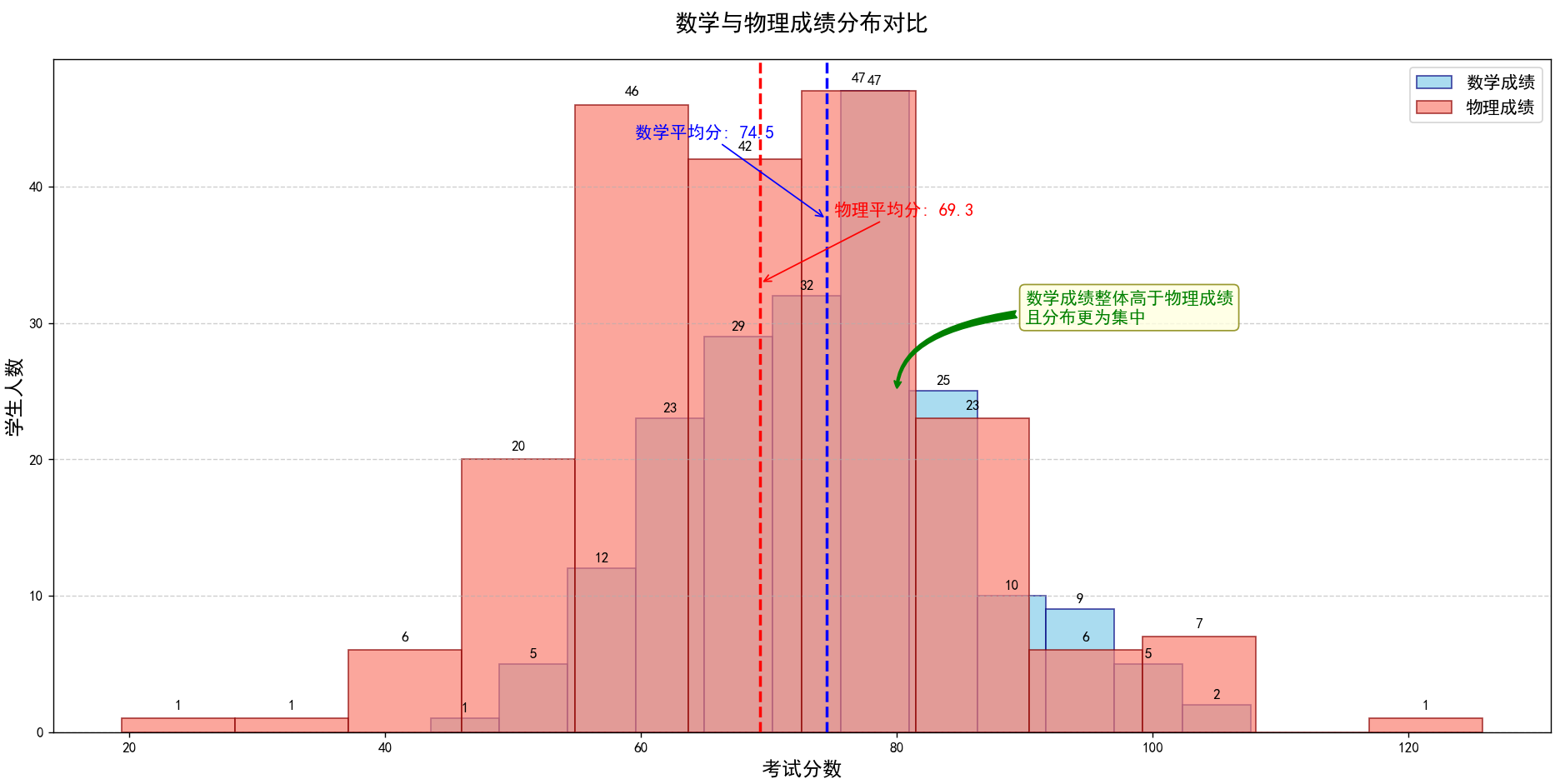
箱线图(boxplot)
绘图库介绍
Python绘图-7箱图_python 箱线图-CSDN博客![]() https://blog.csdn.net/2202_75971130/article/details/136337160
https://blog.csdn.net/2202_75971130/article/details/136337160
| 作用 | 说明 |
|---|---|
| 1. 展示数据分布 | 用5个统计量(最小值、Q1、中位数、Q3、最大值)概括数据分布位置和范围。 |
| 2. 识别异常值 | 超出上下须(1.5×IQR范围)的点被单独标记,快速定位异常值。 |
| 3. 分析偏态与对称性 | 中位数在箱体的位置反映数据偏斜方向(左偏/右偏)。 |
| 4. 比较多组数据 | 并排箱线图可高效对比多组数据的分布差异(如不同类别/时间)。 |
| 5. 检测数据离散度 | 箱体长度(IQR)和须的长度反映数据波动范围(IQR越小,数据越集中)。 |
函数签名(Function Signature)
plt.boxplot(x,notch=None,sym=None,vert=None,whis=None,positions=None,widths=None,patch_artist=None,bootstrap=None,usermedians=None,conf_intervals=None,meanline=None,showmeans=None,showcaps=None,showbox=None,showfliers=None,boxprops=None,labels=None,flierprops=None,medianprops=None,meanprops=None,capprops=None,whiskerprops=None,manage_ticks=True,autorange=False,zorder=None
)
核心参数详解表
| 参数 | 类型 | 默认值 | 说明 | 示例 |
|---|---|---|---|---|
x | Array/Sequence | (必填) | 输入数据(一维数组或数组序列) | x=[data1, data2] |
notch | bool | False | 是否绘制缺口箱线图(展示中位数置信区间) | notch=True |
sym | str | 'b+' | 离群点标记样式 | sym='rs'(红色方块) |
vert | bool | True | 箱线图方向(True=垂直,False=水平) | vert=False |
whis | float | 1.5 | 定义须线长度的IQR倍数 | whis=2.0 |
positions | array-like | [1,2..n] | 箱线图的定位坐标 | positions=[1,3,5] |
widths | float/array | 0.5 | 箱体宽度(标量或每个箱体宽度数组) | widths=0.3 |
patch_artist | bool | False | 是否用颜色填充箱体 | patch_artist=True |
labels | list/str | None | 分组标签 | labels=['A','B'] |
showmeans | bool | False | 是否显示均值标记 | showmeans=True |
meanline | bool | False | 是否用线(而非点)表示均值 | meanline=True |
showcaps | bool | True | 是否显示须线末端横杠 | showcaps=False |
showbox | bool | `True`` | 是否显示箱体 | showbox=False |
showfliers | bool | True | 是否显示离群值 | showfliers=False |
boxprops | dict | None | 箱体样式属性 | boxprops=dict(facecolor='red') |
whiskerprops | dict | None | 须线样式属性 | whiskerprops=dict(linestyle='--') |
capprops | dict | None | 须线末端横杠样式属性 | capprops=dict(linewidth=2) |
medianprops | dict | None | 中位数线样式属性 | medianprops=dict(color='gold') |
meanprops | dict | None | 均值标记样式属性 | meanprops=dict(marker='D') |
flierprops | dict | None | 离群点样式属性 | flierprops=dict(marker='x') |
zorder | float | None | 绘图层级(控制叠放顺序) | zorder=10 |
示例代码
import matplotlib.pyplot as plt
import numpy as np
import os# 设置中文显示
plt.rcParams['font.sans-serif'] = ['SimHei', 'Arial Unicode MS', 'Microsoft YaHei', 'sans-serif']
plt.rcParams['axes.unicode_minus'] = False# 创建输出目录
output_dir = 'output'
os.makedirs(output_dir, exist_ok=True)# 生成更真实的示例数据(模拟产品测试分数)
np.random.seed(42)
product_A = np.random.normal(85, 12, 200)
product_B = np.random.normal(92, 8, 200)
product_C = np.random.normal(78, 15, 200)
product_D = np.random.normal(88, 10, 200)
data = [product_A, product_B, product_C, product_D]# 创建图形和子图
plt.figure(figsize=(12, 8))
ax = plt.subplot(111)# 绘制箱线图
box = plt.boxplot(data,patch_artist=True,showmeans=True,  # 显示均值点meanprops={'marker': 'D', 'markerfacecolor': 'gold', 'markeredgecolor': 'black'},labels=['产品A', '产品B', '产品C', '产品D'])# 设置箱体颜色
colors = ['#FF9999', '#66B2FF', '#99FF99', '#FFCC99']
for patch, color in zip(box['boxes'], colors):patch.set_facecolor(color)patch.set_alpha(0.8)  # 添加透明度# 设置箱线样式
for element in ['whiskers', 'caps', 'medians']:plt.setp(box[element], color='black', linewidth=1.5)# 添加注释
for i, d in enumerate(data):# 计算关键统计量median = np.median(d)q1 = np.percentile(d, 25)q3 = np.percentile(d, 75)iqr = q3 - q1mean = np.mean(d)upper_bound = q3 + 1.5 * iqrlower_bound = q1 - 1.5 * iqr# 标注中位数plt.annotate(f'中位数: {median:.1f}',xy=(i + 1, median),xytext=(i + 1.2, median + 3),fontsize=10,arrowprops=dict(arrowstyle="->", color='black', alpha=0.7))# 标注平均值plt.annotate(f'平均值: {mean:.1f}',xy=(i + 1, mean),xytext=(i + 1.2, mean - 5),fontsize=9,color='darkblue',arrowprops=dict(arrowstyle="->", color='darkblue', alpha=0.5))# 标注IQR范围plt.text(i + 1.1, (q1 + q3) / 2, f'IQR: {iqr:.1f}',fontsize=9, color='darkgreen',verticalalignment='center')# 添加整体标题和说明
plt.title('四种产品质量测试分数分布对比', fontsize=16, pad=20, fontweight='bold')
plt.xlabel('产品型号', fontsize=12, labelpad=10)
plt.ylabel('测试分数', fontsize=12, labelpad=10)# 添加网格线
plt.grid(axis='y', linestyle='--', alpha=0.5)# 添加图例
from matplotlib.patches import Patchlegend_elements = [Patch(facecolor=colors[0], label='产品A'),Patch(facecolor=colors[1], label='产品B'),Patch(facecolor=colors[2], label='产品C'),Patch(facecolor=colors[3], label='产品D'),plt.Line2D([0], [0], marker='D', color='w', markerfacecolor='gold', markersize=10, label='平均值'),plt.Line2D([0], [0], color='black', lw=2, label='中位数')
]
ax.legend(handles=legend_elements, loc='upper right', fontsize=10)# 添加数据来源说明
plt.figtext(0.5, 0.01, '数据来源: 2023年产品质量测试报告 | 注: 箱线图基于200个样本数据',ha='center', fontsize=9, color='gray')# 调整布局
plt.tight_layout()
plt.subplots_adjust(bottom=0.1)  # 为底部文本留出空间# 保存图片到文件 (多种格式)
png_path = os.path.join(output_dir, 'boxplot_with_annotations.png')
pdf_path = os.path.join(output_dir, 'boxplot_with_annotations.pdf')
svg_path = os.path.join(output_dir, 'boxplot_with_annotations.svg')# 保存为PNG (适合网页使用)
plt.savefig(png_path, dpi=300, bbox_inches='tight')
# 保存为PDF (适合印刷和高质量打印)
plt.savefig(pdf_path, format='pdf', bbox_inches='tight')
# 保存为SVG (矢量格式,可编辑)
plt.savefig(svg_path, format='svg', bbox_inches='tight')print(f"图表已保存至: {png_path}")
print(f"图表已保存至: {pdf_path}")
print(f"图表已保存至: {svg_path}")# 显示图形
plt.show()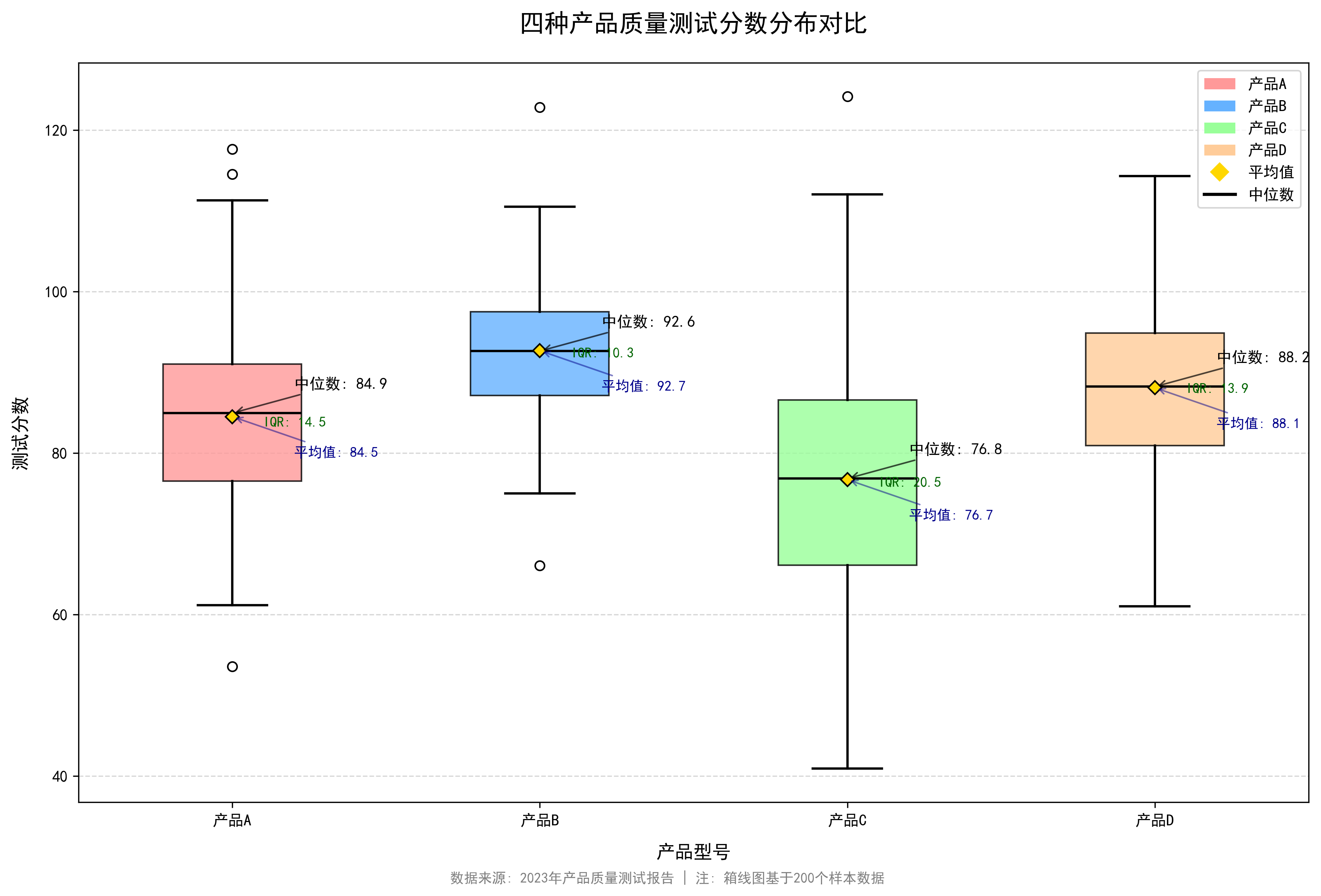
Python获取Excel数据
使用 pandas(适合数据处理)
import pandas as pd# 读取整个文件
df = pd.read_excel("文件路径.xlsx", sheet_name="工作表名")  # sheet_name 可以是名称或索引(从0开始)# 示例
df = pd.read_excel("data.xlsx", sheet_name=0)  # 读取第一个工作表# 查看数据
print(df.head())  # 显示前5行# 获取列数据
column_data = df["列名"]  # 例如 df["姓名"]# 转换为列表或字典
data_list = df.values.tolist()  # 整个表格转为二维列表
data_dict = df.to_dict("records")  # 每行转为字典列表 [{"列1":值1, ...}, ...]# 读取指定范围 (需 openpyxl 引擎)
df_range = pd.read_excel("data.xlsx", sheet_name="Sheet1", usecols="A:C", skiprows=1, nrows=100)
# usecols: 列范围 (A:C 或 [0,2])
# skiprows: 跳过前N行
# nrows: 读取行数
使用 openpyxl(精细控制单元格)
from openpyxl import load_workbook# 加载工作簿
wb = load_workbook("data.xlsx")
sheet = wb["工作表名"]  # 或 wb.worksheets[0]# 获取单元格值
cell_value = sheet["A1"].value  # 直接坐标
cell_value = sheet.cell(row=1, column=1).value  # 行列索引(从1开始)# 遍历行
for row in sheet.iter_rows(min_row=2, values_only=True):  # values_only 只返回值print(row)  # 每行是一个元组 (值1, 值2, ...)# 获取整列数据
column_data = [cell.value for cell in sheet["B"]]  # 整列B# 写入后保存(可选)
sheet["C1"] = "新数据"
wb.save("新文件.xlsx")