Flutter_学习记录_基本组件的使用记录_2
1. PopupMenuButton的使用
代码案例:
import 'package:flutter/material.dart';
// ----PopupMemuButtonDemo的案例----
class PopupMemuButtonDemo extends StatefulWidget {
const PopupMemuButtonDemo({super.key});
State<PopupMemuButtonDemo> createState() => _PopupMemuButtonDemoState();
}
class _PopupMemuButtonDemoState extends State<PopupMemuButtonDemo> {
String _currentMenuItem = "Home";
Widget build(BuildContext context) {
return Scaffold(
appBar: AppBar(
title: Text("PopupMemuButtonDemo"),
),
body: Container(
padding: EdgeInsets.all(16.0),
child: Column(
mainAxisAlignment: MainAxisAlignment.center,
children: [
Row(
mainAxisAlignment: MainAxisAlignment.center,
children: [
Text(_currentMenuItem),
PopupMenuButton(
onSelected: (value) {
print(value);
setState(() {
_currentMenuItem = value;
});
},
itemBuilder: (BuildContext context) => [
PopupMenuItem(value: "Home", child: Text("Home")),
PopupMenuItem(value: "Discover", child: Text("Discover") ),
PopupMenuItem(value: "My", child: Text("My"))
],
)
],
)
],
),
),
);
}
}
效果图如下:

2. Checkbox 和 CheckboxListTile 的使用
代码案例:
import 'package:flutter/material.dart';
class CheckBoxDemo extends StatefulWidget {
const CheckBoxDemo({super.key});
State<CheckBoxDemo> createState() => _CheckBoxDemoState();
}
class _CheckBoxDemoState extends State<CheckBoxDemo> {
bool _checkboxItemA = true;
Widget build(BuildContext context) {
return Scaffold(
appBar: AppBar(
title: Text("CheckBoxDemo"),
),
body: Container(
padding: EdgeInsets.all(16.0),
child: Column(
mainAxisAlignment: MainAxisAlignment.center,
children: [
CheckboxListTile(
value: _checkboxItemA,
onChanged: (value){
setState(() {
if (value != null) {
_checkboxItemA = value;
}
});
},
title: Text("Checkbox Item A"),
subtitle: Text("Description"),
secondary: Icon(Icons.bookmark),
selected: _checkboxItemA,
activeColor: Colors.green,
),
Row(
mainAxisAlignment: MainAxisAlignment.center,
children: [
Checkbox(
value: _checkboxItemA,
onChanged: (value) {
setState(() {
if (value != null) {
_checkboxItemA = value;
}
});
},
activeColor: Colors.green,
)
],
)
],
),
),
);
}
}
效果图如下:

3. Radio 和 RadioListTile的使用
代码案例如下:
import 'package:flutter/material.dart';
class RadioDemo extends StatefulWidget {
const RadioDemo({super.key});
State<RadioDemo> createState() => _RadioDemoState();
}
class _RadioDemoState extends State<RadioDemo> {
int _radioGroupA = 0;
void _handleRadioValueChanged (int? value) {
setState(() {
if (value != null) {
_radioGroupA = value;
}
});
}
Widget build(BuildContext context) {
return Scaffold(
appBar: AppBar(
title: Text("RadioDemo"),
),
body: Container(
padding: EdgeInsets.all(16.0),
child: Column(
mainAxisAlignment: MainAxisAlignment.center,
children: [
Row(
mainAxisAlignment: MainAxisAlignment.center,
children: [
Text("男"),
Radio(
value: 0,
groupValue: _radioGroupA,
onChanged: _handleRadioValueChanged,
activeColor: Colors.green,
),
SizedBox(width: 32.0),
Text("女"),
Radio(
value: 1,
groupValue: _radioGroupA,
onChanged: _handleRadioValueChanged,
activeColor: Colors.green,
),
],
),
SizedBox(height: 32.0),
RadioListTile(
value: 0,
groupValue: _radioGroupA,
onChanged: _handleRadioValueChanged,
activeColor: Colors.green,
title: Text("Option A"),
subtitle: Text("Description"),
secondary: Icon(Icons.filter_1_outlined),
selected: _radioGroupA == 0,
),
RadioListTile(
value: 1,
groupValue: _radioGroupA,
onChanged: _handleRadioValueChanged,
activeColor: Colors.green,
title: Text("Option B"),
subtitle: Text("Description"),
secondary: Icon(Icons.filter_2_outlined),
selected: _radioGroupA == 1,
),
],
),
),
);
}
}
效果图如下:

4. Switch 和 SwitchListTile 的案例
import 'package:flutter/material.dart';
class Switchdemo extends StatefulWidget {
const Switchdemo({super.key});
State<Switchdemo> createState() => _SwitchdemoState();
}
class _SwitchdemoState extends State<Switchdemo> {
bool _switchItemA = false;
void _handleSwitchValueChanged(bool? value) {
setState(() {
if (value != null) {
_switchItemA = value;
}
});
}
Widget build(BuildContext context) {
return Scaffold(
appBar: AppBar(
title: Text("SwitchDemo"),
),
body: Container(
padding: EdgeInsets.all(16.0),
child: Column(
mainAxisAlignment: MainAxisAlignment.center,
children: [
Row(
mainAxisAlignment: MainAxisAlignment.center,
children: [
Text(_switchItemA ? "已打开" : "未打开", style: TextStyle(fontSize: 24.0)),
Switch(
value: _switchItemA,
onChanged: _handleSwitchValueChanged,
activeColor: Colors.lightGreen,
)
],
),
SwitchListTile(
value: _switchItemA,
onChanged: _handleSwitchValueChanged,
title: Text("Switch Item A"),
subtitle: Text("Description"),
secondary: Icon(_switchItemA ? Icons.visibility : Icons.visibility_off),
selected: _switchItemA,
)
],
),
),
);
}
}
效果图如下:

5. Slider 的使用
代码案例:
import 'package:flutter/material.dart';
class SliderDemo extends StatefulWidget {
const SliderDemo({super.key});
State<SliderDemo> createState() => _SliderDemoState();
}
class _SliderDemoState extends State<SliderDemo> {
double _sliderItemA = 0.0;
void _handleSliderValueChanged(double? value) {
setState(() {
if (value != null) {
_sliderItemA = value;
}
});
}
Widget build(BuildContext context) {
return Scaffold(
appBar: AppBar(
title: Text("SliderDemo"),
),
body: Container(
padding: EdgeInsets.all(16.0),
child: Column(
mainAxisAlignment: MainAxisAlignment.center,
children: [
Slider(
value: _sliderItemA,
onChanged: _handleSliderValueChanged,
activeColor: Colors.green,
inactiveColor: Colors.grey[100],
min: 0.0, // 设置最小值
max: 10.0, // 设置最大值
divisions: 10, // 分割为几份
label: "${_sliderItemA.toInt()}", // 标签
),
SizedBox(height: 18.0),
Text("SliderValue: $_sliderItemA")
],
),
),
);
}
}
效果图:

6. 时间选择器的简单使用
代码案例:
import 'package:flutter/material.dart';
import 'package:intl/intl.dart';
import 'dart:async';
class DatetimeDemo extends StatefulWidget {
const DatetimeDemo({super.key});
State<DatetimeDemo> createState() => _DatetimeDemoState();
}
class _DatetimeDemoState extends State<DatetimeDemo> {
DateTime selectedDate = DateTime.now();
TimeOfDay selectedTime = TimeOfDay(hour: 9, minute: 30);
Future<void> _selectedDate() async {
final DateTime? date = await showDatePicker(
context: context,
initialDate: selectedDate,
firstDate: DateTime(1900),
lastDate: DateTime(2100),
);
if (date != null) {
setState(() {
selectedDate = date;
});
}
}
Future<void> _selectedTime() async {
final TimeOfDay? time = await showTimePicker(
context: context,
initialTime: selectedTime
);
if (time != null) {
selectedTime = time;
}
}
Widget build(BuildContext context) {
return Scaffold(
appBar: AppBar(
title: Text("DateTimeDemo"),
),
body: Container(
padding: EdgeInsets.all(16.0),
child: Column(
mainAxisAlignment: MainAxisAlignment.center,
children: [
InkWell(
onTap: _selectedDate,
child: Row(
mainAxisAlignment: MainAxisAlignment.center,
children: [
Text(DateFormat.yMMMd().format(selectedDate), style: TextStyle(fontSize: 18.0)),
Icon(Icons.arrow_drop_down),
],
),
),
SizedBox(height: 18.0),
InkWell(
onTap: _selectedTime,
child: Row(
mainAxisAlignment: MainAxisAlignment.center,
children: [
Text(selectedTime.format(context), style: TextStyle(fontSize: 18.0)),
Icon(Icons.arrow_drop_down),
],
),
)
],
),
),
);
}
}
效果图:


7. SimpleDialog 的使用
代码案例:
import 'package:flutter/material.dart';
class SimpledialogDemo extends StatefulWidget {
const SimpledialogDemo({super.key});
State<SimpledialogDemo> createState() => _SimpledialogDemoState();
}
class _SimpledialogDemoState extends State<SimpledialogDemo> {
String _choiceString = "Nothing";
void _openSimpleDialog() {
showDialog(
context: context,
builder: (BuildContext context) {
return SimpleDialog(
title: Text("SimpleDialog"),
clipBehavior: Clip.none,
children: [
SimpleDialogOption(
onPressed: (){
setState(() {
_choiceString = "A";
});
Navigator.pop(context);
},
child: Text("Option A"),
),
SimpleDialogOption(
onPressed: (){
setState(() {
_choiceString = "B";
});
Navigator.pop(context);
},
child: Text("Option B"),
),
SimpleDialogOption(
onPressed: (){
setState(() {
_choiceString = "C";
});
Navigator.pop(context);
},
child: Text("Option C"),
),
],
);
}
);
}
Widget build(BuildContext context) {
return Scaffold(
appBar: AppBar(
title: Text("SimpleDialogDemo"),
),
body: Container(
padding: EdgeInsets.all(16.0),
child: Column(
mainAxisAlignment: MainAxisAlignment.center,
children: [
Text("Your option is : $_choiceString")
],
),
),
floatingActionButton: FloatingActionButton(
onPressed: _openSimpleDialog,
child: Icon(Icons.format_list_numbered)
),
);
}
}
效果图如下:

8. AlertDialog 的使用
代码案例:
import 'package:flutter/material.dart';
class AlertdialogDemo extends StatefulWidget {
const AlertdialogDemo({super.key});
State<AlertdialogDemo> createState() => _AlertdialogDemoState();
}
class _AlertdialogDemoState extends State<AlertdialogDemo> {
String _alertDialogChoice = "Nothing";
void _openAlertDialog() {
showDialog(
context: context,
barrierDismissible: false,
builder: (BuildContext context) {
return AlertDialog(
title: Text("AlertDialog"),
content: Text("Are you sure about this?"),
actions: [
TextButton(
onPressed: (){
setState(() {
_alertDialogChoice = "cancel";
});
Navigator.pop(context);
},
child: Text("cancel")
),
TextButton(
onPressed: (){
setState(() {
_alertDialogChoice = "ok";
});
Navigator.pop(context);
},
child: Text("ok")
),
],
);
}
);
}
Widget build(BuildContext context) {
return Scaffold(
appBar: AppBar(
title: Text("SimpleDialogDemo"),
),
body: Container(
padding: EdgeInsets.all(16.0),
child: Column(
mainAxisAlignment: MainAxisAlignment.center,
children: [
Text("Your choice is: $_alertDialogChoice"),
SizedBox(height: 16.0),
Row(
mainAxisAlignment: MainAxisAlignment.center,
children: [
OutlinedButton(
onPressed: _openAlertDialog,
child: Text("Open Alert Dialog")
)
],
)
],
),
)
);
}
}
效果如下:

9.showModalBottomSheet 和 showBottomSheet的使用
注意:showBottomSheet 这个需要用到GlobalKey<ScaffoldState>(), 并且这个需要在Scaffold 中的key关联上,不然获取不到对应的状态,就显示不出来。
import 'package:flutter/material.dart';
class BottomsheetDemo extends StatefulWidget {
const BottomsheetDemo({super.key});
State<BottomsheetDemo> createState() => _BottomsheetDemoState();
}
class _BottomsheetDemoState extends State<BottomsheetDemo> {
String _choiceString = "Nothing";
// 需要在Scaffold 中的关联 key
final _bottomSheetScaffoldKey = GlobalKey<ScaffoldState>();
void _openModelBottomSheet() {
showModalBottomSheet(context: context, builder: (BuildContext context){
return Container(
height: 200.0,
child: Column(
children: [
ListTile(title: Text("Option A"), onTap: () {
setState(() {
_choiceString = "A";
});
Navigator.pop(context);
}),
ListTile(title: Text("Option B"), onTap: () {
setState(() {
_choiceString = "B";
});
Navigator.pop(context);
}),
ListTile(title: Text("Option C"), onTap: () {
setState(() {
_choiceString = "C";
});
Navigator.pop(context);
})
],
),
);
});
}
void _openBottomSheet() {
_bottomSheetScaffoldKey.currentState?.showBottomSheet(
(BuildContext context){
return BottomAppBar(
child: Container(
height: 90.0,
width: double.infinity,
padding: EdgeInsets.all(16.0),
child: Row(
children: [
Icon(Icons.pause_circle_outline),
SizedBox(width: 16.0),
Text("Bottom sheet"),
Expanded(child: Text("Fix you - Coldplay", textAlign: TextAlign.right))
],
),
),
);
}
);
}
Widget build(BuildContext context) {
return Scaffold(
key: _bottomSheetScaffoldKey,
appBar: AppBar(
title: Text("BottoomSheetDemo"),
),
body: Container(
padding: EdgeInsets.all(16.0),
child: Column(
mainAxisAlignment: MainAxisAlignment.center,
children: [
Row(
mainAxisAlignment: MainAxisAlignment.center,
children: [
TextButton(
onPressed: _openBottomSheet,
style: ButtonStyle(
backgroundColor: WidgetStatePropertyAll(Colors.blue),
foregroundColor: WidgetStatePropertyAll(Colors.white)
),
child: Text("Open BottomSheet")
),
],
),
Row(
mainAxisAlignment: MainAxisAlignment.center,
children: [
TextButton(
onPressed: _openModelBottomSheet,
style: ButtonStyle(
backgroundColor: WidgetStatePropertyAll(Colors.blue),
foregroundColor: WidgetStatePropertyAll(Colors.white)
),
child: Text("Open Model BottomSheet")
),
]
),
SizedBox(height: 16.0),
Row(
mainAxisAlignment: MainAxisAlignment.center,
children: [
Text("Your choice is $_choiceString", style: TextStyle(fontSize: 18.0))
],
)
],
),
),
);
}
}
效果图如下:


10.showSnackBar 的使用
代码如下:
import 'package:flutter/material.dart';
class SnackbarDemo extends StatefulWidget {
const SnackbarDemo({super.key});
State<SnackbarDemo> createState() => _SnackbarDemoState();
}
class _SnackbarDemoState extends State<SnackbarDemo> {
Widget build(BuildContext context) {
return Scaffold(
appBar: AppBar(
title: Text("SnackBarDemo"),
),
body: Container(
padding: EdgeInsets.all(16.0),
child: Column(
mainAxisAlignment: MainAxisAlignment.center,
children: [
Row(
mainAxisAlignment: MainAxisAlignment.center,
children: [
SnackBarButton()
],
)
],
),
),
);
}
}
class SnackBarButton extends StatelessWidget {
const SnackBarButton({super.key});
Widget build(BuildContext context) {
return OutlinedButton(
onPressed: (){
ScaffoldMessenger.of(context).showSnackBar(
SnackBar(
content: Text('正在注册中....'),
action: SnackBarAction(label: "OK", onPressed: (){}),
),
);
},
child: Text("open SnackBar")
);
}
}
效果如下:

11. ExpansionPanelList 和 ExpansionPanel 的使用
代码如下:
import 'package:flutter/material.dart';
class ExpansionPanelItem {
String headerText;
Widget body;
bool isExpanded;
ExpansionPanelItem({required this.headerText, required this.body, required this.isExpanded});
}
class ExpansionpanelDemo extends StatefulWidget {
const ExpansionpanelDemo({super.key});
State<ExpansionpanelDemo> createState() => _ExpansionpanelDemoState();
}
class _ExpansionpanelDemoState extends State<ExpansionpanelDemo> {
late List<ExpansionPanelItem> _expansionPanelItems;
void initState() {
super.initState();
// 构造数据
_expansionPanelItems = <ExpansionPanelItem>[
ExpansionPanelItem(
headerText: "Panel A",
body: Container(
padding: EdgeInsets.all(16.0),
width: double.infinity,
child: Text("Content of Panel A"),
),
isExpanded: false
),
ExpansionPanelItem(
headerText: "Panel B",
body: Container(
padding: EdgeInsets.all(16.0),
width: double.infinity,
child: Text("Content of Panel B"),
),
isExpanded: false
),
ExpansionPanelItem(
headerText: "Panel C",
body: Container(
padding: EdgeInsets.all(16.0),
width: double.infinity,
child: Text("Content of Panel C"),
),
isExpanded: false
),
];
}
Widget build(BuildContext context) {
return Scaffold(
appBar: AppBar(
title: Text("ExpansionPanelDemo"),
),
body: Container(
padding: EdgeInsets.all(16.0),
child: Column(
mainAxisAlignment: MainAxisAlignment.center,
children: [
ExpansionPanelList(
expansionCallback: (panelIndex, isExpanded) => {
setState(() {
_expansionPanelItems[panelIndex].isExpanded = isExpanded;
})
},
children: _expansionPanelItems.map(
(ExpansionPanelItem item) {
return ExpansionPanel(
isExpanded: item.isExpanded,
body: item.body,
headerBuilder: (BuildContext context, bool isExpanded) {
return Container(
padding: EdgeInsets.all(16.0),
child: Text(item.headerText, style: TextStyle(fontSize: 18.0)),
);
},
);
}
).toList(),
)
],
),
),
);
}
}
效果图如下:

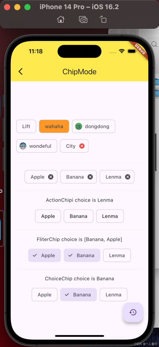
12. Chip的使用
在 Flutter 中,Chip 是一种紧凑的元素,用于向用户呈现小块信息。Chip 可以用来展示输入的标签、选项或实体,如搜索关键词、过滤条件、联系人等。它们通常是圆形的,并且可以包含图标、文本或其他小部件。基础用法,可以参考这篇文章。目前学习到Chip有如下几种:
- Chip
- ActionChip(可点击)
- FilterChip(带有选中图标)
- ChoiceChip(带有选中图标,但是一组中只能选中一个)
代码如下:
import 'package:flutter/material.dart';
class ChipDemo extends StatefulWidget {
const ChipDemo({super.key});
State<ChipDemo> createState() => _ChipDemoState();
}
class _ChipDemoState extends State<ChipDemo> {
List<String> _tags = [
"Apple",
"Banana",
"Lenma",
];
String _selectTag = "Nothing";
List<String> _selectTags = [];
String _choiceTag = "";
Widget build(BuildContext context) {
return Scaffold(
appBar: AppBar(
title: Text("ChipMode"),
),
body: Container(
padding: EdgeInsets.all(16.0),
child: Column(
mainAxisAlignment: MainAxisAlignment.center,
children: [
Wrap(
spacing: 8.0,
runSpacing: 8.0,
children: [
Chip(label: Text("Lift")),
Chip(label: Text("wahaha"), backgroundColor: Colors.orange),
Chip(label: Text("dongdong"), avatar: CircleAvatar(backgroundColor: Colors.green, child: Text("珠")),),
Chip(label: Text("wondeful"), avatar: CircleAvatar(backgroundImage: NetworkImage("https://img1.baidu.com/it/u=1368815763,3761060632&fm=253&fmt=auto&app=138&f=JPEG?w=760&h=434"))),
// deleteButtonTooltipMessage长按--提示文案
Chip(label: Text("City"), onDeleted: (){}, deleteIconColor: Colors.red, deleteButtonTooltipMessage: "Will you want to delete this tag?"),
Divider(color: Colors.grey[200], height: 32.0),
],
),
Wrap(
spacing: 8.0,
runSpacing: 8.0,
children: _tags.map((tag){
return Chip(
label: Text(tag),
// 自带删除按钮
onDeleted: (){
setState(() {
_tags.remove(tag);
});
},
);
}).toList()
),
Divider(color: Colors.grey[200], height: 32.0),
Container(
height: 32.0,
child: Text("ActionChipi choice is $_selectTag"),
),
Wrap(
spacing: 8.0,
children: _tags.map((tag){
// 可选择按钮
return ActionChip(
label: Text(tag),
onPressed: (){
setState(() {
_selectTag = tag;
});
}
);
}).toList()
),
Divider(color: Colors.grey[200], height: 32.0),
Container(
height: 32.0,
child: Text("FliterChip choice is ${_selectTags.toString()}"),
),
Wrap(
spacing: 8.0,
children: _tags.map((tag){
return FilterChip(
label: Text(tag),
selected: _selectTags.contains(tag),
onSelected: (bool value) {
setState(() {
if (_selectTags.contains(tag)) {
_selectTags.remove(tag);
} else {
_selectTags.add(tag);
}
});
},
);
}).toList()
),
Divider(color: Colors.grey[200], height: 32.0),
Container(
height: 32.0,
child: Text("ChoiceChip choice is $_choiceTag"),
),
Wrap(
spacing: 8.0,
children: _tags.map((tag){
return ChoiceChip(
label: Text(tag),
selected: _choiceTag == tag,
onSelected: (bool value) {
setState(() {
_choiceTag = tag;
});
},
);
}).toList()
),
],
),
),
floatingActionButton: FloatingActionButton(
child: Icon(Icons.restore),
onPressed: (){
// 复原数据
setState(() {
_tags = [
"Apple",
"Banana",
"Lenma",
];
_selectTags = [];
_choiceTag = "";
});
}
),
);
}
}
效果图如下:
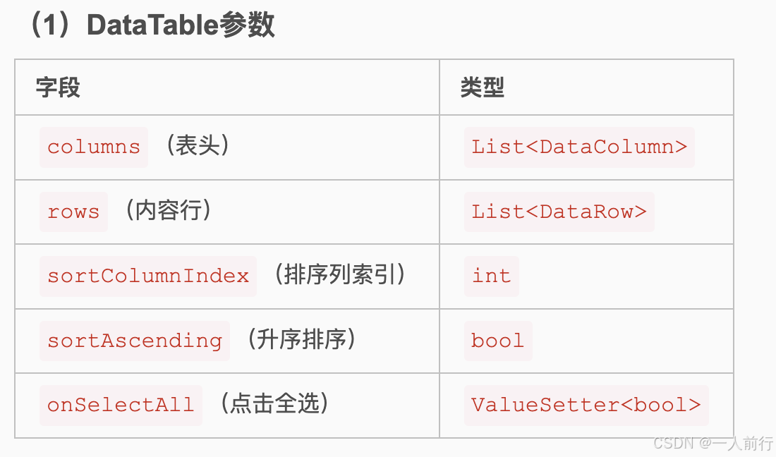
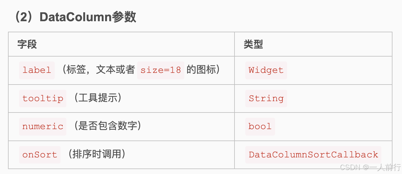
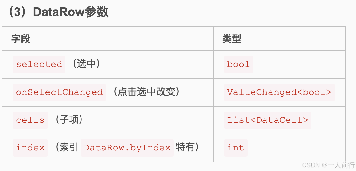
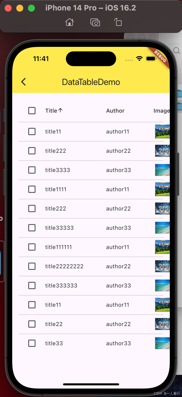
13. DataTable的使用
DataTable是一个用于展示数据的表格组件,它允许开发者以一种结构化和可滚动的方式展示数据集。常规用法,参考这个文章。
代码案例如下:
import 'package:flutter/material.dart';
import '../Model/post.dart';
class DatatableDemo extends StatefulWidget {
const DatatableDemo({super.key});
State<DatatableDemo> createState() => _DatatableDemoState();
}
class _DatatableDemoState extends State<DatatableDemo> {
int _sortColumnIndex = 0;
bool _sortAscending = true;
Widget build(BuildContext context) {
return Scaffold(
appBar: AppBar(
title: Text("DataTableDemo"),
),
body: Container(
padding: EdgeInsets.all(16.0),
child: ListView(
children: [
DataTable(
// 设置排序的索引
sortColumnIndex: _sortColumnIndex,
// 设置排序的顺序
sortAscending: _sortAscending,
columns: [
DataColumn(label: Text("Title"), onSort: (columnIndex, ascending) {
// 排序的方法
setState(() {
_sortColumnIndex = columnIndex;
_sortAscending = ascending;
posts.sort((a, b) {
// if (!ascending) {
// // 降序排序
// return b.title.length.compareTo(a.title.length);
// } else {
// // 升序排序
// return a.title.length.compareTo(b.title.length);
// }
if (!ascending) {
final c = a;
a = b;
b = c;
}
return a.title.length.compareTo(b.title.length);
});
});
},),
// 设置列表头
DataColumn(label: Text("Author")),
DataColumn(label: Text("Image"))
],
rows: posts.map((post){
return DataRow(
// 是否选中
selected: post.selected,
// 选中的动作
onSelectChanged: (value) {
setState(() {
if (post.selected != value) {
if (value != null) {
post.selected = value;
}
}
});
},
cells: [
// 设置列表的内容
DataCell(Text(post.title)),
DataCell(Text(post.author)),
DataCell(Container(padding: EdgeInsets.all(4.0), width: 60.0,child: Image.network(post.imageUrl),))
]
);
}).toList()
)
],
),
),
);
}
}
效果图如下:
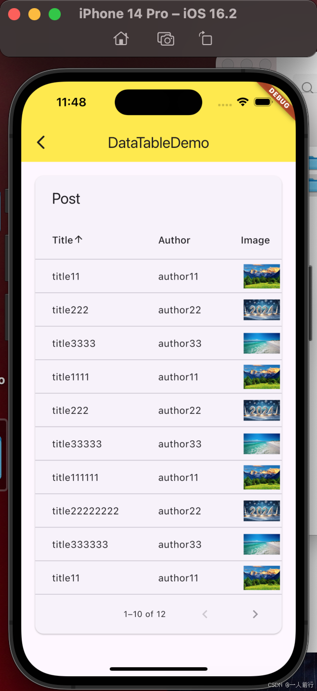
14. PaginatedDataTable
可分页的DataTable, 代码案例如下:
import 'package:flutter/material.dart';
import '../Model/post.dart';
class PaginateddatatableDemo extends StatefulWidget {
const PaginateddatatableDemo({super.key});
State<PaginateddatatableDemo> createState() => _PaginatedDatatableDemoState();
}
class _PaginatedDatatableDemoState extends State<PaginateddatatableDemo> {
int _sortColumnIndex = 0;
bool _sortAscending = true;
final PostDataSource _postDataSource = PostDataSource();
Widget build(BuildContext context) {
return Scaffold(
appBar: AppBar(
title: Text("DataTableDemo"),
),
body: Container(
padding: EdgeInsets.all(16.0),
child: ListView(
children: [
PaginatedDataTable(
header: Text("Post"),
rowsPerPage: 10,
source: _postDataSource,
// 设置排序的索引
sortColumnIndex: _sortColumnIndex,
// 设置排序的顺序
sortAscending: _sortAscending,
columns: [
DataColumn(label: Text("Title"), onSort: (columnIndex, ascending) {
_postDataSource._sort((post) => post.title.length, ascending);
setState(() {
_sortColumnIndex = columnIndex;
_sortAscending = ascending;
});
},),
DataColumn(label: Text("Author")),
DataColumn(label: Text("Image"))
],
)
],
),
),
);
}
}
// 设置数据源
class PostDataSource extends DataTableSource {
final _posts = posts;
int _selectedCount = 0;
int get rowCount => _posts.length;
bool get isRowCountApproximate => false;
int get selectedRowCount => _selectedCount;
DataRow? getRow(int index) {
final post = _posts[index];
return DataRow.byIndex(
index: index,
cells: [
DataCell(Text(post.title)),
DataCell(Text(post.author)),
DataCell(Container(padding: EdgeInsets.all(4.0), width: 60.0,child: Image.network(post.imageUrl),))
]);
}
void _sort(getField(post), bool ascending) {
_posts.sort((a, b) {
if (!ascending) {
final c = a;
a = b;
b = c;
}
final aValue = getField(a);
final bValue = getField(b);
return Comparable.compare(aValue, bValue);
});
notifyListeners();
}
}
效果图如下:
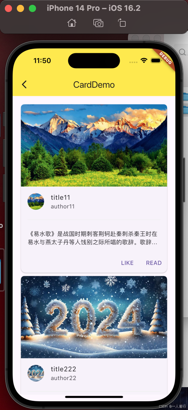
15. card 的使用
卡片的使用案例:
import 'package:flutter/material.dart';
import '../Model/post.dart';
class CardDemo extends StatefulWidget {
const CardDemo({super.key});
State<CardDemo> createState() => _CardDemoState();
}
class _CardDemoState extends State<CardDemo> {
Widget build(BuildContext context) {
return Scaffold(
appBar: AppBar(
title: Text("CardDemo"),
),
body: Container(
padding: EdgeInsets.all(16.0),
child: ListView(
children: posts.map((post) {
return Card(
child: Column(
children: [
AspectRatio(
aspectRatio: 16/9,
child: ClipRRect(
borderRadius: BorderRadius.only(
topLeft: Radius.circular(8.0),
topRight: Radius.circular(8.0),
),
child: Image.network(post.imageUrl, fit: BoxFit.cover),
),
),
ListTile(
leading: CircleAvatar(
backgroundImage: NetworkImage(post.imageUrl),
),
title: Text(post.title),
subtitle: Text(post.author),
),
Divider(
color: Colors.grey[200],
indent: 16.0,
endIndent: 16.0,
),
Container(
padding: EdgeInsets.all(16.0),
child: Text(post.description, maxLines: 2, overflow: TextOverflow.ellipsis),
),
ElevatedButtonTheme(
data: ElevatedButtonThemeData(
style: ElevatedButton.styleFrom(
foregroundColor: Colors.white,
backgroundColor: Colors.blue,
minimumSize: Size(80, 40),
elevation: 2,
),
),
child: Row(
mainAxisAlignment: MainAxisAlignment.end,
children: [
OverflowBar(
children: [
TextButton(onPressed: (){}, child: Text("LIKE")),
TextButton(onPressed: (){}, child: Text("READ")),
],
)
],
),
)
]
)
);
}).toList(),
),
),
);
}
}
效果图如下:
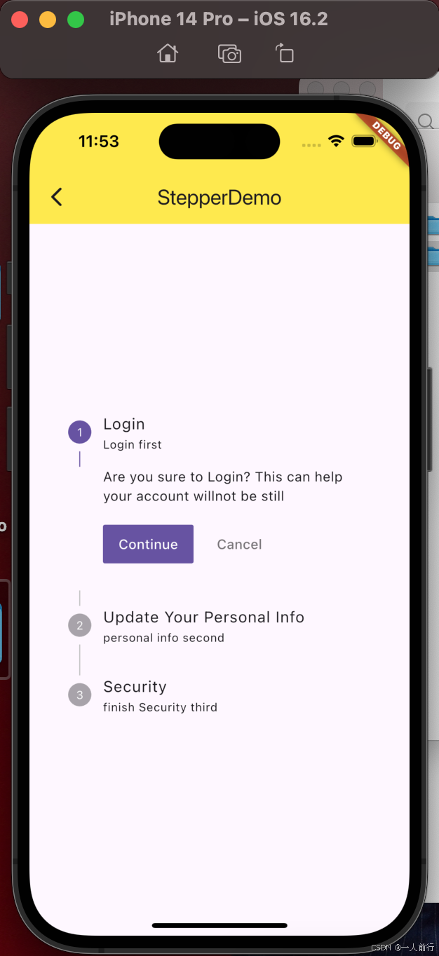
16. stepper 的使用
Stepper 是一种用于创建向导式界面或分步表单的小部件。基础使用方法,请参考这篇文章。
代码案例如下:
import 'package:flutter/material.dart';
class StepperDemo extends StatefulWidget {
const StepperDemo({super.key});
State<StepperDemo> createState() => _StepperDemoState();
}
class _StepperDemoState extends State<StepperDemo> {
int _currentStep = 0;
Widget build(BuildContext context) {
return Scaffold(
appBar: AppBar(
title: Text("StepperDemo"),
),
body: Container(
padding: EdgeInsets.all(16.0),
child: Column(
mainAxisAlignment: MainAxisAlignment.center,
children: [
Theme(
data: Theme.of(context).copyWith(
primaryColor: Colors.black
),
child: Stepper(
currentStep: _currentStep,
onStepTapped: (value) {
setState(() {
_currentStep = value;
});
},
onStepContinue: () {
setState(() {
if (_currentStep < 2) {
_currentStep += 1;
} else {
_currentStep = 0;
}
});
},
onStepCancel: () {
setState(() {
if (_currentStep > 0) {
_currentStep -= 1;
} else {
_currentStep = 0;
}
});
},
steps: [
Step(
title: Text("Login"),
subtitle: Text("Login first"),
content: Text("Are you sure to Login? This can help your account willnot be still"),
isActive: _currentStep == 0
),
Step(
title: Text("Update Your Personal Info"),
subtitle: Text("personal info second"),
content: Text("Are you finish your personal info?"),
isActive: _currentStep == 1
),
Step(
title: Text("Security"),
subtitle: Text("finish Security third"),
content: Text("Are you finish your security? This can help your account willnot be stil "),
isActive: _currentStep == 2
),
]
)
)
],
),
),
);
}
}
效果图如下: